#visual design
-

Square in a Circle Branding
My friend Titus reached out a while back to do some brand work for his new venture, Square in a Circle. He's branching out into life coaching and voiceovers, and needed an identity that could hold all of that together.
-

Experimenting with layering, filtering, and masking in CSS
I’ve recently been doing some experiments with layering, filtering, and masking in CSS. The language has come a long way in the past few years, with properties like `filter`, `mask-image`, `mix-blend-mode`, additional gradient types like `radial-gradient`, and more, opening the door for Photoshop-like effects that weren’t possible before.
-

How I unknowingly upped my visual design game
As I’ve been building out the team at LaunchDarkly, I realized my eye for visual design details had gotten a lot sharper. I was seeing rough edges and ways to improve UIs that I wouldn’t have caught a few years prior. This was cropping up in the UI work I was doing myself as well. I hadn’t explicitly tried to improve my visual design skills, and professionally have spent more time in management than IC work, so how had this happened?
-
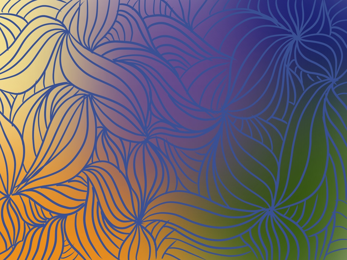
Exercises from 'Interaction of Color' by Josef Albers
Interaction of Color is, by far, the best book on color I’ve ever read. Other teaching methods focus on theory, color systems, the physics of color (wavelength, rods and cones, etc.), or resort to rote rules like, "red means danger." It’s mechanical, mathematical, rules-based, and divorced from how people perceive and react to color. Or as Albers puts it: "Experience teaches that in visual perception there is a discrepancy between physical fact and psychic effect."
-
Site Redesign IV: Color, Layout, & Logo
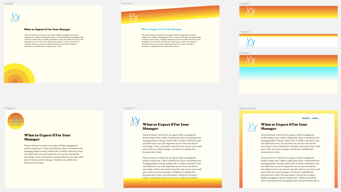
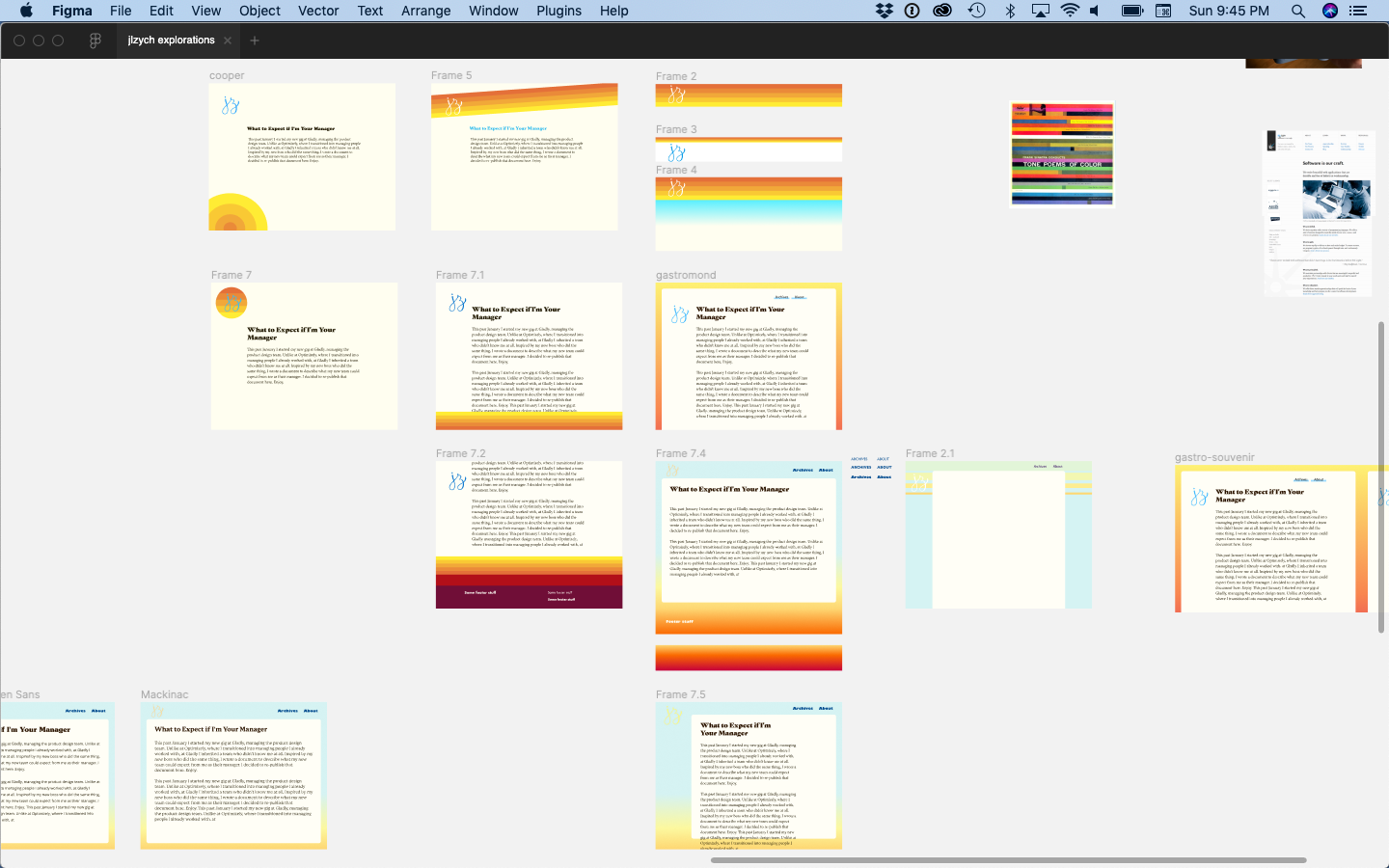
Part IV of my site redesign series. The final post. While I was exploring the world of typography to match my guiding concept, I was also exploring ideas for the color, layout, and logo (some of which you saw in the previous post). I explored all 3 of these together because they were all interrelated. The placement of the logo and navigation dictated their color and style, so I was changing each variable simultaneously.
-
Site Redesign III: Typography
Before I started moodboarding, or even found my guiding concept, I read The Designer's Dictionary of Type and realized the typography on my site was not particularly warm or human. In this third part of my redesign series, I document the process of choosing new fonts for the site.
-
Site Redesign II: Inspiration
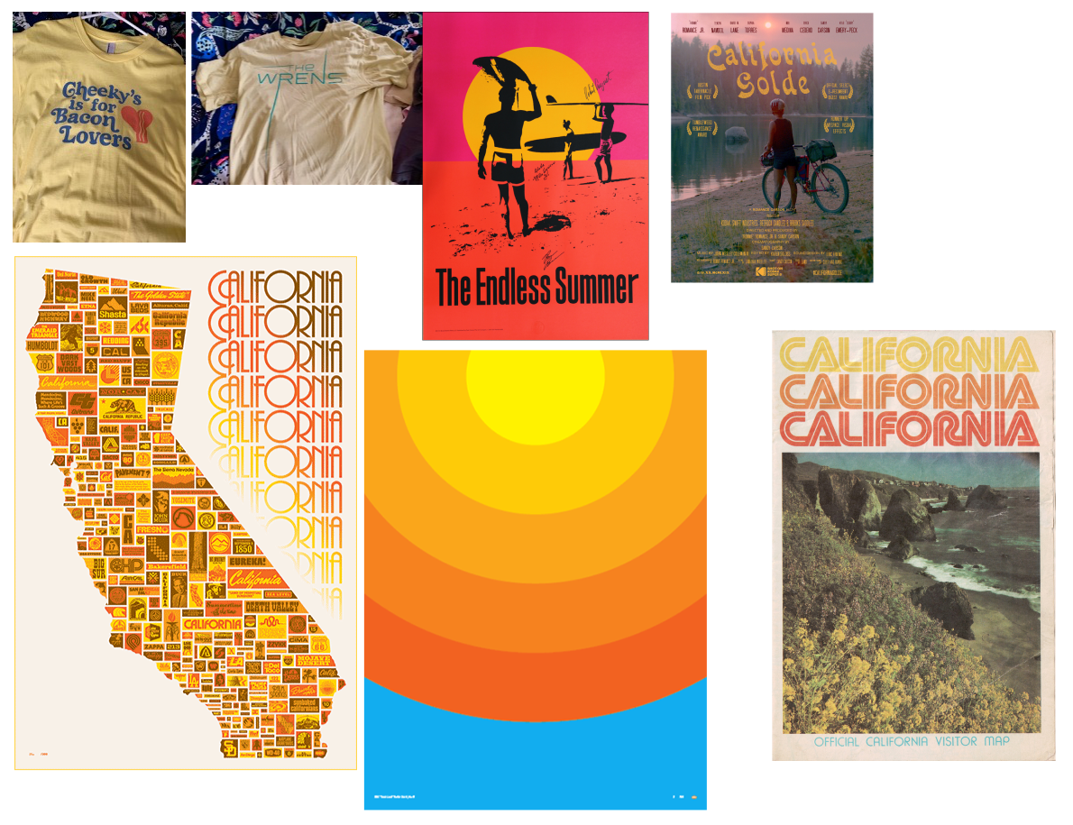
Having found my guiding concept in my last post (tl;dr is it should feel like me, but on the internet, as expressed through SoCal summer vibes), I started gathering inspiration for how to translate that into colors, fonts, and an overall site design.
-

Site Redesign I: The Guiding Concept
As some of you may have noticed, I (semi-)recently gave my site a visual overhaul. It's far more opinionated than before, so I want to document my decision making process over the next couple of posts.