Site Redesign I: The Guiding Concept
As some of you may have noticed, I (semi-)recently gave my site a visual overhaul. It’s far more opinionated than before, so I want to document my decision making process over the next couple of posts.
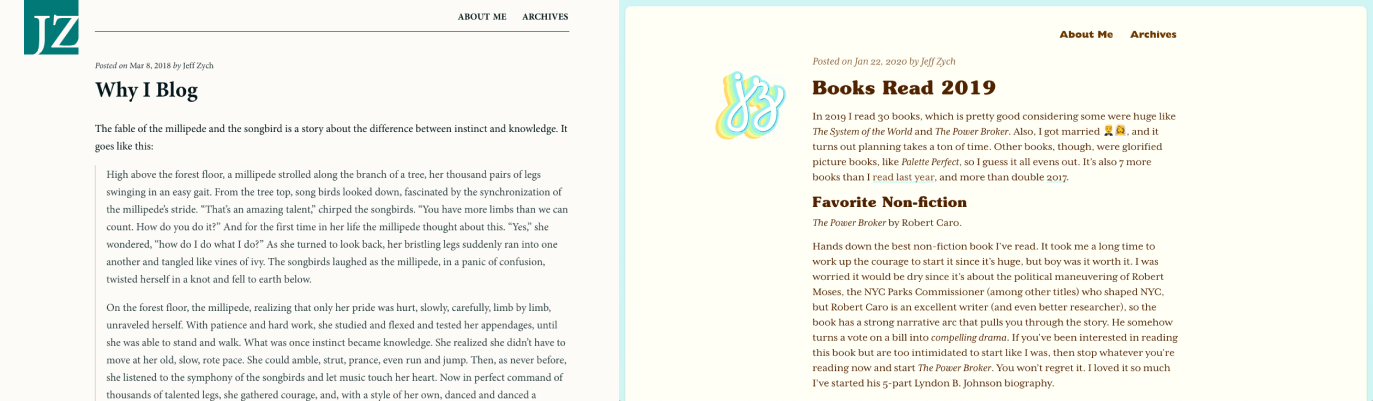 Before (left): a dull gray background. Minion typeface throughout. After (right): much warmer. More engaging. More personality.
First up is the concept that drove the visual design of the site. The concept took a long time to come into focus, but is the most important (and hardest) part of the redesign.
When I transitioned my site from a portfolio to a blog (circa 2012, after graudating from grad school), there was no concept behind it. I just wanted a site that “didn’t look bad” and was easy to read (it was a blog, remember?). That meant safe, overused typeface (Minion). Minimal color. No ornamentation. Nothing flashy or special at all, really. Just text on a page.
The JZ monogram was just the letters set in a nice font, cut out of a box. I designed it like that because I thought it looked cool. The image came to me one day, so I whipped it up in Illustrator. I chose the blue-kissed green because it looked nice and was neither flashy nor boring. Not exactly the strongest reasoning.
So I ended up with a site that looked fine, and avoided making mistakes, but that was it. It wasn’t special or unique or interesting.
And that’s how my site was for many years. It did its job. But as the site kept evolving, I wanted the design to be more opinionated and memorable.
That’s when I started looking for a stronger point of view to express. A feeling to evoke. A guiding concept to build around.
My starting point was just to make my site feel more personal. It’s my site. A blog. Not a corporate site. Not a product page. Not a publication. So I should express myself more. That led me to swap my knocked-out JZ with a hand-lettered monogram a couple of years back. I also added a better photo and a hand-lettered “Hello!” on my about page.
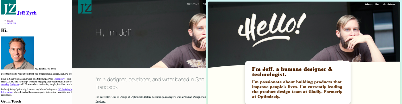 Before (left 2): I don’t have a screenshot of the original about page, but the leftmost image is an unstyled version of the page from the Wayback Machine, and isn’t far off from how it looked. The middle one is a revamped page from some number of years ago. After (right): how it looks at the time of this post. It doesn’t fully live up to the new concept, but is the best yet.
While these all undoubtedly improved my site, the concept wasn’t strong enough to stand on its own two legs.
I pushed myself to go deeper. “What does more personal mean? What makes a website ‘personal’ anyway?” I didn’t have answers, but they were good provocations to keep in the back of my mind.
While I let those questions marinate (for more than a year, probably — it’s hard to remember, exactly), I read Conversational Design by Erika Hall, who recommends thinking of a website (or app, or any touchpoint) as a person as a way to create a memorable design (which I also read about many years ago in Well Designed by Jon Kolko and forgot about). How would that person talk? Act? Dress?
That’s when all these disparate ideas — making my site “more personal;” the website as extension of self; touchpoints as people — fused into one: my site should be an extension of me! When people interact with my site, it should feel like interacting with me IRL (that’s in real life for the older crowd).
The concept immediately connected with me. There was just one problem: how do I do that? What does it mean to translate myself into a digital medium? How does a website “feel” like me? What feelings do people get when they see me, or think of me? How would my friends describe me?
It got very existential very quickly. 😳 Who am I? What defines me? Shorts? T-shirts? Owls? Bravo reality TV?
Once again, I wasn’t sure how to answer. And once again, I let this idea marinate in the back of my brain.
After many months (at least), I was in the kitchen at work wearing my customary shorts and owl t-shirt, when my coworker reacted with surprise at my outfit (it was winter), and said, “It’s like you always bring summer with you wherever you go!”
BOOM! 💥 That was the underlying concept I was looking for! Summer, warm, friendly, beach-y, So Cal vibes. Those were feelings I could evoke on the screen with visual design.
Next up, I’ll write about how I turned those into the color and font choices you’re seeing now (unless you’re from the future).
The rest of the site redesign posts