Site Redesign II: Inspiration
Having found my guiding concept in my last post (tl;dr is it should feel like me, but on the internet, as expressed through SoCal summer vibes), I started gathering inspiration for how to translate that into colors, fonts, and an overall site design.
Right off the bat I had a couple of shirts and posters in mind that had the exact vibe I wanted. They said “California” (literally and figuratively), warmth, and summer to me.
 Shirts and posters that immediately inspired me. I own the shirts in the top left.
From there, I kept my eyes peeled while browsing Instagram, reading my daily dose of design blogs, and experiencing the world. I screenshotted my favorites and photographed sunsets (specifically the time right when the sun is getting at or below the horizon, which has beautiful oranges, yellows, and a warm blue sky).
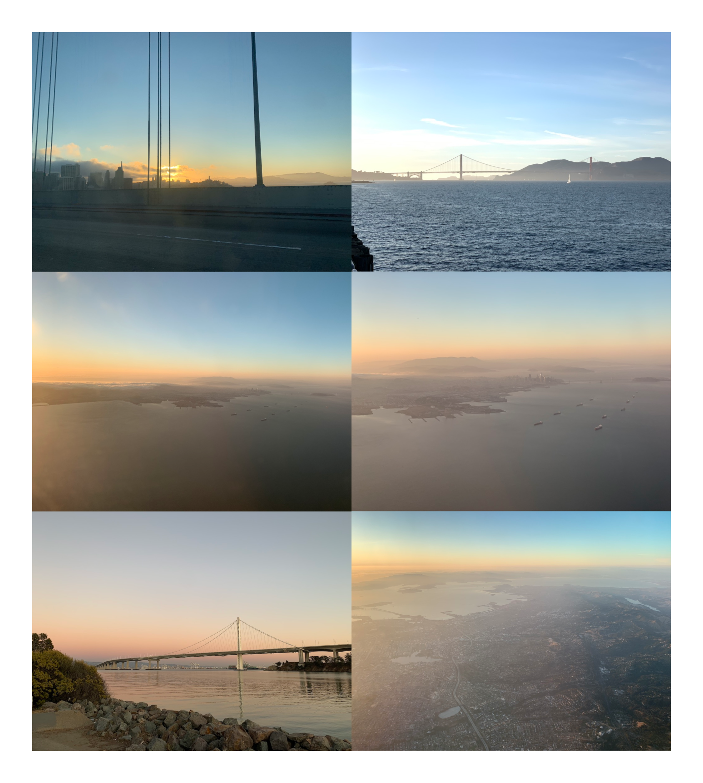 Pictures of sunsets that inspired me
Over the months (I wasn’t in a hurry, and this work was mostly passive), I got pulled towards 60s/70s styles, which often have a warm color palette, rounded serifs (like Cooper), and repeating lines and shapes.
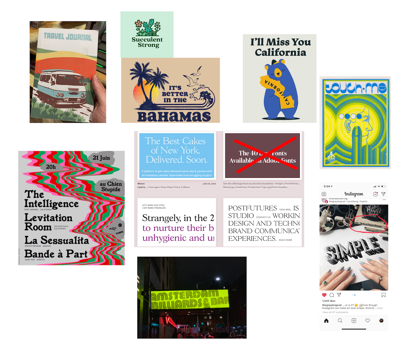 60s and 70s graphics I was diggin
For the site itself, I was inspired by a tweet I saw from Jules Forrest praising the site design of Iheanyi Ekechukwu. I loved the gradient border/background, and the otherwise simple layout with its focus on the content. An image immediately snapped into my head of this layout and gradient, but with my 60s/70s summer color palette.
 Screenshot of Iheanyi’s website that Jules posted
This gave me enough direction to start choosing typography and a color palette for the site, which I’ll describe in my next posts. In the meantime, check out my Figma file that I published on their community page (which contains spoilers for the actual site design).
The rest of the site redesign posts