Exercises from 'Interaction of Color' by Josef Albers
Interaction of Color is, by far, the best book on color I’ve ever read. Other teaching methods focus on theory, color systems, the physics of color (wavelength, rods and cones, etc.), or resort to rote rules like, “red means danger.” It’s mechanical, mathematical, rules-based, and divorced from how people perceive and react to color. Or as Albers puts it: “Experience teaches that in visual perception there is a discrepancy between physical fact and psychic effect.”
In contrast, Albers’ teaches you how to truly see color. His central thesis is that there are no absolutes in color. The way humans perceive color is influenced by the surrounding context of neighboring colors, lighting conditions, size and quantity, what we look at before and after, and more. Two colors can look like one. One color can look like two. What looks dull in one context may look bright in another. Reds can look cool-toned, and blues can be warm-toned. As Albers says, “This fact makes color the most relative medium in art.”
He teaches you to see this relativity of color through a series of exercises. To get the most out of the book, you need to do the exercises, and often many times to make sure you’re getting the desired effect. As a result, it took me at least 4 years, off and on, to get through it all (you could do it in a couple of months if you were diligent, though).
Now that I’m done, I thought it would be fun to share the output of those exercises, both for posterity and the benefit of others.
Warning: This post ended up being longer than I was expecting, so feel free to just skim through the pictures.
The Exercises
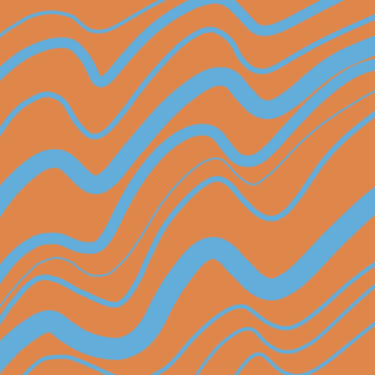
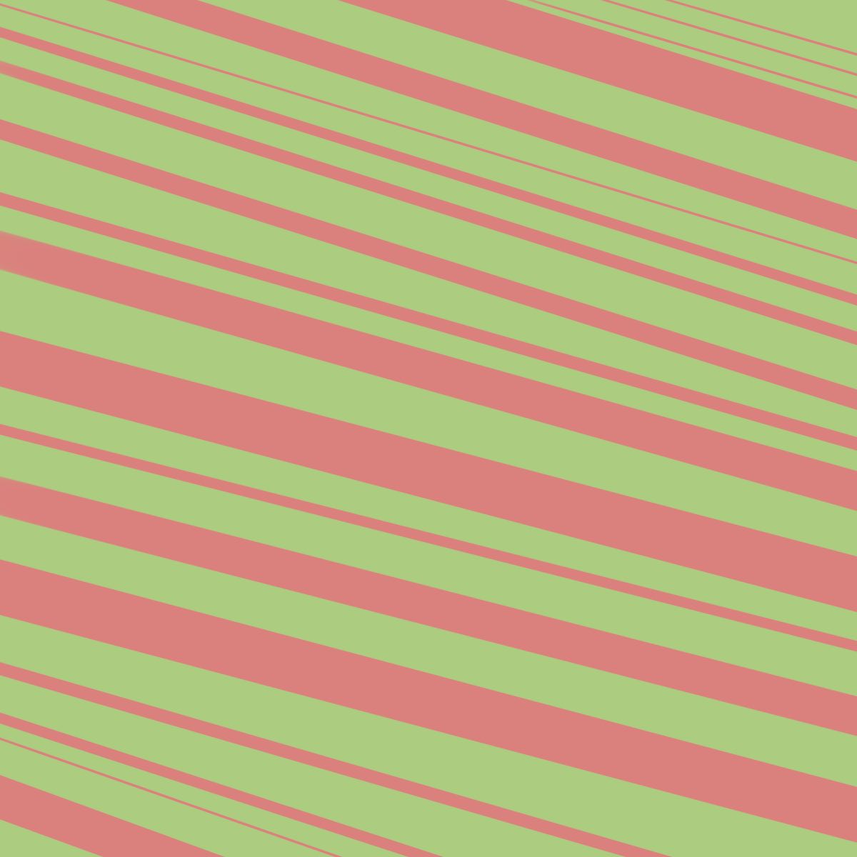
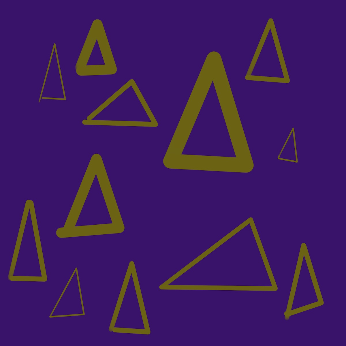
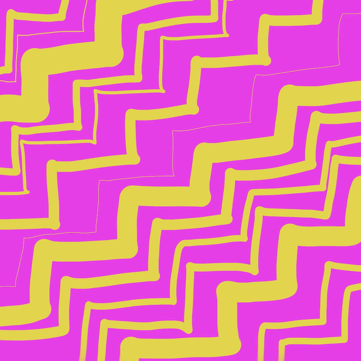
These exercises’ aim is to show a particular color effect that exploits a gap between what’s physically happening, and what humans perceive. They’re often little optical illusions. Because of this, they aren’t meant to be good, by any definition of “good.” They aren’t pretty, the colors aren’t harmonious, and any layout and shapes are arbitrary.
I did most of them in Procreate on my iPad. Albers recommends using colored paper rather than mixing oil paint because it’s hard to get precise mixtures in paint, paper is less messy, and the focus stays on how you’re perceiving color rather than trying to get the right mixture.
Working digitally had these advantages, plus some that weren’t available in Albers’ day, like measuring precise color values, blend modes, and adjusting hue/saturation/brightness after the fact. This was also a downside, though, because I sometimes got bogged down fiddling with the lightness and saturation of a color. A limited palette of colored paper would have prevented this. I did some of the later exercises with water-based markers, which were a good way of having a limited, but still expressive, palette.
So if you do these exercises, the iPad is a good way to go. Just aim for approximate colors that show the effect, and don’t spend too much time fiddling with the colors (or cheat with blending modes).
I — Color recollection
If I ask you to imagine the color “red,” the color you see and the color I see will be different. Even if I ask you to imagine Coca-Cola red, we won’t see the same color.
This demonstrates that peoples’ ability to recall a specific color is hard (as compared to a specific flavor or sound, for example), and that there are no absolutes in color.
II — Color reading and contexture
This chapter says that the way we perceive color depends on context. “We almost never (that is, without special devices) see a single color unconnected and unrelated to other colors. Colors present themselves in continuous flux, constantly related to changing neighbors and changing conditions.”
III — Why color paper
In this chapter Albers just explains why you should use colored paper. No exercise here.
IV — A color has many faces — the relativity of color
This chapter expands on the previous ones by explaining how our perception of color is further influenced by the colors we see before and after them.
Albers uses an analogy of three buckets of water – warm, lukewarm, and cold — to demonstrate this. If you dip your hand in the warm water first, then the middle bucket, it will feel cold. But if you start with the cold bucket, the middle one will feel warm. This happens despite the fact that the physical temperature in the middle bucket is constant. Color is the same way.
V — Lighter and/or darker — light intensity, lightness
This exercise asks you to sort grays from lightest to darkest. I didn’t do this one since I didn’t have colored scraps of paper. Also, I’ve done sorting exercises like these in the past.
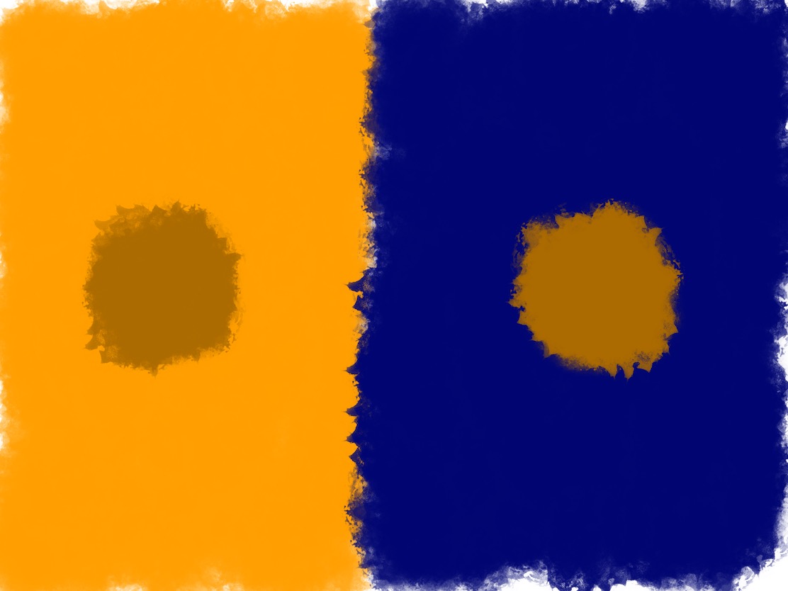
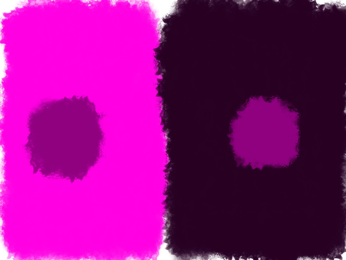
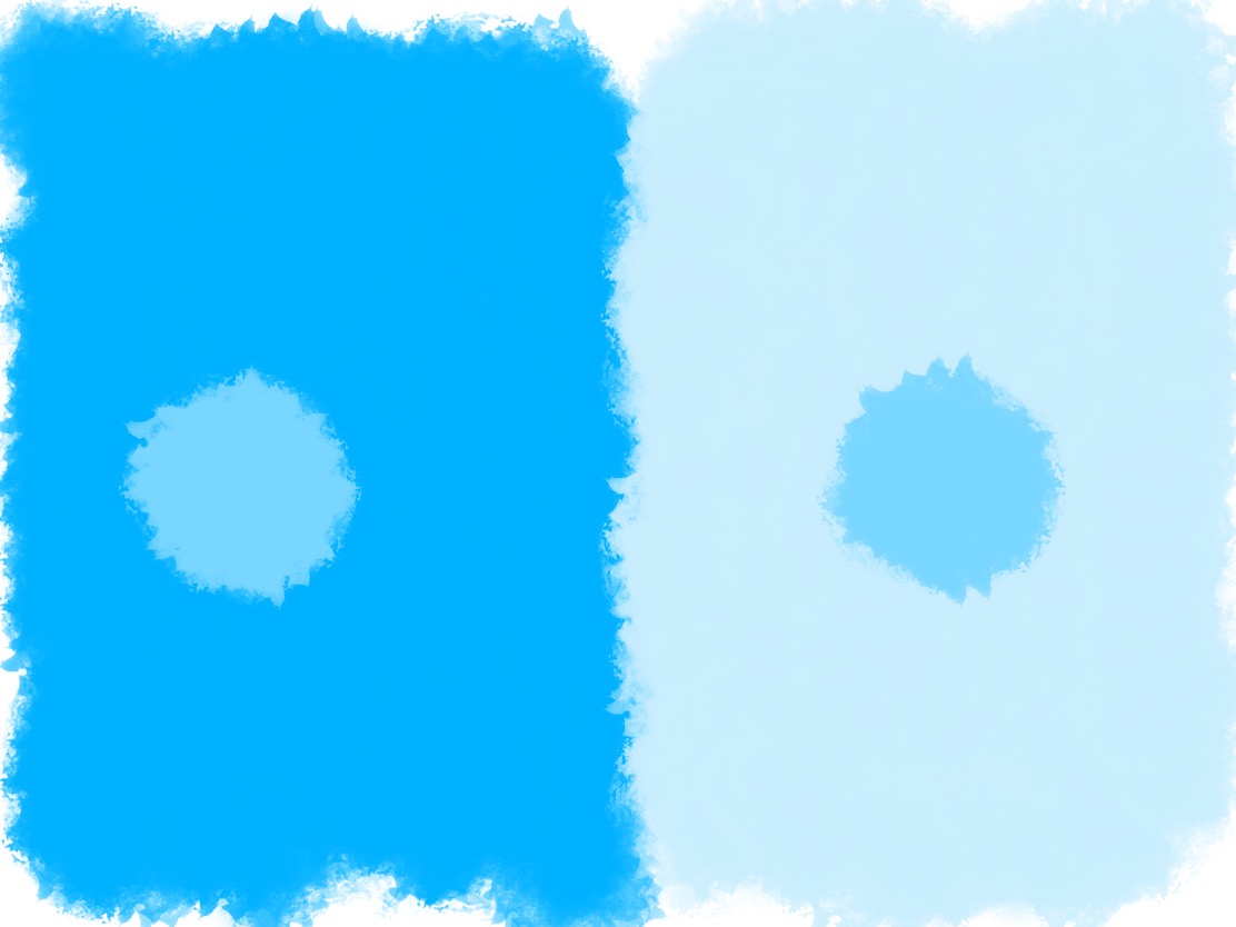
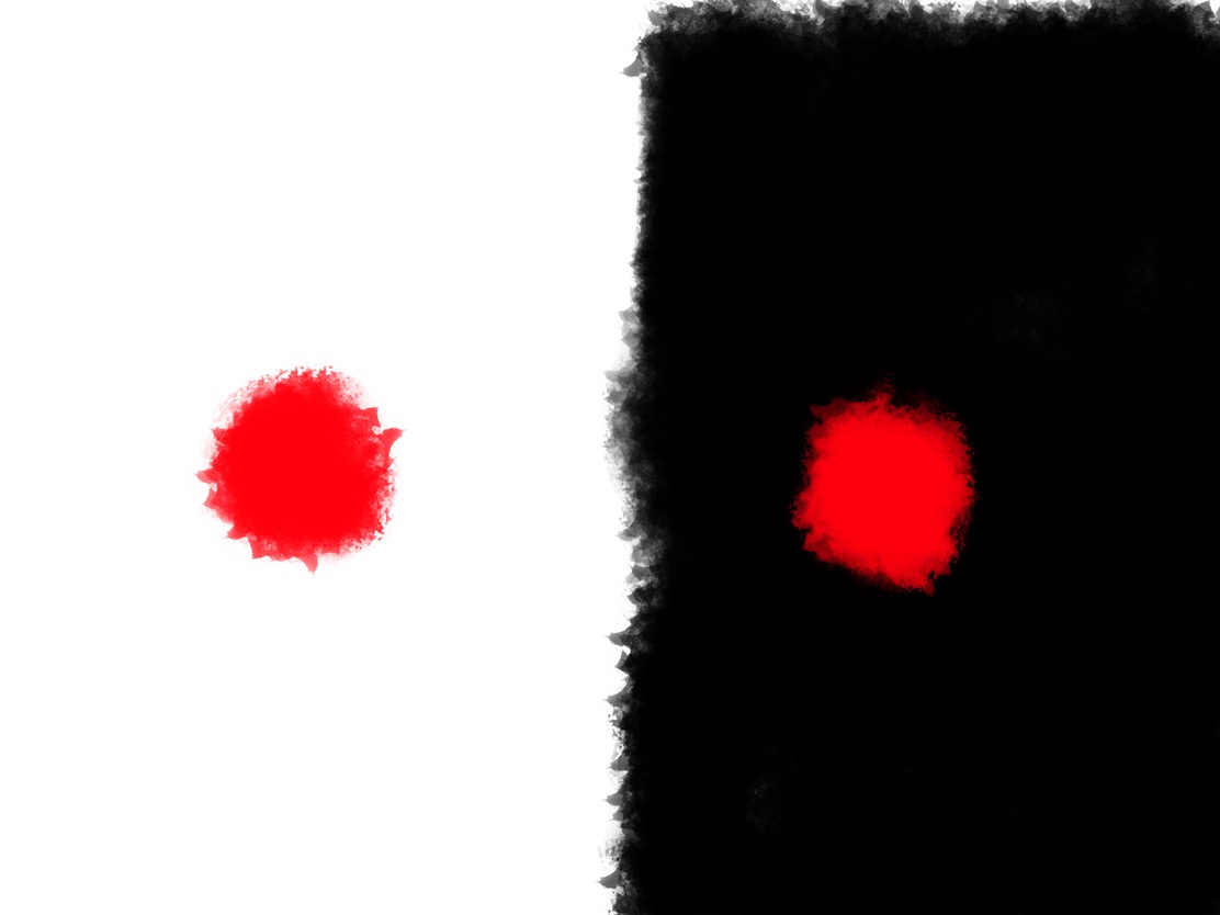
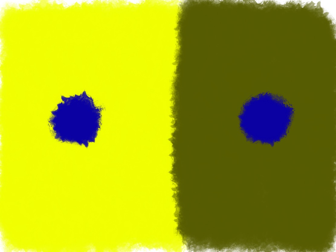
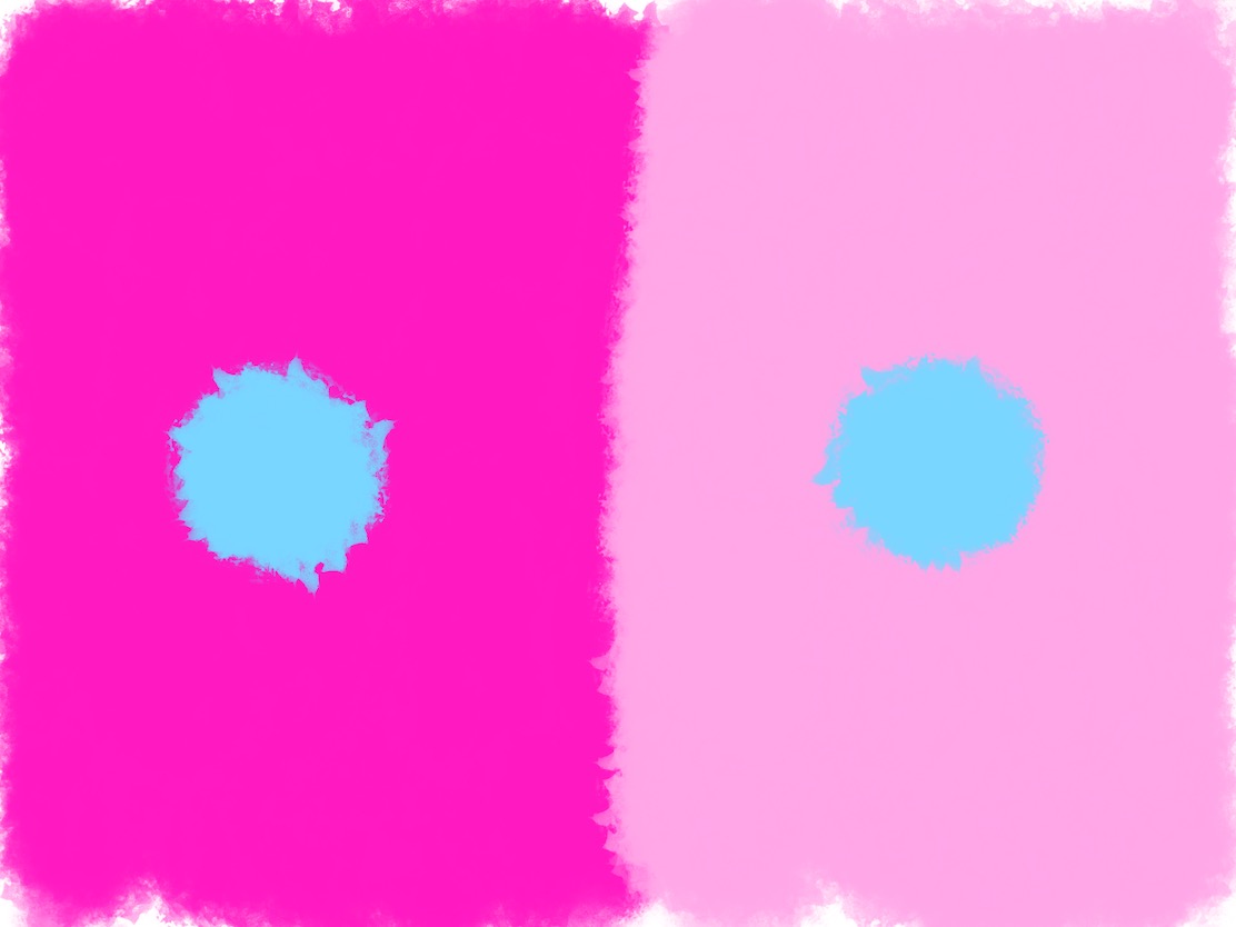
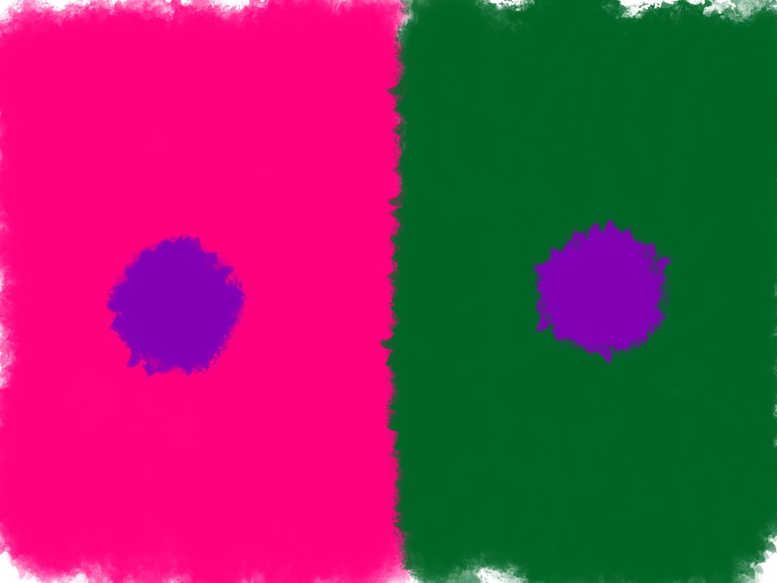
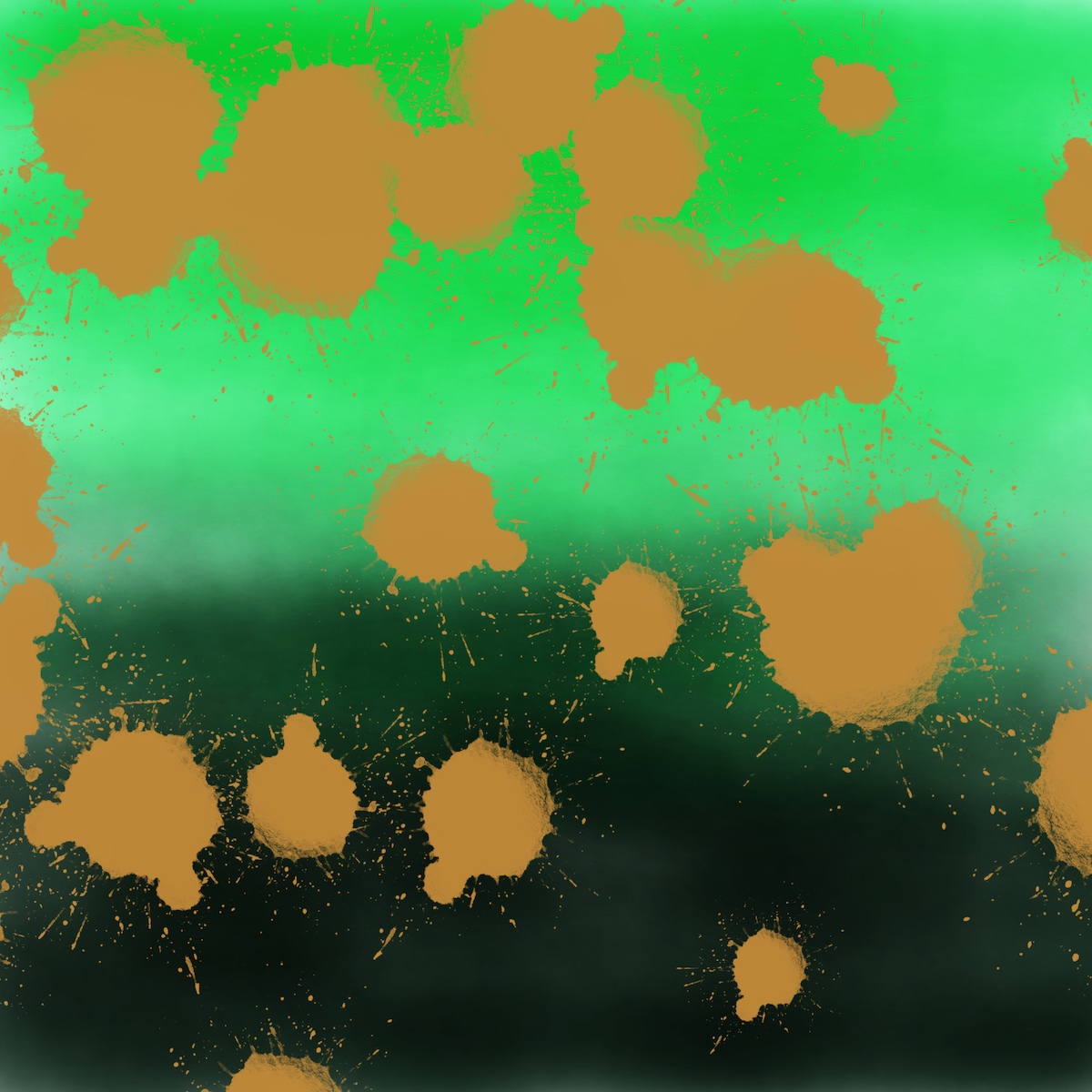
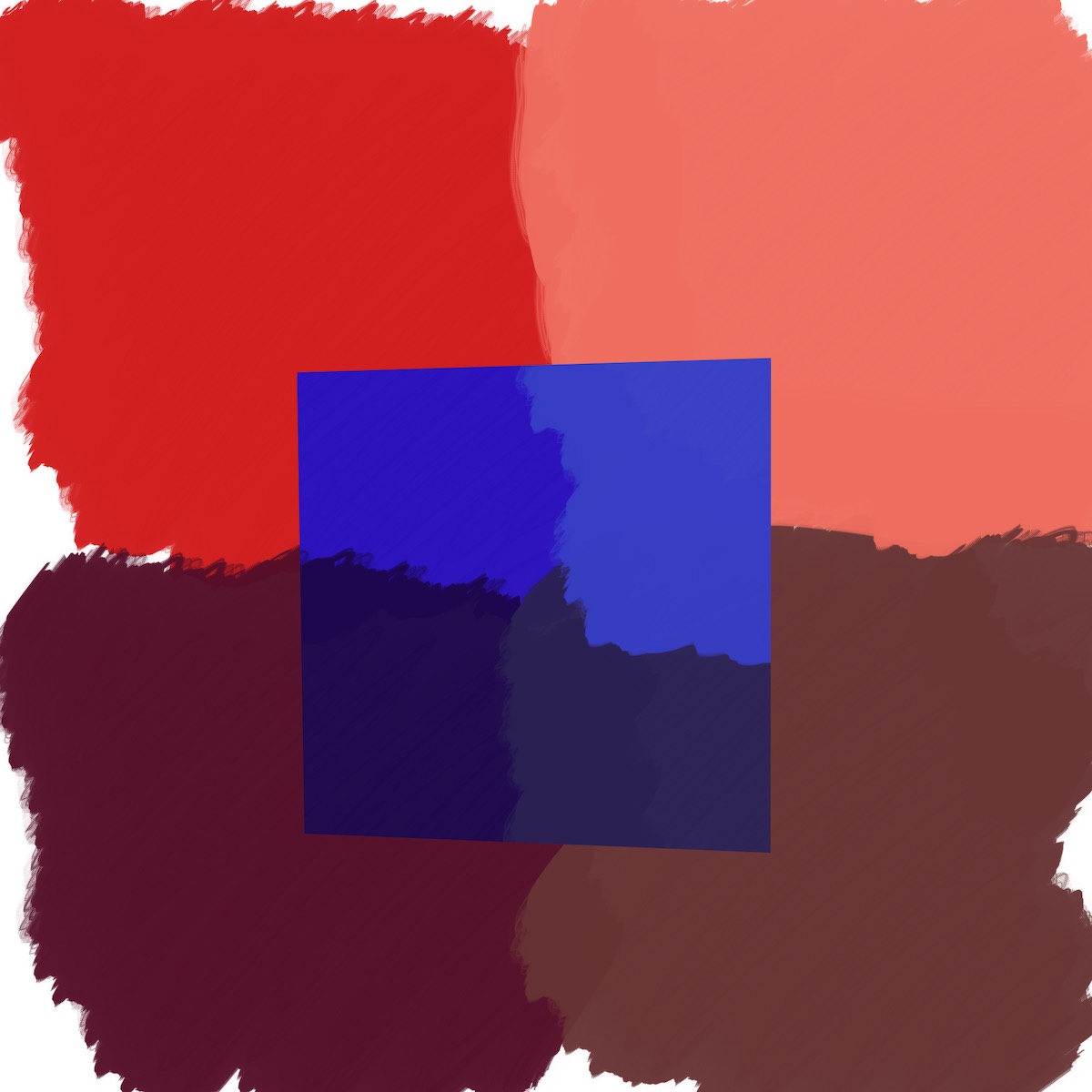
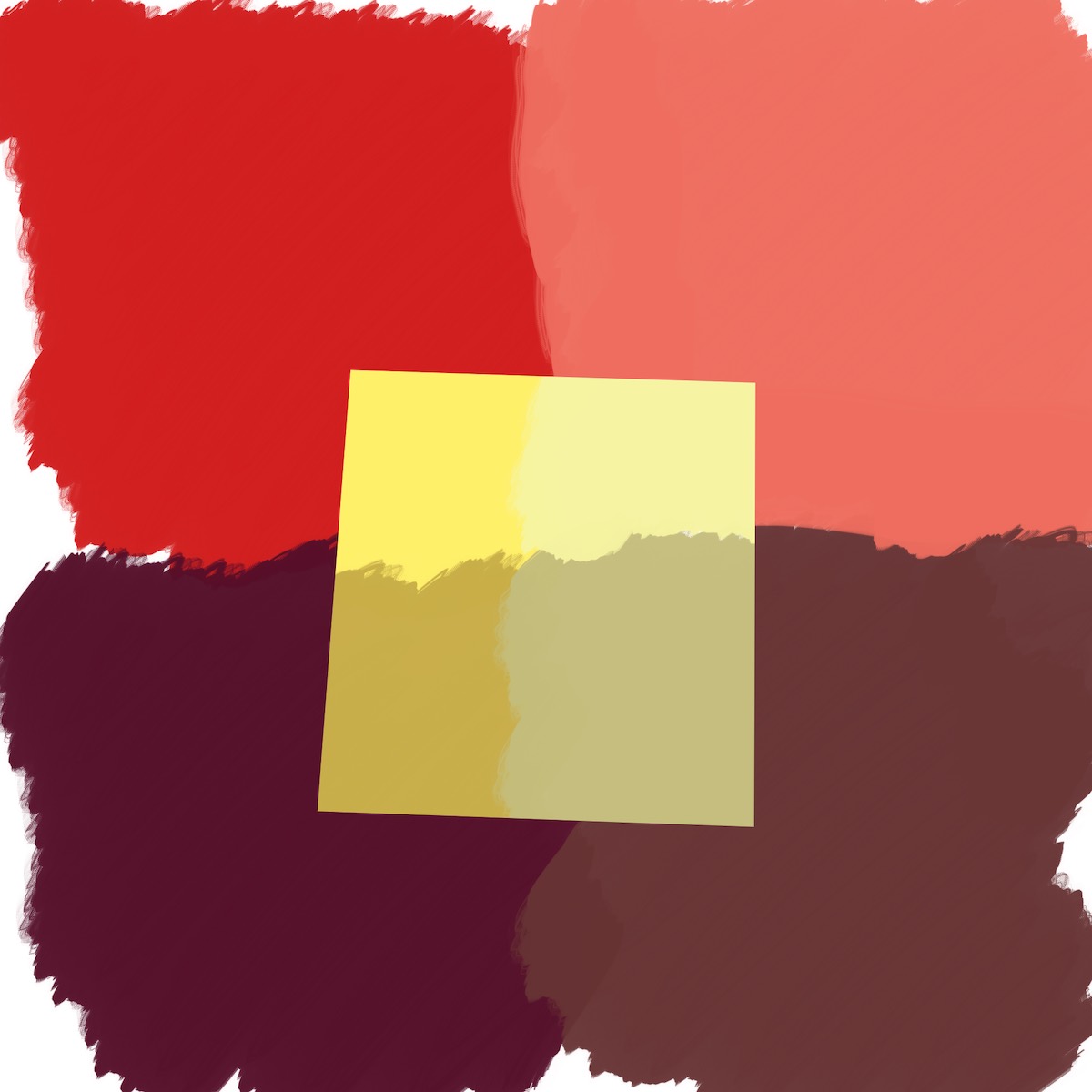
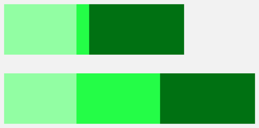
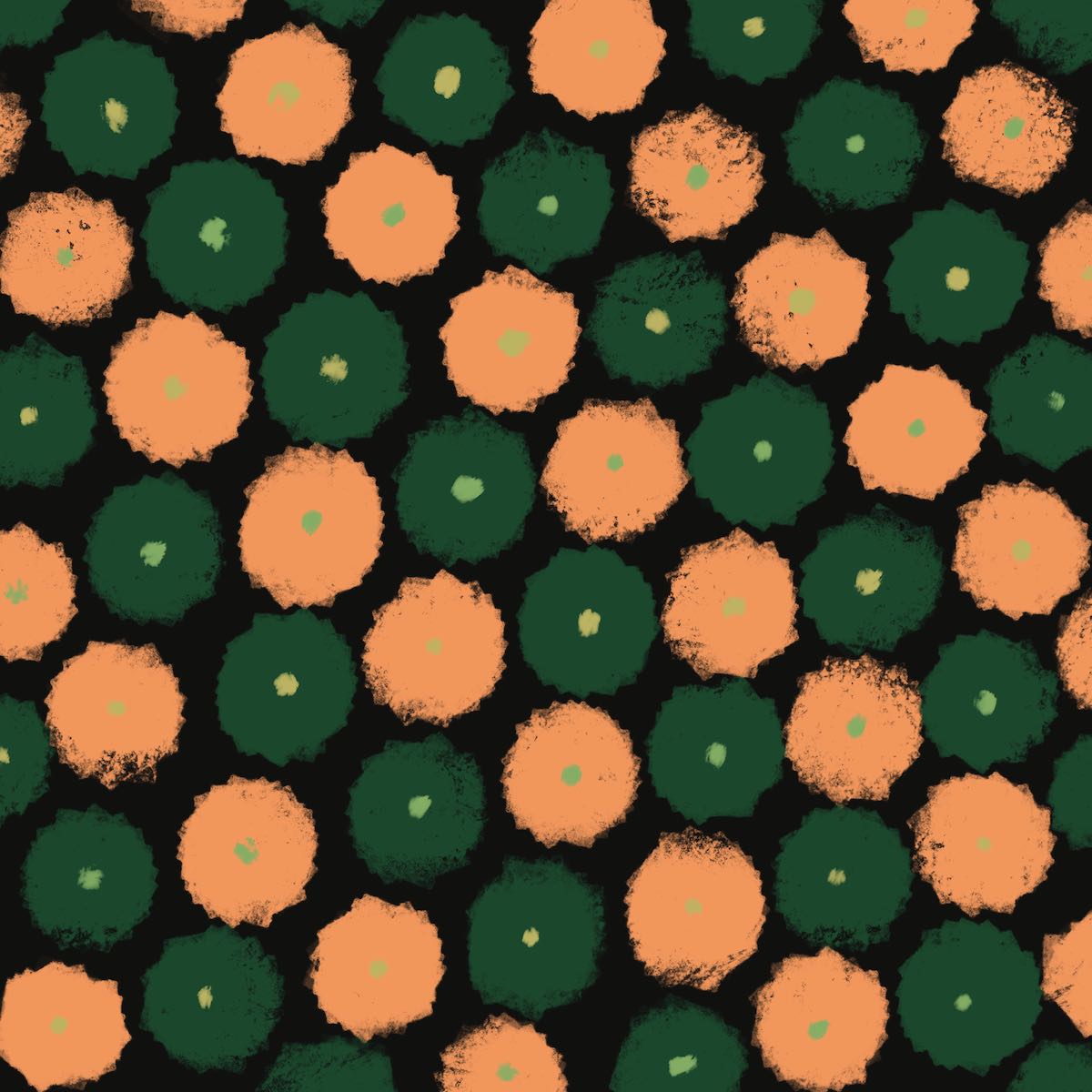
VI — 1 color appears as 2
This is the first “Oh shit!” moment. All the talk of “context” influencing color perception is made real here. He shows how one color can look like two. I didn’t believe my eyes when I first saw the effect. All the small blobs of color in the middle are the same. If you don’t believe me (and I didn’t when I first looked), you can measure them yourself.
I had fun with this one and made a ton of these. This isn’t even half.
 In this one I tried to achieve this effect just changing the hue, and keeping saturation and brightness constant. It was tough to do. It’s weaker than some other examples, but works overall.
Below are two few free studies I did that explore different ways of exploiting this effect.
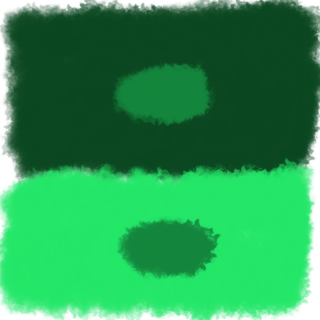
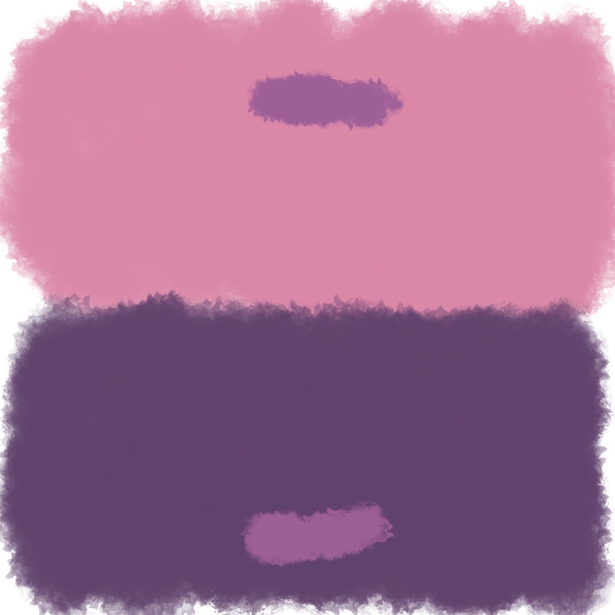
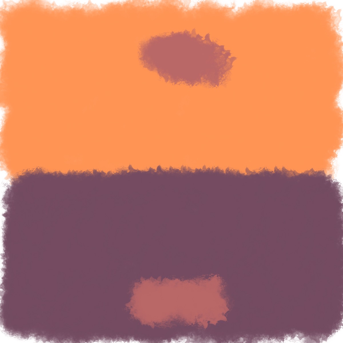
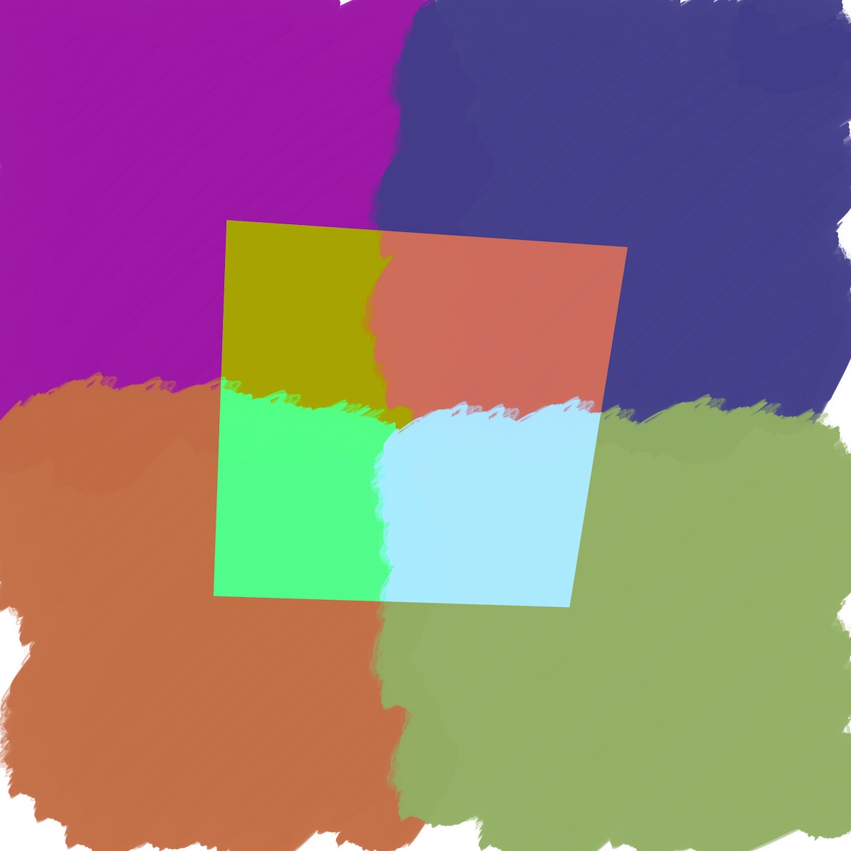
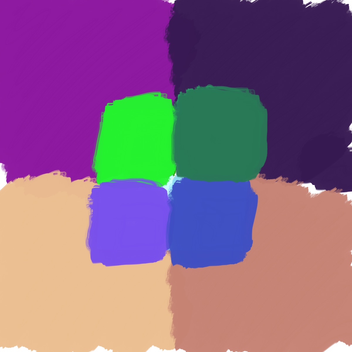
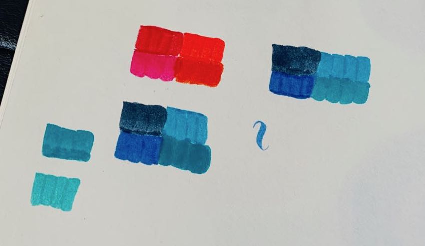
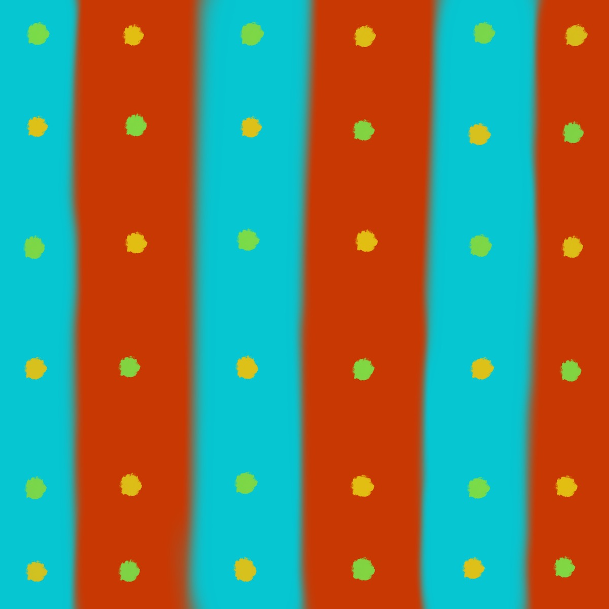
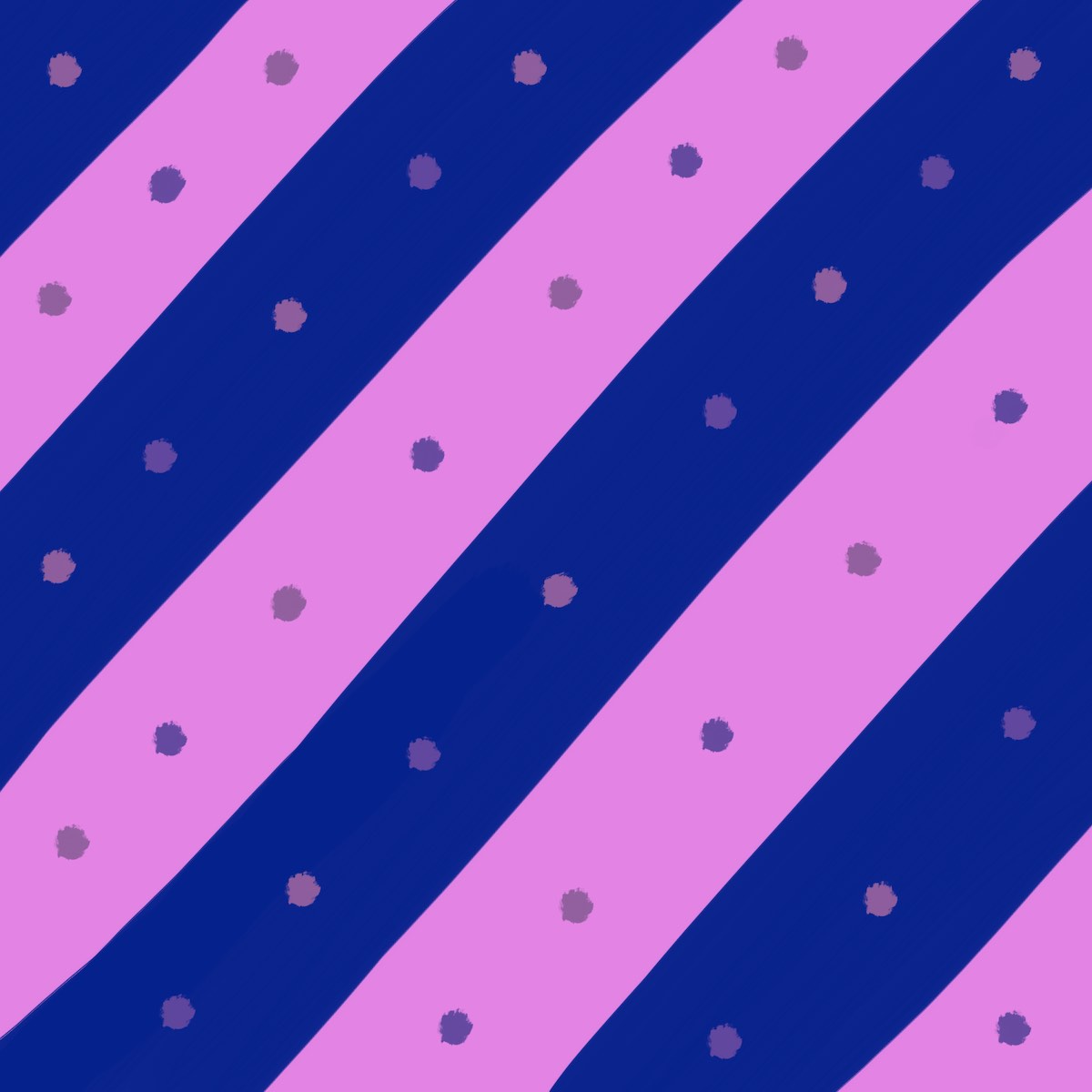
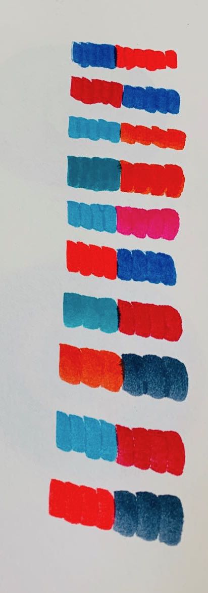
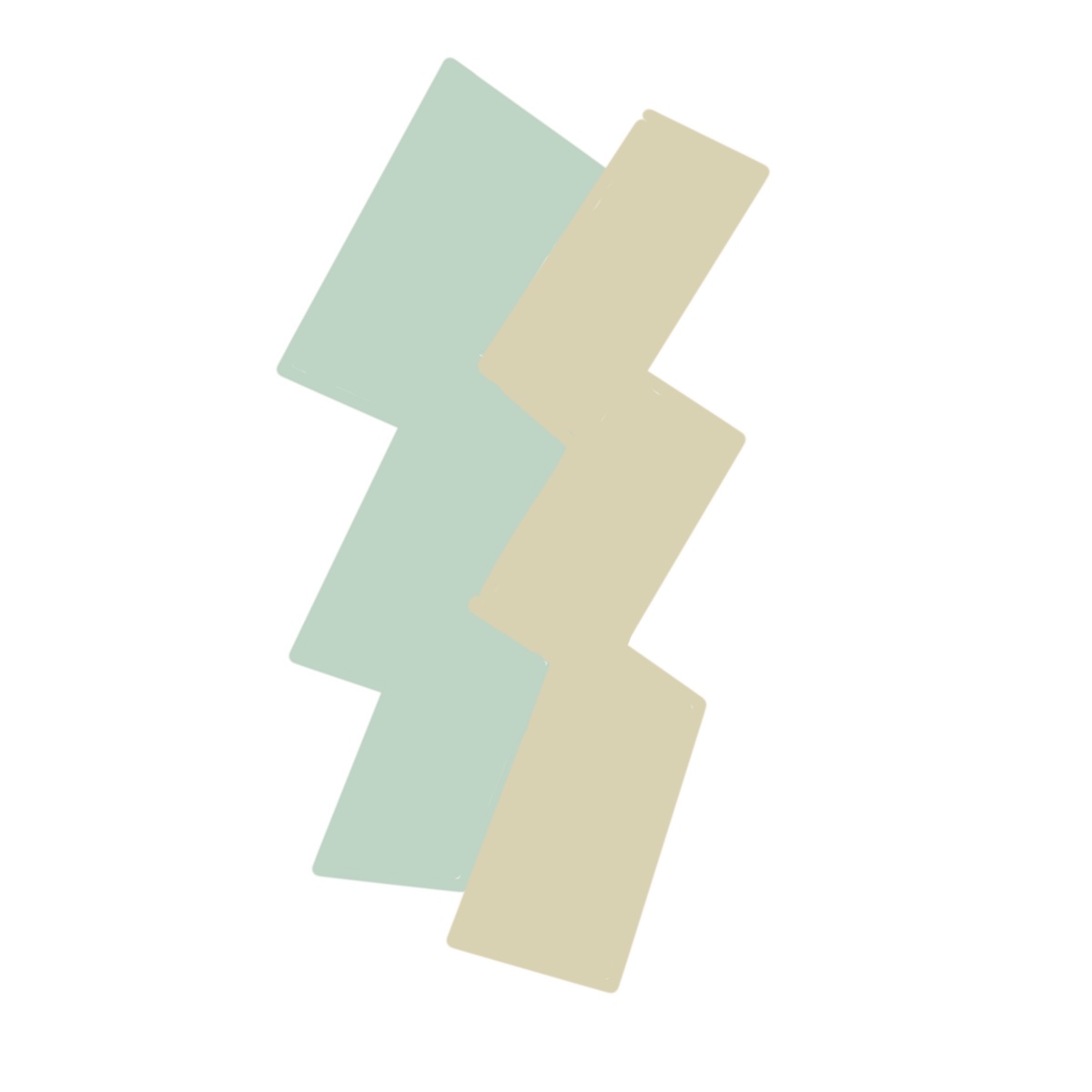
VII — 2 different colors look alike
This is the opposite of the above exercise — make 2 colors look like 1. This one was hard. It took me a lot of trial and error to even get these solutions, which aren’t that pronounced. Even Albers says this effect sometimes just “pushes” colors closer together, rather than making them look exactly the same. But regardless of how strong the effect is, it will influence how people perceive colors you use, so you should be aware of it.
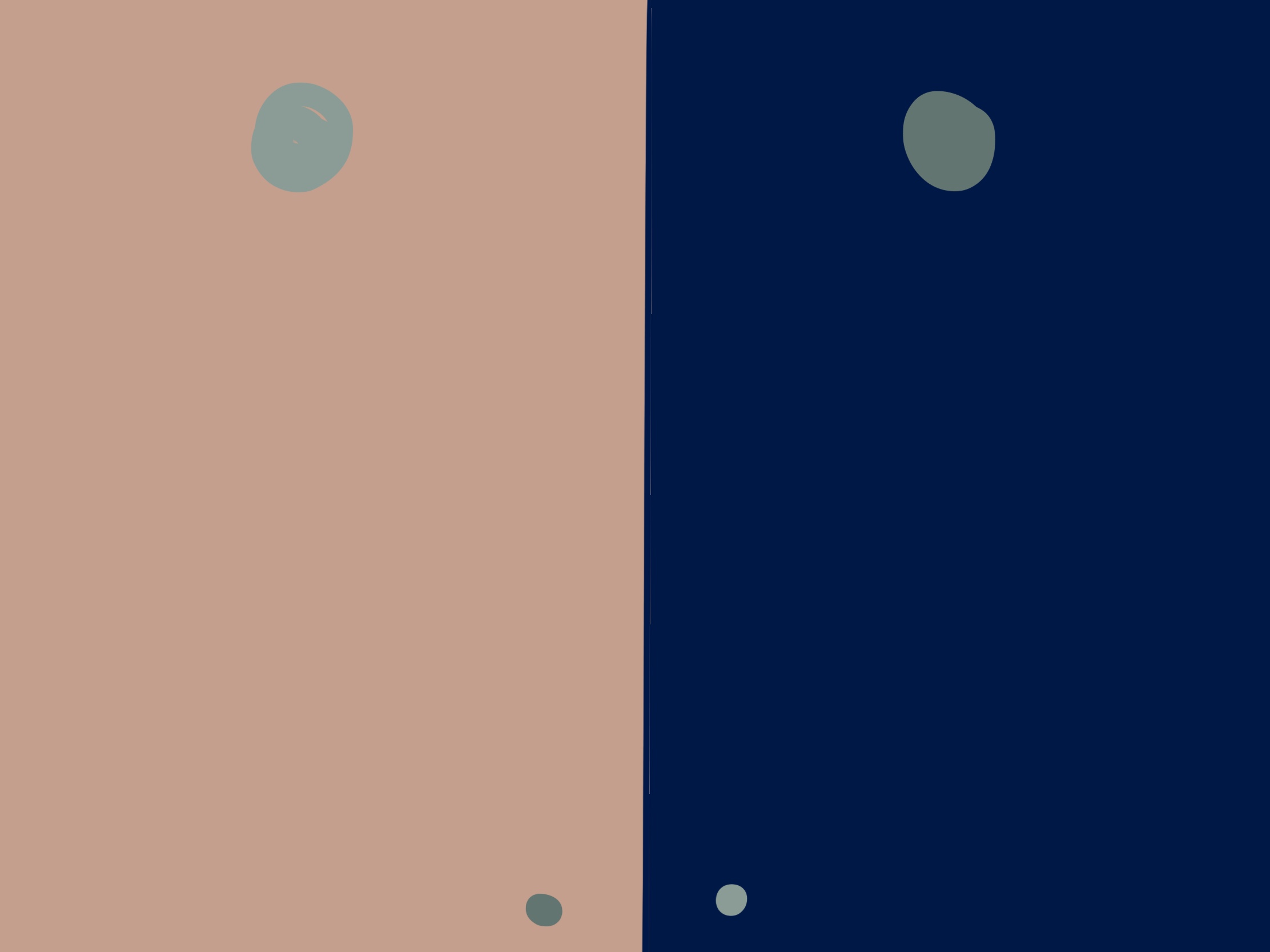 The larger dots at top are different gray colors. The small dots in the middle corners are the grays used on the opposite side, which makes it clear how different they are from each other.
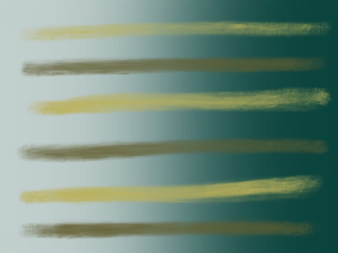
 This uses the colors from above. The gray streaks look like they’re an even gray tone, but they’re not. They’re a gradient from the middle colors above. See below for the solid gradient.
 This is the solid gradient of “gray” streaks above. Clearly not a flat gray.
 Not particularly effective, but close.
 A free study using the colors above. I like the way it draws your eye around and different blues pop out at different places. There are only 4 colors in this image, but it looks like more.
VIII — Why color deception? After-image, simultaneous contrast
This chapter isn’t an exercise, but demonstrates the effect of after-image. We all experience this when we look directly at a light for a few seconds, then look elsewhere, and the “after-image” of the light bulb follows you around, but in the opposite color (usually a blue-ish color since most light is yellow-ish).
According to Albers, this is the “cause of most color illusions.” This exercise magnifies something that’s happening to us all the time, but usually in subtle ways we aren’t conscious of. The variables are the amount of time and quantity of the color.
IX — Color mixture in paper — illusion of transparence
This exercise challenges you to take two pieces of different colored paper, say blue and yellow, imagine the mixed color in your head, then find a piece of paper that matches this mixed color. I didn’t have colored paper, so I didn’t do this exercise, but chapter XI studies a similar effect.
X — Factual mixtures — additive and subtractive
Colors can be mixed with an additive or subtractive processes. This wasn’t an exercise, but rather an explanation of the effect, so I just used the blending modes in Procreate. The next exercise asks you to exploit this effect.
“Additive” refers to mixing color with light, which makes the resulting colors brighter (because there’s more light. “Screen”, “Overlay”, and “Lighten” are blending modes you can use in your graphics program of choice or CSS).
“Subtractive” is mixing colors with pigment, as in painting and printing. This makes the resulting color darker (“Multiply” and “Darken” are examples of this in graphics programs and CSS).
 Subtractive color mixing, as with pigments.
 Additive color mixing, like mixing light.
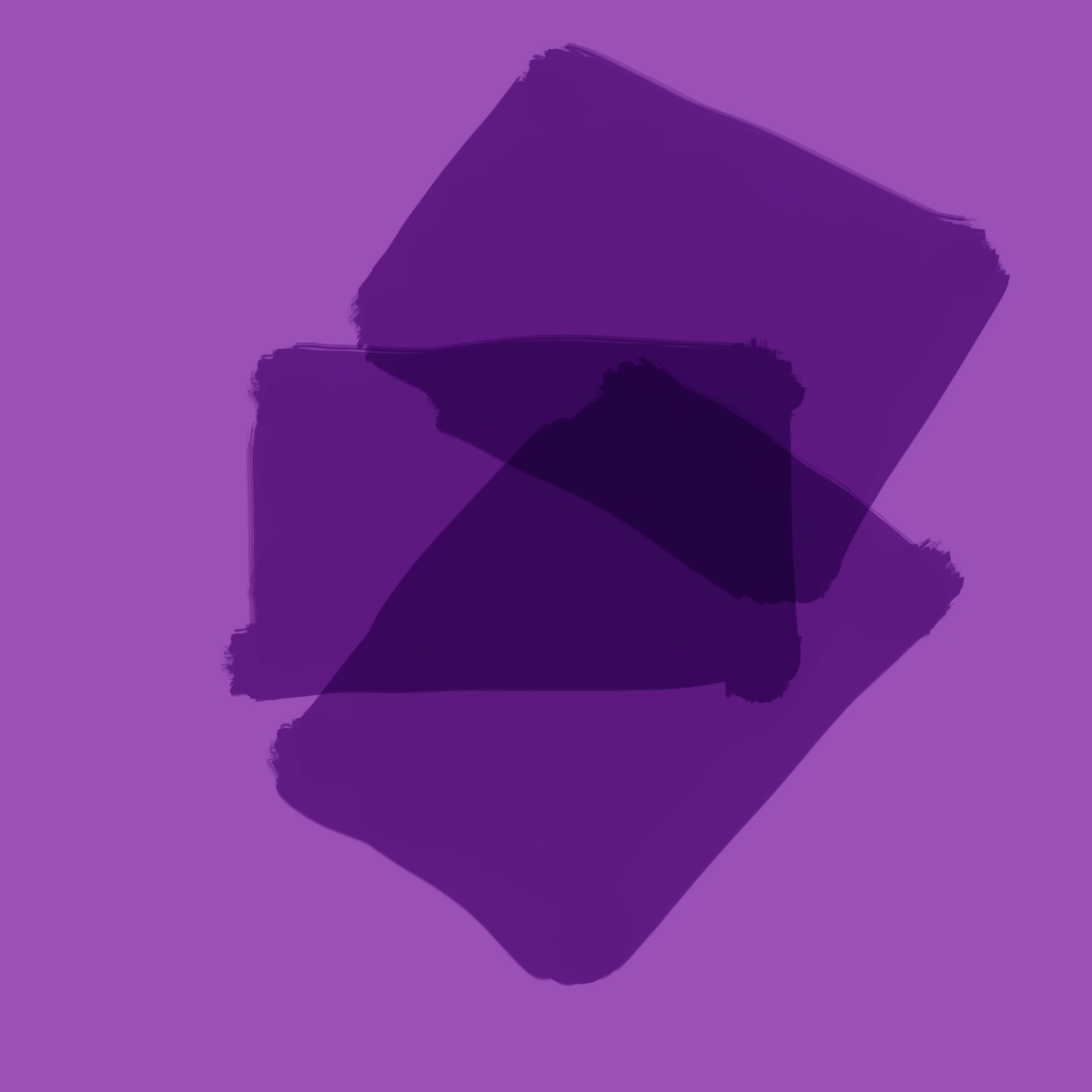
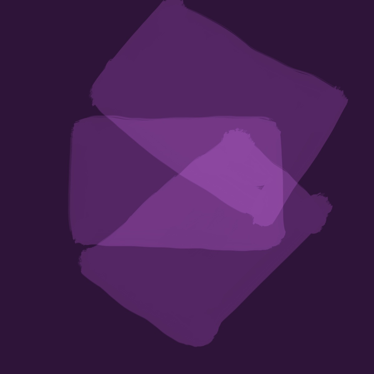
XI — Transparence and space-illusion
This exercise asks you to choose colors so that where they overlap, one appears “above” the other, then “below” it, then the “middle mixture” where neither is above the other and they’re perfectly mixed (this is also the point at which the middle color looks like its own distinct color). This demonstrates the illusion of spatiality. Doing this successfully requires understanding the effects from the previous lessons.
I did this one initially with water-based markers, since it’s easy to cheat in Procreate by just choosing blending modes. I wanted to see if I could achieve these effects using my eyes. I used Procreate for one (shown here first since the effect is easier to see), but chose colors by hand.
To test which color is “above” the other, or if you’ve found a true middle, Albers recommends running your eyes from left to right over the edges where the colors meet many times, then top to bottom, and vice versa. Which border has a “harder” edge? That color is more dominant, and thus perceived “above” the other one. To me this can feel like your eyes fall off a cliff, or hit a wall (depending on the direction you’re coming from).
As Albers explains it: “Since softer boundaries disclose nearness implying connection, harder boundaries indicate distance, separation. […] Thus, with a middle mixture, all boundaries are equally soft or hard. As a consequence, a middle mixture appears frontal, as a color by itself.”
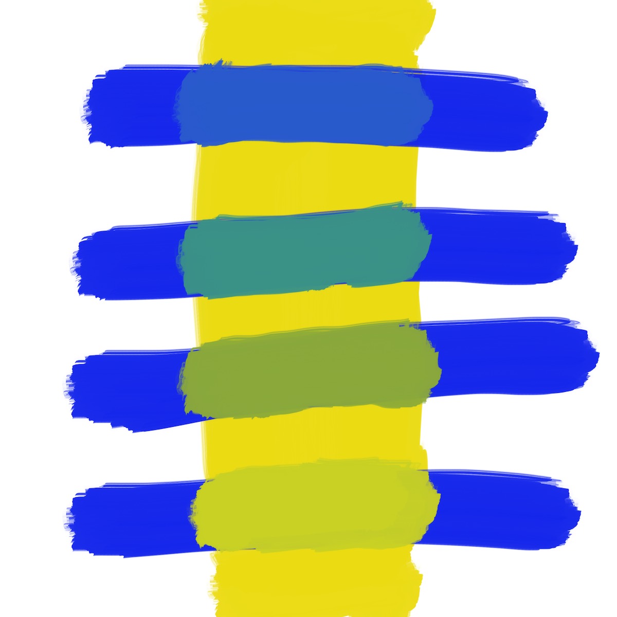 In the top two streaks, blue feels above the yellow. In the bottom two, yellow feels above blue. Run your eyes over the edges to feel the “hardness” and “softness” of the borders. There is no middle mixture.
XII — Optical mixture — after-image revised
“Optical mixture” means our eyes will mix two colors into a third. We all experience this daily without being aware of it. The printing process only uses 4 colors – Cyan, Magenta, Yellow, and blacK (aka CMYK), yet a full gamut of colors can be reproduced. How? The answer is because each color is printed in tiny dots (smaller than we can individually make out), and our eyes “mix” them into their final color. Cyan and magenta, for example, combine to make blue. These are also known as “halftones” in offset printing. If you look close enough at a newspaper or magazine you can see the individual dots.
Pointillist painters also exploit this effect. They wouldn’t paint green directly, for example, but instead use small dabs of blue and yellow and let the viewer’s eyes “mix” the colors.
This can happen with larger blobs of color, too, if you’re far enough away. This once again demonstrates how size, quantity, and viewing distance influence the final perception of color.
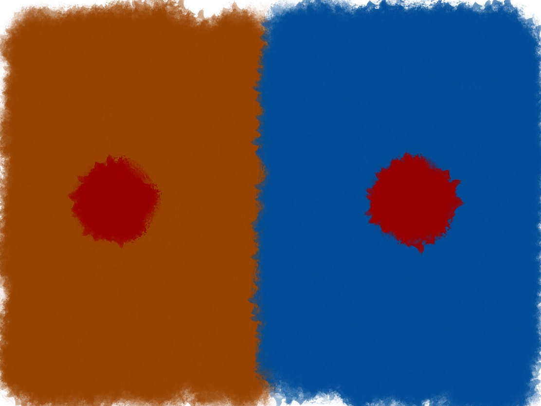
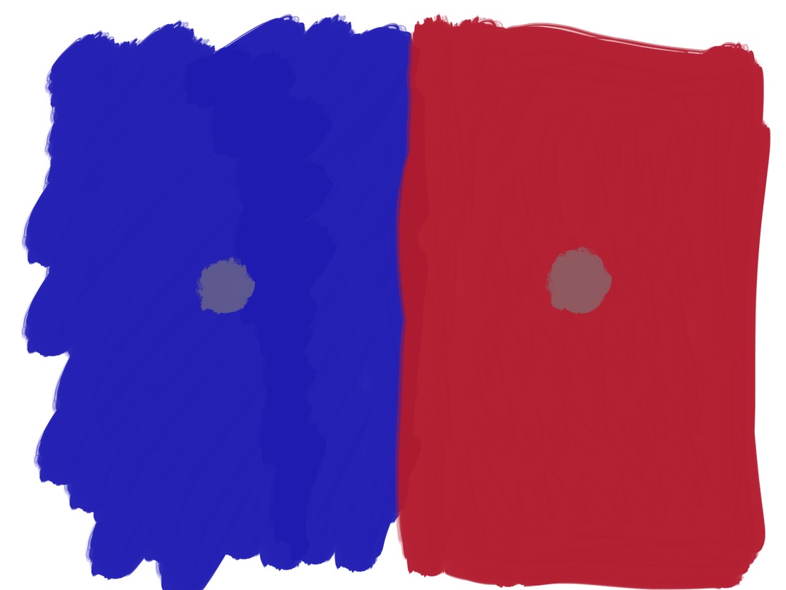
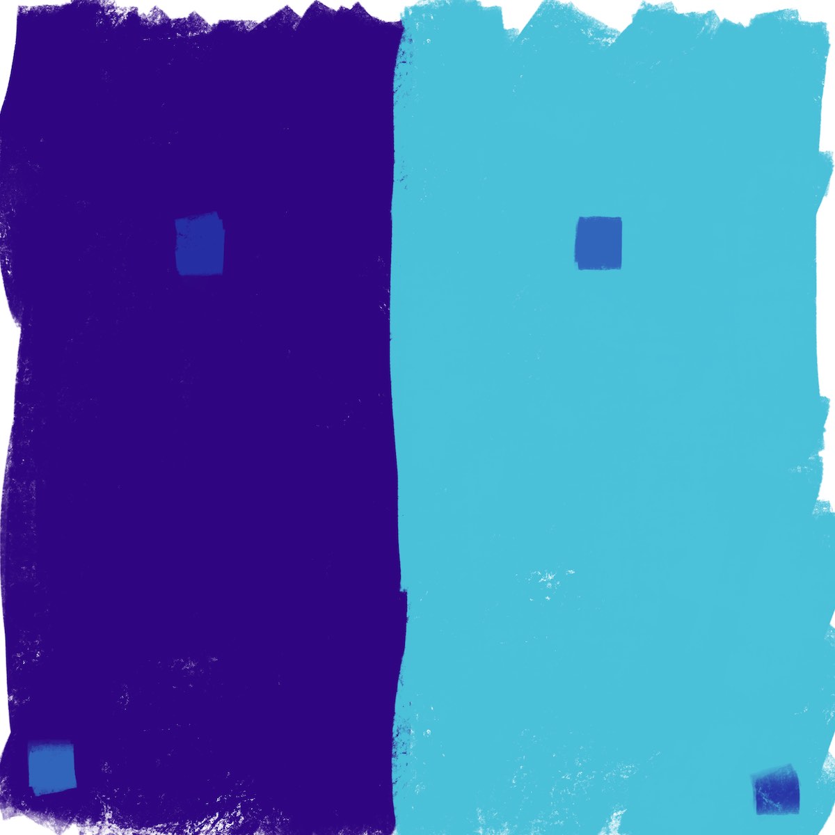
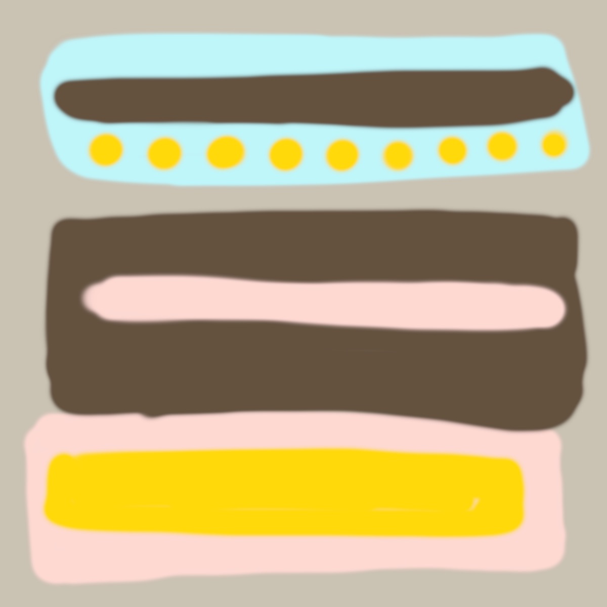
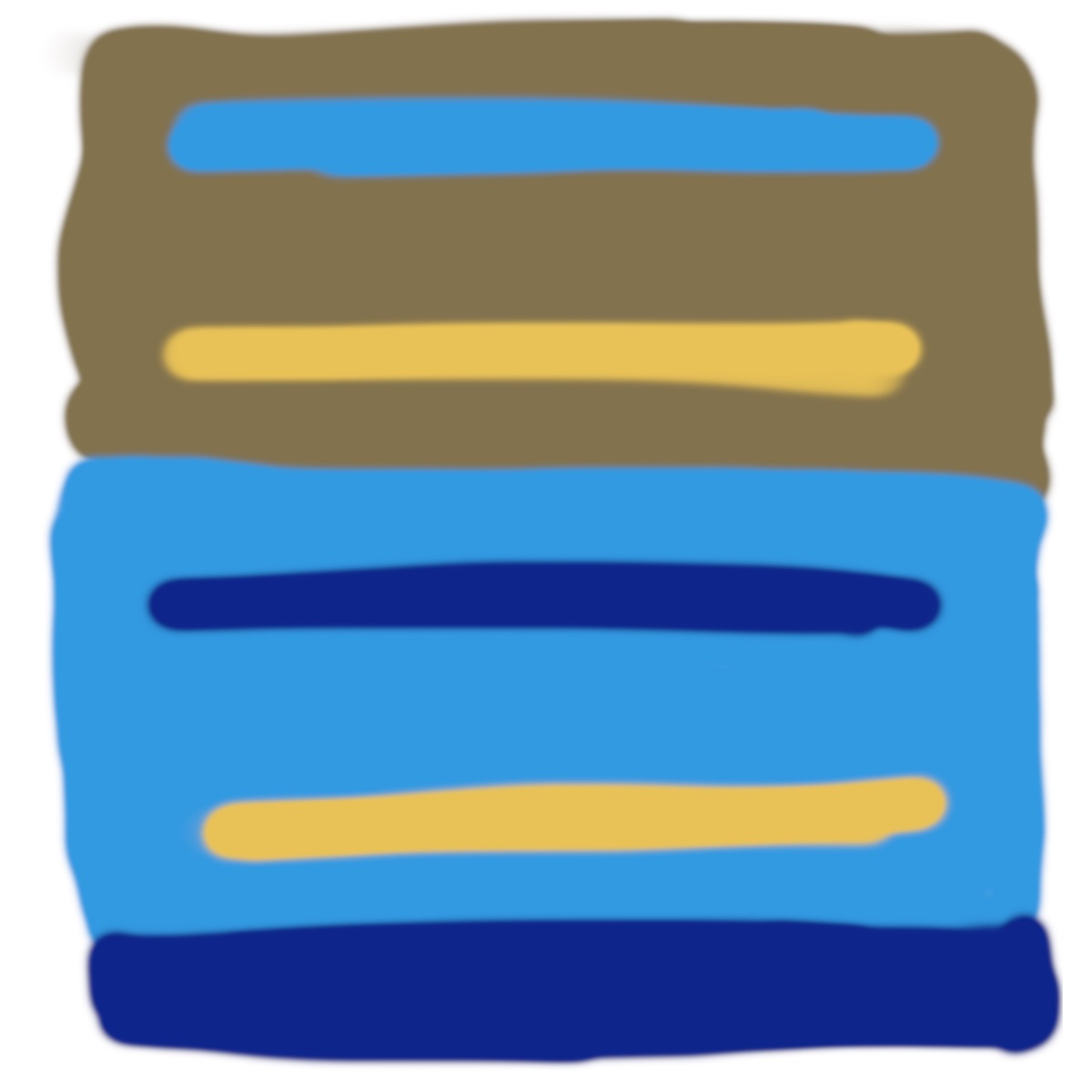
XIII — The Bezold Effect
Bezold was a rug maker who learned he could swap out one strong color (white for black, say) to change how the rest of the colors are perceived, thus making the rug “feel” like a different design. This occurs due to a combination of optical mixture and after-image.
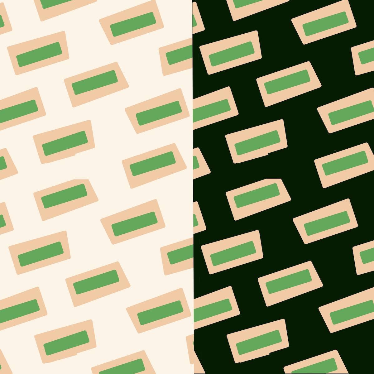 The only difference from the left and right sides is the background. Notice how the left side feels lighter and calmer, whereas the right side feels heavier and more aggressive, like each rectangle is jumping out at you.
XIV — Color intervals and transformation
This was a tough exercise. The goal is to take a collection of 4 colors, and “transcribe” them into a different “color key” of 4 different colors. In other words, the relationships, or “intervals,” between each color’s lightness and saturation are the same for both collections of colors. Just like transcribing a piece of music to another key.
Once again, this is trivial in Procreate or any graphics program. But I did it by eye to train how I see color. (Doing the transformation in Procreate does provide a useful way of “checking” your work, though, since it can be hard to know if you did it correctly until you’ve trained your eye).
Once again, the technique of running your eyes over the borders reveals the “hardness” and “softness” of each, which can tell you if you maintained the “intervals” in the transcribed colors.
 In this one it looks like I used Procreate’s HSB tool to rotate the hues around. But even this doesn’t work because it doesn’t take luminosity into effect, which is the measure of the perceived brightness of a color. For example, yellow appears brighter than blue, even at the same lightness and saturation levels. In this exercise, it makes the top-right blue color a salmon that’s more luminous than its source color, which makes its border “softer” than the original.
This one, and the previous one, were the hardest of all because you have to transcribe four colors of different hues. Looking back at the solution above, it’s clear it’s not transcribed correctly. The intervals between the left two middle colors isn’t the same as the original, underlying colors.
XV — The middle mixture again — intersecting colors
Albers has you do an activity to test if a color is the “middle mixture.” Get three colored papers of same hue but different lightness (you can also do this with overlapping rectangles in Figma or graphics program of choice — see picture below). Place the lightest one on the bottom, then the middle one partially overlapping that, and the darkest on top of that, showing just a sliver of the middle color. Slowly pull the top, darkest color to the right, revealing more of the middle color. Stare at the middle color while you do this, and you’ll see a gradient from darkest, at left, to lightest, at right. If it’s even, it’s a middle mixture. This is also a result of our vision’s “after-image.”
 Start with the top setup, then slowly move the top color to the right to get to the bottom image.
If this middle color is truly in the middle, the gradient will appear even.
This is also known as the “fluting” effect. It can make blocks of color appear to have gradients, or to be “concave” like doric columns. In the image below, stare at the middle color for awhile and you’ll start to perceive a gradient in each row. Or a “shadow” at bottom and “highlight” at top. Once I started seeing this, I couldn’t stop seeing it.
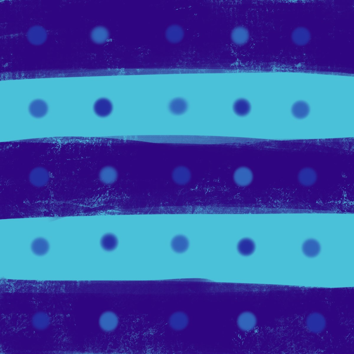
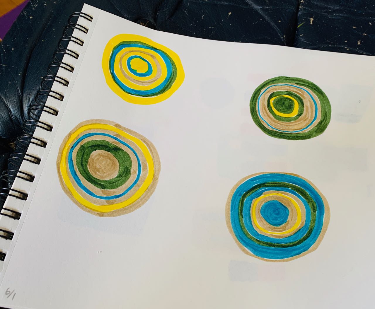
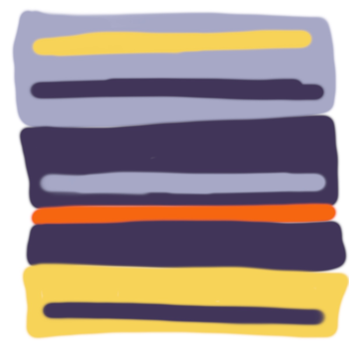
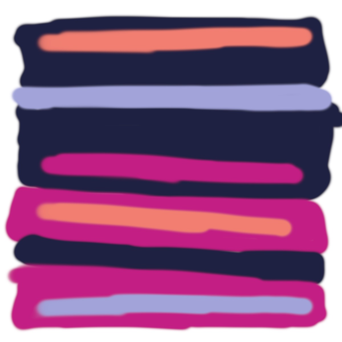
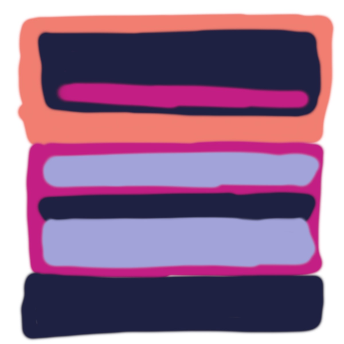
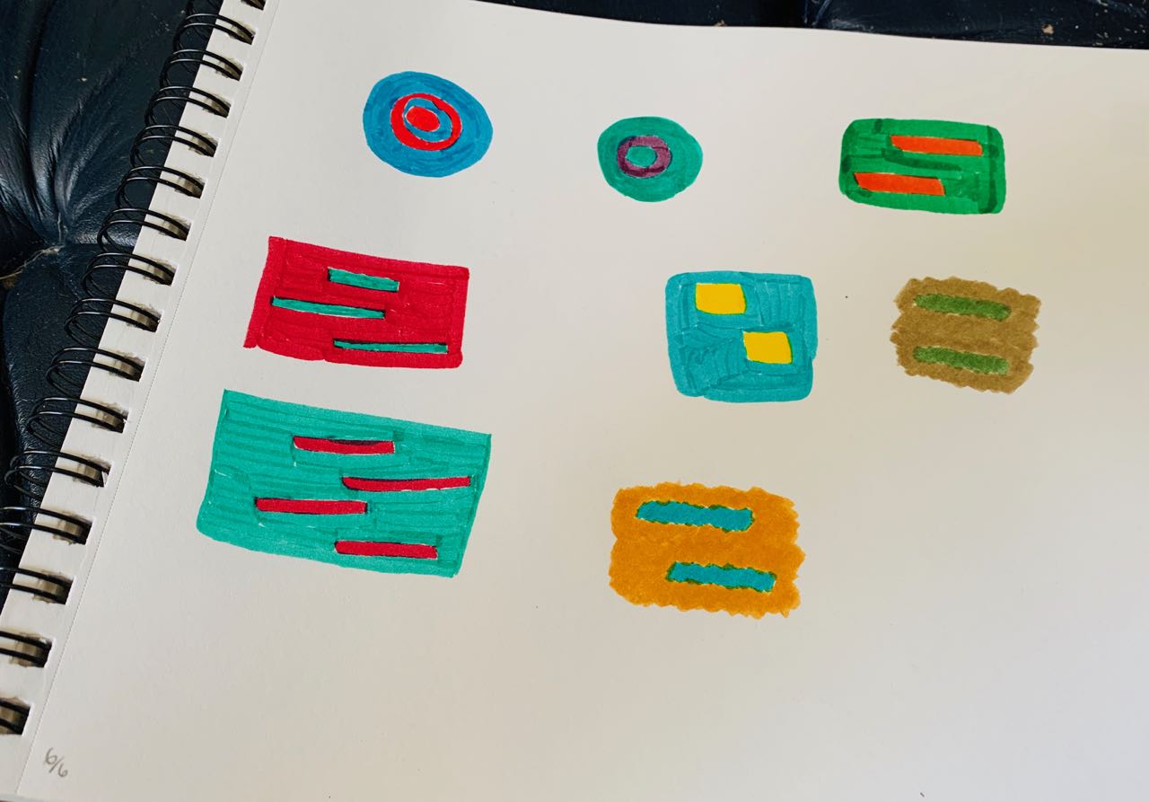
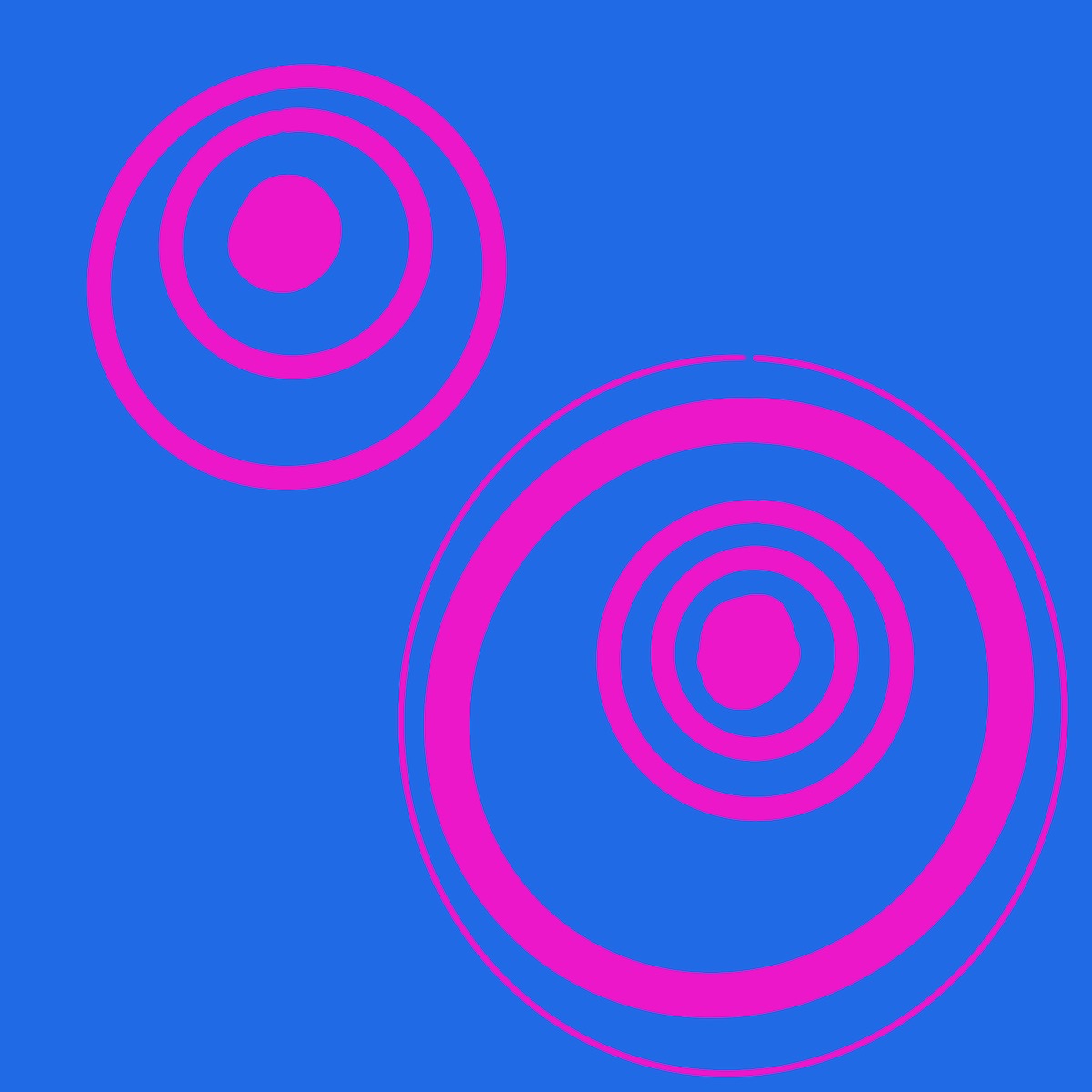
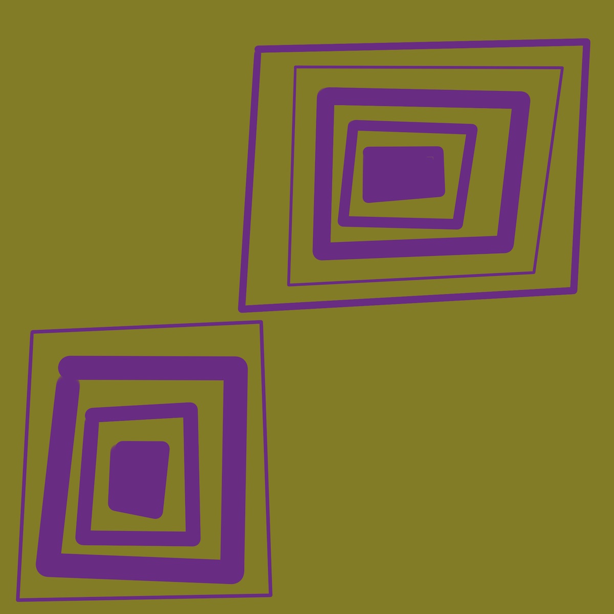
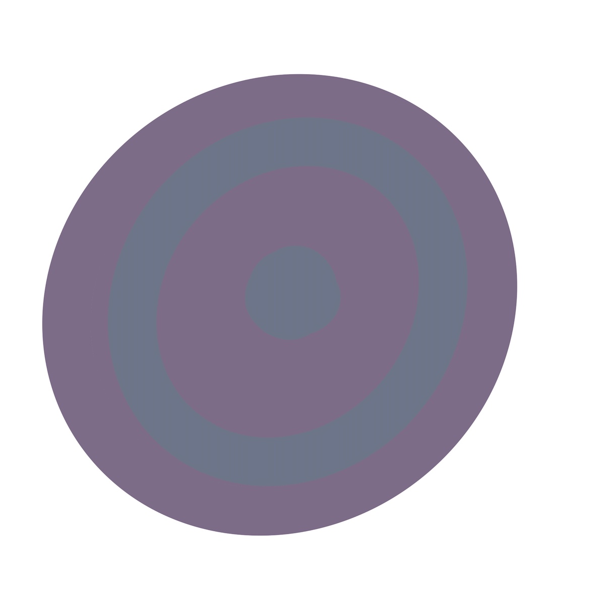
XVI — Color juxtaposition — harmony — quantity
This chapter was another “Oh shit!” moment. The goal is to use the same four colors, but make them “feel” different, by varying the quantity and relative proportion of each. In my solution below, the four circles use the same four colors, but each feels different because of the varying quantities of each. “Quantity” here refers to both size and amount of repetition.
Albers makes an analogy with actors and performances. A cast of actors puts on performances, each of which will feel different depending on who is in the lead and supporting roles, despite it being the same actors throughout. Colors are the actors, and the way we use them are the performances.
This chapter sums up why all other methods of teaching color have fallen short for me. They talk about warm and cool tones, analogous and complementary and contrasting colors, but don’t recognize the impact of quantity and context. As Albers puts it: “Our conclusion: we may forget for a while those rules of thumb of complementaries, whether complete or ‘split’, and of triads and tetrads as well. They are worn out.” Amen.
Most palette generators and color inspiration sites overlook this, too. Once again, Albers expertly sums this up: “Usually, illustrations of harmonic color constellations which derive from authoritative systems look pleasant, beautiful, and thus convincing. But it should not be overlooked that they are usually presented in a most theoretical and least practicable manner, because normally all harmony members appear in the same quantity and the same shape, as well as in the same number (just once) and sometimes even in similar light intensity. Such outer equalizations may unify them, but at the expense of the more important inner relatedness — namely, as color only.”
This chapter is full of great quotes, but I’ll leave you with just one more: “Good painting, good coloring, is comparable to good cooking. Even a good cooking recipe demands tasting and repeated tasting while it is being followed. And the best tasting still depends on a cook with taste.”
XVII — Film color and volume color — 2 natural effects
Seeing mountains in the distance, or an object through water, or putting semi-transparent acetate in front of something all diminish the colors of the underlying object. Distant mountains look more washed out, for example. No exercise here, just showing examples of the effect.
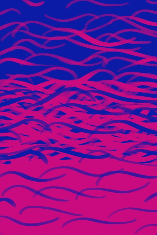
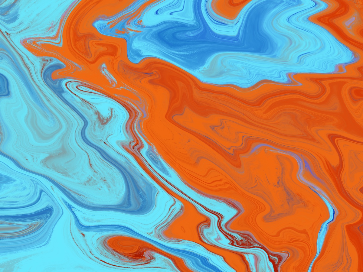
XVIII — Free studies
The idea here to play with color, divorced from form and layout and anything else that influences its perception. This is, strictly speaking, impossible. But the point is to use color to produce a mood or effect on people.
The next three explore “old–young.” I was trying to juxtapose muted colors, to represent old (like faded newspapers), with lighter and brighter colors. I think they’re going the right direction, but not all the way there yet.
These next two use a “magical” palette from Palette Perfect by Lauren Wager. This is a great book for color inspiration, and it gets bonus points for including the proportions in which you should use each color 🥳.
 This final one makes use of a bunch of effects – the blue lines are factually the same color throughout but shift their “feel” over each background (chapter IV, 1 color becomes 2), vanishing boundaries (below), and slight vibrating boundaries (also below).
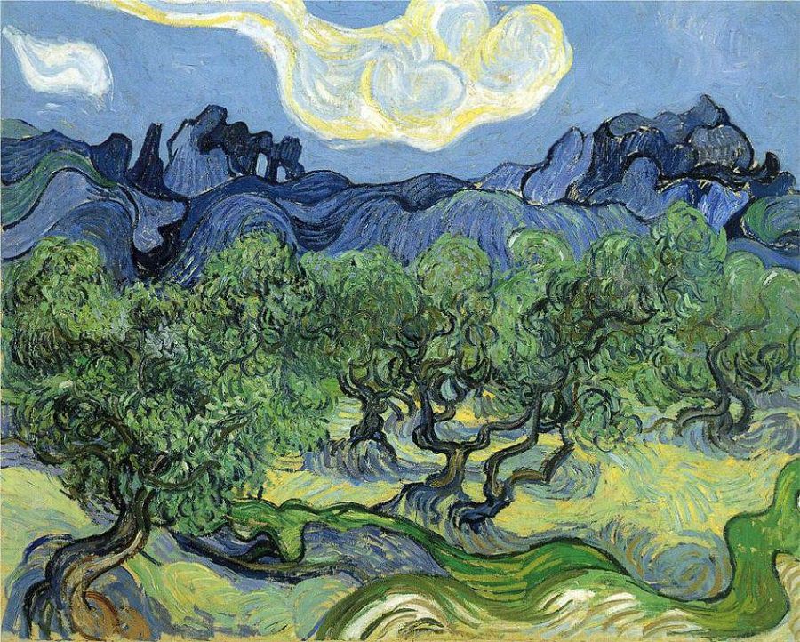
XIX — The Masters — color instrumentation
This was a fun one. In this exercise, we choose a painting and then recreate it using blocks of color (scraps of paper as written in the text). The point isn’t to recreate the masterpiece, but instead to engage with the color choices the artist made. “We try to give a general impression only as to climate, temperature, aroma, or sound of their work — not minute details.”
The point, as Albers puts it, is that it’s “another means of learning to develop a sensitive and critical eye for color relatedness. […] Singing a tune and playing it on instruments — even more, conducting several instruments — provides more contact, more insight than merely hearing the tune. So cooking, normally and naturally, teaches more than reading recipes.” In other words, doing what the artist did forces you to engage with their work more deeply than just looking at it, even though it can feel like you’re just “copying” it. This is also the main point of Austin Kleon’s book Steal Like an Artist.
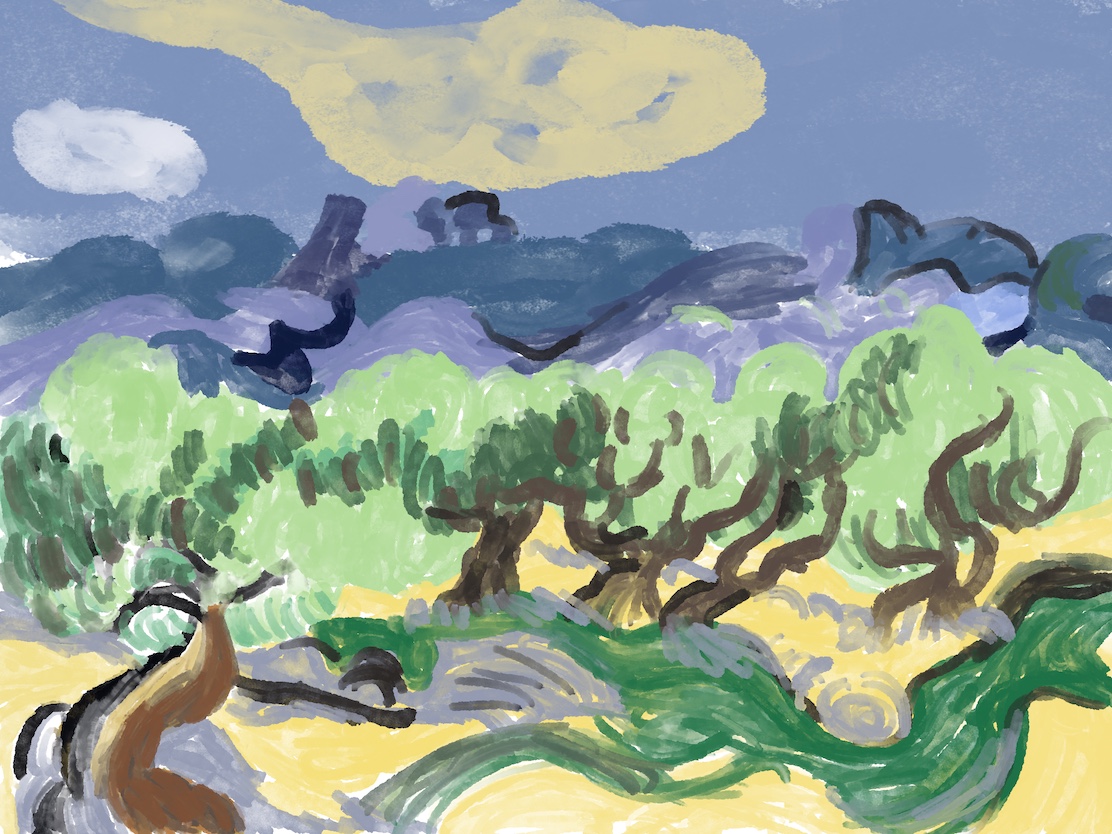
 This is a fun drawing and coloring exercise I did using the palette from above. I like that it still “feels” like the original painting, even though it’s in a completely different form.
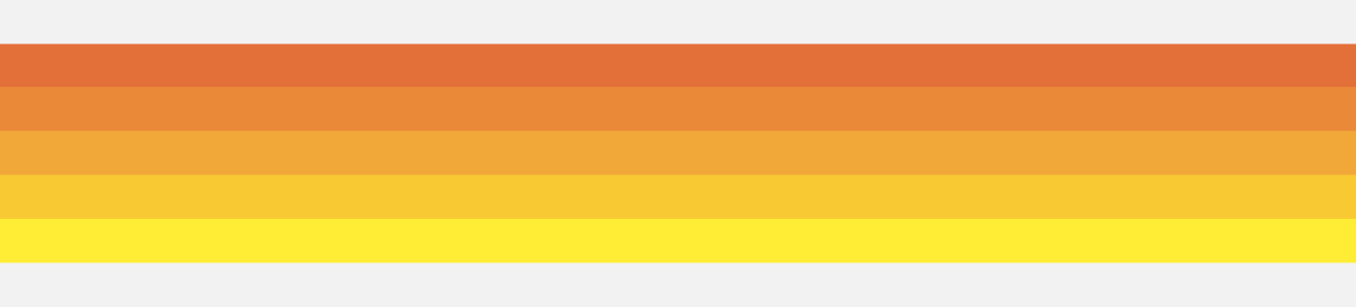
XX — The Weber-Fechner Law — the measure in mixture
This effect demonstrates that to achieve a perceptually even gradation of saturation of color, you need to double the amount of pigment used at each step. This is more easily shown than described.
The left progression shows adding one more pen stroke at each step (as in, 1-2-3-4), whereas the right one doubles the pen strokes at each step (1-2-4-8). The left one doesn’t look equally more saturated throughout, and the last two steps especially look the same, despite the literal amount of pigment being doubled.
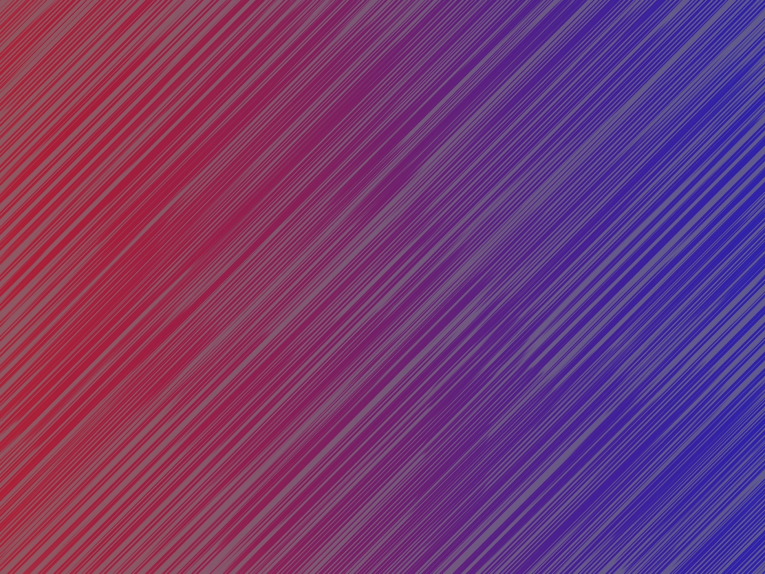
XXI — From color temperature to humidity
This demonstrates that traditionally “warm” colors, like reds, oranges, and yellows, can also appear “cool.” And vice-versa for “cool” colors, like blues, purples, and greens. This depends not only on their underlying hues, which can have warm or cool tones mixed in, but is also relative to the surrounding context.
 Some of these blues look warm, and some reds look cool.
XXII — Vibrating boundaries — enforced contours
There’s a coffee shop near my house that has a sign I can’t help but look at every time I walk by. It has a bright, saturated blue background with the name in bright, saturated red letters. I would sometimes perceive a slight border between the letters and background, but when I looked directly at it it would disappear. Are the letters slightly overprinted? Is there a subtle shadow or border there? Are my eyes just playing tricks on me? I could never quite figure it out.
Then I read this chapter. “A-ha!” I exclaimed. “I knew I wasn’t crazy!”
What’s happening is that contrasting, or near-contrasting, colors of similar saturation and brightness, when placed next to each other, will have a vibrating boundary. Sometimes it looks like reflected light, or a shadow, or a doubling or tripling of the border, or a separate border in a new hue. It happens in some conditions and not others, like natural light versus artificial, near or far focus, etc.
It’s a rare effect, and one that’s surprisingly hard to pin down. I often see it in my peripheral vision, but when I try to look directly at it it disappears, but then I’ll see it in another part of my peripheral vision, and on and on, pulling my eyes around and around. When it appears it’s usually somewhat unpleasant.
My first attempt was not so great. Doing it with pens was a mistake because the edges need to be precisely against each other, but my edges overlapped, mixing the pigments and ruining the effect.
I made the ones below in Procreate and they’re much clearer.
XXIII — Equal light intensity
This exercise is the opposite of the previous one. Colors of similar hues, of similar light intensity, will have borders that disappear. It’s an even more difficult effect to achieve than the last chapter. Albers says very few painters can achieve it at all (it’s not so hard in Procreate).
 Try looking off to the side, instead of directly at the image, and see if you can make out the jagged border between the two colors. For me, it disappears and the colors blend.
XXIV — Color theories — color systems
At the end of the book, Albers gets to color theory. Only after experimenting with color and learning to see it, and all the tricks it plays on us, should we talk about underlying theories. As Albers says, “A sensitive eye for color became our first concern.” We must learn how to look at color, and to train our eyes. There are no absolutes in color. Therefore, using color theory without understanding this, and knowing all the ways colors can change depending on their context, is pointless. Even now color theory is of marginal usefulness, and trusting ones eyes is more important than following rules or the math of what a color “should” be or is “measured” to be.
This is pretty much all Albers says on color theory. He doesn’t talk about contrasting colors, analogous, complementary, split complementary, etc., because it’s all relative. You need to learn to use your eyes and recognize the influence of quantity and context. As he says, “We emphasize that color harmonies, usually the special interest or aim of color systems, are not the only desirable relationship. As with tones in music, so with color–dissonance is as desirable as its opposite, consonance.”
Techniques for seeing and evaluating color
This book taught me some useful techniques for evaluating color. I included them in the relevant sections above, but I also collected them in a more general way here so they’re easy to refer back to.
- Look at colors out of the periphery of your eyes. Stare at a point off to the side, but focus your attention on the color (or area) in question. Does it pop out? Recede? Vibrate with its neighbors? And so on.
- Look at a middle point between two colors or areas to compare them simultaneously. Don’t look back and forth at them directly.
- Run your eyes back and forth over edges to see which are “hard” and which are “soft.” This tells you the color relationship between colors (which is darker or lighter, above or below, and so on).
- Look at work close up, and far away. Blur and squint your eyes. These reveal the overall gestalt of a piece. What colors pop out? Which recede? Which feel balanced?
- Put two colors on top of each other (paper, rectangles on a screen, etc.). Stare at the overlapping area for longer than is comfortable (about 30 seconds or more). Then abruptly remove the top color, but keep staring at the covered area to look for an after-image. Do it again in the reverse order and look for an after-image. If they both have after-image (or no after-image), they’re about equal light intensity. If one has after-image but not the other, then the top color is darker. Do this multiple times to make sure the readings hold.
Fin
Wow, what a journey. Going through this again has really shown me how far I’ve come. I look at color completely differently now. I can remember designing UIs in the past, looking at a color (border, shadow, whatever) and thinking it looked “off,” and checking its hex value to see if it was the correct color (“correct” here meaning the hex I expected, or the same value we’ve used previously, or in our design system, or whatever). Turns out I should have learned to listen to my eyes more.
This is also a mistake I see in junior designers. Yes, a color might be what’s in our design system, but does it look good? Does it feel right? Learning taste and judgement is much harder, but infinitely more valuable. This lesson applies beyond just color — spacing, alignment, layout, size, and more.
This has also had a profound effect on me beyond just colors. Context is a key, yet overlooked, ingredient to a lot of parts of life. It influences flavors in cooking, sounds and notes in music, temperature, textures, smells, life experiences, how teams perform, how people behave, and more.
In short, I can’t recommend this book enough (and actually doing the exercises!) if you’re serious about color. I’ll leave you with one last Albers quote that sums this all up nicely: “Again: knowledge and its application is not our aim; instead, it is flexible imagination, discovery, invention – taste.”
Books referenced in the text
- Interaction of Color by Josef Albers.
- Palette Perfect by Lauren Wager.
- Steal Like an Artist by Austin Kleon.
Links above are Amazon Affiliate links.