How I unknowingly upped my visual design game
As I’ve been building out the team at LaunchDarkly, I realized my eye for visual design details had gotten a lot sharper. I was seeing rough edges and ways to improve UIs that I wouldn’t have caught a few years prior. This was cropping up in the UI work I was doing myself as well. I hadn’t explicitly tried to improve my visual design skills, and professionally have spent more time in management than IC work, so how had this happened?
Looking back on the past few years, I realized some independent threads had come together to improve my visual design skills without me noticing. I thought it would be fun to document those, and to be a resource for others who are looking to improve their designs (spoiler alert: there’s no silver bullet here, just deliberately and consistently putting in the work).
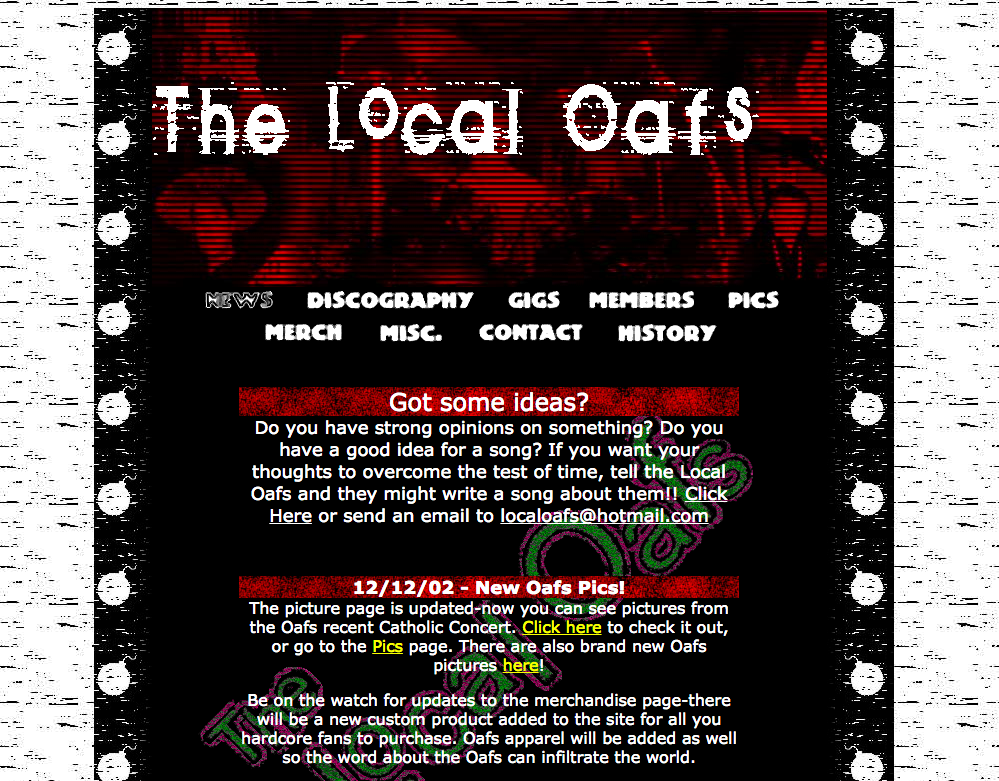
 One of the first websites I designed back in high school for my friends’ band, The Local Oafs, circa 2002 (roughly). It’s actually kinda dope, in an amateur-ish, grunge aesthetic way.
Lettering
The first thread is hand lettering. (See my journey here). Back in 2017 a couple of Optimizely designers and I hung out after work, ordered some Pizza Hut, drank beer and doodled with a bunch of pens and brushes. I started messing around with a brush pen and fell in love with the thick and thin strokes and the overall feeling of making marks with it. I had always admired hand-lettering and sign painting, so I got my own brush pens and started drawing letters. I copied a bunch of Instagram artists to start, and then got some books to help me improve even more. I kept practicing ever since, expanding into drawing letters with a pen & pencil, laying out phrases, and doing calligraphy (which I actually did as a kid also).
I started doing this just for fun, and to get back to analog creative activities that didn’t require a computer, not to get better at design. But hand lettering helped me develop my eye for typography, to see the subtle curves that define a character’s personality, and just general layout and details and color. I now have much stronger opinions about fonts and all the small details that define their mood and character.
Some books that helped me the most:
- House Industries Lettering Manual by Ken Barber
- The ABC of Lettering by Ivan Castro
- In Progress by Jessica Hisch
- Handstyle Lettering published and edited by Victionary (a great visual reference, but won’t teach you how to draw letters).
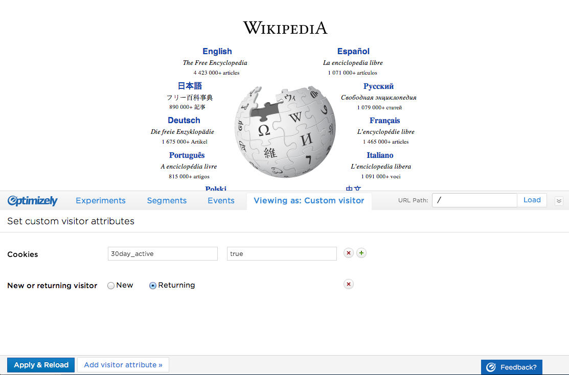
 Optimizely’s preview tool, which I redesigned back in 2013. This is what shipped, but to my eyes today this looks like a first round wireframe.
Type & Color & Branding
I also read a lot about typography, color, and branding over the past few years. The type books further trained my eye and attuned me to the subtleties of every character and how that lends personality and uniqueness to each font, making typefaces that previously looked almost identical look vastly different now.
On the color front, I kept buying palette books for inspiration. Inspiration for what, exactly? I don’t know because I didn’t have any projects that needed them. I just liked them.
The palettes also developed my eye, but by far the biggest book that changed how I see color is Interactions of Color, by Josef Albers. This book is a series of exercises that trains your eye to see how color will look different depending on the circumstance, how they interact, and how they influence each other. I couldn’t recommend this book more if you want to get better at using color. Read about the exercises and my experience with the book in this blog post.
I also got a lot more interested in branding during this time. I read some books on branding, but the bigger influence has been subscribing to Armin Vit’s brand review site, Brand New. It further honed my eye for branding, typography, and color.
Some of my favorite books on color, type, and branding:
- Logo Design Love by David Airey
- The Designer’s Dictionary of Color by Sean Adams
- Sagmeister & Walsh: Beauty by Stefan Sagmeister and Jessica Walsh
- Thinking with Type: A Critical Guide for Designers, Writers, Editors, and Students by Ellen Lupton
- The Secret Lives of Color by Kassia St. Clair
- The Designer’s Dictionary of Type by Sean Adams
- Palette Perfect by Lauren Wager
- Draplin Design Co.: Pretty Much Everything by Aaron James Draplin
 My original website, circa 2012, compared to my refreshed website, circa 2019. The old one was fairly bland and safe and avoided making mistakes, whereas the new one has a lot more personality, bolder font choices, and a more evocative color palette. Read about the design process here.
UI resources
Even though I said I didn’t set out to improve my UI design skills, I did read two UI focused resources: Refactoring UI, and Learn UI Design (not a book, but a website & blog & course [I did not take the course]). These are both very practical resources that focus on actual techniques to use when designing UIs, as opposed to theory which I have found leaves a gaping chasm between itself and how it applies to actual UI design. So these were great for both developing my eye for details, and also giving me specific tips and tricks to to use in UI design.
 Before and after comparison of a side project I worked on in 2020/21 called Center.
Creativity
The final thread is general creativity. I’ve always been fascinated by the creative process, and love reading how people from other creative disciplines do what they do. These have helped me think more about how I work, and given me techniques to try from other disciplines to break through creative obstacles or find novel solutions.
By far the most impactful book I’ve read in this category is The Artist’s Way by Julia Cameron. Saying I “read” it does it a disservice. It’s a 12-week program that shows you how to shed your inhibitions and find your inner artist. You can read more about my general experience with the book here, and a follow-up post about artist dates here.
Creativity books I recommend:
- The Artist’s Way by Julia Cameron
- Making Music: 74 Creative Strategies for Electronic Producers by Dennis DeSantis
- Working by Robert Caro
- On Writing by Stephen King
- Keep Going and Steal Like an Artist by Austin Kleon
- Bird by Bird: Some Instructions on Writing and Life by Anne Lamott
- Draft No. 4. On the writing process by John McPhee
- The Gift by Lewis Hyde
- Understanding Comics by Scott McCloud
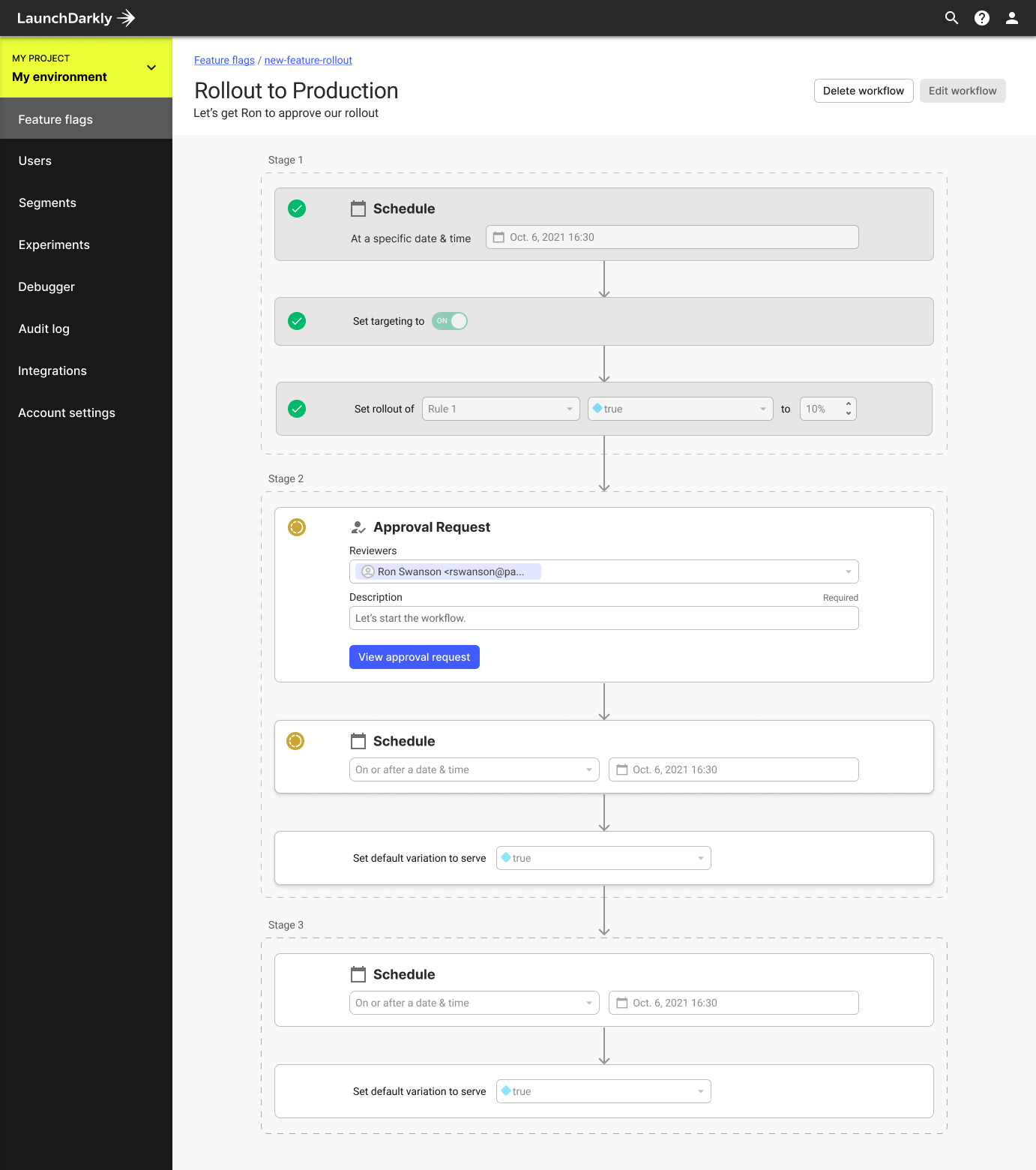
 LaunchDarkly’s workflow builder, circa 2021 (worked on in collaboration with other designers & PMs).
So that’s it! Now you know all my secrets: just read a ton of books and put in consistent practice to an artistic pursuit like lettering for years. Easy, right?
But seriously though, all of this did help me become a stronger visual designer without me explicitly setting out to do so. And one of the biggest changes between now and 5 or 6 years ago is how much I’ve developed my eye. I didn’t appreciate how important it is to tune your eye to all the small details that really elevate design work. There’s no shortcuts, but anyone can do it as long as you’re willing to put in the work.