#design process
-

Claude Code is Re-shaping My Design Process
Claude Code has fundamentally changed how I design. I'm skipping mid-fi mockups entirely, going straight to working code, and shipping more than ever. Here's how my process has evolved — and what hasn't changed.
-
Don’t let a linear design process snuff out your sparks of inspiration
Earlier in my career, I would follow the double diamond design process as a series of linear steps: define the problem, explore solutions, test & iterate, then build and ship. But the more times I’ve gone through this cycle, the more I’ve realized that this is a recipe for snuffing out good ideas.
-
When in the design process should I use components in my design system?
A common mistake I see product designers make is that they start the solution exploration phase by cobbling together UIs out of the components and patterns in their design system (often skipping lo-fi, broad explorations).
-
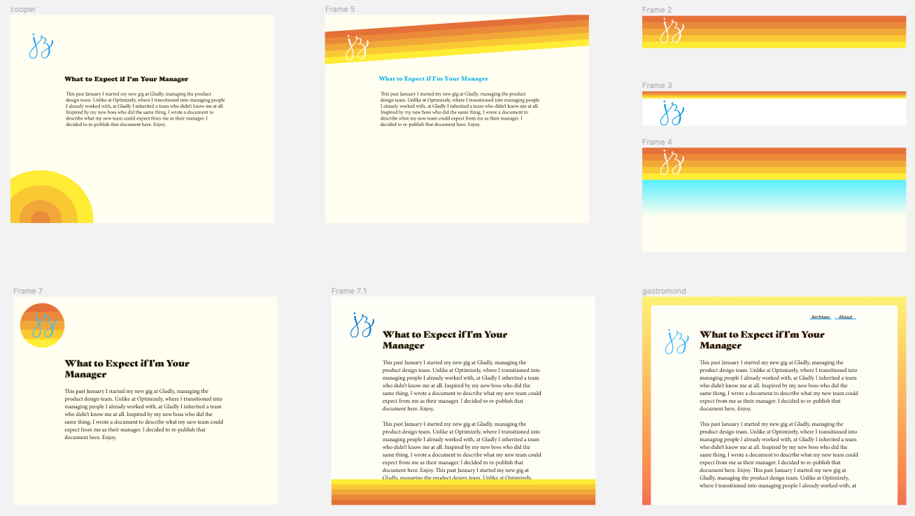
Site Redesign IV: Color, Layout, & Logo
Part IV of my site redesign series. The final post. While I was exploring the world of typography to match my guiding concept, I was also exploring ideas for the color, layout, and logo (some of which you saw in the previous post). I explored all 3 of these together because they were all interrelated. The placement of the logo and navigation dictated their color and style, so I was changing each variable simultaneously.
-
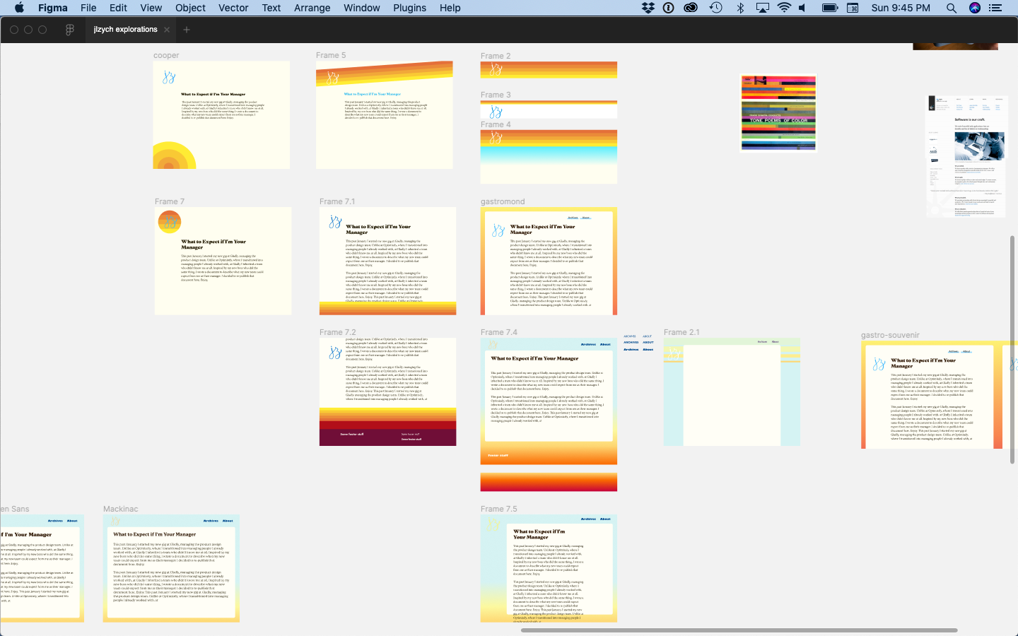
Site Redesign III: Typography
Before I started moodboarding, or even found my guiding concept, I read The Designer's Dictionary of Type and realized the typography on my site was not particularly warm or human. In this third part of my redesign series, I document the process of choosing new fonts for the site.
-
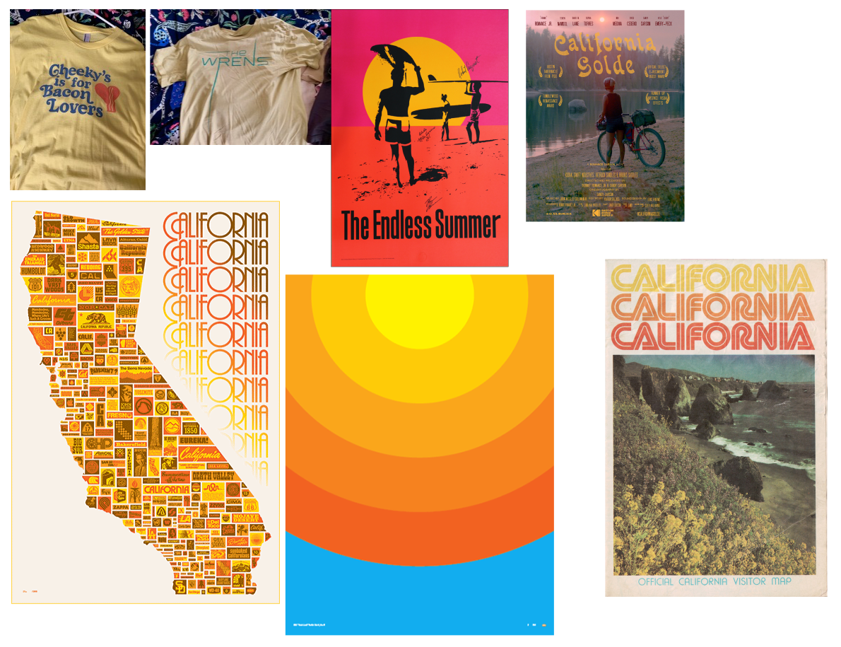
Site Redesign II: Inspiration
Having found my guiding concept in my last post (tl;dr is it should feel like me, but on the internet, as expressed through SoCal summer vibes), I started gathering inspiration for how to translate that into colors, fonts, and an overall site design.
-

Site Redesign I: The Guiding Concept
As some of you may have noticed, I (semi-)recently gave my site a visual overhaul. It's far more opinionated than before, so I want to document my decision making process over the next couple of posts.
-

Discovery Kanban 101: My Newest Skillshare Class
I just published my first Skillshare class — Discovery Kanban 101: How to Integrate User-Centered Design with Agile
-
My Talk at Lean Kanban Central Europe 2017
On a chilly fall day a few weeks back, I gave a talk at the cozy Lean Kanban Central Europe in Hamburg, Germany. I was honored to be invited to give a reprise of the talk I gave with Keith earlier this year at Lean Kanban North America.
-
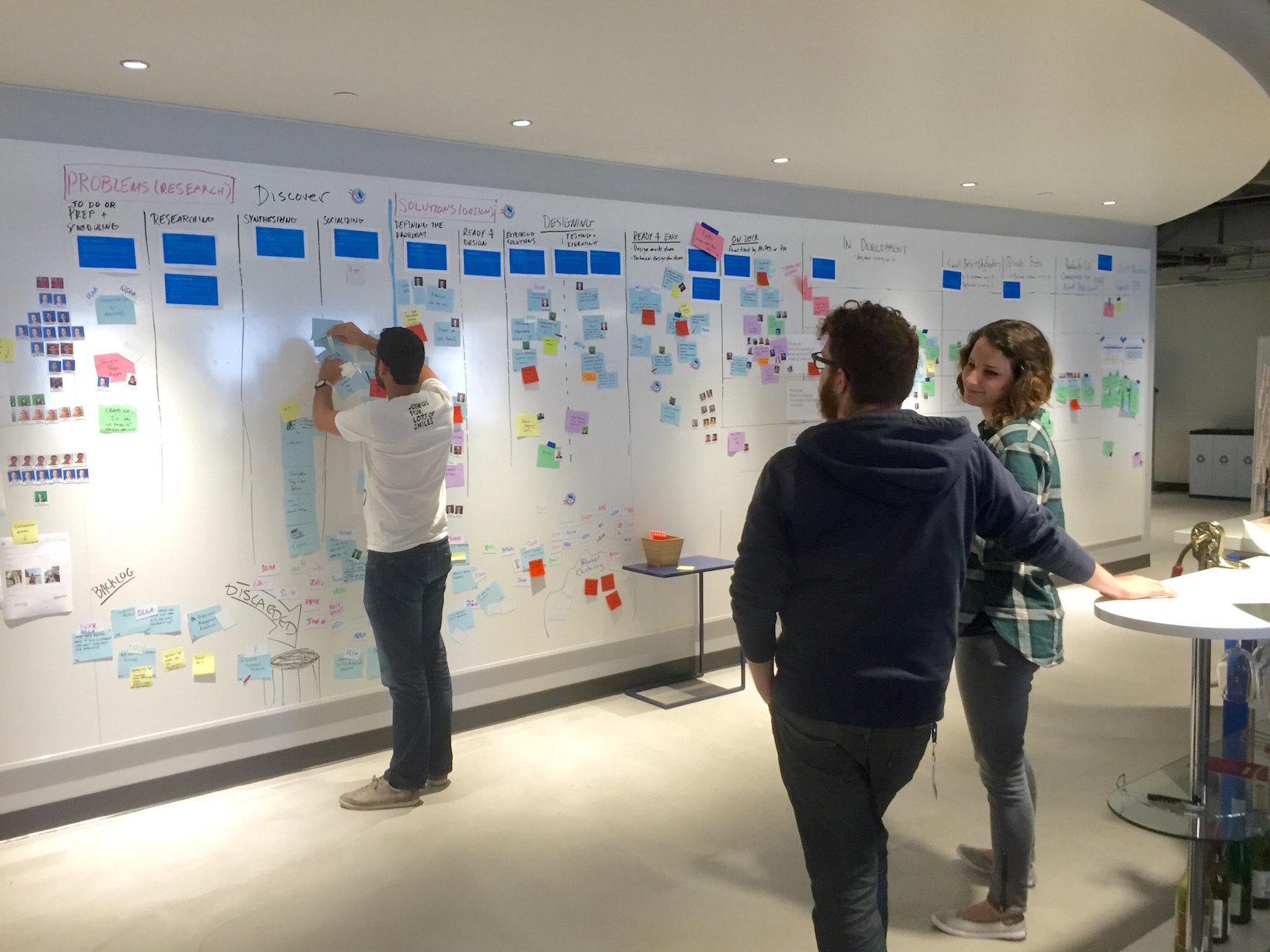
Managing Design work with Discovery Kanban at Optimizely
In my previous article, I described how we transformed our Agile development process at Optimizely to include research and design by implementing our own flavor of Discovery kanban. In this article, I’ll go a level deeper to describe all the stages research and design work moves through during the discovery process.
-
Discovery Kanban at Optimizely
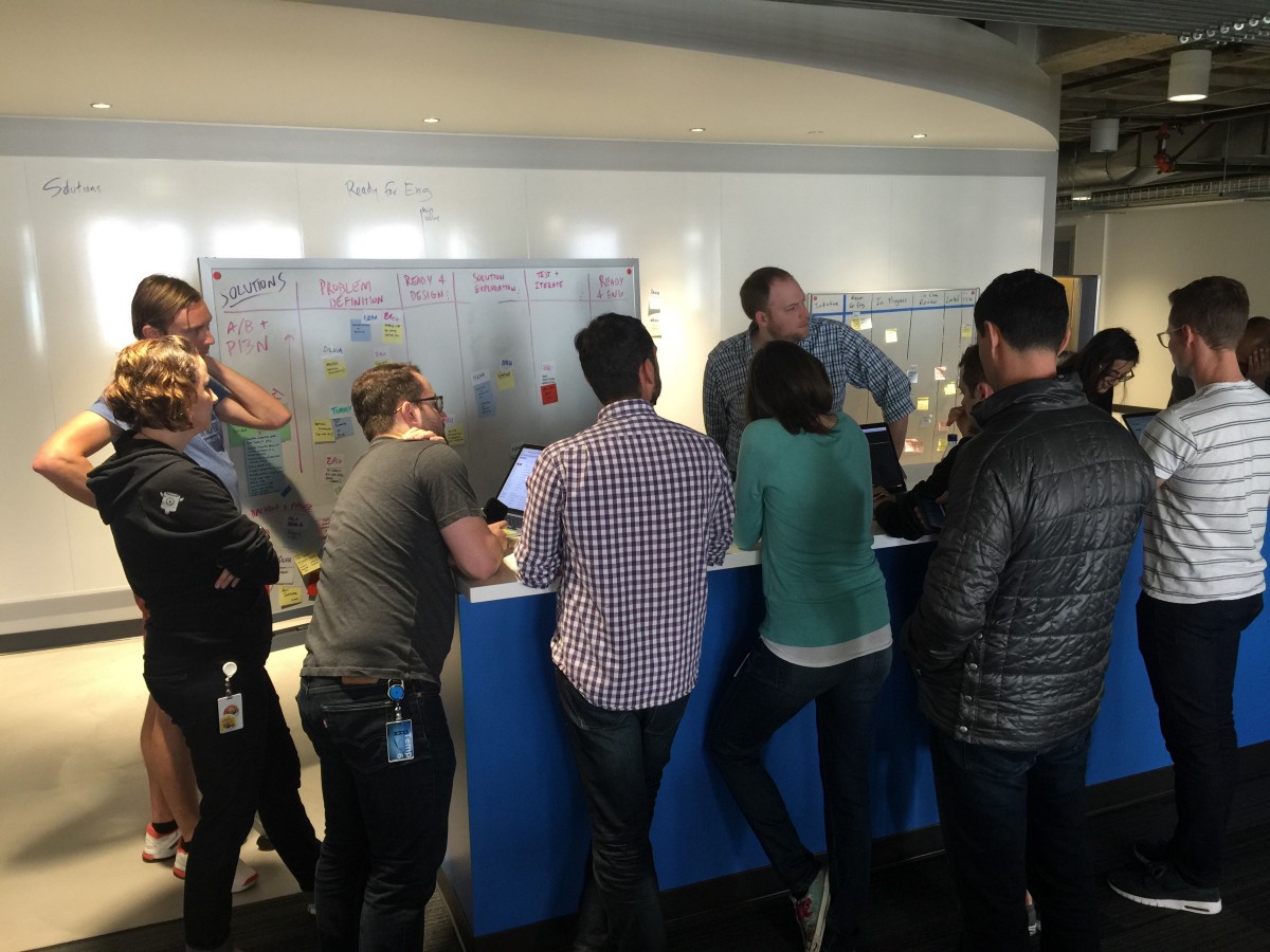
Like most tech startups, Optimizely uses an Agile process to build software. Agile has been great at helping us plan what we’re building, coordinate across teams, and ship iteratively; however, that meant design and research were awkwardly shoehorned into the process.
-
Behind the Design: Optimizely's Mobile Editor
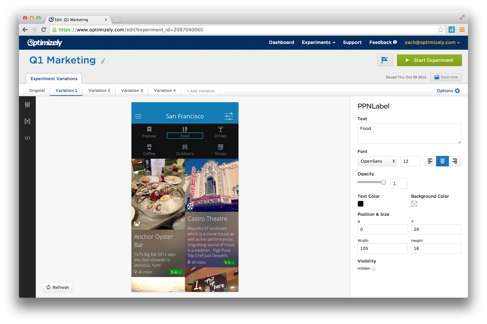
In this post, I will walk you through the design process, show you the sketches and prototypes that led up to the final design of Optimizely's Mobile editor.
-
Building an MVPP - A Minimum Viable Product we're Proud of
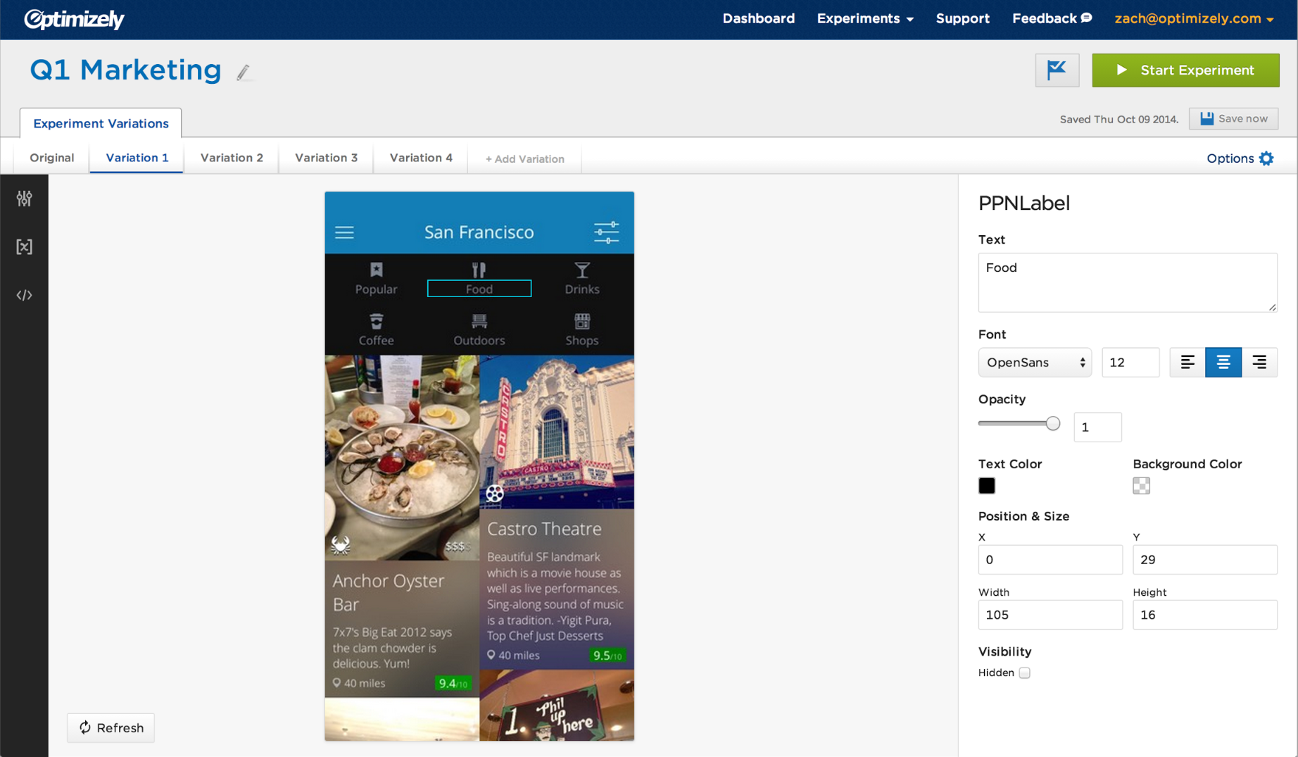
On November 18th, 2014, we publicly released Optimizely's iOS editor. This was a big release for us because it marked the end of a months-long public beta in which we received a ton of customer feedback and built a lot of missing features.
-
Design Process of Optimizely's Sample Size Calculator
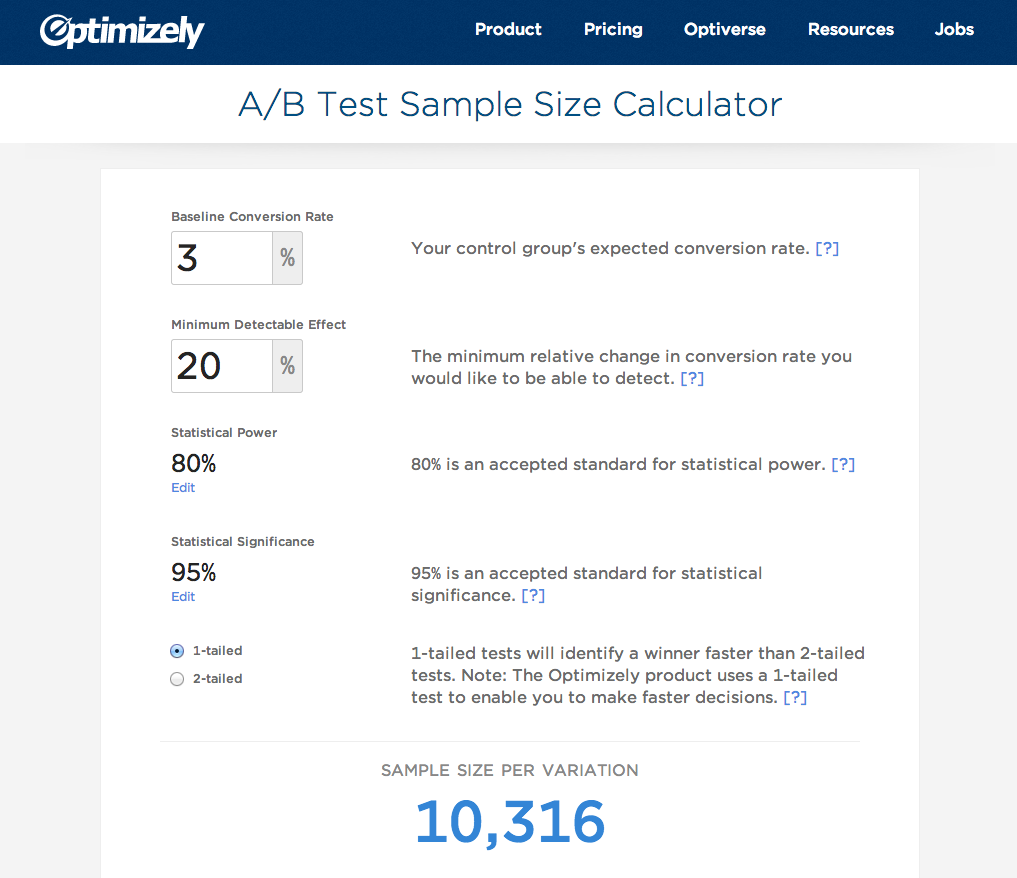
Optimizely just released a sample size calculator, which tells people how many visitors they need for an A/B test to get results. This page began as a hack week project, which produced a functioning page, but needed some design love before being ready for primetime. In this post, I'm going to explain the design decisions we made along the way.
-
Re-Designing Optimizely's Preview Tool
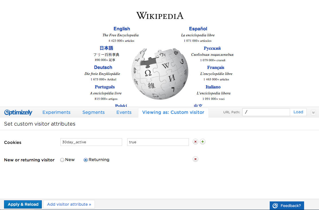
We just released a major addition to Optimizely's preview tool: the ability to impersonate visitors. In this post, I am going to describe our design process and the design decisions we made along the way.