Re-Designing Optimizely's Preview Tool
We just released a major addition to Optimizely’s preview tool: the ability to impersonate visitors. This lets our customers see content they’re targeting to different audiences. Designing and developing this was a larger undertaking than any of us expected. In this post, I am going to describe our design process and the design decisions we made along the way. My hope is this post will serve as a record of the work that went into it, as well as provide a glimpse into the black box of design.
Impersonate what? Preview who?
Optimizely’s Preview tool has been around for many years as a QA tool for our customers to view draft experiments on their live site. Its proven itself useful, but until now it wasn’t possible to view experiments targeted to users whose conditions you didn’t match, such as people in another country. The new impersonation functionality lets you do just that.
Optimizely’s newly redesigned preview tool
The problem
Our broad goal was to make it easy for our customers to personalize content to their audiences. Like any good design process, we started by asking questions and doing research. We sought to answer questions such as: “Do our customers even want to do this at all? Do they do this now? Why do they do this?” We began by looking at usage metrics, which taught us that a small number of people already target content to audiences.
But why do they do this? What are their difficulties? Why aren’t more people doing this? To answer these questions, we switched into qualitative mode and spoke with customers. After a few interviews, the most consistent and actionable insight we had was that the biggest pain point is managing these targeted experiments. Among other issues, it’s especially hard to preview and test content that’s served to different audiences.
A seedling of an idea
With our research in hand, we brainstormed a bunch of different ways of tackling this problem. The most obvious improvement that everyone agreed on was augmenting the preview tool with the ability to impersonate different users. Adding this to the preview tool was a natural fit, since it’s meant to be a QA tool. It doesn’t solve every problem, but it’s a good first step.
During the brainstorming sessions we sketched a (very) rough mockup on a whiteboard (see below). The functionality of the previous preview tool would remain the same, and we’d just add the ability to view your site as a different audience member.
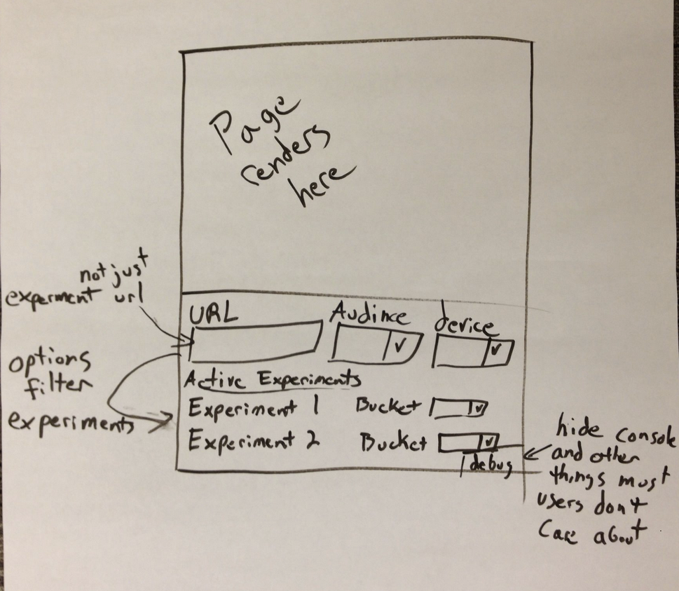
The first sketch outlining the new impersonate functionality.
Better sketches
After we had a basic idea of how this would work, it became my job to fully design the feature. This meant thinking through all the user interactions, layout, and visual design. My first step was to sketch more detailed interfaces. The original sketch relied on an overly simplistic assumption of how impersonation would work: users would select an audience to view the page as. Unfortunately, Optimizely doesn’t (yet) have the concept of an “audience” in the product. Since an audience is basically a collection of targeting criteria (location, cookies, browser, etc.), impersonating a visitor morphed into setting values for targeting attributes. These values are evaluated against each experiment’s targeting conditions, and the experiments that match are displayed on the page.
This is a pretty major change from the original concept. Instead of a simple dropdown to select a predefined audience, a person would have to set targeting attribute values to define their audience (for example, set browser to “Firefox” and location to “Bulgaria”). This change made the interface and user interactions significantly more complicated than the original sketch.
As a result, my early wireframes only focused on how people would set their targeting values. I threw down a bunch of different ways of doing this on a big sheet of poster paper (see picture below). My goal here was to figure out where this new UI would go, and how people would interact with it. It wasn’t meant to think through every corner of the tool. It simply got me to the point where I felt confident putting impersonation in a sidebar alongside the other panes. The form didn’t need to be very wide, and the different targeting attributes fit pretty easily in this constrained space.
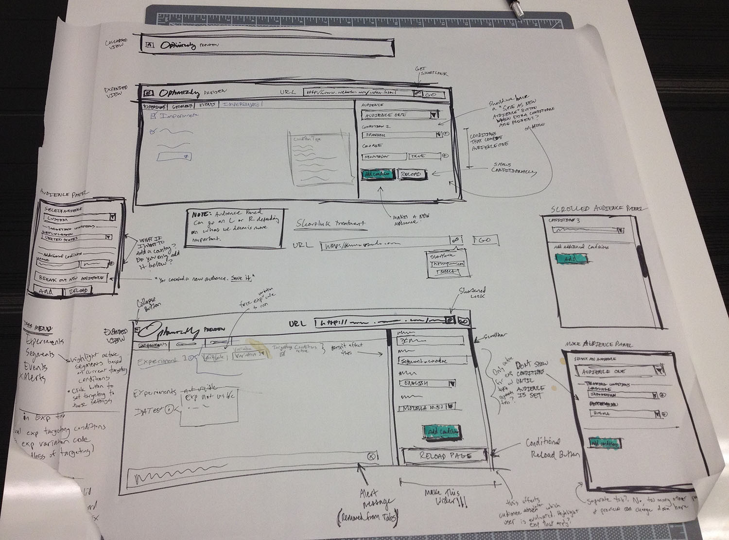
More refined sketches of the new preview tool.
Interactive mockups
Now that I felt comfortable with the basic layout of the new preview, I moved into high fidelity interactive mockups. At this stage it was important for me to get my ideas into a form that I could actually interact with. It’s one thing to look at a static sketch, but it’s completely different to actually click through and interact with it. I could have sketched more, but I couldn’t be sure of my design decisions until I could use them.
My goal with the interactive mockup was to decide the major user interactions that shape how the product works. This would essentially act as a skeleton, to which I’d add the “skin” of visual design later. To achieve this, I coded a static HTML page that would look and act like the final product, but not actually do anything. I decided to build an HTML prototype because:
- It’s quick and easy to make changes (for me),
- It runs in the browser, the medium through which actual users will interact with it, and
- Large portions of the HTML, CSS, and JS can be re-used in the final version.
While working on the interactive mockup, I proceeded in a very iterative fashion. I would identify the worst part of the UI, work on it until it was no longer the worst part of the UI, and then move on to the new worst part. Eventually, the original worst part would be the worst again, and I would improve it more. Working in this manner, nothing is ever “done”, and I’m continuously in the mindset of asking, “what can be better?”.
The other advantage of this approach is it lets me sit with a portion of the UI in an imperfect state for awhile. This lets me focus my attention elsewhere, which is helpful because it’s easy to get dragged down in details and lose objectivity. I’ve noticed that by focusing on another part of the UI, problems with what I was working on naturally pop out. And just as often, some detail I was sweating becomes a distant memory. A design decision ends up being more minor than I thought, or the solution just works in the overall context of the UI.
Although my process consisted of lots of iterations on every part of the interface, the rest of this post will focus on each part of the UI in isolation, as if I worked on each section straight from start to finish (even though I didn’t).
Warning: this post isn’t even halfway done, so if you don’t care to read through a bunch of design decisions, I recommend you skip through my work-in-progress screenshots all the way to the end.
Where to put the new impersonation feature?
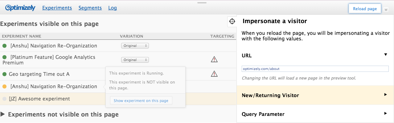
The worst part that first jumped out at me was the location of the impersonation feature — it was too front and center. This is the new feature we were building, so naturally my sketches focused primarily on that. But in doing so, I lost sight of the larger picture: users will be coming from the editor to view a draft variation on their live site. Impersonating visitors is a secondary (maybe even tertiary) activity. And today, most users won’t find it useful (from our previous research, we knew only about 12% of running experiments are targeted).
My first attempt to solve this problem was to hide the impersonation sidebar by default. To open it, users would need to click a “targeting” icon. At the core of it, this approach worked. It got the impersonation pane out of people’s faces, while still being just a click away. But it worked too well. The icon was too cryptic, and overall the impersonate functionality was too hidden for anyone to find.
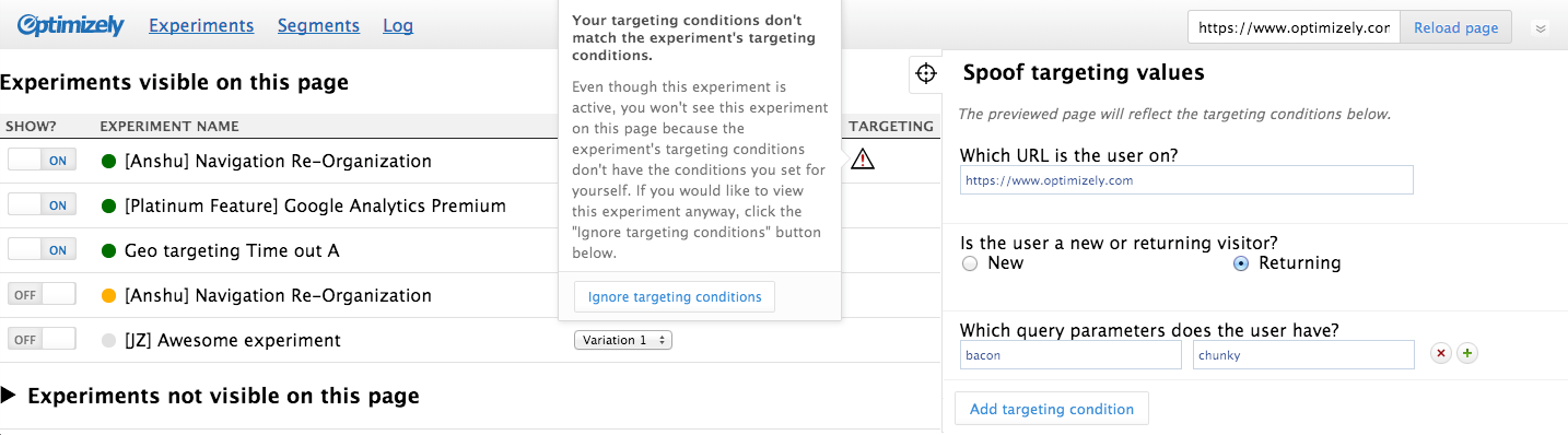
This early screenshot shows how prominent the new impersonation feature was. It also shows one possible solution to this problem — toggling it by clicking a “targeting” icon (the cross hairs).
It also had another, more subtle problem. By being next to the experiments list, it implies a strong relationship between the two. For a long time, I thought this relationship was important. After all, changing targeting values affects which experiments are visible. And the targeting conditions of your experiments influence the custom visitor you’re trying to impersonate. Therefore, experiments must be next to the impersonation attributes!
For a long time, that reasoning made sense to myself and the larger group. I even tried to get cute and show a warning icon next to experiments that would not be visible after loading th epage as the custom visitor (with an option to pre-emptively ignore the targeting conditions — see screenshot above. Foreshadowing: I recycle this idea later). But after using this UI for awhile, I realized the relationship between these two is not as important as I originally thought. In general, having the list of experiments next to the impersonation UI (with icons turning on and off) was actually more distracting than helpful. It was complex and clever in a way that wasn’t benefiting users.
So I decided to simplify things by putting the impersonation feature in its own tab. This proved to be a good decision that solved a lot of problems beyond this immediate one. For one thing, it kept the user’s focus on setting targeting values, rather than splitting their attention between targeting values and experiments. And putting the UI behind a tab provided a label in the UI that hinted at its functionality (instead of an obtuse icon). Next, it allowed for some extra room to provide in-context help and an explanation of this new feature’s use. And finally, it provided a place to communicate when a person was in “impersonation mode”. I could use the tab for double duty by updating the text to say when a person was viewing the page as themselves, or impersonating a custom visitor.
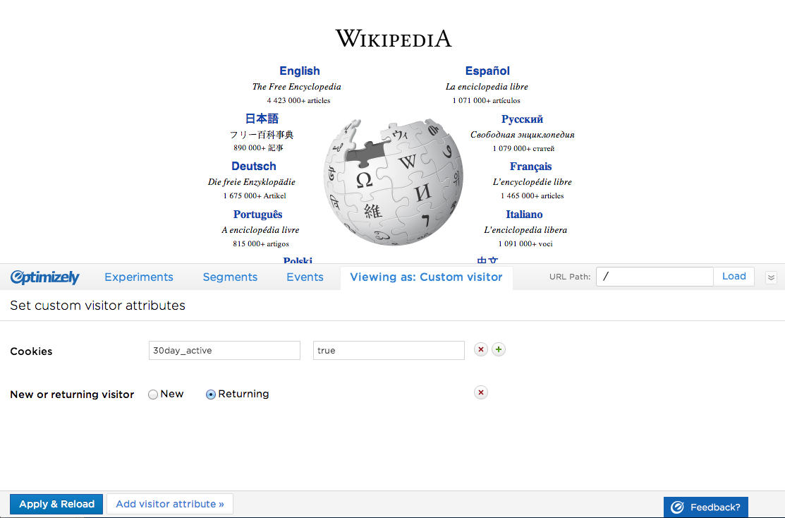
Custom visitor attributes
The next issue to solve was how to set custom visitor attributes. I saw two major branches for this UI: have all of them available to set from the beginning; or, start with a blank slate and choose the attributes to set from a list. My sketches had potential solutions, but this was a question I could only answer by interacting with each interface.
There were advantages to each method. Having everything already in the UI laid all the cards on the table: all 11 possible attributes were already there, and you can see the fields you’ll need to fill in before interacting with anything. You just need to set the ones relevant for the custom visitor you want to impersonate. But it had some serious drawbacks: it looked visually cluttered and overwhelming; some attributes will be used a lot, while others will barely be used at all; and not all users understand what all the attributes are (e.g. custom tags? query parameters?).
This early interactive mockup shows one attempt at placing all the targeting attributes in the UI from the start.
The other branch — inserting attributes by selecting them from a list — was also a mixed bag. The advantages are that the interface starts with a blank slate, which puts the user in control of what’s in the UI. It also doesn’t look overwhelming, and is less distracting (since only the attributes they want to see are present). The interaction is also split into two simple, discrete steps: first, choose the attribute you want to set; and second, set its value. But this is more clicks (at least 2, versus 1). And starting with a blank slate means a person must figure out how to insert the attribute(s) they want (since they’re not already on the screen).
Then I went in circles for weeks trying out different variations of each branch. Nothing felt quite right, and I couldn’t find a creative way to minimize the disadvantages of either idea. At this point I was pretty deep in the weeds, and my usual technique of focusing on another aspect of the UI for awhile wasn’t yielding any insights. So I decided I needed a fresh perspective. Using the mockup below, I ran some guerrilla usability studies with two of our sales people to see how they reacted to the UI. The results were pretty clear: they found it intimidating. One of them said, “it looks developer-y”. And in fact, my inspiration for this version came from the Chrome Developer tools.
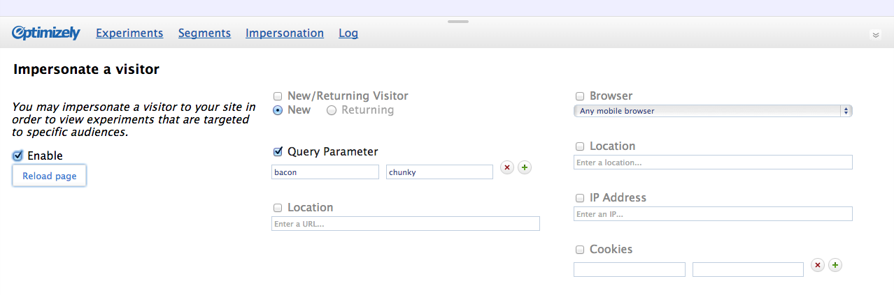
This screenshot illustrates one possible method of setting custom visitor attributes – have all of them available in the UI from the start.
Getting qualitative data at this point was immensely valuable. Additionally, I thought back to some of the quantitative data we had gathered, and knew that most targeted experiments use fewer than 4 targeting criteria. This means most people will only need to set between 1 and 3 attributes when impersonating a visitor. From this I felt confident that inserting attributes from a list was the best approach. And after using the version pictured below for a few days, it felt about right. (But as you can see, it still needed a lot of refinement before going live).
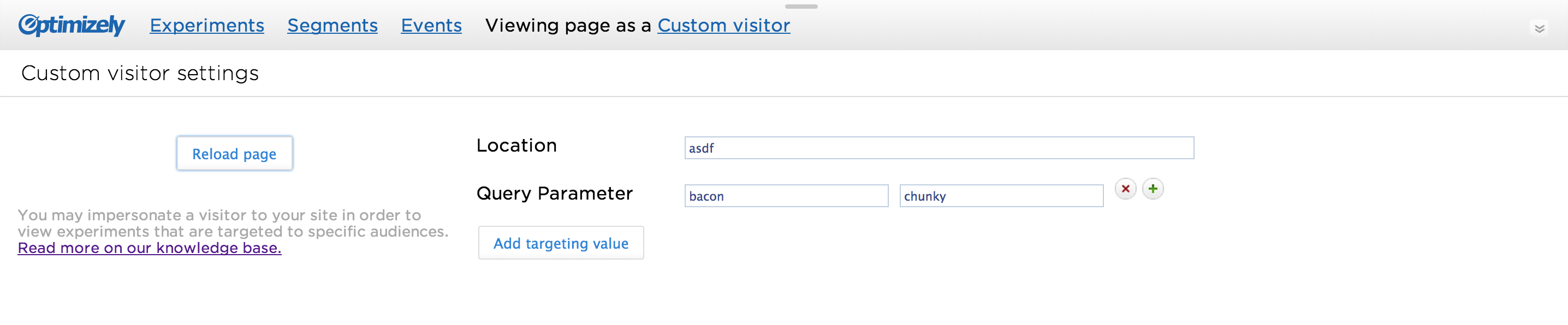
This version of adding custom visitor attributes is close to the final version, but still needed a lot of refinement.
Experiment activation
The original preview had “Activate” links next to each of the inactive experiments in the experiment list, which was a big source of confusion. What does “activate” mean? Does clicking it mean the experiment is now “Running”? Is it a permanent change? In reality, it just makes it visible on the page for the duration of the preview session. I knew this interaction had to improve, but it required more than just a simple name change and better visual design (both of which were also necessary).
To find a solution, I started with two key questions: first, why do people click that button; and two, why do experiments need to be activated at all? I started with the second question, which turned out to be more complicated than I expected. An experiment may need to be activated for the following reasons:
- It’s running on a different page (the most obvious reason, but also the least likely scenario in which a person would want to make it visible)
- It’s paused or draft (second most obvious, and also the most likely reason for a person to make it visible)
- It’s manually activated (i.e. a piece of javascript on the user’s site triggers the experiment to run via our javascript API)
- The user doesn’t match the experiment’s targeting conditions
To make things more confusing, an experiment may not be visible for all of these reasons, or any combination of them. For example, a paused experiment running on this page might also fail the targeting conditions, making it not run for two separate reasons. When clicking “Activate”, which action is supposed to happen? Ignore the experiment’s status, or the targeting conditions, or both?
Initially I assumed anytime “Activate” was clicked, the experiment should be visible, regardless of the reason it’s not visible. After all, the user’s intent was to make the experiment visible, right? Well, after some discussions with the larger group, the answer was “maybe” for the old UI, but “probably not” for the new one.
To understand why, we need to start with the goal of the new preview tool: give people impersonation capabilities, so they can preview targeted experiments. Put another way, it’s a testing tool to help you be confident that your targeting conditions are set correctly, and that your end-users are seeing the proper content. Viewed in this light, an experiment that’s not visible because it fails the targeting criteria becomes a lot more important. For example, lets say you have a draft experiment that is also targeted to an audience. While impersonating a visitor, you want to make sure this experiment’s targeting conditions are set properly. If clicking “Activate” were to override everything and make the experiment visible, there would be no way to know if you actually met the targeting conditions.
At this point there was clear motivation for separating out the actions, but there are still a lot of reasons an experiment may not be visible. Luckily, having a well-defined use case helped guide me. Rather than have buttons for every possibility, I could group the user’s intent into two categories: override targeting conditions (i.e. targeted URL and visitor targeting criteria), and everything else (e.g. ignore a paused experiment’s status). This meant I only needed two buttons.
Button labels
Next, I had to figure out what to label the buttons, and where to put them. What to label each button took a lot of discussion, and we ended up with three verbs to use (for only two buttons). The first was to use “Activate” to view manually activated experiments. Ironically, this is the same as the old UI, which I said needed to change, but in this case it’s consistent with the way we talk about manually activated experiments throughout the product (and is, in fact, the reason the original UI used “Activate” in the first place).
The action to view paused and draft experiments was more difficult. It couldn’t conflict with existing product terminology (e.g. running or active), but it needed to indicate you’re taking a non-permanent, temporary action. We felt “Stage” hit both of those requirements.
For the second button, my mockups used “Ignore targeting conditions” since I needed something for development purposes, and in the end that’s what we shipped. Everyone agreed it was clear and we felt there was no reason to over think it. Usability studies further confirmed that these label choices made sense.
Button placement
Now the only issue remaining was where to put the buttons. An obvious approach is to put them next to each experiment in the list (as the old UI did). I didn’t like this for two reasons: first, it’s visually heavy and repetitive (the same button is repeated again and again); and second, it’s not a common enough activity to have them always present (remember, the core use case is still coming from the editor to view the variation you’re working on).
I decided to hide them in a popover that appears when you click the name of an experiment. I tried a similar idea earlier in my iterations (remember the warning icon popover?), and liked the concept of only exposing secondary functionality when the user asks for it. It also provided another advantage: a place to put contextual information about the experiment. I could state the experiment status (paused, running, draft), and describe why an experiment was visible (or not).
Finding a solution that solves multiple problems always feels good. This is also a good example of how a scrapped idea can still be valuable. Rather than being a waste of time, it came back later to inspire me.
But it wasn’t perfect yet. My first iteration had both buttons in the popover, leaving it up to the user to decide which action they wanted (activate/stage an experiment, or ignore targeting conditions). But I could tell immediately that having two buttons of equal importance was confusing. As Steve Krug says, “Don’t make me think”, and this definitely made the user think.
In thinking through this problem, I knew both buttons were not required for every experiment (e.g. a paused, un-targeted experiment will never need to ignore targeting conditions). So for the complex case where an experiment needs both buttons to make it visible, I decided to make the actions sequential. First, the popover explains the experiment isn’t visible because it’s paused or draft, and to make it visible you must click “Stage”. Then, if it’s still not visible, the popover informs you why, and provides you an override button.
Although this is technically more work (i.e. more clicks), it’s less of a cognitive burden on the user. They are presented with one decision at a time. And they don’t need to figure out what’s happening – the system tells them.
After using this UI for awhile, an obvious improvement popped out at me: adding a label next to experiments that are staged/actived, and ignoring targeting conditions. This information was previously only available in the popover, which makes it cumbersome to access. With labels, it’s easy to see at a glance which experiments were forced to be visible. I also added a label for the experiment being previewed from the editor, which is really nice for orienting the user when they first arrive in the preview tool.
Path field interaction
One of the last things I worked on was the URL path field. This field exists to give people the ability to continue impersonating visitors and previewing experiments on other pages of their site. We considered just letting a person click through their site and have the preview tool follow them around, but this behavior isn’t always desirable (e.g. what if they navigate to a new domain?). Plus, there were technical issues with implementing this. And since it isn’t a common action, we went with giving people the ability to type new URL paths, even though it’s not ideal.
So at a minimum I knew there had to be an input field with a button to load the page. And that’s exactly what it was during the prototyping phase and most of the implementation phase. But after awhile it became clear to me that it was going to need a bit more polish. The main problem was it was too squished between the tabs and rightmost edge. If you’re typing a really long path, you won’t be able to see the whole thing at once, which can lead to errors. Plus, it just “feels” cramped to use.
My first attempt was to move it out of the header completely — give it a dedicated space to live and breath. And since it’s not something that will be used frequently, it’s better to put it in a less prominent spot. Unfortunately, it didn’t make sense in any of the tabs. It’s a global action, unspecific to anything in the tabs. And putting it in its own dedicated tab was overkill since it would be the only field there.
So with that option off the table, I had to find a way to make it work in the header. The only reasonable approach I came up with was to keep it small and unobtrusive until someone started interacting with it. I experimented with a few different ways of doing this, but the one that felt best was hiding the domain name and keeping the field small until the user clicked into it, at which point the field expands, the tabs disappear, and the domain name pops out. This put all of the focus on the URL field, and provided a lot of room for editing the path.

When clicking into the path field, the input expands and the tabs duck down out of the way.
Ship it!
If you made it this far, congratulations! What I just described only scratches the surface of all the design decisions that were made. In writing this post, a lot of little decisions and early, incorrect assumptions came back to me. But if I went any deeper this post would be a novel, so instead I focused on the most difficult aspects of the impersonation feature. Design is often seen as a black box, and as writing this post has shown me, that’s because documenting the thought process and decision making can be exhausting. It’s amazing how some little detail you obsessed over for days can be so quickly forgotten. So this post acts as a historical record to help remind myself and the larger team all the work that went into this feature, in addition to providing a glimpse into the process of design.