As some of you may have noticed, I (semi-)recently gave my site a visual overhaul. It’s far more opinionated than before, so I want to document my decision making process over the next couple of posts.
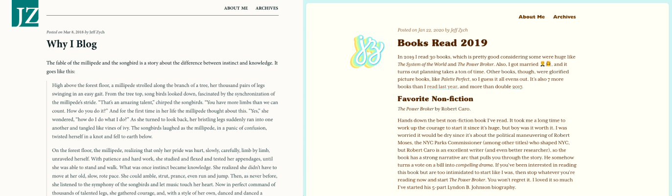
Before (left): a dull gray background. Minion typeface throughout. After (right): much warmer. More engaging. More personality.
First up is the concept that drove the visual design of the site. The concept took a long time to come into focus, but is the most important (and hardest) part of the redesign.
When I transitioned my site from a portfolio to a blog (circa 2012, after graudating from grad school), there was no concept behind it. I just wanted a site that “didn’t look bad” and was easy to read (it was a blog, remember?). That meant safe, overused typeface (Minion). Minimal color. No ornamentation. Nothing flashy or special at all, really. Just text on a page.
The JZ monogram was just the letters set in a nice font, cut out of a box. I designed it like that because I thought it looked cool. The image came to me one day, so I whipped it up in Illustrator. I chose the blue-kissed green because it looked nice and was neither flashy nor boring. Not exactly the strongest reasoning.
So I ended up with a site that looked fine, and avoided making mistakes, but that was it. It wasn’t special or unique or interesting.
And that’s how my site was for many years. It did its job. But as the site kept evolving, I wanted the design to be more opinionated and memorable.
That’s when I started looking for a stronger point of view to express. A feeling to evoke. A guiding concept to build around.
My starting point was just to make my site feel more personal. It’s my site. A blog. Not a corporate site. Not a product page. Not a publication. So I should express myself more. That led me to swap my knocked-out JZ with a hand-lettered monogram a couple of years back. I also added a better photo and a hand-lettered “Hello!” on my about page.
Before (left 2): I don’t have a screenshot of the original about page, but the leftmost image is an unstyled version of the page from the Wayback Machine, and isn’t far off from how it looked. The middle one is a revamped page from some number of years ago. After (right): how it looks at the time of this post. It doesn’t fully live up to the new concept, but is the best yet.
While these all undoubtedly improved my site, the concept wasn’t strong enough to stand on its own two legs.
I pushed myself to go deeper. “What does more personal mean? What makes a website ‘personal’ anyway?” I didn’t have answers, but they were good provocations to keep in the back of my mind.
While I let those questions marinate (for more than a year, probably — it’s hard to remember, exactly), I read Conversational Design by Erika Hall, who recommends thinking of a website (or app, or any touchpoint) as a person as a way to create a memorable design (which I also read about many years ago in Well Designed by Jon Kolko and forgot about). How would that person talk? Act? Dress?
That’s when all these disparate ideas — making my site “more personal;” the website as extension of self; touchpoints as people — fused into one: my site should be an extension of me! When people interact with my site, it should feel like interacting with me IRL (that’s in real life for the older crowd).
The concept immediately connected with me. There was just one problem: how do I do that? What does it mean to translate myself into a digital medium? How does a website “feel” like me? What feelings do people get when they see me, or think of me? How would my friends describe me?
It got very existential very quickly. 😳 Who am I? What defines me? Shorts? T-shirts? Owls? Bravo reality TV?
Once again, I wasn’t sure how to answer. And once again, I let this idea marinate in the back of my brain.
After many months (at least), I was in the kitchen at work wearing my customary shorts and owl t-shirt, when my coworker reacted with surprise at my outfit (it was winter), and said, “It’s like you always bring summer with you wherever you go!”
BOOM! 💥 That was the underlying concept I was looking for! Summer, warm, friendly, beach-y, So Cal vibes. Those were feelings I could evoke on the screen with visual design.
Next up, I’ll write about how I turned those into the color and font choices you’re seeing now (unless you’re from the future).
In 2019 I read 30 books, which is pretty good considering some were huge like The System of the World and The Power Broker. Also, I got married 🤵👰, and it turns out planning takes a ton of time. Other books, though, were glorified picture books, like Palette Perfect, so I guess it all evens out. It’s also 7 more books than I read last year, and more than double 2017.
Favorite Non-fiction
The Power Broker by Robert Caro.
Hands down the best non-fiction book I’ve read. It took me a long time to work up the courage to start it since it’s huge, but boy was it worth it. I was worried it would be dry since it’s about the political maneuvering of Robert Moses, the NYC Parks Commissioner (among other titles) who shaped NYC, but Robert Caro is an excellent writer (and even better researcher), so the book has a strong narrative arc that pulls you through the story. He somehow turns a vote on a bill into compelling drama. If you’ve been interested in reading this book but are too intimidated to start like I was, then stop whatever you’re reading now and start The Power Broker. You won’t regret it. I loved it so much I’ve started his 5-part Lyndon B. Johnson biography.
Favorite Fiction
A Heartbreaking Work of Staggering Genius by Dave Eggers.
This book is autobiographical and based on real events in Dave Eggers’ life, but he calls it a work of fiction (and it’s generally classified that way by libraries). This book is deeply moving and sad, but worthwhile. And that ending… oof.
Favorite Design/Product Book
Tied between Beauty by Sagmeister and Walsh, and The Designer’s Dictionary of Type by Sean Adams.
Beauty made the argument that industrial design and architecture of the 20th century was overtaken by Bauhaus and “form follows function,” at the expense of beauty. In other words, we valued objects and buildings being functional, and devalued beauty as frivolous “ornamentation.” This book is an argument against this trend. People’s lives and society can be improved by having more beauty in it. As a product designer, I got caught up in “form follows function” and not valuing beauty, and this book pushed me to re-evaluate that (which is part of the reason I visually updated my site recently).
The Designer’s Dictionary of Type gave me a deeper appreciation of typefaces, more so than any previous type book I’ve read. I’m not sure why, since this book follows a familiar format of grouping type into different families (serif, blackletter, script, etc.) and giving the history of the most famous typefaces in each category. But it may have been the right book at the right time. I’ve been doing hand lettering for the past couple of years, which got me to engage deeply with letters and their shapes and curves and forms, which may have magnified all the minor differences between each font that I had previously overlooked.
Biggest Disappointments
Play Bigger. This talked about a lot of ideas I have seen batted around for awhile (specifically, being a “category defining company”), so it didn’t feel particularly novel. Maybe that’s because I’m a few years late to it. It also rang hollow because it basically says to create a category for your product, but then pays lip service to the fact that your product actually has to be different enough to be a new category. It also cites Apple and Facebook as examples throughout the book, but they are such wild outliers of success, and so many factors (many out of their control) contributed to their wild success, that citing them as examples is not particularly helpful or compelling evidence for why their ideas are correct or can be replicated. You know, survivor bias and all that.
The other disappointment was The Messy Middle. I didn’t disagree with anything in this book, but I also didn’t get anything new out of it. I’ve seen all these ideas in other books/articles/podcasts. It had a lot of vignettes of ideas about the creative process that weren’t particularly deep, and didn’t make me see anything in a new way.
Full List
Sagmeister & Walsh: Beauty by Stefan Sagmeister and Jessica Walsh (1/1/19)
The System of the World by Neal Stephenson (1/6/19)
The War of Art: Break Through the Blocks and Win Your Inner Creative Battles by Steven Pressfield (1/8/19)
Thinking with Type: A Critical Guide for Designers, Writers, Editors, and Students by Ellen Lupton (1/11/19)
How To by Michael Bierut (2/3/19)
The Messy Middle by Scott Belsky (2/12/19)
Mad Men Carousel by Matt Zoller Seitz (2/19/19)
Company of One by Paul Jarvis (2/24/19)
The Secret Lives of Color by Kassia St. Clair (3/10/19)
The Designer’s Dictionary of Type by Sean Adams (5/16/19)
The Power Broker by Robert Caro (6/3/19)
The Making of a Manager by Julie Zhou (6/17/19)
The Circle by Dave Eggers (7/6/19)
Bad Blood by John Carreyrou (7/14/19)
Working by Robert Caro (7/24/19)
Hard-boiled Wonderland and the End of the World by Haruki Murakami (8/25/19)
Next Level Basic by Stassi Schroeder (8/26/19)
The Art of Noticing by Rob Walker (9/6/19)
On Writing by Stephen King (9/18/19)
The Medium is the Massage by Marshall McLuhan and Quentin Fiore (9/19/19)
Design Leadership: How Top Design Leaders Build and Grow Successful Organizations by Richard Banfield (10/6/19)
A Heartbreaking Work of Staggering Genius by Dave Eggers (10/10/19)
Play Bigger by Christopher Lochhead, Al Ramadan, Dave Peterson, and Kevin Maney (10/23/19)
Palette Perfect by Lauren Wager (11/10/19)
Keep Going by Austin Kleon (11/11/19)
Salt Fat Acid Heat by Samin Nosrat (11/18/19)
In Progress by Jessica Hische (11/21/19)
The Decision Book by Mikael Krogerus and Roman Tschäppeler (11/24/19)
I was walking the engineers through the final designs of some admin screens when they asked me this. The page is just a table of objects, with a tab showing the active ones, and another tab showing archived ones.
I hadn’t explicitly designed the “Archived” tab since it was the same basic design as the accompanying active tab – a table. But I told the engineers I would mock it up.
I expected mocking it up to take a few minutes. Boy was I naive! As I mocked it up I discovered a bunch of complexity that I hadn’t anticipated (and the engineers hadn’t anticipated either). What’s the un-archive flow? These objects can be nested inside of each other (like folders), so does un-archiving a parent un-archive all of its descendants? If a child is nested, but the parent is active, how do we display that in the table (on the active tab, children are visually shown underneath and indented from parents, but if the parent isn’t archived the child will be “orphaned” on the archived tab)? If a parent and its children are archived, can you un-archive just a child? If so, where does it appear in the active hierarchy (it will once again be “orphaned”)?
I mocked up these flows and made some product and design decisions to address the above complexity based on what the user would expect in these situations, and what I believe is technically possible based on my understanding of how the feature is being built. I shared it with the engineers and luckily they agreed with my decisions, so we had a happy ending (for now, at least — more unforeseen complexity may pop up while they code it).
The lesson here is that you should always design every screen, even if you assume it will look the same as another similar screen. Engineers appreciate you being explicit, and in the worst case (or best case, depending on your perspective), you’ll discover open questions that need to be addressed.
If you were to look at Robert Caro’s notebook, you would see lots of “SU”s, short for “Shut Up!”, scattered throughout his interview notes. The Pulitzer-prize winning author of The Power Broker, among other mammoth books, uses this trick to keep himself silent while interviewing subjects. About this, he writes:
In interviews, silence is the weapon, silence and people’s need to fill it—as long as the person isn’t you, the interviewer. Two of fiction’s greatest interviewers—Georges Simenon’s Inspector Maigret and John le Carré’s George Smiley—have little devices they use to keep themselves from talking and to let silence do its work. Maigret cleans his ever-present pipe, tapping it gently on his desk and then scraping it out until the witness breaks down and talks. Smiley takes off his eyeglasses and polishes them with the thick end of his necktie. As for me, I have less class. When I’m waiting for the person I’m interviewing to break a silence by giving me a piece of information I want, I write “SU” (for Shut Up!) in my notebook. If anyone were ever to look through my notebooks, he would find a lot of “SU”s.
This is a fantastic trick to use during user research interviews, too. Remaining silent after a person’s initial response often leads them to elaborate more, revealing an additional nuance, or an exception to the “typical” use case they just described.
I take longhand notes on paper for this reason. My note taking never keeps pace with the speaker, so I’m always catching up after they stop talking, which forces me to shut up.
When you’re interviewing users, find your own eyeglass polishing or “SU.”
Last week I was featured on Interface Lovers, a site that “put[s] the spotlight on designers who are creating the future and touching the lives of many.” Read my response to their first question about what led me into design.
What led you into design?
In some ways, I feel like I’ve always been designing, and in other ways, I feel like I stumbled into it without realizing it. I’ve been into art and drawing since I could hold a pencil, taking art classes and doodling throughout my childhood. Then in high school, I signed up for a web design class. The summer before the class even started I was so excited that I bought a book on web development — “Learn HTML in 24 hours” — and taught myself how to build web pages. By the time the school year started, I had already put a website online. Being able to create something that anyone, anywhere in the world could immediately see was completely intoxicating to me.
From there, I went down a rabbit hole of learning Photoshop, Illustrator, 3D modeling, Flash, and any creative technologies even vaguely related to web design. That led me to get a degree in Graphic Communication at Cal Poly, San Luis Obispo, with a concentration in new media. Back then (early 2000s), there weren’t many web design programs, and the ones that existed were shoe-horned into graphic design and art programs. Cal Poly’s graphic communication program was the most technical of the bunch.
As part of my degree at Cal Poly, I took a computer science class and learned C and Java. I found programming to be super fun, too and went deeper down the stack into backend technologies and database development. Basically, anything tangentially related to web development interested me, so I took every class I could.
After college, I went down the programming path and got a job as a data warehouse developer. I went technical because the analytical nature of it meant you know if your work is good — it either works, or it doesn’t. I found design to be very subjective and didn’t feel confident that my web design work was “good” (however that might be measured).
I joined a small company, so I was doing database design, ETLs, backend programming, frontend programming, and UI design. Over time I discovered that updating the interface, even minor updates, elicited strong positive reactions and gratitude from customers, whereas re-factoring a database to cut query times in half rarely did. I realized I wanted to work closer to the customer.
I started spending more time designing user interfaces and studying usability testing. I discovered it married the analytical, scientific part of my brain (which drew me to programming in the first place) to the subjective, intuitive part. This was the tool I needed to “prove” my designs were “right” (which I now know isn’t exactly true, but it felt this way back then).
This made me want to formally study design, so I got my master’s degree at UC Berkeley’s School of Information. The program is the study of technology, broadly speaking — how technology impacts society, how it changes people and their lives, and how to build technology with the needs of people at the center of it. The program was great. It only had a few required classes, then you could take basically whatever you wanted. So I took classes that sounded the most fun and interesting — design, programming, psychology, research, product development, business, and more. I learned a ton about product development and user-centered design while I was there.
One of my favorite classes was behavioral economics for the web class, in which we explored how to apply behavioral economics principles to web sites and use A/B testing to measure their impact. That led me to join Optimizely after grad school, which at the time (2012) was just a simple A/B testing product for the web. I started out doing UI engineering, then switched into product design as the company grew. When I officially became a product designer I felt like I fell into it by accident. It was a result of what the company needed as it grew, not my specific career goal. But when I looked back over what led me there I realized I had always been designing in one way or another.
The company was growing fast, so I was presented the opportunity to move into management. I was resistant at first, but when I realized I could have a bigger impact in that position, I jumped on it. Eventually, my boss left, and I became the Head of Design, leading a team of product designers, user researchers, and UI engineers.
After 5 and a half years at Optimizely, I was ready for a break and new challenges, so I left and took some time off. I realized I wanted to be hands-on again and ended up joining Casetext as a product designer. They’re building legal research tools for lawyers, which pushed me to be a better designer because I was designing for people with expertise I don’t have and can’t acquire.
After a few months, it wasn’t the right fit, so now I’m at Gladly managing their product design team. It feels great to be in management again, working cross-functionally to deliver great experiences to our customers, while growing and nurturing the talents of my team.
 Before (left): a dull gray background. Minion typeface throughout. After (right): much warmer. More engaging. More personality.
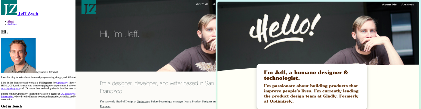 Before (left 2): I don’t have a screenshot of the original about page, but the leftmost image is an unstyled version of the page from the Wayback Machine, and isn’t far off from how it looked. The middle one is a revamped page from some number of years ago. After (right): how it looks at the time of this post. It doesn’t fully live up to the new concept, but is the best yet.