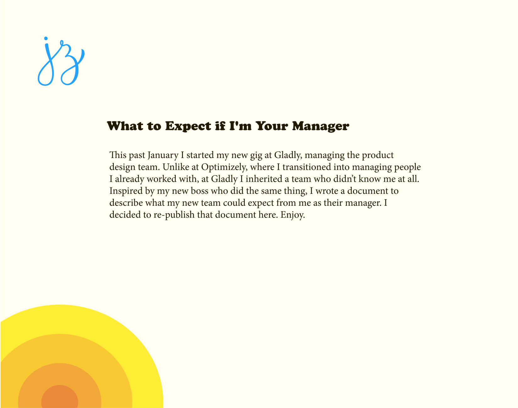
You’re working on a project and the team is aligned on the customer problem to be solved, the business value, and success criteria. The project has moved into the solution exploration phase, and now the ball is firmly in your court. The whole team is looking to you to come up with a solution. A stroke of genius the likes of which the world has never seen! The success of this entire project rests on your shoulders. In the words of Ru Paul, Don’t fuck it up!
Feeling the pressure? I bet you are. Well I’m here to let you in on a little secret. Ready? Come closer so it’s just you and me…
You don’t need to have all the answers.
That’s right. You don’t need to answer every question that comes up during the design process. A little known secret about design is that it’s a team sport. You’re going to face a million decision points along the way. Decisions that impact not only the user experience, but also the data model, backend and frontend architecture, customer adoption, project timelines, marketing messaging, sales demos, support docs, and more. Decisions that you can’t possibly have all the information or expertise to make alone.
If you aren’t answering all of these questions, then what are you doing here? Why are you even on the team?
Don’t despair. Your role is to guide the team to the best answer, together. Draw out knowledge and ideas from all of your cross-functional peers.
Take those ideas and give them form. It doesn’t matter if you came up with the idea or not. It doesn’t even matter if you like the idea. Put your ego aside. You’re not a bad designer if someone else has a better idea than you. Make them all real as quickly and cheaply as possible. That may be lo-fi mockups, written scenarios, flowcharts, clickthrough prototypes, boxes and arrows, or something else. The method you choose doesn’t matter. Just give them form, quickly and cheaply.
That last part is the true super-power of designers: giving concrete form to abstract ideas.
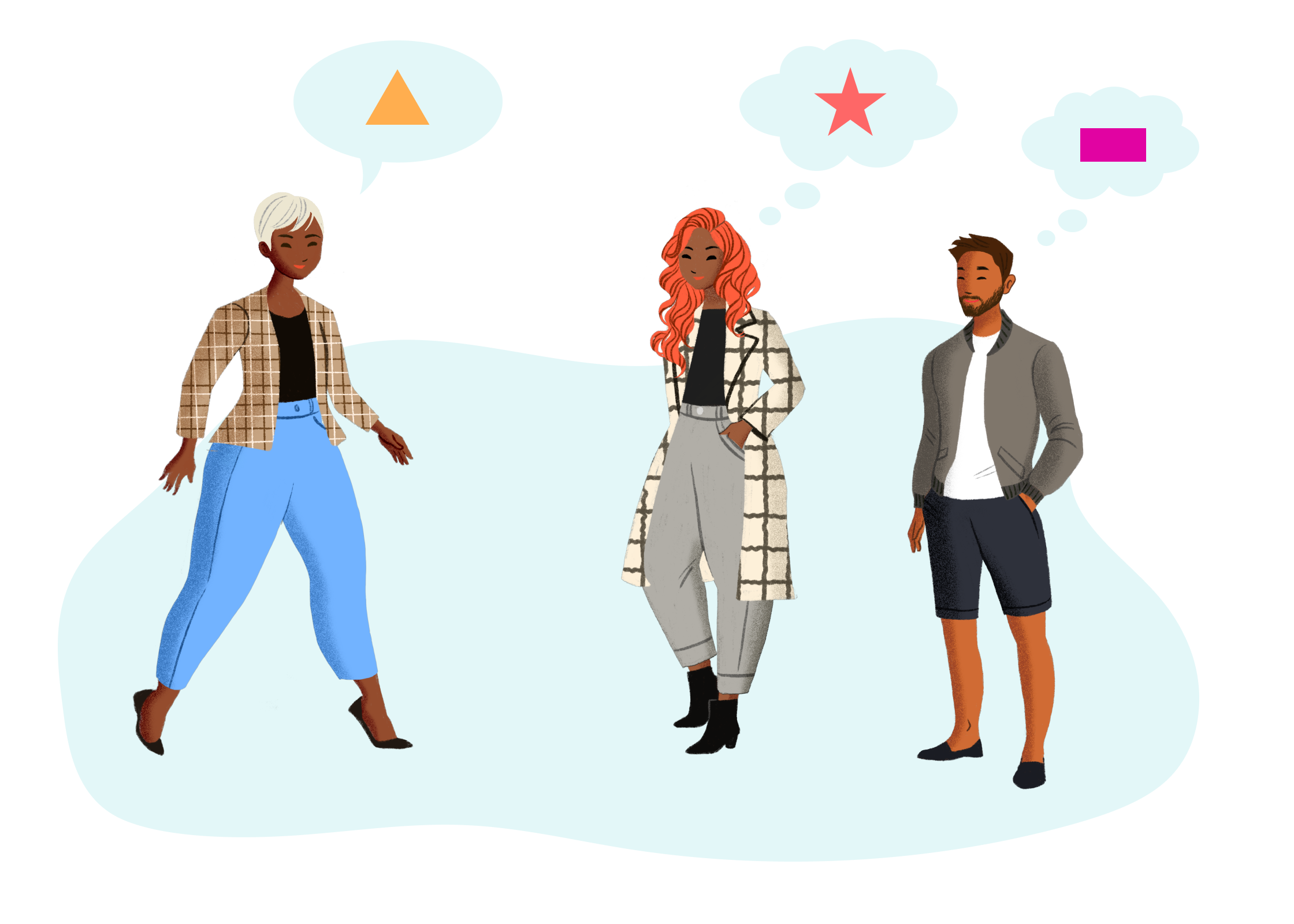
When you talk about ideas in the abstract, everyone will have a different image in their head of what that is. There’s a lot of room for misunderstanding and ambiguity.
She’s describing one thing, but everyone is imagining something different. Illustrations from fresh-folk.com, created by Leni Kauffman. Composition, speech and thought bubbles added by me.
By giving concrete form to abstract ideas, you ensure everyone is talking about the same thing. The good, the bad, and the ugly is all laid bare. It shines a light on all the gaps in knowledge and assumptions that were lurking in the shadows.
I was recently in a team meeting where a designer presented the first round of lo-fi work for a project. It was full of holes and open questions and unknowns. He certainly didn’t have all the answers. But he was open about gaps in his own knowledge and the questions this was raising for him. There were technical questions that he couldn’t answer on his own. Questions about the customer’s workflow that hadn’t surfaced. It highlighted that the team hadn’t even agreed on the conceptual model for how this feature should work yet!
He laid it all out on the table. The group had a productive discussion about what was working, what wasn’t working, and open questions for each person to answer. At the end of the meeting, the lead engineer remarked, “It was very helpful to have something concrete to look at.”
So, designer, I’m here to tell you that we don’t expect you to have all the answers. We expect you to guide the team to the best answer.
Now get out there and lead your teams to success! 💪
This was how our brand designer began his feedback to one of my product designers in design critique. The product designer presented early designs for a feature he was working on. Most importantly, his work was low-fidelity. It used simple black-and-white components and a casual, hand-written font.
An example of a low-fidelity modal component. Not what the designer showed.
His designs were still early, and subject to change. He needed feedback on high-level flows and interactions, not colors or fonts or spacing. Exploring those design details, and getting feedback on that, would have been a waste of time. The fidelity of his work matched the fidelity of his thinking.
The brand designer ended that statement with some general visual design advice for when he moves into high-fidelity. It took less than a minute. He didn’t rabbit-hole on a detailed, point-by-point critique of the entire design. How could he? There was no visual design. His feedback matched the fidelity of what was shown. The product designer got the feedback he needed, and the brand designer gave feedback that played to his strengths.
That simple interaction demonstrated the power of showing low-fidelity work.
While I was exploring the world of typography to match my guiding concept, I was also exploring ideas for the color, layout, and logo (some of which you saw in the previous post). I explored all 3 of these together because they were all interrelated. The placement of the logo and navigation dictated their color and style, so I was changing each variable simultaneously.
My starting point was summer and beach — blue skies and water, warm sun, yellow sand, and so on. These ended up being both too cool-toned, and like I was getting fried on the beach under the bright mid-day sun. They were too literal. But hey, you have to start somewhere.
Exploring blue skies and water, warm sun, and yellow sand.
I switched to a warmer palette, and using fat bands of solid color that I pulled from my mood board.
Warmer palettes with fat bands of color.
I also tried out a “watercolored” (it was done in Procreate) header, and while the colors were nice, the aesthetic felt too artistic.
Watercolor header.
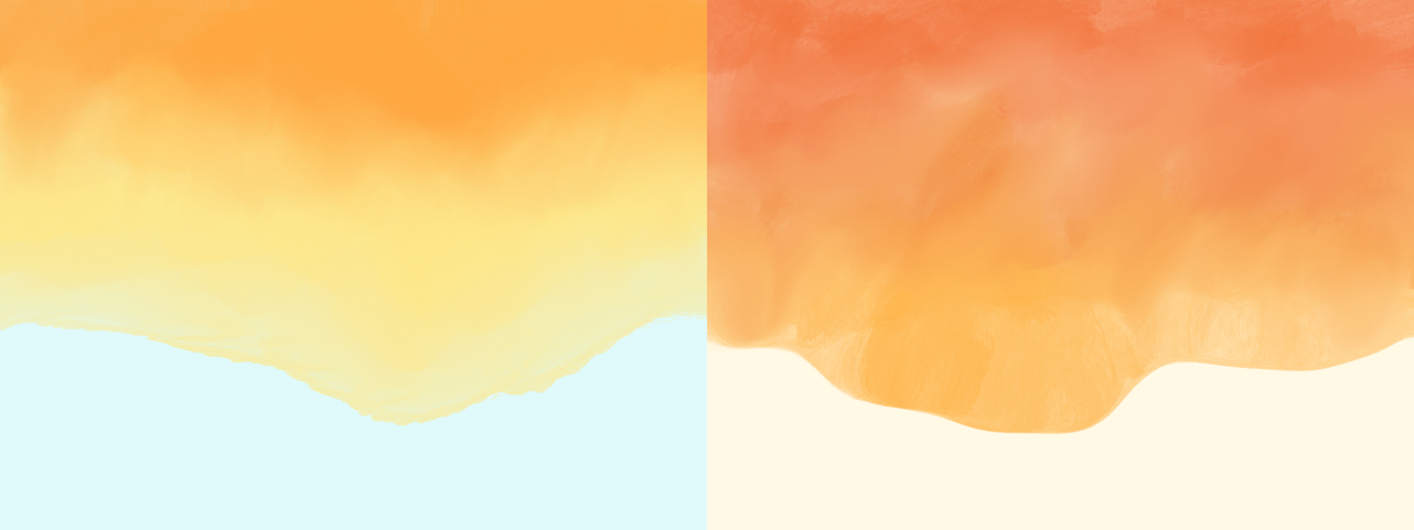
While none of these were working as is, the colors were moving in the right direction. These explorations also helped me refine the aesthetic towards a 60s/70s California summer vibe (as described in the inspiration post). That pushed me to notice sunsets more. Specifically the time right when the sun is setting and the sky is a warm blue and the horizon is orange. That palette had just the right tones. The blues of my previous exploration were too bright and cool-toned, but this blue felt warm and comforting. And the orange paired with it perfectly (you can’t go wrong taking inspiration from nature, y'all).
Pictures of sunsets that inspired me.
Not too long after this (or maybe before, the timeline is impossible to keep track of) I saw the site design of Iheanyi Ekechukwu via Jules Forrest’s tweet. I combined his site layout with my sunset-inspired gradient, and violà! I had the basic frame for my site. I gave the content a warm, off-white background, and made the text a warm brown-ish orange, and the main content’s style snapped into place.
Navigation & Logo
Even though I was heavily influenced by Iheanyi Ekechukwu’s site, my navigation and logo were different from his, so I still needed to figure out where to place them, and how to style them.
I tried them both inside and outside the main content area, in various blues, oranges, whites, and blacks. I didn’t fall in love with any option, and eventually settled on a temporary location of the navigation being dark blue and sitting above the main content while I tried out various type options.
Logo and navigation above content.
I was also struggling with the JZ monogram. The hand drawn warmth of it still fit with the site’s new guiding light, but where do I put it? How do I style it? This took awhile to nail down. Like the navigation, I settled on the logo sitting above the content area in a light orange while I played with type (see image above), but that option never felt right.
After I set the type, I revisited these temporary decisions. I hit reset and started over with the design of Iheanyi Ekechuku’s site. The thinner outside gradient, combined with everything inside the white content area, felt cleaner, lighter, and put the emphasis on the content while having just enough color to make the site visually interesting and pull your eyes down the page.
I made the navigation dark blue so it would be of secondary importance to the content, and placed it in the top left corner, and that felt about right. At the last minute I switched it to a lighter brown color because I decided the blue was actually calling too much attention to itself. I must have done this in code because I couldn’t find it in Figma.
Now I was left with the logo, and let me tell you — this was a struggle. I converged on its placement pretty quickly (left side of the content, top-aligned with it), but couldn’t find any color or style that fit with the guiding concept.
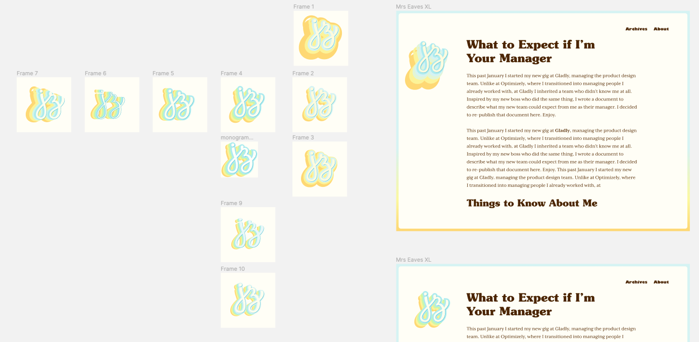
I churned out dozens of variations, of which a good 20 or so survived in Figma. I tried strokes, shadows, different colors and backgrounds, and more. I tried a bunch of tricks I learned from doing hand lettering, and was confident I had a style somewhere in my tool belt that would work. Alas, nothing stuck.
A subset of monogram variations.
I eventually hit a wall, so I sought out more inspiration. I scoured Fonts in Use posts, Google image searched for retro posters, and browsed 60s/70s lettering. I eventually found a hand-lettered style of big, chunky type that was duplicated and offset many times in different colors (inspiration that I apparently never saved anywhere).
I tried that out and could tell I was in the right ballpark (see image below). I played around with the offest colors, sizes, and directions until landing on what you see today (see them all in my Figma Community file).
Monogram explorations in the right ballpark.
I’m pretty happy with the final result, although I find the colors a little too bright (especially in contexts off the site, like the favicon and Twitter), so I need to desaturate it and tweak the colors a bit more.
The last thing I did, mostly in code, was the link style. I knew I wanted a link style that didn’t call too much attention to itself, but at the same time they were an opportunity to give the text some visual flair. I can’t remember exactly what I tried, but when I saw the bright blue underline style, I knew that was it. I decided to make the underline “grow” on hover as a nice way to do something different and surprise readers.
And that, my friends, sums up my journey of how I redesigned this site. It took multiple years of off-and-on bursts of activity going back all the way to when I started adding hand lettering to the site, but the end result is a massive leap forward. I will continue tweaking it, but I’m confident the core aesthetic will serve me for years to come.
Before I started moodboarding, or even found my guiding concept (as documented in those previous two posts), I read The Designer’s Dictionary of Type and realized the typography on my site was not particularly warm or human. The fonts I had at the time were Myriad Black for headlines and interface copy (e.g. navigation), and Minion for body copy. (Before that I used Minion everywhere — even more boring). These fonts paired nicely together, and are well-made, but they’re too bland, corporate, and impersonal for a personal website. Once again, these decisions were made out of a desire to “not look bad.” They certainly didn’t feel like me.
The Designer’s Dictionary of Type, mixed with a couple years of hand lettering, helped me see how all the small details and idiosyncracies of a typeface gave it personality. Before making a serious attempt to give my site a facelift (as documented here), I knew I wanted more human typography.
My first attempt, before I even had my guiding concept, was swapping Myriad for Gill Sans. Gill is similar to Myriad, but has unique letterforms for a sans, like the triangle-topped “t”. I tried it on, probably in code since I didn’t find it in Figma, and immediately discarded it. It looked fine, but overall my site still felt the same.
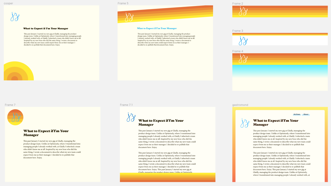
I started keeping an eye out for more fonts to try and subscribed to Fonts in Use to give me a steady stream of font inspiration. During this time I found my guiding concept and started gathering inspiration. I was being drawn to warm, friendly typefaces from the 60s and 70s, like Cooper Black. This melded with the “summer” guiding light, and I realized this style of type would be a great way to express warmth and summer.
I first tried on Cooper for size, since it’s the quintessential 70s font, and it (unsurprisingly) didn’t fit at all (screenshots below, which show various ideas I was workshopping). It felt too much like a novelty. Too flower power 🌸✌️☮︎ Also, Garfield. But I had to try it to be sure.
Cooper Black as the headline font. What a goofball.
So I started casting about for another font in the spirit of Cooper. A font that has the round, soft serifs of Cooper, but is a little more serious. I scoured Adobe Fonts, Google Fonts, Typewolf, and more, but didn’t find anything worth trying. I searched for “rounded serifs,” and browsed 60s and 70s type lists, all to no avail.
After cooling my search for a few months, Mackinac came to me via a Nice Very Nice font pairings article (which came to me from Sidebar). They featured Mackinac as used on Pattern Brands’ site. Seeing it used there, it felt warm and friendly and inviting. I was excited to try it on, but when I did… flop. It was a little too straight-laced. The edges of the serif were a bit too pointy. A little more rigid. It just wasn’t as warm and inviting on my site as I was hoping.
Mackinac as the headline font for Pattern Brands.
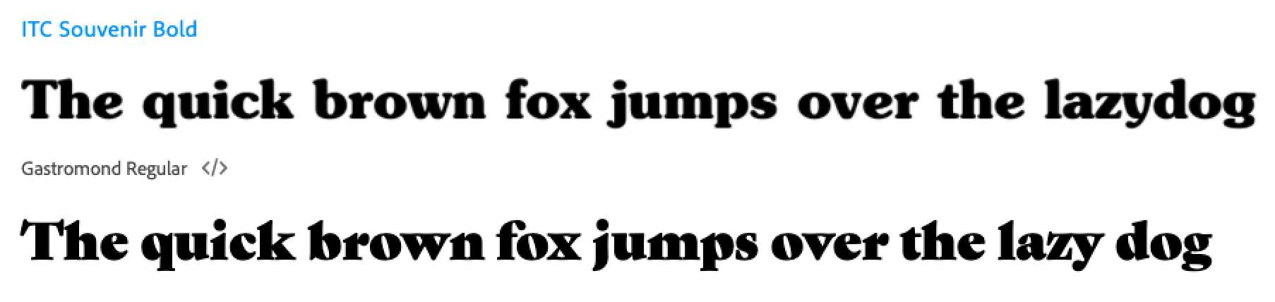
I was back to square one, but this time not for long. Souvenir came across my desk, I’m guessing via one of these two posts on Fonts in Use. That also led me to Gastromond, probably by searching for similar typefaces (or maybe I was just browsing Adobe Fonts? Who knows).
Souvenir on top, Gastromond on the bottom.
With Souvenir, I loved the warmth and friendliness that came from its soft edges and nice wide, round letterforms. The “e” has a great laid back vibe that I love. The lowercase “v” and “y”, uppercase “A”, and a few other letters have a little bit of bowing to them that make them feel relaxed and happy.
With Gastromond, its off-axis counterforms make it feel like it’s leaning back and relaxed. I also loved the contrast between the thick and thin strokes.
I tried them both on, and Souvenir was the clear winner. It was warm, friendly, a little funky and retro, all without feeling goofy or like a novelty font. It retained just enough seriousness to not undermine the generally serious tone of my writing.
Gastromond was a little too pointy, and not as warm as I was hoping.
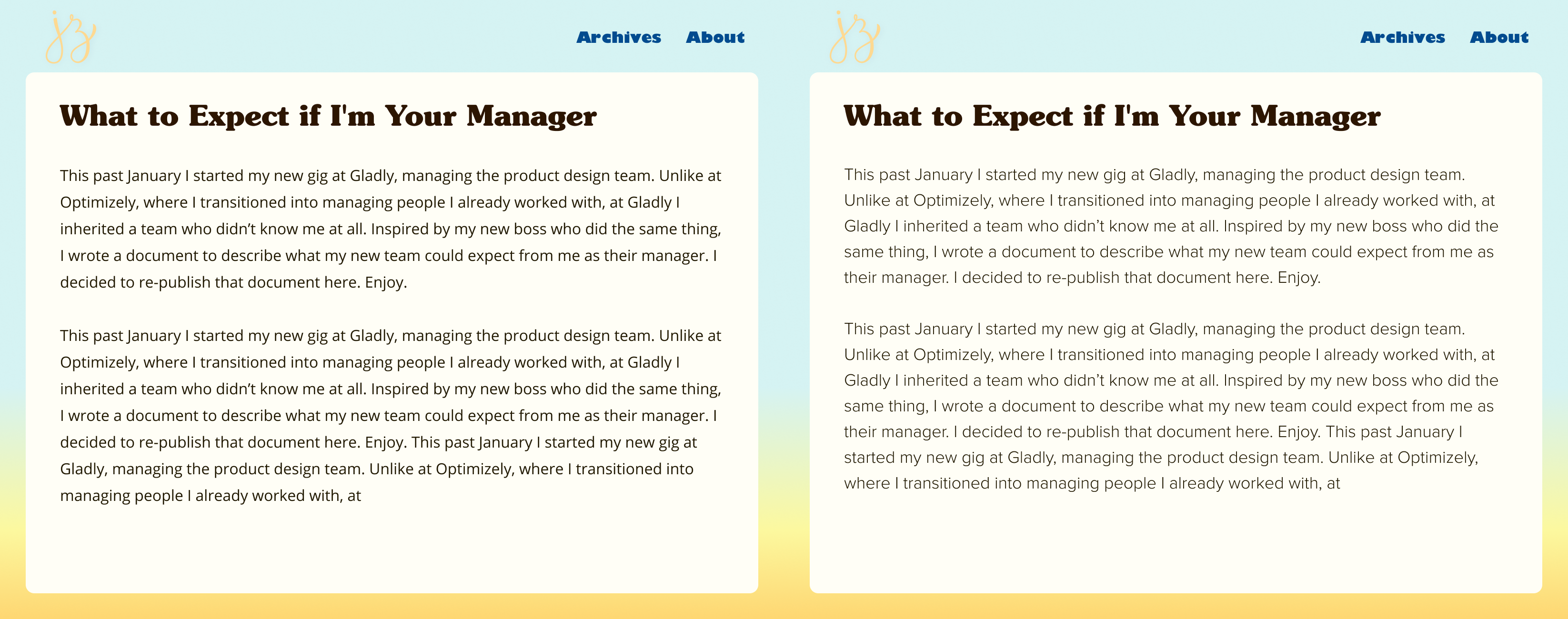
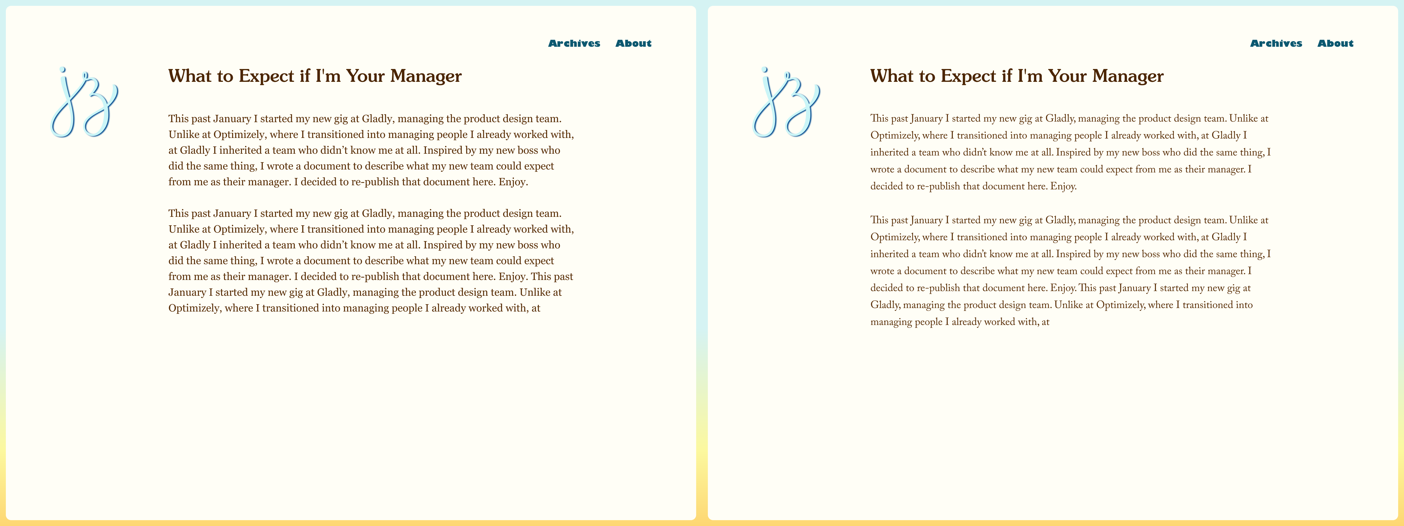
Headlines set as Gastromond on the left, and Souvenir on the right, using an early design exploration.
I went with Souvenir Bold to really lean into its personality. It borders on chunky at times, but the Medium weight felt too timid.
My only complaint about Souvenir is the kerning is sometimes off. At times letters run into each other (like around the lowercase “i"s), and other times my eyes trip over the space between letters (like between "v” and “o”). The kerning of the numbers is also too wide.
Body Copy
Having finally found a headline font, I was on to the next challenge: body copy. The headline took a long time to find, but I was at least chasing a muse, and knew it when I saw it. But I had no idea what to do with the body copy. What pairs with a warm 70s serif? Another serif? A sans-serif? Blackletter? Souvenir is often used in signs, storefronts, posters, and record covers — not editorials. I had no idea where to start.
Since Souvenir is a serif, my first move was to pair it with a sans serif. Classic pairing. But I was never too keen on this idea because my site is a blog, and it’s mostly longform content, so I prefer serifs for their ease of reading and the editorial tone they imbue the text with. I want the content to be taken seriously, so the typeface should reflect that, but still have some warmth to it to match the headline font. It shouldn’t be overly literary or stuffy or newspaper-y.
I first tried some wider sans, including Proxima Nova and Open Sans. But they were still sans, so the reading experience wasn’t great, and overall they just didn’t feel right. Even so, Open Sans wasn’t awful, so I kept it in my back pocket for awhile and used it in Figma while trying out different layouts and colors.
Body copy set in Open Sans on the left, Proxima Nova on the right, in another early exploration.
Then I moved on to some classic serifs, like Times New Roman and Caslon and Georgia, but they felt too stuffy. I liked Georgia the best so far, and it was my leading choice for quite a while. It also had the advantage of being free and preinstalled on everyone’s devices, thus fast to load.
Body copy set as Georgia on the left, Caslon on the right.
At this point, I liked Georgia and Open Sans, but I didn’t love them the way I loved Souvenir. I knew I had to keep pushing to find something better. I asked myself, what is it that’s working about those fonts? The characteristics that gelled with Souvenir were their wide, round, open letterforms, and tall x-heights. Open Sans also had a softness about it that came from a lack of serifs. Nothing that could poke your eye out. These characteristics paired well with Souvenir.
This led me to search for a serif that was round, open, tall x-height, but friendlier and softer and a little lighter than Georgia. Once again, I trawled Adobe Fonts, Google Fonts, Fonts in Use, Typewolf, and more. Searching for a font to meet those requirements was tough — there weren’t filters for the specific attributes I was looking for. I just browsed long lists of serifs for body copy.
On Adobe Fonts I eventually came across Mrs Eaves XL, which is a modern revival of the classic Mrs Eaves, but made for setting “long readerly texts.” It has round, open letter forms, was easy to read at body copy sizes, and was warmer, more human, and lighter than Georgia. It also has beautiful italics (especially the “w” and “v”). I tried it out in Figma and 🙌.
Interface text
Finally, there was the question of what to do with interface copy. Specifically, the navigation and links to Twitter after each post. You may remember from the beginning of this post (which was ages ago in real-time), I tried out Gill Sans. I also tried Gill Sans Black, which is basically its own distinct typeface, and super unique. Neither worked as headlines, but the fun quirkiness of Gill Sans Black stayed with me. On a lark, I ended up setting the navigation links to that in Figma while messing around with other fonts, layouts, and colors, with the assumption that I would change it later.
As it turns out, I never had any other serious contenders. I tried out some other sans serif options, like Verdana, Myriad, and regular Gill Sans, but none of them were doing it for me. After seeing Gill Sans Black in there over and over again it grew on me. When I saw it set alongside Souvenir and Mrs Eaves XL, it worked in a funky, unexplainable way. Certainly not a conventional choice, but I loved how opinionated its personality was, and how that makes it stand out so distinctly from the rest of the type on the site. It clearly signals to visitors that this text is different from everything else you’ve been looking at.
Type Scale
Over 6 months later, I finally had my fonts. The final piece of the puzzle was defining my type scale. I’m not particularly rigorous about this process. No fancy math or ratios to calculate my type sizes, leading, and margins. Instead, I started with some rough sizing in Figma, and then iterated in code so I could make adjustments with real content until it looked right.
My starting point from Figma was too large, so I cut down my headlines across the board. I started with the H4, which is the deepest I go, setting it just large enough to stand out from the copy (easy to do since the typefaces are so different). Then I set the H1 large and in charge to communicate its importance, and lean into its personality.
For H2 and H3, I chose some sizes between H1 and H4. These are always the toughest for me to set because they’re the in the middle. Is it too big? Too small? I dunno 🤷♂️ I try to make sure they’re just different enough to be distinct, that when I scroll through the page they set pieces of text apart from each other, when squinting they still stand out as headlines, and that when all 4 are next to each other they have a clear hierarchy.
I also looked at the spacing between headlines and paragraphs, cutting down the margins between some elements so that the page had a smooth rhythm while scrolling. In other words, no gaps for your eyes to trip over. While going through this process, Frank Chimero blogged about his process for this, which helped me get to my final design.
Game, Set, Match.
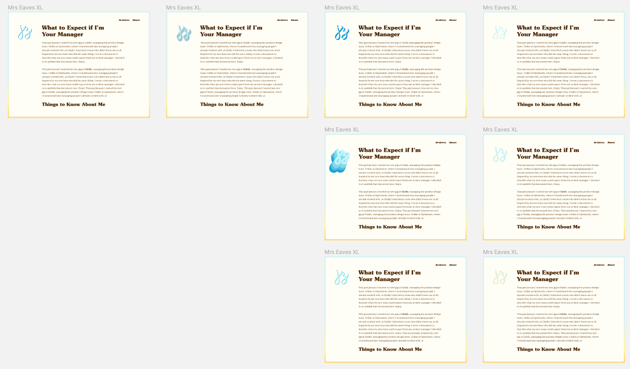
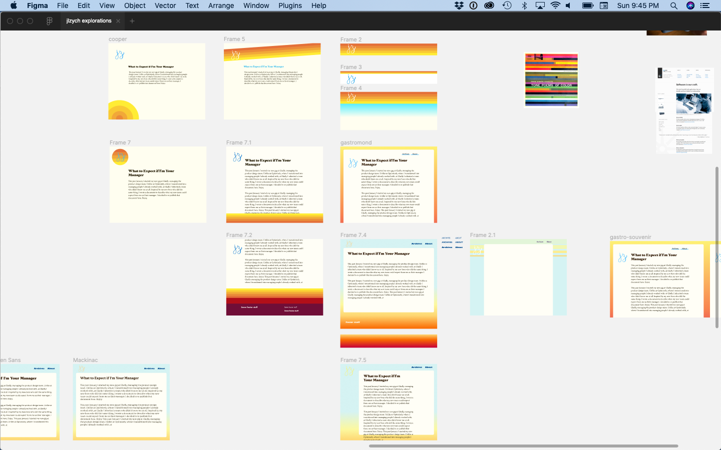
And finally, the better part of a year later, my typography was set. You can check out a fraction of my explorations in the screenshot below, or check out my published Figma file to browse everything.
A fraction of my type explorations (and visual design ideas) in Figma.
It wasn’t an easy process, and the road was far from straight, but in the end I’m really happy with how it turned out.
Having found my guiding concept in my last post (tl;dr is it should feel like me, but on the internet, as expressed through SoCal summer vibes), I started gathering inspiration for how to translate that into colors, fonts, and an overall site design.
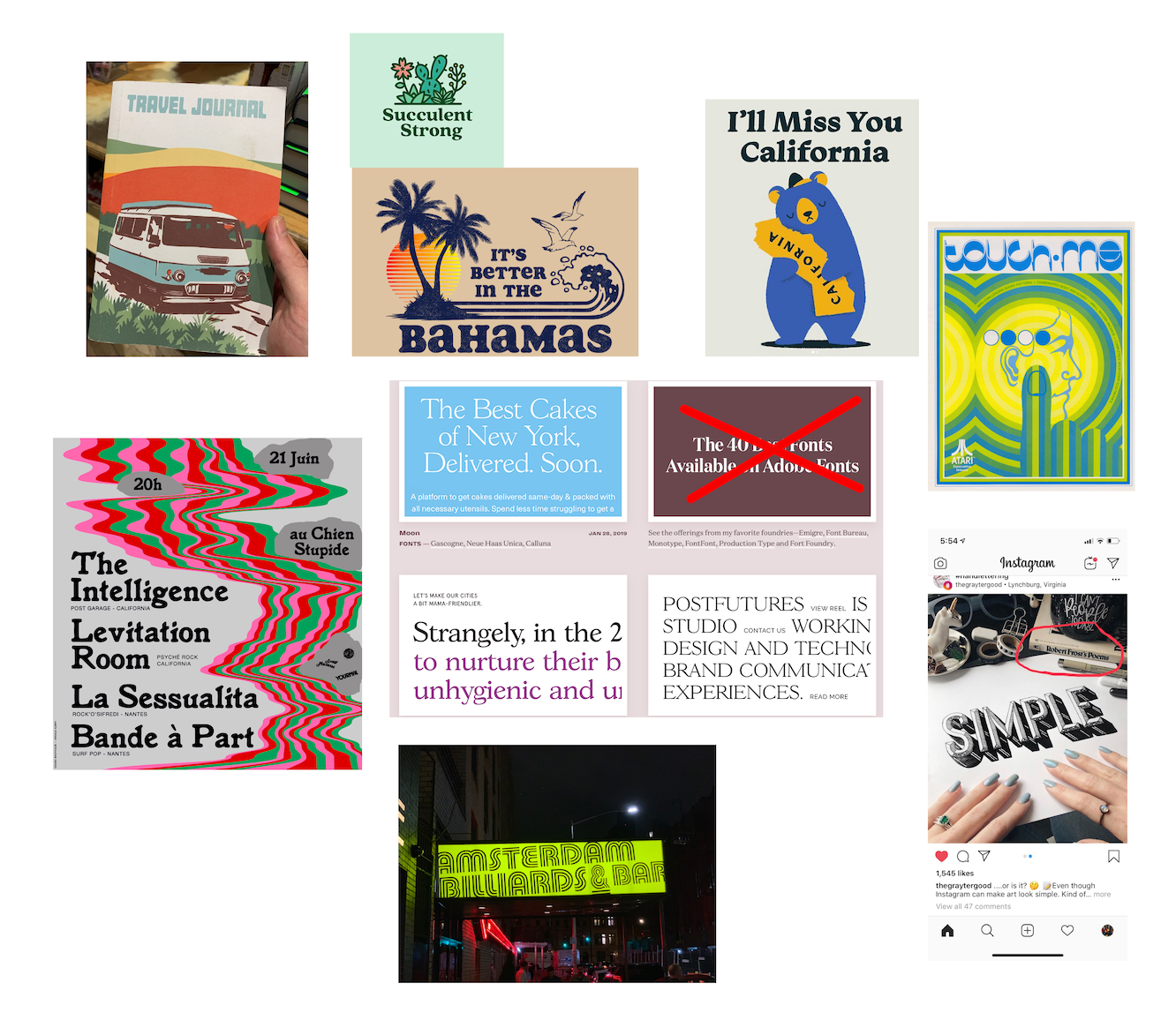
Right off the bat I had a couple of shirts and posters in mind that had the exact vibe I wanted. They said “California” (literally and figuratively), warmth, and summer to me.
Shirts and posters that immediately inspired me. I own the shirts in the top left.
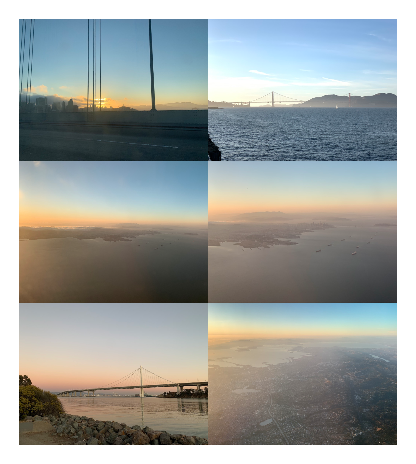
From there, I kept my eyes peeled while browsing Instagram, reading my daily dose of design blogs, and experiencing the world. I screenshotted my favorites and photographed sunsets (specifically the time right when the sun is getting at or below the horizon, which has beautiful oranges, yellows, and a warm blue sky).
Pictures of sunsets that inspired me
Over the months (I wasn’t in a hurry, and this work was mostly passive), I got pulled towards 60s/70s styles, which often have a warm color palette, rounded serifs (like Cooper), and repeating lines and shapes.
60s and 70s graphics I was diggin
For the site itself, I was inspired by a tweet I saw from Jules Forrest praising the site design of Iheanyi Ekechukwu. I loved the gradient border/background, and the otherwise simple layout with its focus on the content. An image immediately snapped into my head of this layout and gradient, but with my 60s/70s summer color palette.
Screenshot of Iheanyi’s website that Jules posted
This gave me enough direction to start choosing typography and a color palette for the site, which I’ll describe in my next posts. In the meantime, check out my Figma file that I published on their community page (which contains spoilers for the actual site design).
 She’s describing one thing, but everyone is imagining something different. Illustrations from fresh-folk.com, created by Leni Kauffman. Composition, speech and thought bubbles added by me.
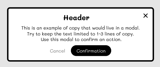 An example of a low-fidelity modal component. Not what the designer showed.
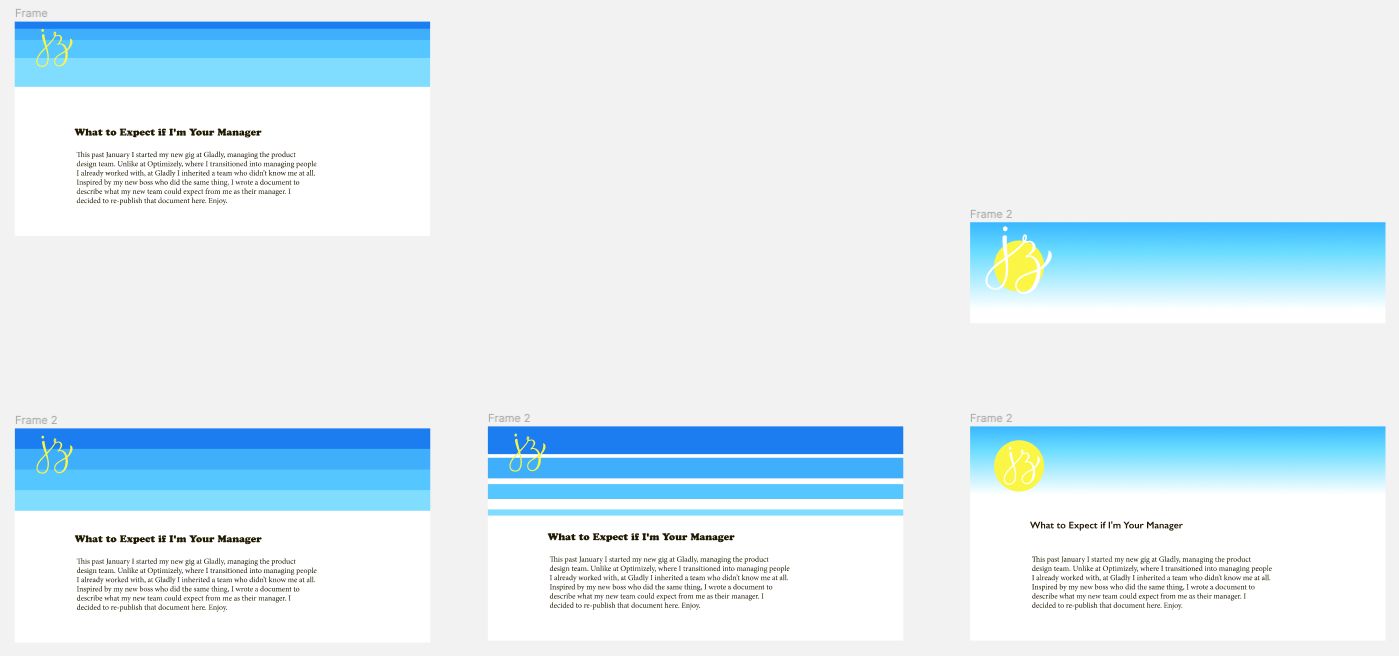