I recently ran a test on Optimizely’s free trial signup page that’s a great example of using social proof to increase conversions. I’ve written about social proof before, but the gist of the idea is that telling a person other people are already using your product or service makes them more likely to also use it. Knowing other people have already taken a particular action reduces perceived risk.
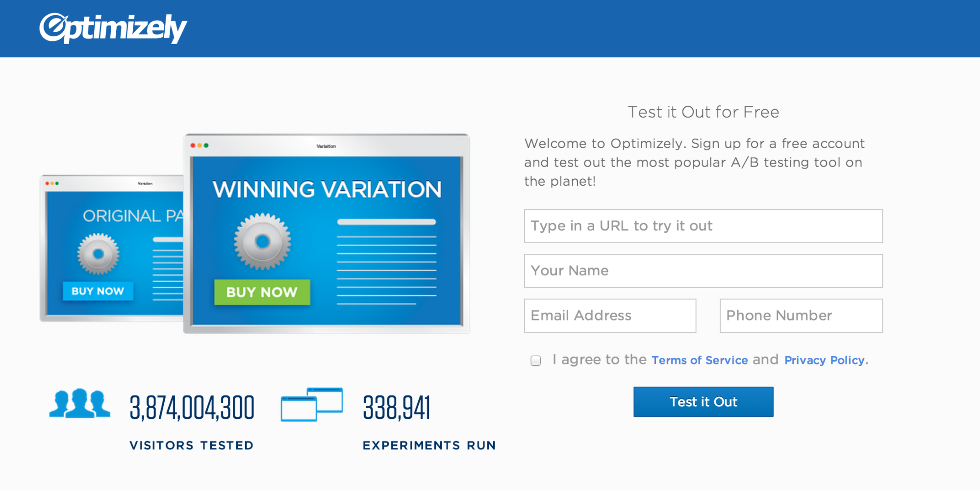
The free trial signup page is a search engine marketing page that people land on when coming from an ad. The page started out as a simple signup form with an image to illustrate split testing, whose primary goal is to get people to sign up for Optimizely. I created a variation that displayed the total number of visitors tested and experiments run with Optimizely, which are live counters that tick up in real time. I wanted to see if using data to demonstrate how many people are already using Optimizely was an effective form of social proof.
Original page with no social proof.
Variation with the total visitors tested and experiments run as social proof.
The test was a definitive win that resulted in an 8.7% lift in sign ups. The change itself was relatively simple (i.e. easy to design, easy to implement), but the test further proved the power of social proof.
A few months ago, myself and the design team created the Optimizely Stylguide (note: the styleguide has been deprecated). It’s a living document of our brand standards and the visual style of our site. Designing, building, and writing the content for it took a significant amount of time, but it was worth the effort. In this post I’m going to explain why we did it.
Why build a styleguide?
A branding one-stop-shop
The original reason we wanted to build a styleguide was because we often get requests from people around the company for our logo. They also like to ask us which blue is our official blue. (It’s #1964af). Providing one place for everyone to access this information, and explaining when and how to use our logos, saves both parties time.
To achieve this goal, we put the full Optimizely logo, the Optimizely O, and our official brand colors on the styleguide’s home page. We provided the logos in png, psd, svg, and eps formats in black, white, and Optimizely blue, which covers the widest use cases. Since this is the primary information that most people are looking for, it makes sense to have it be the most immediately available.
Document our visual style
The second biggest driving force was to provide developers (including myself) documentation of the modules, classes, and mixins that exist in the codebase. It’s important that we maintain a consistent visual style, and re-using classes and mixins helps ensure we’re consistent. It also speeds up development. There have been a lot of times that I’ve written a mixin or class that someone didn’t know about, and they re-implemented it in a different area of our code. Documenting these styles helps prevent this.
Furthermore, complex widgets that require a combination of HTML, CSS, and JS to function properly (such as popovers and dialog boxes) are hard to figure out just from reading source code. Explaining how to add these modules to a page, and all of their styling and JS options, is invaluable.
In addition to just explaining how something works, we also wanted to document when it’s appropriate to use these various modules. You also can’t get this from reading code alone. This helps both engineers and designers understand when to use a popover instead of a tooltip, for example.
This content is the meat of the site, and the parts that change most frequently (in fact, many still need to be written). We decided the most effective way to document these elements was to create real, working examples with HTML, CSS, and JS, rather than just provide static screenshots. This allows developers to interact with the widgets, see how they behave, and inspect the code. It also makes it easier to communicate complex modules, such as popovers and dialog boxes. We took a lot of inspiration from Twitter’s Bootstrap and Zurb’s Foundation, which are both fantastic examples of using working code as documentation.
Code conventions
Along with documenting the various modules and classes we have available, we also wanted a place to explain our frontend code conventions (e.g. how to name classes, how files are organized, etc.). This is especially useful for new developers who are getting up to speed, but is also beneficial as a reference for all developers.
Shake out inconsistencies
Finally, a secondary goal and benefit of documenting our styles is that it brings us face to face with inconsistencies that need to be ironed out. There have been numerous times that writing down how something works made these inconsistencies obvious. This acts as a great forcing function to get us to have consistent styles (although we haven’t had time to fix all of them).
Conclusion
In the months since the guide was released, it has been successful at achieving each of these goals. Various people around the company consult it regularly for our logos and colors; developers refer to it when implementing common modules; new developers have learned our coding conventions on their own; and we’ve found many ways to improve our visual style and code. Taking the time to build and document our brand guidelines and frontend code was well worth the effort, and I recommend anyone else who works on a moderately complex site build their own styleguide.
Anyone who has ever ignored to-do lists knows that any friction between yourself and your goal leads to frustration and potentially giving up altogether. This lesson applies to real life equally as well as it does to visitors on your website.
If people sign up for something, how do you get them to actually follow through? Of course, anything that reduces friction is good for everyone involved, but there are often limitations to how much you can realistically remove. So how do you optimize these kinds of experiences? One technique is to explicitly spell out the next steps. Knowing the steps ahead of time makes the process easier to finish and overall less daunting. This theory is known as channel factors.
In 1965, psychologist Howard Levanthal studied this phenomenon [pdf] by trying to persuade college students to get a tetanus vaccination. He distributed documents describing the risks of tetanus and the value of inoculation among two groups of people. The first group received just the information sheet, whereas the second group received the information sheet along with a campus map with the infirmary circled. Follow up surveys showed the communication was effective in changing beliefs and attitudes in both groups, but the number of people who actually followed through varied drastically. Only 3% of the first group got inoculated, compared to 28% of the group that also received a map.
The key difference is that the map reduced the friction to following through. Just telling students to get vaccinated created a barrier: where do I go? Showing the students where to get the shot and urging them to pencil time on their calendar eliminated this barrier. In contrast, the group that only received the info sheet had no clear plan of how to get vaccinated. This made the task more abstract and difficult to complete, so fewer people followed through with an appointment.
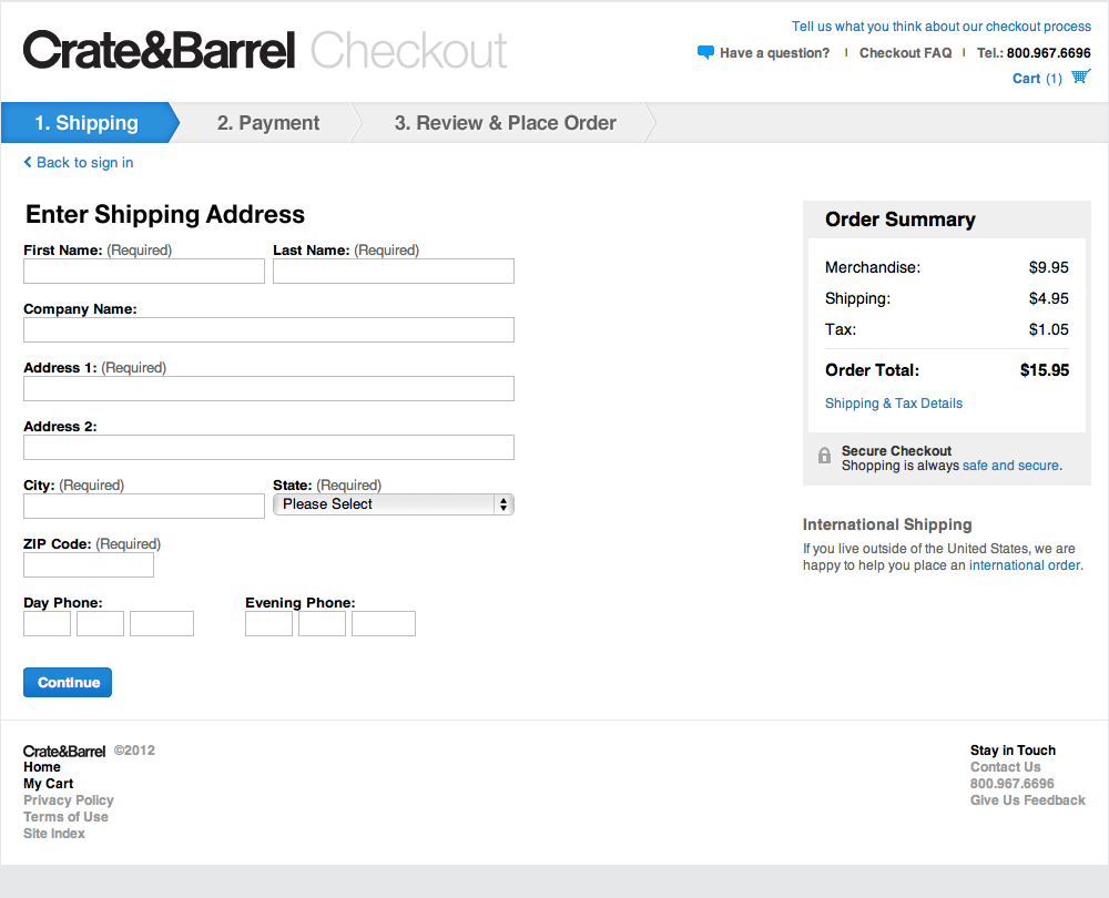
The implication for a website is clear: remove barriers to success. Make the next steps explicit, and provide as much information as possible to enable people to follow through. A great example of this is Create&Barrel’s checkout funnel, which was ranked as the top e-commerce checkout user experience by the Baymard Institute. (Note: since this rating, Crate&Barrel has done more A/B testing to further improve their checkout funnel). First of all, they reduced the funnel to as few steps as possible: Shipping; Payment; and Review & Place Order. Second, they clearly spell out each of these steps from the start, telling the user what they’ll need to do to place their order. Without this, people don’t have any expectation of how long the checkout process could take, and are more likely to drop out partway through.
Crate&Barrel’s checkout funnel spells out each step for the user, which helps them complete their purchase.
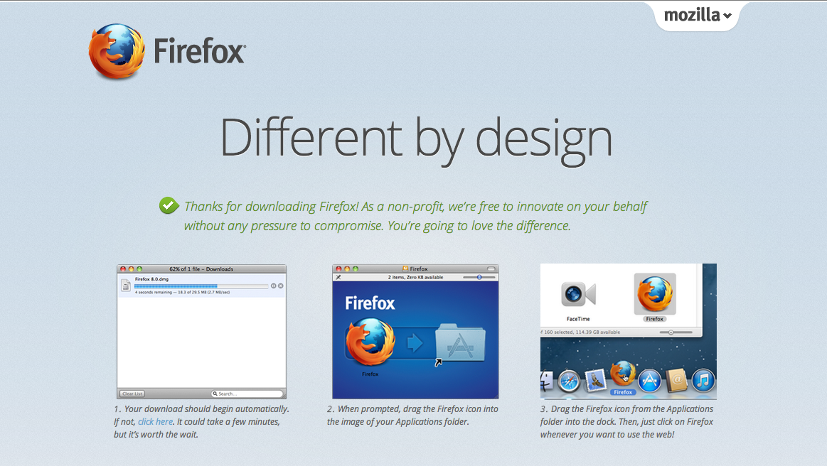
This technique is especially useful for actions that take place off of the website, such as installing software. Firefox does a great job of this by listing each step with screenshots. This helps all users, technical and non-technical, successfully install their browser.
Firefox’s download page walks the user through the exact steps they must go through to install their browser, which increases the chances users will install their product.
These examples just scratch the surface of how channel factors can help you increase conversions. They key is to put yourself in the shoes of your users and ask yourself, “What additional information do I need to complete this task? What barriers are preventing me from reaching my goal?” Although they may look obvious to you, it won’t to your customers.
Do you want your users to:
Call, email, or write a politician? Provide a pre-written template that they just need to populate with their name.
Volunteer for a cause? Show them a map of the closest location and the next time they can attend.
Attend a live webcast? Provide an “Add to Calendar” button.
Use your product or service? List each of the steps users have to go through to use it.
Use a new (or even existing) feature? Figure out where in the flow of using your product this feature fits, and explicitly tell them to use it at the end of the previous step.
Any objective on your site that requires completing a series of steps can potentially benefit from applying the lessons behind channel factors. Increase the chances that a visitor follows through on what they signed up for by providing all the help you can. When in doubt, over explain and be direct — even when the directions may seem obvious to you and your team. By A/B testing, you will ultimately find an optimized design somewhere between hit-you-over-the-head-obvious and confusion.
I recently read Smashing Magazine’s article “On Creative Leadership” that talks about creating an environment in which people can be creative. This section really resonated with me because it’s something we do occasionally at Optimizely, and talk about doing more of:
Every month, my team and I enter our planning room for at least three hours. We lock the doors, opening it only for pizza and beer deliveries. Our mission is to solve one problem. In past sessions, we have redesigned the user interface that powers our systems, solved marketing problems by “remarketing,” and found new and creative ways to present information. The role of an impresario has had such a direct and positive impact on the way we do business that I am now introducing the role to every team in our 100+ person company.
Why does having an impresario work? Well, certain rules guide the team to moments of insight:
Identify a very specific problem to solve, and stay focused.
Provide the necessary tools to spark inspiration (white boards, markers, paper, etc.).
Be technology-agnostic! Don’t worry about how you will solve the problem; focus only on the why.
There are no wrong answers; some are just better than others.
Celebrate failures.
My team looks forward to their time spent locked up together because it gives us an opportunity to be creative in front of each other. Support their ideas, and help them grow. Don’t force your opinions and thoughts. If the group is moving in the wrong direction, ask them questions until they find the right path.
The design team at Optimizely has done this a few times, and it’s always been extremely rewarding and productive. For example, recently another designer and myself locked ourselves in a room all day to redesign our jobs page. By the end of the day, the page was almost fully coded.
This setting allowed us to be productive for two key reasons. First, we were insulated from distractions, which can quickly kill productivity and focus. Second, we had instant, high-bandwidth communication that enabled quick feedback and input from each other when needed. No waiting around for emails or responses via IM.
Given the success of this and other similar sessions, we intend to do more of these focused work sessions in the future to foster our creativity and productivity.
SASS has a lot of really powerful features to help you write DRY code quickly. One such feature is @extend, which I find is overlooked by many developers but can be very useful when used properly.
@-what?
First, a little background on @extend. It allows a selector to extend the styles of another selector, essentially providing a form of sub-classing. @extend works by combining selectors into a single comma-separated selector. A simple example:
The SASS docs give a fuller explanation of how it works, and its limitations.
Why it’s great
@extend can cut down duplicate styles and selectors. Modules derived from a base style can all @extend the parent, and all the sub-classes will be added to the base selector. Alternative ways to achieve this in SASS include using mixins to output the base styles (which just adds bloat to the stylesheet, since the same set of rules is output multiple places in the final CSS); duplicate the properties in each selector (violates the principle of DRY and is a maintenance nightmare); or manually add each new selector to the base selector (also violates DRY and also is a maintenance nightmare, and the exact problem @extend was designed to solve).
Placeholder selectors
Placeholder selectors make @extend even sweeter. They are selectors that aren’t output unless extended by another selector (also known as abstract classes in OOP). It doesn’t sound like much, but I often run into situations where I have some classes (or elements) that share common styles, but I don’t need the base class in the HTML or CSS. For example:
Each container selector has to be typed out twice – once for their shared styles, and again for their specific styles. Not a big deal here, but quickly becomes unweildy the more sub-containers you add. Placeholder selectors can help us here:
Now the common styles are in one place, and each class is in one place. This pays off the more selectors you have extending the placeholder.
You can also feel guilt-free about using unsemantic, descriptive names, since the placeholder itself isn’t output in the final CSS. They are purely for yourself and other developers.
Dangers of @extend
As with any SASS you write, you need to keep an eye on the final CSS it outputs. If you @extend a class that’s used in many places, the selector will be copied to every instance of that class (even if it’s nested in other selectors). This is often unnecessary, and can cause unintended side effects (I ran into a nasty styling bug because of this once).
For example, a .button class is originally defined in one place, but modified to look slightly different in a dialog. When extending it, you only wanted the original styles, but the new selector is copied into the dialog button as well. This wasn’t what you intended, isn’t necessary, and bloated your final CSS. Before extending classes, check everywhere they’re defined and make sure you want your selector to be duplicated in all of those places. (Arguably, this is bad CSS to begin with [you shouldn’t change a button style based on the dialog context in the first place], but in real world CSS it happens).
Additionally, the depth and breadth of selectors you have nested under the base selector, combined with the number of selectors extending the base, can create some very long selectors, not all of which are necessary. Once again, pay attention to the CSS that’s being compiled. And once again, this is arguably bad SASS (mind the Inception Rule), but these things happen in legacy codebases with multiple developers.
Closing Thoughts
Extending selectors can save you time and DRY out your code, when used properly. As with most SASS features, it can be abused and create some pretty hairy CSS, but as long as you keep an eye on the final CSS you’ll be fine.