Using Channel Factors to Increase Offline Conversions
Anyone who has ever ignored to-do lists knows that any friction between yourself and your goal leads to frustration and potentially giving up altogether. This lesson applies to real life equally as well as it does to visitors on your website.
If people sign up for something, how do you get them to actually follow through? Of course, anything that reduces friction is good for everyone involved, but there are often limitations to how much you can realistically remove. So how do you optimize these kinds of experiences? One technique is to explicitly spell out the next steps. Knowing the steps ahead of time makes the process easier to finish and overall less daunting. This theory is known as channel factors.
In 1965, psychologist Howard Levanthal studied this phenomenon [pdf] by trying to persuade college students to get a tetanus vaccination. He distributed documents describing the risks of tetanus and the value of inoculation among two groups of people. The first group received just the information sheet, whereas the second group received the information sheet along with a campus map with the infirmary circled. Follow up surveys showed the communication was effective in changing beliefs and attitudes in both groups, but the number of people who actually followed through varied drastically. Only 3% of the first group got inoculated, compared to 28% of the group that also received a map.
The key difference is that the map reduced the friction to following through. Just telling students to get vaccinated created a barrier: where do I go? Showing the students where to get the shot and urging them to pencil time on their calendar eliminated this barrier. In contrast, the group that only received the info sheet had no clear plan of how to get vaccinated. This made the task more abstract and difficult to complete, so fewer people followed through with an appointment.
The implication for a website is clear: remove barriers to success. Make the next steps explicit, and provide as much information as possible to enable people to follow through. A great example of this is Create&Barrel’s checkout funnel, which was ranked as the top e-commerce checkout user experience by the Baymard Institute. (Note: since this rating, Crate&Barrel has done more A/B testing to further improve their checkout funnel). First of all, they reduced the funnel to as few steps as possible: Shipping; Payment; and Review & Place Order. Second, they clearly spell out each of these steps from the start, telling the user what they’ll need to do to place their order. Without this, people don’t have any expectation of how long the checkout process could take, and are more likely to drop out partway through.
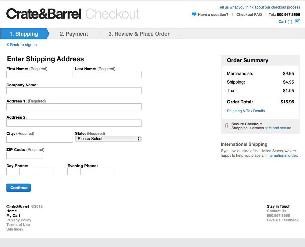
Crate&Barrel’s checkout funnel spells out each step for the user, which helps them complete their purchase.
This technique is especially useful for actions that take place off of the website, such as installing software. Firefox does a great job of this by listing each step with screenshots. This helps all users, technical and non-technical, successfully install their browser.
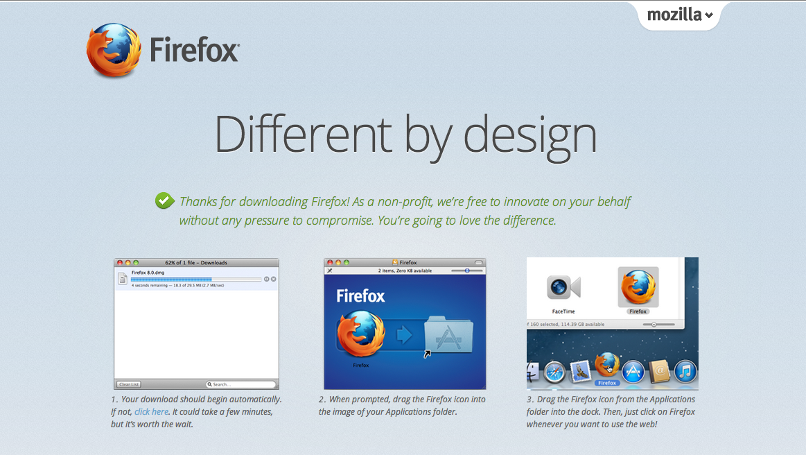
Firefox’s download page walks the user through the exact steps they must go through to install their browser, which increases the chances users will install their product.
These examples just scratch the surface of how channel factors can help you increase conversions. They key is to put yourself in the shoes of your users and ask yourself, “What additional information do I need to complete this task? What barriers are preventing me from reaching my goal?” Although they may look obvious to you, it won’t to your customers. Do you want your users to:
- Call, email, or write a politician? Provide a pre-written template that they just need to populate with their name.
- Volunteer for a cause? Show them a map of the closest location and the next time they can attend.
- Attend a live webcast? Provide an “Add to Calendar” button.
- Use your product or service? List each of the steps users have to go through to use it.
- Use a new (or even existing) feature? Figure out where in the flow of using your product this feature fits, and explicitly tell them to use it at the end of the previous step.
Any objective on your site that requires completing a series of steps can potentially benefit from applying the lessons behind channel factors. Increase the chances that a visitor follows through on what they signed up for by providing all the help you can. When in doubt, over explain and be direct — even when the directions may seem obvious to you and your team. By A/B testing, you will ultimately find an optimized design somewhere between hit-you-over-the-head-obvious and confusion.