I finally finished “The Gift,” by Lewis Hyde, after reading it on and off for at least the last 4 months (probably more). Overall I really enjoyed it and found it very thought-provoking. At its core it’s about creativity, the arts, and the tension between art and commerce — topics which are fascinating to me. It explores the question, how do artists make a living in a market-based economy? (I say “explores the question” instead of “answers” because it doesn’t try to definitively answer the question, although some solutions are provided).
It took me awhile to finish, though, because the book skews academic at times, which made some sections a slog to get through. The first half goes pretty deep into topics including the theory of gifts, history of gift-giving, folklores about gifts, and how gift-based economies function; the latter half uses Walt Whitman and Ezra Pound as real-life examples of the theory-based first half. Both of these sections felt like they could have been edited down to be much more succinct, while still preserving the main points being made. This would have made the book easier to get through, and the book’s main points easier to parse and more impactful.
There’s a sweet spot in the middle, however, which is a thought-provoking account of the creative process and how artists describe their work. If I were to re-read the book I’d probably just read Chapter 8, “The Commerce of the Creative Spirit.”
The book makes a lot of interesting points about gifts and gift-giving, market economies, artists and the creative process, how artists can survive in a market economy, and the Cold War’s affect on art in America, which I summarize below.
On Gifts and Gift-Giving
Gifts need to be used or given away to have any value. Value comes from the gift’s use. They can’t be sold or stay with an individual. If they do, they’re wasted. This is true of both actual objects and talent.
Gift giving is a river that needs to stay in motion, whereas markets are an equilibrium that seeks balance.
Giving a gift creates a bond between the giver and recipient. Commerce leaves no connection between people. Gifts foster community, whereas commerce fosters freedom and individuals. Gifts are agents of social cohesion.
Gifts are given with no expectation of a return gift. By giving something to a member of the community, or the community itself, you trust that the gift will eventually return to you in some other form by the community.
Converting a gift to money, e.g. by selling it on the open market, undermines the group’s cohesion, fragments the group, and could destroy it if it becomes the norm.
Gift economies don’t scale, though. Once it grows beyond the point that each member knows each other to some degree it will collapse.
On Market Economies
Market economies are good for dealing with strangers, i.e. people who aren’t part of a group, people who you won’t see again. There’s a fair value to exchange goods and services with people outside the group, and no bond is created between people.
Markets serve to divide, classify, quantify. Gifts and art are a way of unifying people.
On Artists and the Creative Process
Artists typically don’t know where their work comes from. They produce something, then evaluate it and think, “Did I do that?”
To produce art, you have to turn off the part of your brain that quantifies, edits, judges. Some artists step away from their work, go on retreats, travel, see new things, have new experiences, take drugs, isolate themselves, and so on. The act of judging and evaluating kills the creative process. Only after a work of art is created can an artist quantify it and judge it and (maybe) sell it.
Art is a gift that is given to the world, and that gift has the power to awaken new artists (see above, gifts must keep moving). That is, an artist is initially inspired by a master’s work of art to produce their own. In this way, art is further given back to the world, and the cycle of gift-giving continues.
Each piece of work an artist produces is a gift given to them by an unknown external agent, and in turn a gift they pass on to the world.
Artists “receive” their work – it’s an invocation of something (e.g. “muse”, “genius”, etc.). The initial spark comes to them from a source they do not control. Only after this initial raw “materia” appears does the work of evaluation, clarification, revision begin. Refining an idea, and bringing it into the world, comes after that initial spark is provided to them by an external source.
Artists can’t control the initial spark, or will it to appear. The artist is the servant of the initial spark.
Evaluation kills creativity – it must be laid aside until after raw material is created.
The act of creation does not empty the wellspring that provided that initial spark; rather, the act of creation assures the flow continues and that the wellspring will never empty. Only if it’s not used does it go dry.
Imagination can assemble our fragmented experiences into a coherent whole. An artist’s work, once produced, can then reproduce the same spirit or gift initially given to them in the audience.
This binds people by being a shared “gift” for all who are able to receive it. This widens one’s sense of self.
The spirit of a people can be given form in art. This is how art comes to represent groups.
The primary commerce of art is gift exchange, not market exchange.
How Artists Can Survive in a Market Economy
The pattern for artists to survive is that they need to be able to create their work in a protected gift sphere, free of evaluation and judgment and quantification. Only then, after the work has been made real, can they evaluate it and bring it to market. By bringing it to the market they can convert their gift into traditional forms of wealth, which they can re-invest back in their gift. But artists can’t start in the market economy, because that isn’t art. It’s “commercial art,” i.e. creating work to satisfy an external market demand, rather than giving an internal gift to the world.
There are 3 ways of doing this:
Sell the work itself on the market — but only after it’s been created. Artists need to be careful to keep the two separate.
Patronage model. A king, or grants, or other body pays for the artist to create work.
Work a job to pay the bills, and create your work outside of that. This frees artists from having to subsist on their work alone, and frees them to say what they want to say. This is, in a sense, self-patronage.
Bonus way: arts support the arts. This means the community of artists creates a fund, or trust, that is invested in new artists. The fund’s money comes by taking a percentage of the profits from established artists. This is another form of patronage.
But even using these models, Hyde is careful to point out that this isn’t a way to become rich – it’s a way to “survive.” And even within these models there are still pitfalls.
Soviet Union’s affect on art in America
In the 25th Anniversary edition afterword, Hyde makes the connection that the Cold War spurred America to increase funding to the arts and sciences to demonstrate the culture and freedom of expression that a free market supports. A communist society, on the other hand, doesn’t value art and science since they don’t typically have direct economic benefit, and thus doesn’t have the same level of expression as a free market. The end of the Cold War, unfortunately, saw a decrease in funding since the external threat was removed. This was an interesting connection that I hadn’t thought about before.
Final Thoughts
All in all, a very thought-provoking book that I’m glad I read.
Update 3/23/18: I created a Skillshare class to teach you how to implement a Discovery process at your organization.
In my previous article, I described how we transformed our Agile development process at Optimizely to include research and design by implementing our own flavor of Discovery kanban. This process gives designers and researchers space to understand our customer’s problems and explore solutions before we commit to shipping new features. In this article, I’ll go a level deeper to describe all the stages research and design work moves through during the discovery process.
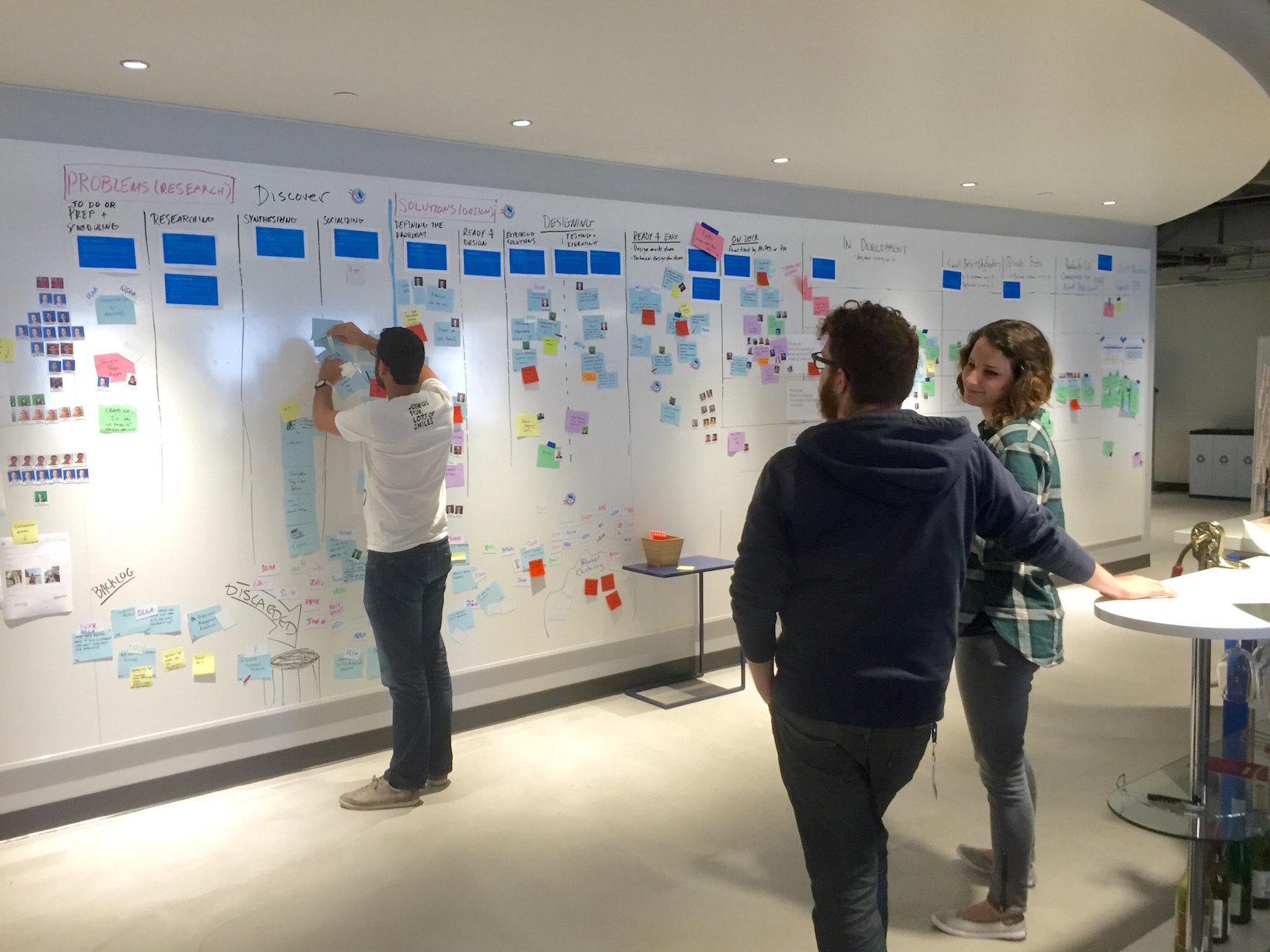
Updating work on the Discovery kanban board
Background
The Discovery kanban board is based on the double-diamond model of design, which visualizes the design process as two connected diamonds. The first diamond represents understanding the problem, and the second diamond represents solving the problem. Diamonds are used to communicate that work alternates between divergent phases, in which ideas are broadly explored, and convergent phases, in which ideas are filtered and refined. Peter Merholz, a founding partner of UX consulting company Adaptive Path, has a nice overview of double diamond design.
The diamonds represent different kinds of work, with defined inputs and outputs, so I adapted each diamond into a kanban board. A kanban board is simply a series of stages, represented as columns, that work moves through, with acceptance criteria that dictate when items move into each stage.
The first kanban board is Problem Understanding, where we gather information to understand and frame the problem. The second kanban board is Solution Exploration, where we take the output of Problem Understanding and solve the specific problem we identified. Together, they make up Optimizely’s Discovery kanban process.
Overview of Discovery kanban at Optimizely
Problem Understanding
The goal of the Problem Understanding phase is to understand, refine, and frame the problem so it’s concrete and solvable. The input is a problem area to study further, and the output is a deeper understanding of the problem (often in the form of a report or presentation). The output either feeds directly into the Solution Exploration backlog, or it’s general knowledge that benefits the company (e.g. helps us make a strategic decision).
Work on this board moves through 5 columns: Backlog, To Do, Researching, Synthesizing, and Socializing.
Problem Understanding kanban board
Backlog
“Backlog” is just a bucket of problem areas and pain points. It isn’t prioritized, and anyone can put a card up on the board. There’s no promise that we’ll work on it, but it’s at least captured and we can see what people are thinking about.
The cards themselves are typically written in the form of a question to answer, e.g. “What metrics do people want to track?” But sometimes we just write a problem area to study, e.g. “New metrics & metrics builder.”
To Do
Each week, we take items out of Backlog and move them into “To Do.” We typically prioritize items based on how big of a problem they are for customers (with input from the product vision, roadmap, and company priorities), but this isn’t a strict rule. For example, we may need some data to make a strategic decision, even if it isn’t the “biggest” problem.
After an item has been prioritized, we write up a research plan to answer the question. This includes choosing a research method(s) that’s best suited to answering this question. There’s no prescribed format for the research plan, but at a minimum it specifies what question we’re answering and the research method to use.
The research method could be a qualitative method, such as customer interviews or contextual inquiry, or a quantitative method, such as sending a survey, analyzing server logs, or querying the data warehouse. For some problems we use a combination of different methods.
Researching
Once a research plan has been agreed upon, work moves into the “Researching” stage. This means we execute the research plan — customer interviews are scheduled, a survey is sent out, analytics are analyzed, and so on. This stage is divergent — we go broad to gather as much data related to the problem as we can.
Synthesizing
After gathering data in the Researching stage, work moves into the “Synthesizing” stage. We analyze the data we’ve gathered for insights and, hopefully, a deeper understanding of the problem. This stage is convergent — we are filtering and focusing the data into concrete takeaways and problems to be solved.
Socializing
Once the research has been synthesized, it moves into the “Socializing” phase. The bulk of the work is done, but the outcome is being shared with the team or company. This takes the form of meetings, a presentation, a written report, opportunity assessment, or whatever format is appropriate for the problem being studied. At the very least, a link to the research plan and the data captured is shared with the team.
Sometimes we learn that a problem is especially complicated and the research plan wasn’t sufficient to understand it. If so, we may do more research (if this problem is important enough), or just make the best decision we can based on the data we do have.
After studying a particular problem, the work either ends there (in the case of things like personas or data to inform product strategy), or it turns into a problem for design to solve. In the latter case, work moves into the Solution Exploration backlog.
Solution Exploration
Once we understand the problem, we can start designing solutions to it. We track this work on the Solution Exploration board (a.k.a. the second diamond in double diamond design). A problem may have UX challenges to solve, technical challenges to solve (i.e. is this feasible to build?), or both. The output of the Solution Exploration phase is a finished solution to build. The solution is either a complete UI, such as mockups or a prototype, or a technical solution, such as a technical design doc or a technical prototype, which can be implemented in a production environment.
In this phase, work also moves through 5 columns: Backlog, To Do, Exploring & Thinking, Iterating & Deciding, and Ready to be Built.
Solution Exploration kanban board
Backlog
Just like in Problem Understanding, work starts life in the “Backlog.” This is a big pool of problems to solve, and anyone can add items to it. But once again, just because it’s in the backlog doesn’t mean we’ll work on it — it still needs to be prioritized.
To Do
Each week we prioritize items in the Backlog and move them into “To Do.” This means we have a well-formed problem, informed by data (typically generated in Problem Understanding, but may come from other sources), that the team will design a solution to. For most problems, we formally write out a what the problem is, why it’s worth solving, who we’re solving it for, and the scope. (View the template on Google Drive).
Writing out the problem before jumping into solutions ensures the team is aligned on what we’re solving, which prevents wasted work and changing scope after a project begins. It also surfaces assumptions or incomplete data we may have, which would mean we need to go back to Problem Understanding to gather more data.
Exploring & Thinking
After a problem definition has been written, work moves into the “Exploring & Thinking” stage. This means we’re exploring solutions to the problem. This could be sketching, prototyping, building technical proof-of-concepts, researching potential libraries or frameworks, writing technical design docs, or whatever method is best for exploring possible solutions. This stage is divergent — a broad range of possible solutions are being explored, but we’re not filtering or refining any particular solution yet.
Iterating & Deciding
Once a broad range of solutions have been explored, we move into the “Iterating & Deciding” stage. This means potential solutions are being evaluated and refined. Tradeoffs and approaches are being discussed with relevant groups. This stage is convergent — ideas are being refined into a single, finished solution.
There isn’t strict criteria for whether an item is in “Exploring & Thinking” or “Testing & Iterating.” The creative process is somewhat chaotic and people often switch between an “exploring” and “refining” mindset throughout a project. But there’s typically an inflection point at which we’re doing more refining than exploring. The exact column work is in is up to the person doing it.
Having 2 columns may sound unnecessary, but it’s useful for two reasons. First, it helps communicate where in the creative process work is (especially early stage vs. late stage). This helps designers, engineers, and PMs have better discussions about the solutions being explored. Second, it encourages people to separate divergent thinking from convergent thinking. It’s easy to just go with the first idea, but that’s rarely the best solution. By encouraging exploration, we increase the odds that we’ll choose the best solution.
Ready to be Built
After we’ve iterated enough we’re left with one finished solution that’s ready to be built and shipped to customers. A “finished solution” is one for which all edge cases have been thought through, it’s been vetted by relevant parties, and there are no major questions open that would slow down development. Finished solutions are in the form of mockups or a prototype, if a UX solution, or a technical design doc or proof-of-concept, if a technical feasibility solution. The finished solution then moves into engineering’s backlog, where it gets prioritized against all the other potential work to be done.
Together, the Problem Understanding and Solution Exploration kanban boards make up Discovery kanban. The definition of each column may sound prescriptive, but it’s actually a suggested process to follow. Work doesn’t always move linearly through each column, and we aren’t sticklers about meeting exact acceptance criteria to move work forward. The important thing is that we’re working together to solve our customer’s biggest problems, ultimately increasing customer value and business value.
Since implementing this process we’ve gotten better at prioritizing the biggest customer problems to understand, have space to explore solutions to those problems, and are regularly shipping work to customers. No process is perfect, but we’re always trying to improve how we work in an effort to consistently ship great products to our customers.
How we transformed our Agile process to include research and design
Discovery work planning meeting
Update 3/23/18: I created a Skillshare class to teach you how to implement a Discovery process at your organization.
Like most tech startups, Optimizely uses an Agile process to build software. Agile has been great at helping us plan what we’re building, coordinate across teams, and ship iteratively. Agile’s focus, however, is on shipping working software, which meant design and research were awkwardly shoehorned into the process.
Scrum, according to HBO’s Silicon Valley
Practically speaking, this meant we got into a habit of building a feature while it was being designed. This put pressure on designers to produce mockups of a feature in order to “unblock” engineers, which didn’t give them room to understand the problem and iterate on solutions. And it rarely provided space for our researchers to gather data to understand the problem, or do usability testing.
This caused problems on the engineering side, too: since engineers were building a feature while it was being designed, the requirements were shifting as we explored solutions. This slowed down the development process since they would have questions about what to build, and features would have to be rewritten as the designs evolved. This also made it hard to estimate how long it would take to build, which led to missed deadlines, cutting corners (such as not writing unit tests and or doing formal QA), and low morale.
In short, our process didn’t have high velocity or produce high quality solutions.
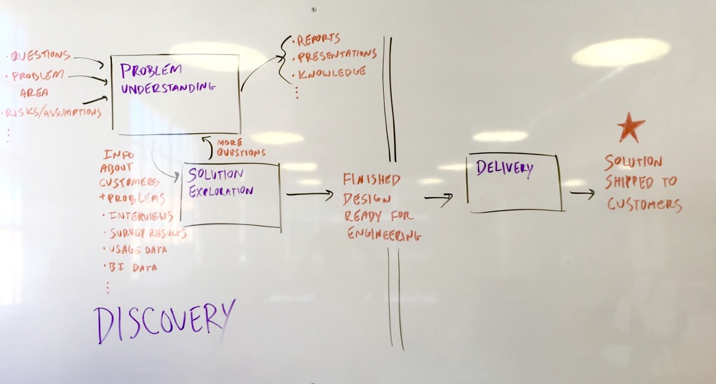
To improve this situation, we split our product development process into two phases: Discovery and Delivery. In the Discovery phase, the goal is to understand and solve our customer’s problems. The output is finished designs that solve for all use cases. After designs are done, work moves into the Delivery phase. The goal of this phase is to ship the finished solution to customers, and uses our standard Agile process to manage and plan the work.
The key to this system is that design and research are an explicit part of the process, and there is acceptance criteria that must be met before engineers write any code.
Diagram of Optimizely’s product development process
To help with organizational buy-in and planning, Discovery work is tracked on a physical kanban board in our office. The board is split into two parts: Problem Understanding (Research), and Solution Exploration (Design). In the Problem Understanding phase we gather data to help us understand and frame the problem. Data includes both qualitative and quantitative data, such as customer interviews, surveys, support tickets, sales call feedback, product usage, and NPS feedback. That data either becomes general company knowledge, such as our user personas, or feeds directly into the Solution Exploration phase.
In Solution Exploration, designers use the data gathered during Problem Understanding to frame the problem to be solved. Designers explicitly write down what the problem is, use cases, target users, and anything that’s out of scope. After getting buy-in from the PM and team, they explore solutions by creating sketches, wireframes, and prototypes. Engineers are looped in to provide feedback on technical feasibility. Researchers do usability testing in this phase as well. Finally, the output is finished designs that are fully thought through. This means there are no open questions about what a feature does that would slow down an engineer during development.
Optimizely’s Discovery kanban board
Is this waterfall?
This process is more structured than our previous Agile process, but not as rigid as a typical waterfall process. We don’t “throw work over the wall” to each other, stop requirements from changing, or rely on documentation to communicate across teams.
Additionally, designers still sit with scrum teams and attend standups. This keeps whole team involved throughout the entire process. Although engineers aren’t building anything during the Discovery phase, they are aware of what problem we’re solving, why we’re solving it, and proposed solutions. And designers are included in the Delivery phase to make sure the finished feature matches what they designed.
Since rolling out this system across our scrum teams, our design and development process has been much smoother. Researchers have a stronger voice in product development, designers have space to iterate, and engineers are shipping faster. By giving designers and researchers an explicit place in our product development process, we’ve improved our planning, increased coordination and alignment across teams, and upped our velocity and quality.
Further Reading
These posts all informed my thinking for why I implemented Discovery Kanban at Optimizely:
In the spirit of sharing my work, I thought it would be fun to look back at some early web sites I designed and built.
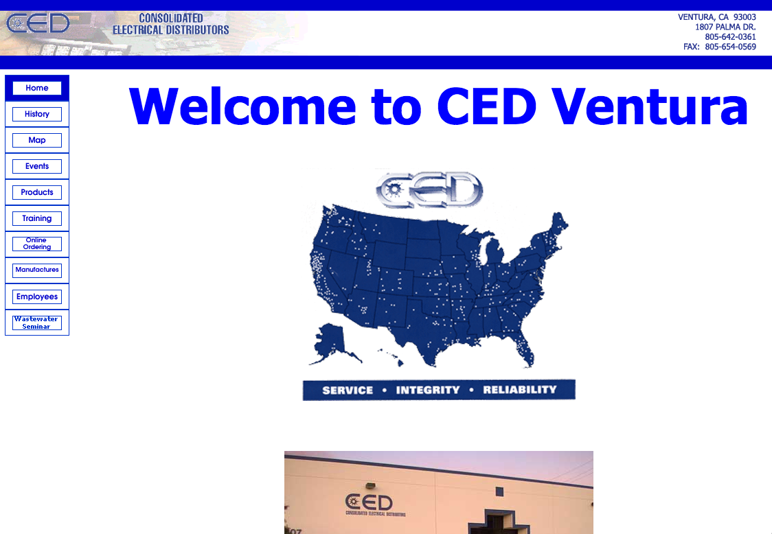
First site: CED Ventura
I built this site while I was in high school in 2000 or 2001 for my dad, who manages the Ventura branch of CED. It was the first full site I designed and built. I built it as the final project of a web design class I took in high school, and it went live shortly after that (you can still see it on the Wayback Machine). Prior to this I had been experimenting with HTML and made some sample sites, but had never made a full site.
Fun facts about this project:
No CSS. CSS barely existed back then and didn’t become practical to use until the mid-2000s. I had never even heard of CSS when I made this site. All styling comes from HTML tags like <font>, images, and some style attributes like valign.
Frames. The whole site is built in a <frameset> — one for the top logo area, another for the navigation, and a third for the content. Back then that was the best way to reuse content across pages, since static site generators didn’t exist and I didn’t know anything about server-side programming at the time.
Tables for positioning. Since I knew nothing about CSS back then, and it wasn’t a viable option anyway, I used tables to position everything.
Spacer gifs! In addition to using tables for positioning, I also sprinkled spacer gifs throughout the site to position elements.
Hand-coded. Yep, the whole site was coded by hand, before that became a retro, throwback badge of honor. I seem to recall using Dreamweaver to build the site, but was somehow already experienced enough to know the code it generated was shit, so I primarily lived in the code view.
Animated gifs. You can’t tell from this static screenshot, but the homepage had not 1, but 2 animated gifs on it: the logo in the top left that says “CED Consolidated Electrical Distributors,” which fades in one letter at a time over the excruciatingly long period of about 10 seconds (longer than your typical Snapchat); and the map, which features each dot lighting up to emphasize how many locations CED has nationwide. I thought I was the shit for making each of these animated gifs. Once again, the Wayback Machine will let you experience these gifs in all their glory.
1,300px wide top banner. At the time, a 1,300 pixel wide image for the banner seemed absurdly wide and I didn’t think there’d ever be a monitor large enough to display it. Boy was I wrong. When viewed on any computer today the image will start to repeat.
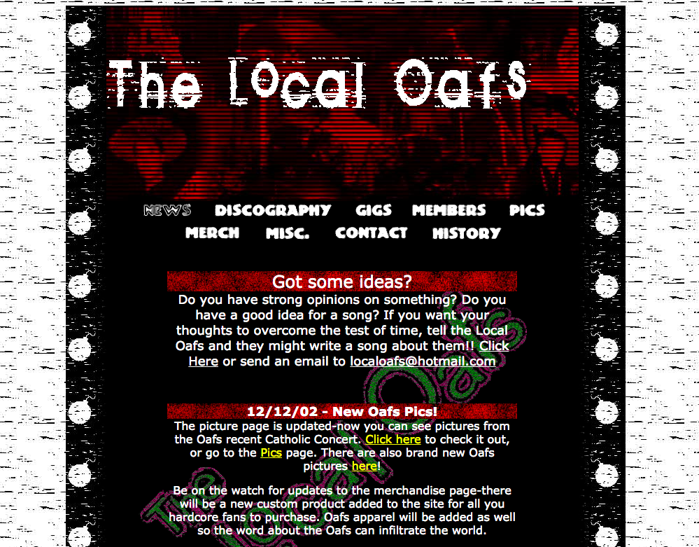
The Local Oafs
This is the second full website I designed and built. In true American tradition, I made this site for my closest friends’ band, The Local Oafs (named after a Simpsons reference, if you were wondering). I’m not sure it was ever on the public internet, but if so it was probably hosted on Geocities.
For whatever reason, I added a splash page to the site. I guess that was all the rage back then. I also designed the sweet logo with one of the band members. We also printed up stickers of the logo, and stuck it on a shirt.
Pretty sweet grunge look going on here, which I made in Photoshop. This site also features a table layout, spacer gifs, and no CSS.
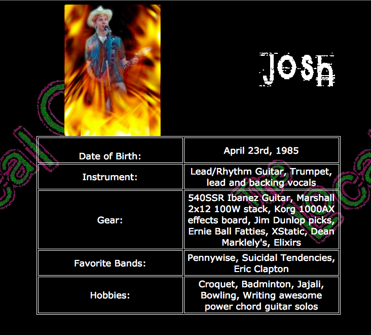
I made bio pages for each band member, adding a different rad Photoshop effect to each bio pic. I really hope we were being ironic, but I fear we probably thought this was actually cool. I was also the band’s photographer, and did a photoshoot to populate the site with pictures.
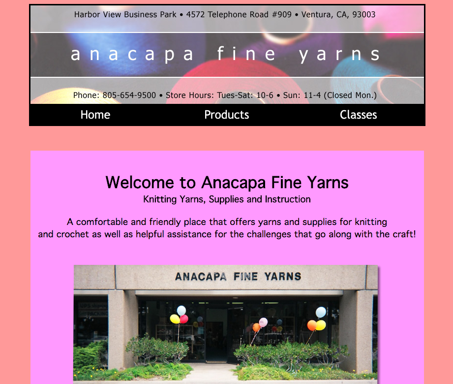
Anacapa Fine Yarns
This is the first site I actually got paid for, which was hugely exciting at the time (2004 or 2005, I believe). I think I got a couple hundred bucks, which felt like highway robbery. I built the site for my parents’ friend who opened this yarn shop in Ventura.
Oof those colors. Not sure what I was thinking there. And the nav items are green when hovered 😬. And such centering!
For whatever reason I have two versions of the site on my computer. I think I rebuilt the site for her about a year after the initial version. Unfortunately the design updates I made didn’t include a better color palette. The biggest update, however, was that I built the site with CSS. This must have been the first real site that I used CSS on. It features great selectors like div#main.
The properties are surprisingly well organized, though. I grouped them by position, width/height, typography, and finally visual styles (background, border, etc.). The selectors are all quite flat, and I indented them to indicate the nesting in the HTML. Which seems pretty forward thinking considering pre-processors didn’t exist yet and I was pretty new to CSS.
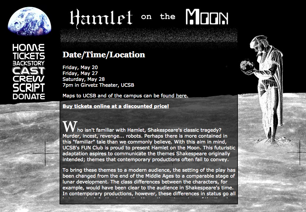
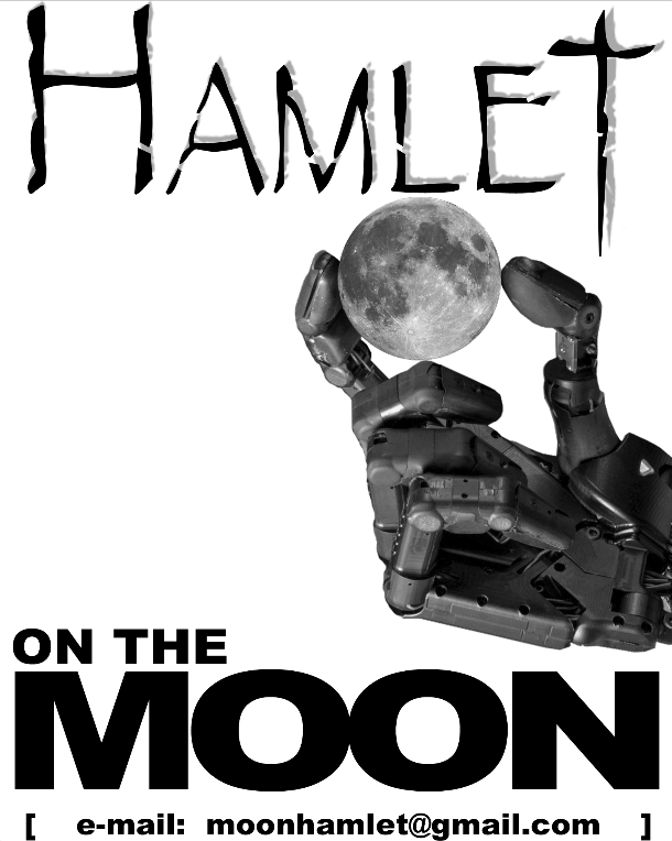
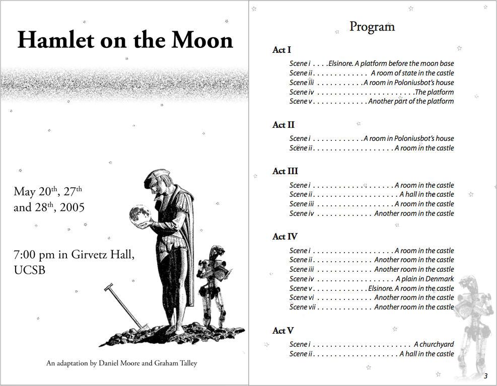
Hamlet on the Moon
In college a close friend of mine did an adaption of Hamlet set on the moon, aptly named “Hamlet on the Moon.” It was actually a full play that was produced and performed at UCSB. It featured Polonius as a robot named “Poloniusbot,” Ophelia as a cyborg named “Opheliatron,” and Rosencrantz and Guildenstern as a two-headed monster. I designed and built the website, posters, and program for them.
Can you tell this play takes place on the moon? You may need to look again to pick up on the space theme. I especially love the NASA-y font for the nav, and that I made it a literal block of text by adjusting the type size to maintain a fixed width. And there’s virtually no vertical space between them. I had to do the text with images since web fonts were still years away.
And don’t miss that great pseudo-drop cap in the first paragraph.
This is one of two posters I created for them, which I believe they actually printed and put up around campus. The oddest thing about the posters is that neither feature dates, times, location, or the website’s URL. I have no idea why we chose to only have the email address on the poster.
The program, on the other hand, does include the date, time, and location, even though you’d have to be at the play already to be holding one of these. But overall it actually came out pretty decently. I was taking typography and print layout classes at the time and put those skills to use. It’s at least a more understated and mature design than the website.
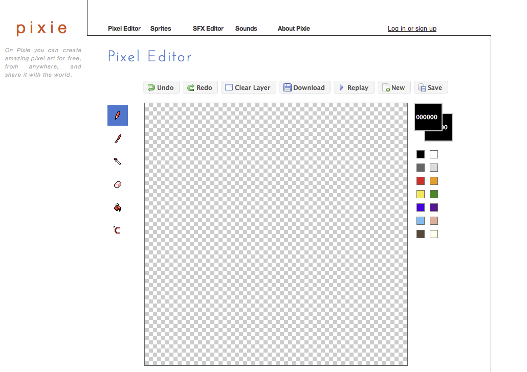
Pixie
Around 2008 or 2009 my close friend (who also did Hamlet on the Moon) started building Pixie, a web-based pixel art editor. I helped out with design and frontend engineering. I also built a couple features, like fill. I believe this was my first exposure to HAML and SASS. Looking back on it, this was the first time I did product design (although I wouldn’t have called it that back then).
The design is pretty clean. Probably a little too clean. Those left icons are about to float off the page. And are they even clickable? I kind of like the way the line draws your eye from the top left to bottom right, even though the line itself strangles the page a bit. The left button style and icons are weirdly inconsistent with the top button style and icons. Perhaps I was trying to draw a distinction between image editing tools, like drawing and erasing, and document controls, like “Save”? And what is that bottom icon supposed to do? The “logo” is also odd – where did that orange come from? I still hadn’t really figured out “color palettes.”
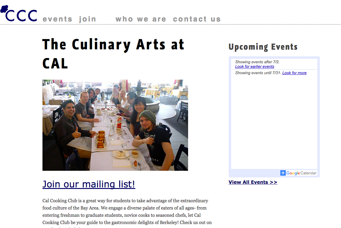
Cal Cooking Club
In 2010 I was in grad school and a member of the Cal Cooking Club, so I made their website. It features web fonts and a clean, modern design! I believe I used this for a class project, too. I think I made a static version of the site first, and then converted it to a Wordpress theme so the officers could update the site themselves.
Not the pinnacle of design, but it at least doesn’t make me cringe. The oddest thing about the design is that I tried to keep the site on a grid, which is why the nav items have weird spacing between them. I think I had just read Ordering Disorder by Khoi Vinh and went a bit too far trying to put his principles into practice.
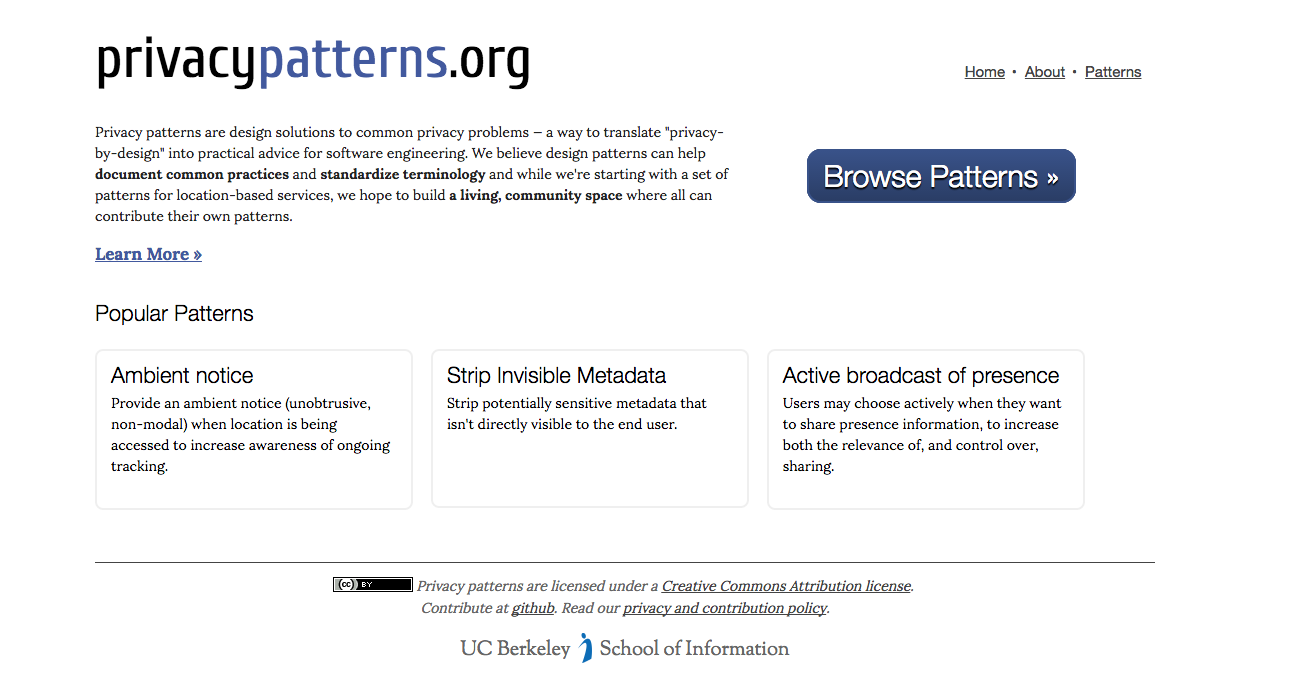
Privacy Patterns
Privacy Patterns is a project spearheaded by one of my grad school professors and a PhD student, with the goal of documenting best practices for building software that supports privacy. I got involved to help them design and build the site.
We built the site using Hyde, a static site generator. All the content was stored in Markdown for ease of authoring and portability. I believe it’s the first statically-generated site I built (with the help of a fellow grad student). Surprisingly I didn’t use SASS, even though I had at least experimented with it at this point. If I had to guess, it was probably because Hyde is built in Python, and SASS in Ruby.
Overall the site isn’t too bad. Clean design, no weird colors, and good type hierarchy.
It’s humbling to look back at where I started and reflect on how far I’ve come since. Best practices, technologies, and design trends all shaped my work, and have changed a lot over the years. It will be fascinating to look back at the work I’m doing now and marvel at the misguided decisions that seemed so right at the time.
In The Elements of Style, the seminal writing and grammar book by Strunk and White, the authors have a style rule that states, “Do not take shortcuts at the cost of clarity.” This rule advises writers to spell out acronyms in full unless they’re readily understood. For example, not everyone knows that madd is Mothers Against Drunk Driving.
Acronyms come at the cost of clarity. “Many shortcuts are self-defeating,” the authors say, “they waste the reader’s time instead of conserving it.”
Icons are the acronyms of design. Designers often rely on them to communicate what an action or object does, instead of simply stating what the action or object is. Unless you’re using universally-recognized icons (which are rare), you’re more likely to harm the usability of an interface.
Do you know what the icons on the left mean?
So as Strunk and White advise, don’t take shortcuts at the cost of clarity. “The longest way round is usually the shortest way home.”
 Updating work on the Discovery kanban board
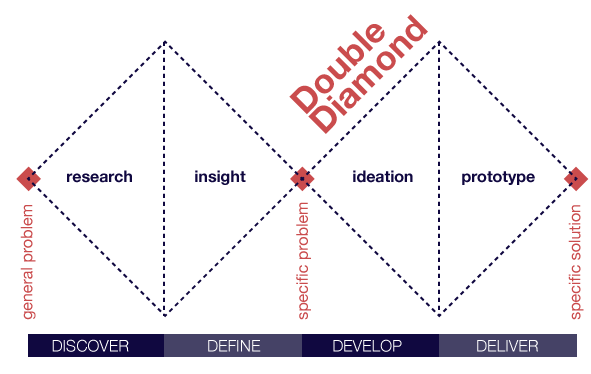
 Overview of Discovery kanban at Optimizely
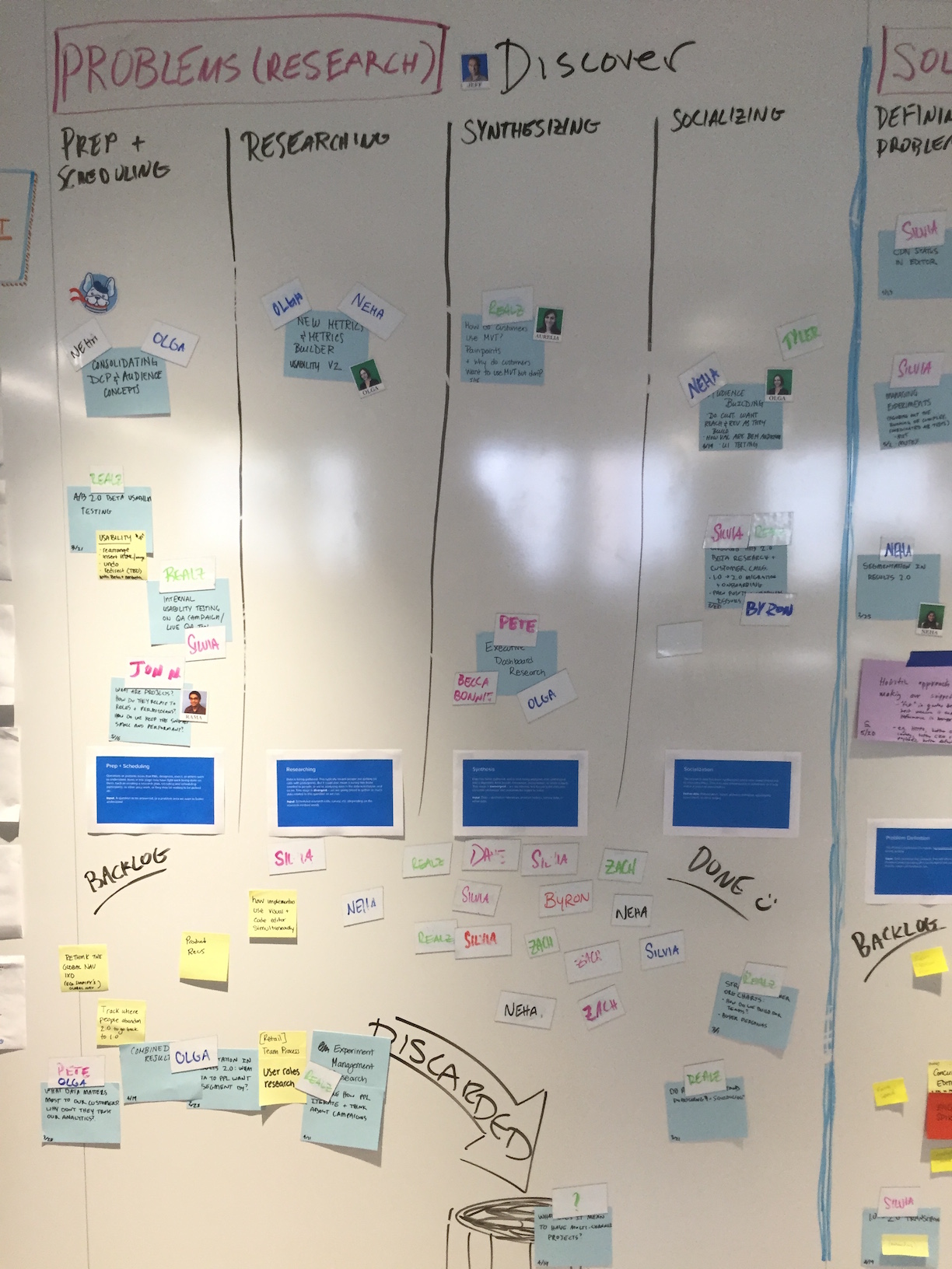 Problem Understanding kanban board
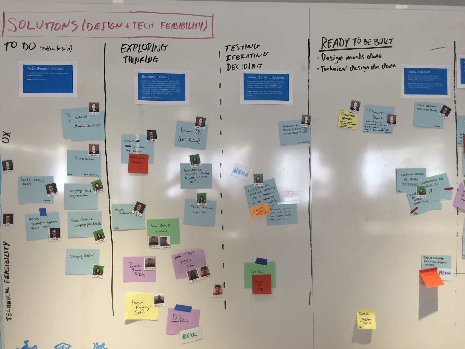 Solution Exploration kanban board
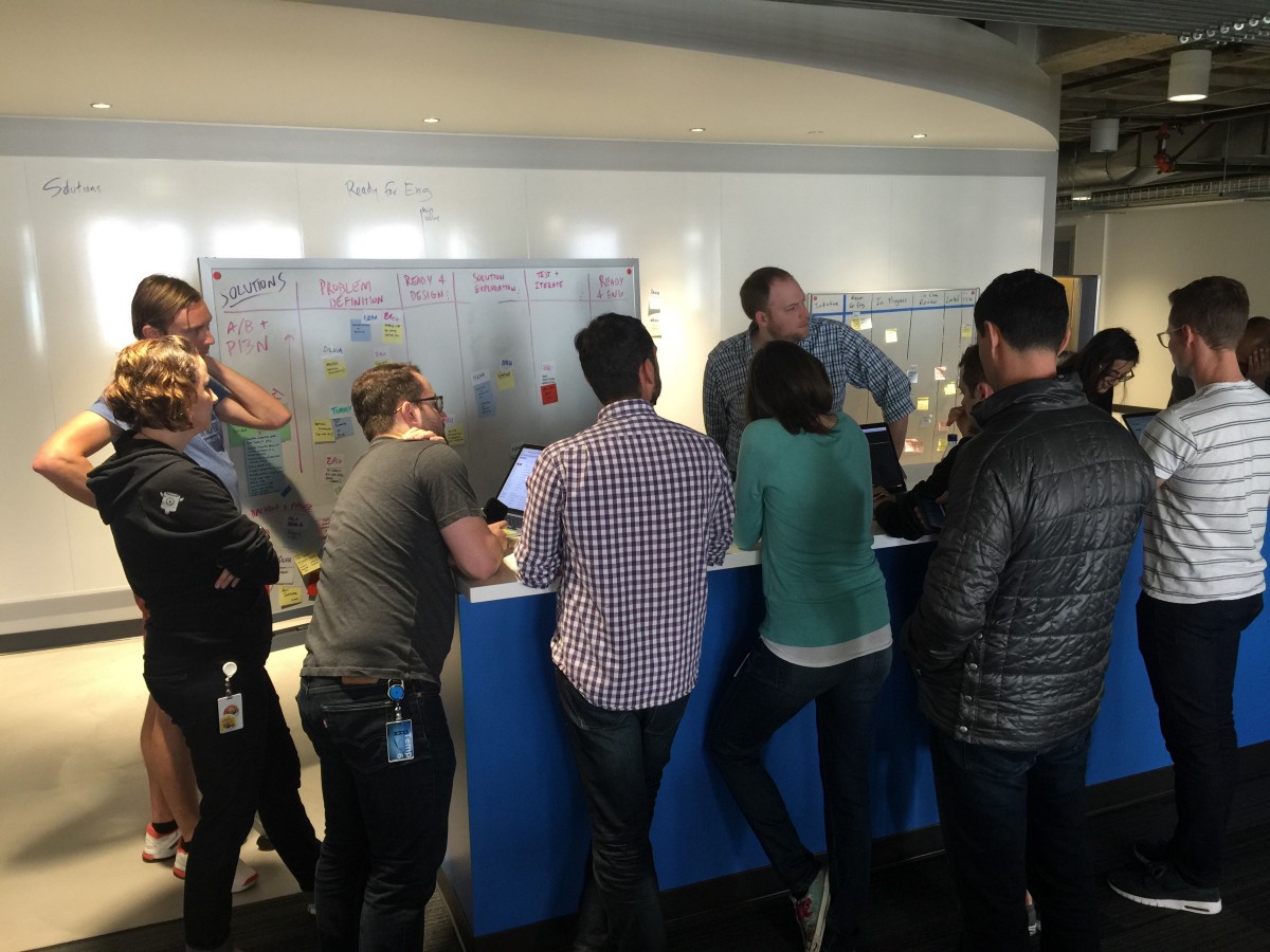 Discovery work planning meeting
 Diagram of Optimizely’s product development process
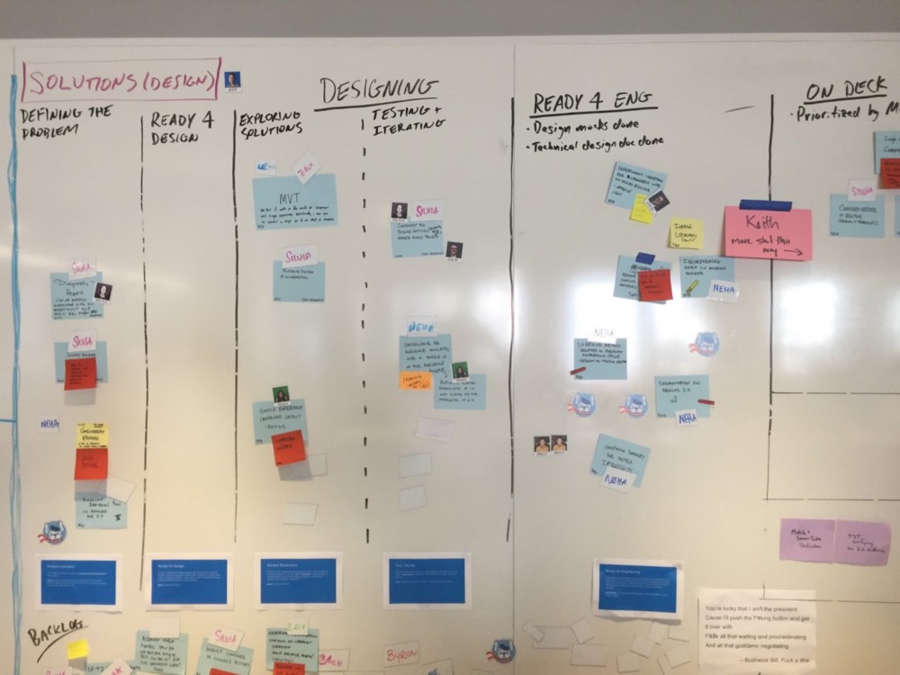 Optimizely’s Discovery kanban board