A Look Back at My Early Web Design Work
In the spirit of sharing my work, I thought it would be fun to look back at some early web sites I designed and built.
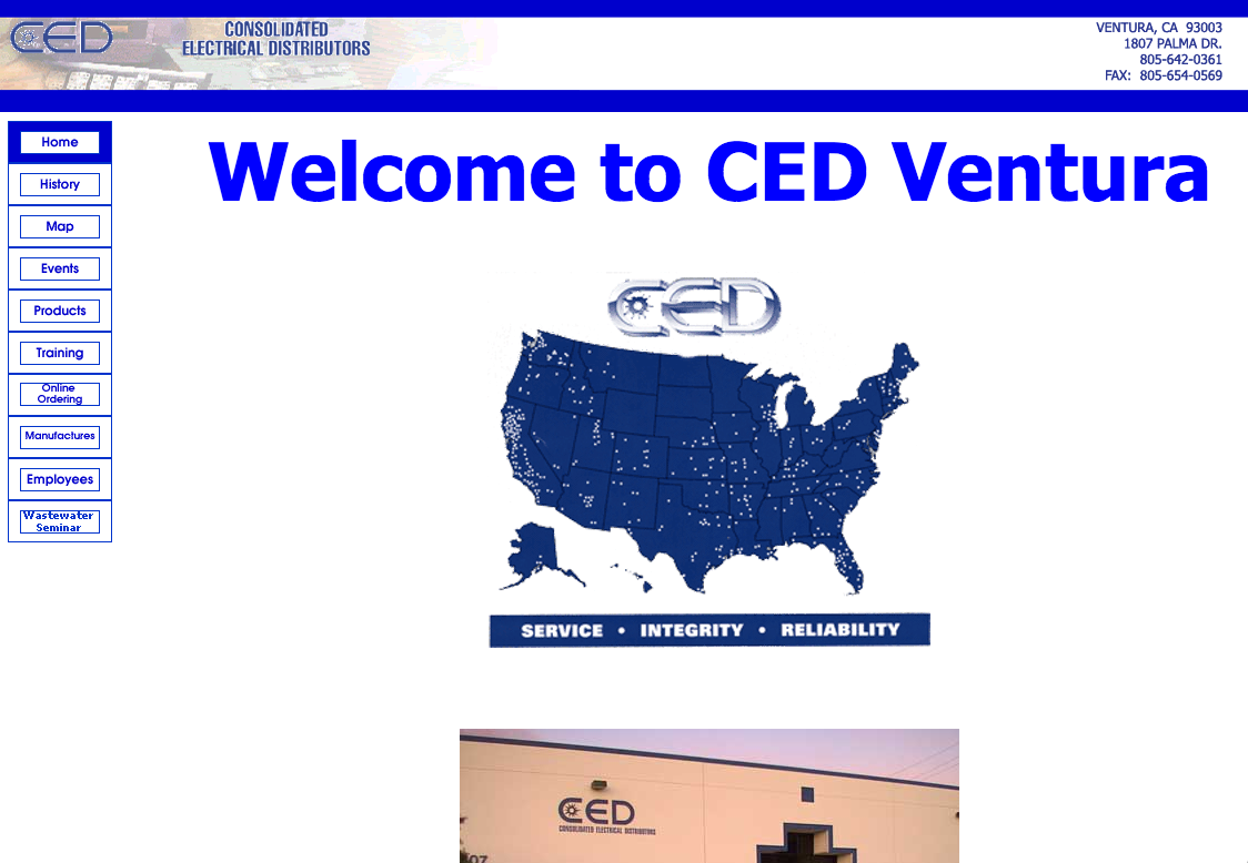
First site: CED Ventura
I built this site while I was in high school in 2000 or 2001 for my dad, who manages the Ventura branch of CED. It was the first full site I designed and built. I built it as the final project of a web design class I took in high school, and it went live shortly after that (you can still see it on the Wayback Machine). Prior to this I had been experimenting with HTML and made some sample sites, but had never made a full site.
Fun facts about this project:
- No CSS. CSS barely existed back then and didn’t become practical to use until the mid-2000s. I had never even heard of CSS when I made this site. All styling comes from HTML tags like
<font>, images, and some style attributes likevalign. - Frames. The whole site is built in a
<frameset>— one for the top logo area, another for the navigation, and a third for the content. Back then that was the best way to reuse content across pages, since static site generators didn’t exist and I didn’t know anything about server-side programming at the time. - Tables for positioning. Since I knew nothing about CSS back then, and it wasn’t a viable option anyway, I used tables to position everything.
- Spacer gifs! In addition to using tables for positioning, I also sprinkled spacer gifs throughout the site to position elements.
- Hand-coded. Yep, the whole site was coded by hand, before that became a retro, throwback badge of honor. I seem to recall using Dreamweaver to build the site, but was somehow already experienced enough to know the code it generated was shit, so I primarily lived in the code view.
- Animated gifs. You can’t tell from this static screenshot, but the homepage had not 1, but 2 animated gifs on it: the logo in the top left that says “CED Consolidated Electrical Distributors,” which fades in one letter at a time over the excruciatingly long period of about 10 seconds (longer than your typical Snapchat); and the map, which features each dot lighting up to emphasize how many locations CED has nationwide. I thought I was the shit for making each of these animated gifs. Once again, the Wayback Machine will let you experience these gifs in all their glory.
- 1,300px wide top banner. At the time, a 1,300 pixel wide image for the banner seemed absurdly wide and I didn’t think there’d ever be a monitor large enough to display it. Boy was I wrong. When viewed on any computer today the image will start to repeat.
The Local Oafs
This is the second full website I designed and built. In true American tradition, I made this site for my closest friends’ band, The Local Oafs (named after a Simpsons reference, if you were wondering). I’m not sure it was ever on the public internet, but if so it was probably hosted on Geocities.
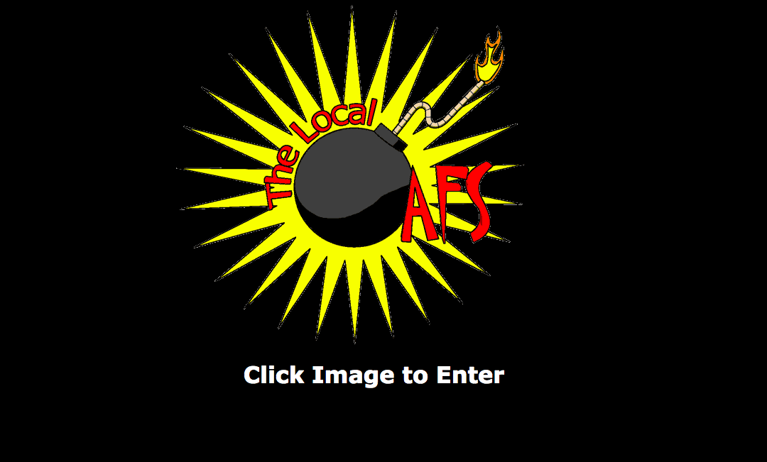
For whatever reason, I added a splash page to the site. I guess that was all the rage back then. I also designed the sweet logo with one of the band members. We also printed up stickers of the logo, and stuck it on a shirt.
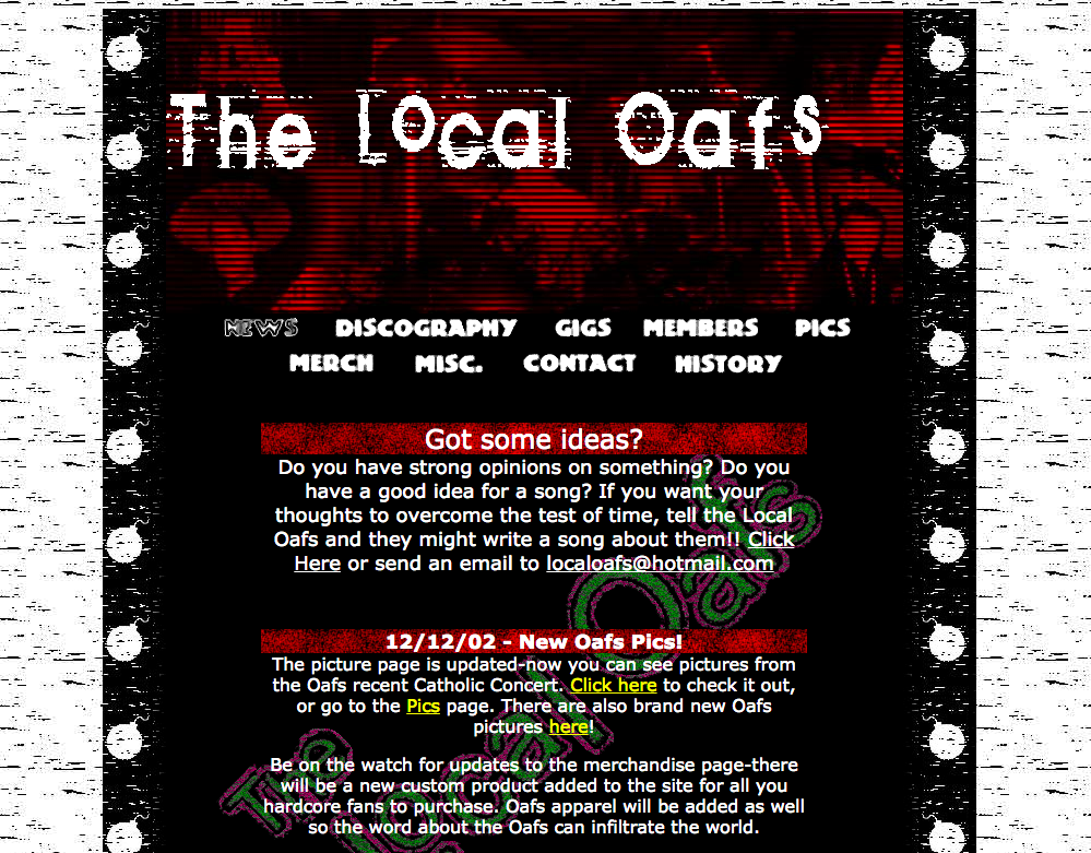
Pretty sweet grunge look going on here, which I made in Photoshop. This site also features a table layout, spacer gifs, and no CSS.
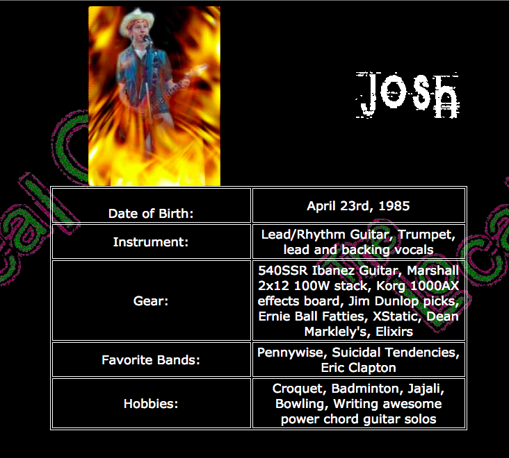
I made bio pages for each band member, adding a different rad Photoshop effect to each bio pic. I really hope we were being ironic, but I fear we probably thought this was actually cool. I was also the band’s photographer, and did a photoshoot to populate the site with pictures.
Anacapa Fine Yarns
This is the first site I actually got paid for, which was hugely exciting at the time (2004 or 2005, I believe). I think I got a couple hundred bucks, which felt like highway robbery. I built the site for my parents’ friend who opened this yarn shop in Ventura.
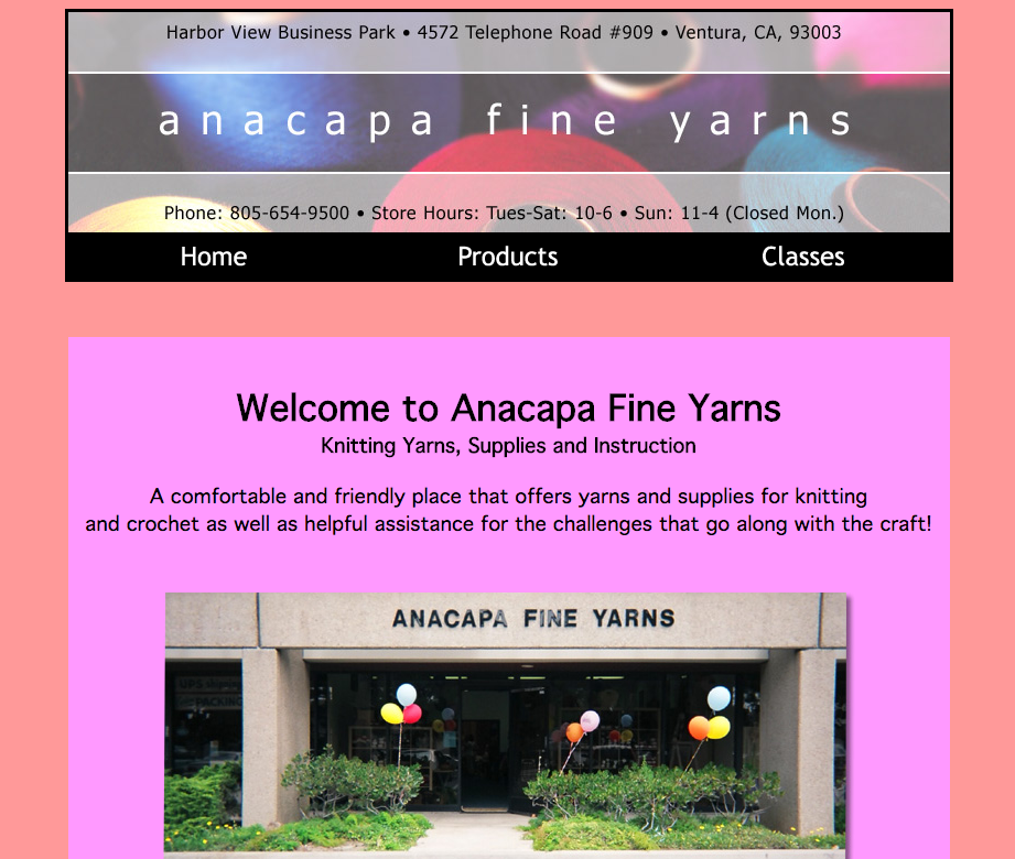
Oof those colors. Not sure what I was thinking there. And the nav items are green when hovered 😬. And such centering!
For whatever reason I have two versions of the site on my computer. I think I rebuilt the site for her about a year after the initial version. Unfortunately the design updates I made didn’t include a better color palette. The biggest update, however, was that I built the site with CSS. This must have been the first real site that I used CSS on. It features great selectors like div#main.
The properties are surprisingly well organized, though. I grouped them by position, width/height, typography, and finally visual styles (background, border, etc.). The selectors are all quite flat, and I indented them to indicate the nesting in the HTML. Which seems pretty forward thinking considering pre-processors didn’t exist yet and I was pretty new to CSS.
Hamlet on the Moon
In college a close friend of mine did an adaption of Hamlet set on the moon, aptly named “Hamlet on the Moon.” It was actually a full play that was produced and performed at UCSB. It featured Polonius as a robot named “Poloniusbot,” Ophelia as a cyborg named “Opheliatron,” and Rosencrantz and Guildenstern as a two-headed monster. I designed and built the website, posters, and program for them.
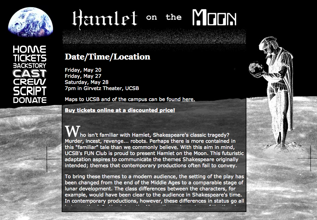
Can you tell this play takes place on the moon? You may need to look again to pick up on the space theme. I especially love the NASA-y font for the nav, and that I made it a literal block of text by adjusting the type size to maintain a fixed width. And there’s virtually no vertical space between them. I had to do the text with images since web fonts were still years away.
And don’t miss that great pseudo-drop cap in the first paragraph.
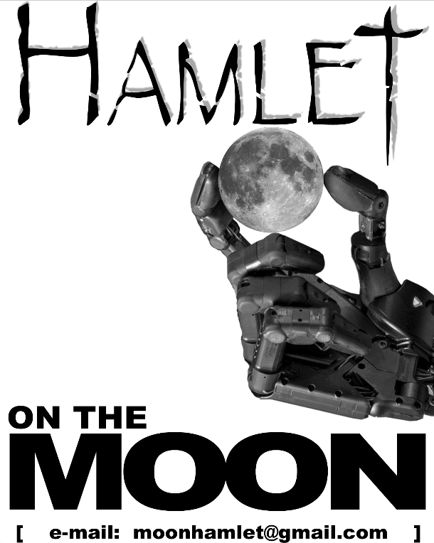
This is one of two posters I created for them, which I believe they actually printed and put up around campus. The oddest thing about the posters is that neither feature dates, times, location, or the website’s URL. I have no idea why we chose to only have the email address on the poster.
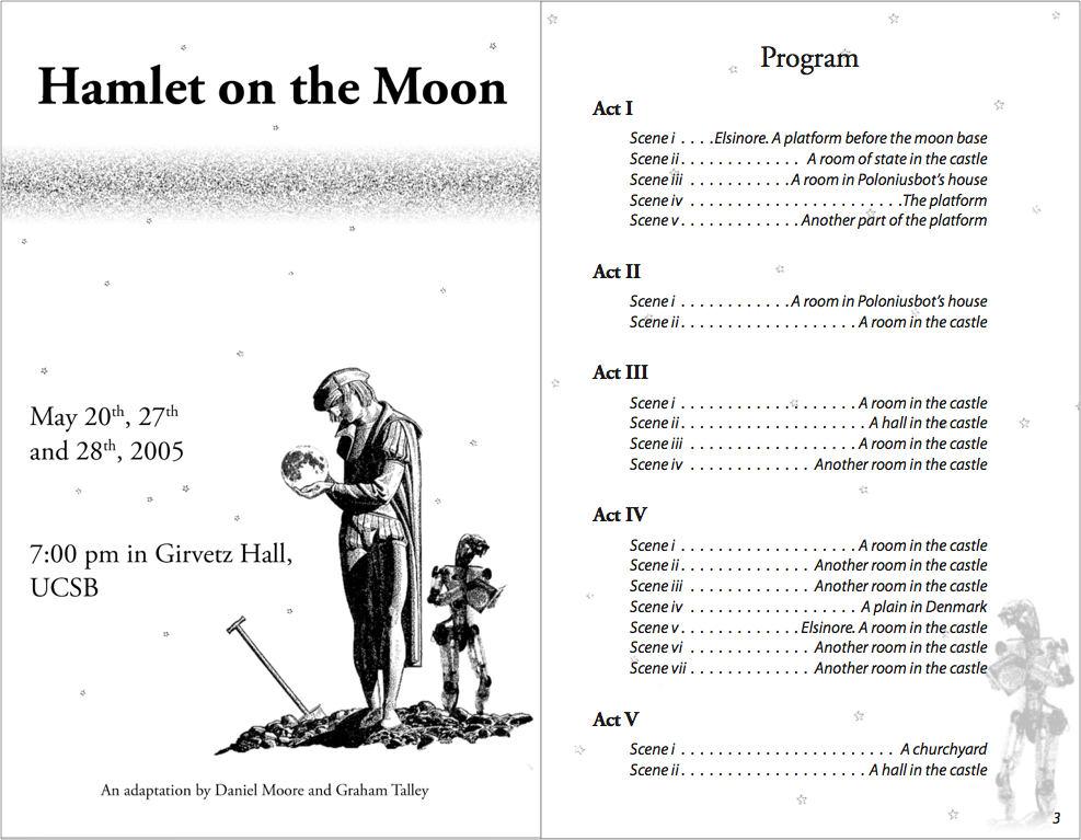
The program, on the other hand, does include the date, time, and location, even though you’d have to be at the play already to be holding one of these. But overall it actually came out pretty decently. I was taking typography and print layout classes at the time and put those skills to use. It’s at least a more understated and mature design than the website.
Pixie
Around 2008 or 2009 my close friend (who also did Hamlet on the Moon) started building Pixie, a web-based pixel art editor. I helped out with design and frontend engineering. I also built a couple features, like fill. I believe this was my first exposure to HAML and SASS. Looking back on it, this was the first time I did product design (although I wouldn’t have called it that back then).
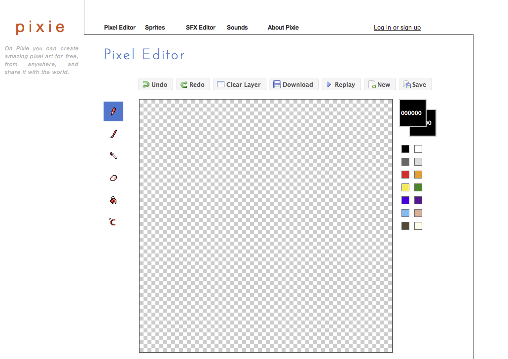
The design is pretty clean. Probably a little too clean. Those left icons are about to float off the page. And are they even clickable? I kind of like the way the line draws your eye from the top left to bottom right, even though the line itself strangles the page a bit. The left button style and icons are weirdly inconsistent with the top button style and icons. Perhaps I was trying to draw a distinction between image editing tools, like drawing and erasing, and document controls, like “Save”? And what is that bottom icon supposed to do? The “logo” is also odd – where did that orange come from? I still hadn’t really figured out “color palettes.”
Cal Cooking Club
In 2010 I was in grad school and a member of the Cal Cooking Club, so I made their website. It features web fonts and a clean, modern design! I believe I used this for a class project, too. I think I made a static version of the site first, and then converted it to a Wordpress theme so the officers could update the site themselves.
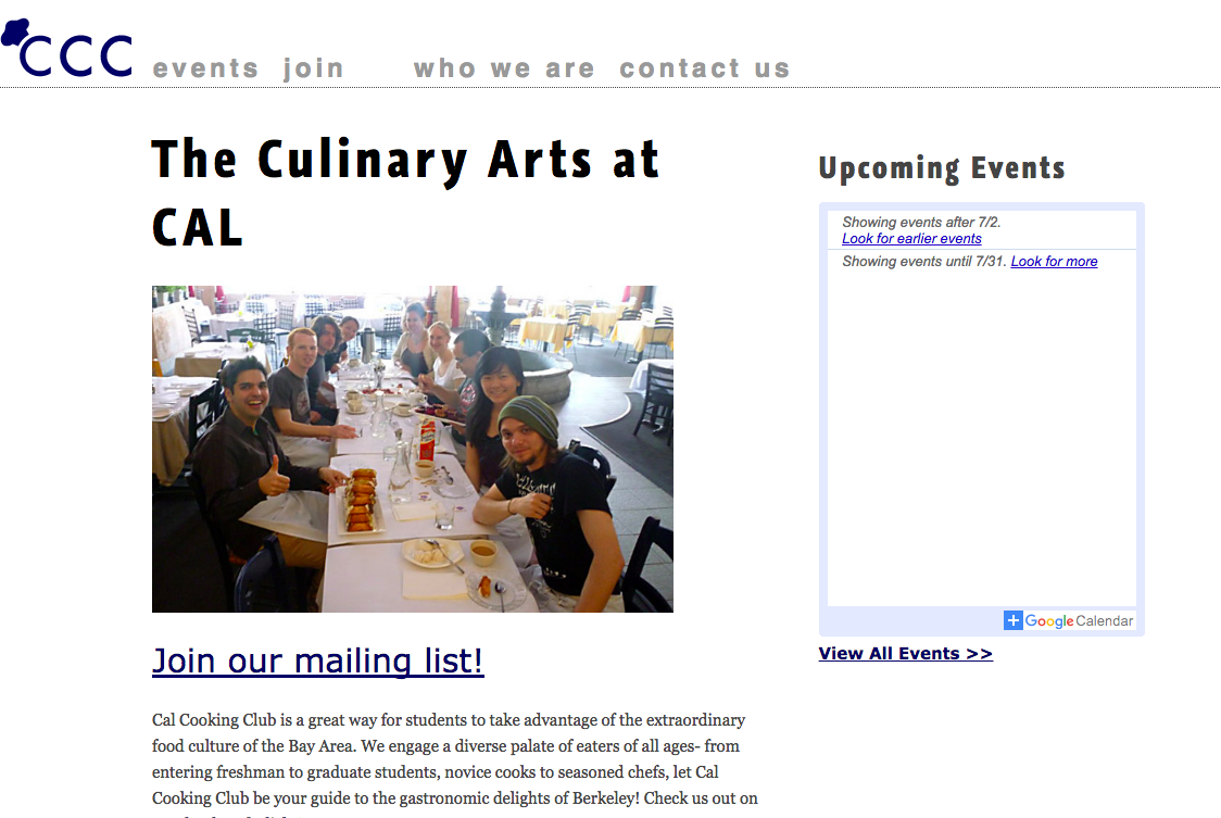
Not the pinnacle of design, but it at least doesn’t make me cringe. The oddest thing about the design is that I tried to keep the site on a grid, which is why the nav items have weird spacing between them. I think I had just read Ordering Disorder by Khoi Vinh and went a bit too far trying to put his principles into practice.
Privacy Patterns
Privacy Patterns is a project spearheaded by one of my grad school professors and a PhD student, with the goal of documenting best practices for building software that supports privacy. I got involved to help them design and build the site.
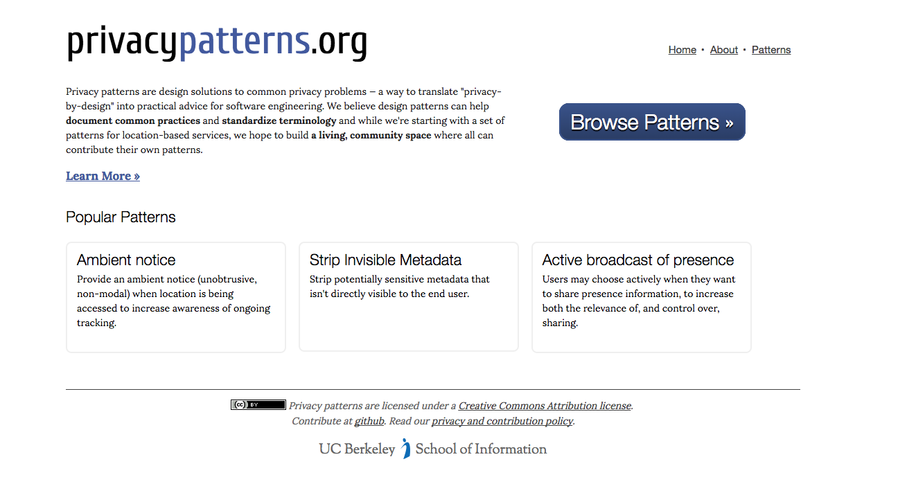
We built the site using Hyde, a static site generator. All the content was stored in Markdown for ease of authoring and portability. I believe it’s the first statically-generated site I built (with the help of a fellow grad student). Surprisingly I didn’t use SASS, even though I had at least experimented with it at this point. If I had to guess, it was probably because Hyde is built in Python, and SASS in Ruby.
Overall the site isn’t too bad. Clean design, no weird colors, and good type hierarchy.
It’s humbling to look back at where I started and reflect on how far I’ve come since. Best practices, technologies, and design trends all shaped my work, and have changed a lot over the years. It will be fascinating to look back at the work I’m doing now and marvel at the misguided decisions that seemed so right at the time.