#product design
-
Take my job, AI!
The idea of AI replacing product designers isn’t scaring me. It’s actually having the opposite effect: I’m embracing it. This post is a mix of thoughts of where I’m at personally in my career, and observations on industry trends.
-

Claude Code is Re-shaping My Design Process
Claude Code has fundamentally changed how I design. I'm skipping mid-fi mockups entirely, going straight to working code, and shipping more than ever. Here's how my process has evolved — and what hasn't changed.
-
Ingredients for a great product design case study
While I was the Head of Product Design at LaunchDarkly, I hired 12 people in a year and a half. In that time I looked at a lot of case studies from product designers (on the order of 100s, I’m sure) and saw examples of great ones and terrible ones and everything in between. I’d like to share more case studies of my work, so I wrote down what makes for great case studies and bad case studies to guide me when I start writing them.
-
Good North Star, Bad North Star
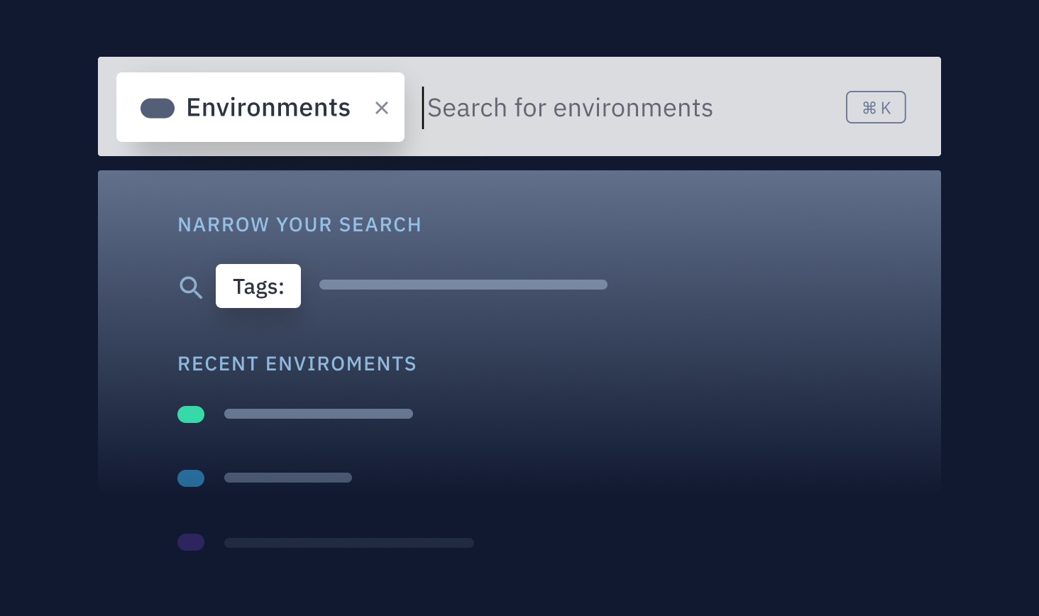
"We need a North Star." Most product designers have been asked for one at some point, and it usually causes us to internally groan and roll our eyes (if not externally, too). We've all worked on North Stars that are a frustrating waste of time and served no purpose, and where the sole burden was on us to "come up with the vision."
-

How I unknowingly upped my visual design game
As I’ve been building out the team at LaunchDarkly, I realized my eye for visual design details had gotten a lot sharper. I was seeing rough edges and ways to improve UIs that I wouldn’t have caught a few years prior. This was cropping up in the UI work I was doing myself as well. I hadn’t explicitly tried to improve my visual design skills, and professionally have spent more time in management than IC work, so how had this happened?
-
When in the design process should I use components in my design system?
A common mistake I see product designers make is that they start the solution exploration phase by cobbling together UIs out of the components and patterns in their design system (often skipping lo-fi, broad explorations).
-
Product Manager and Product Designer: Who Does What?
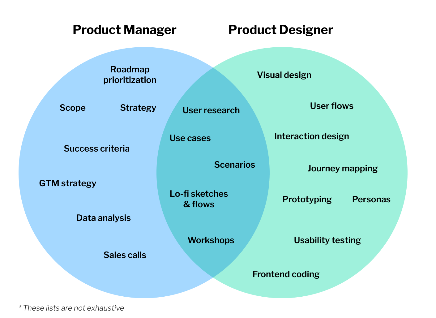
I recently noticed that my team of Product Designers at LaunchDarkly was having trouble navigating the overlap of Product Design and Product Management. No one said it explicitly, but after hearing some frustrations in 1:1s and team meetings I connected the dots that this issue was the common variable across a variety of complaints.
-

Dear Designer: You Don't Need to Have All the Answers
You're working on a project and the team is aligned on the customer problem to be solved, the business value, and success criteria. The project has moved into the solution exploration phase, and now the ball is firmly in your court. The whole team is looking to you to come up with a solution. A stroke of genius the likes of which the world has never seen. The success of this entire project rests on your shoulders. In the words of Ru Paul, don't fuck it up!
-
The Power of Low-Fidelity
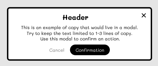
"I know you’re not there yet, but..." This was how our brand designer began his feedback to one of my product designers in design critique. The product designer presented early designs for a feature he was working on. Most importantly, his work was low-fidelity.
-
A cautionary tale about the importance of designing every screen
"What does the 'Archived' tab look like?" I was walking the engineers through the final designs of some admin screens when they asked me this. The page is just a table of objects, with a tab showing the active ones, and another tab showing archived ones.
-
User Research Interview Tip: Shut. Up.
If you were to look at Robert Caro's notebook, you would see lots of "SU"s, short for "Shut Up!", scattered throughout his interview notes. The Pulitzer-prize winning author of "The Power Broker," among other mammoth books, uses this trick to keep himself silent while interviewing subjects.
-
Interface Lovers Interview
Last week I was featured on Interface Lovers, a site that "put[s] the spotlight on designers who are creating the future and touching the lives of many." Read my response to their first question about what led me into design.
-
Adding clarity by removing information
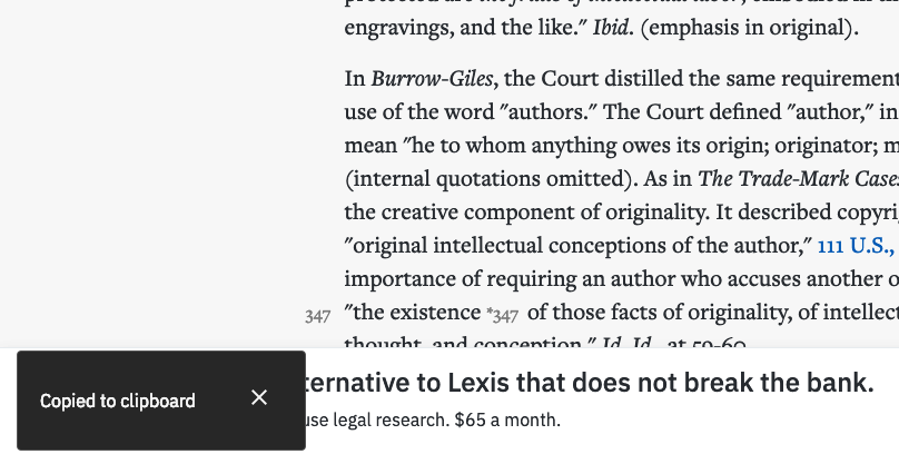
“Where’s the clipboard?” A customer wrote this in to our support team after using our “Copy with cite” feature. But who doesn't know where the clipboard is?
-

My Yardstick for Empathy
How do you know if you‘re being empathetic? It‘s easy to throw the term around, but difficult to actually apply. This is important to understand in my chosen field of design, but can also help anyone improve their interactions with other people.
-

-
Discovery Kanban 101: My Newest Skillshare Class
I just published my first Skillshare class — Discovery Kanban 101: How to Integrate User-Centered Design with Agile
-
Stay Focused on the User by Switching Between Maker Mode and Listener Mode
By switching between “maker” and “listener” modes, you put yourself in your user’s shoes and seeing your work through their eyes, which helps prevent you from “put[ting] too much in.”
-
My Talk at Lean Kanban Central Europe 2017
On a chilly fall day a few weeks back, I gave a talk at the cozy Lean Kanban Central Europe in Hamburg, Germany. I was honored to be invited to give a reprise of the talk I gave with Keith earlier this year at Lean Kanban North America.
-
Shifting from a Product-centric to a Service-centric Mindset
Over the past few months I’ve shifted from a product-centric mindset to a service-centric mindset. My focus used to be on building products that help people accomplish a task or goal. That meant I would try to understand the problem to solve, who it’s being solved for, and then design digital products to solve that problem.
-
Managing Design work with Discovery Kanban at Optimizely
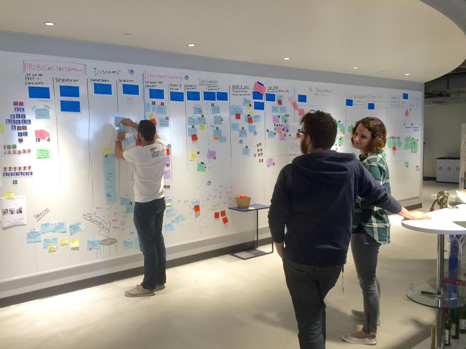
In my previous article, I described how we transformed our Agile development process at Optimizely to include research and design by implementing our own flavor of Discovery kanban. In this article, I’ll go a level deeper to describe all the stages research and design work moves through during the discovery process.
-
Discovery Kanban at Optimizely
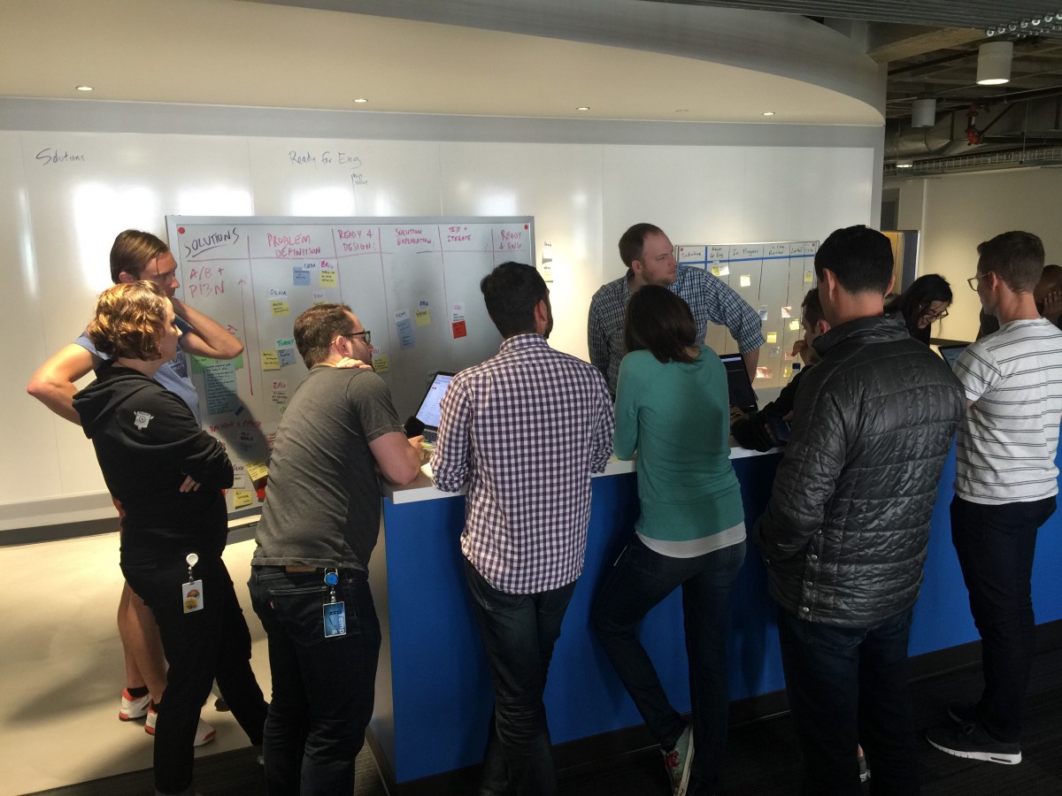
Like most tech startups, Optimizely uses an Agile process to build software. Agile has been great at helping us plan what we’re building, coordinate across teams, and ship iteratively; however, that meant design and research were awkwardly shoehorned into the process.
-
Icons are the Acronyms of Design
In 'The Elements of Style,' the seminal writing and grammar book by Strunk and White, the authors have a style rule that states, 'Do not take shortcuts at the cost of clarity.' This rule advises writers to spell out acronyms in full unless they're readily understood.
-
Designing Backwards
Action is the bedrock of drama. Action drives the play forward and makes for a compelling story that propels the audience to the end. And an engaging play is just a series of connected actions, according to David Ball in 'Backwards & Forwards.'
-
Play the Right Note
Like many Americans, I started learning guitar back in high school. I began where everyone did – strumming basic chords and melodies and building up my finger strength. I got a little better every day, and could eventually play simple songs.
-
Why Designers Should Code
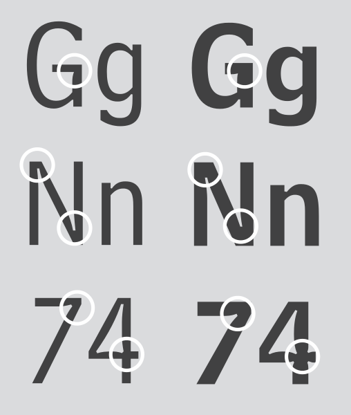
In the 1970s, AT&T commissioned Matthew Carter to design a typeface for their phone book. They wanted a typeface that could fit more characters per line without a loss of legibility, especially at smaller sizes.
-
Get Comfortable Sharing Your Shitty Work
After jamming with a friend, she commented that she felt emotionally spent afterwards. Not quite sure what she meant, I asked her to elaborate. She said that improvising music makes you feel vulnerable. You’ve got to put yourself out there, which opens you up to judgement and criticism.
-
Link: The Notebooks of Optimizely's Design Team
Over on Design @ Optimizely (the Optimizely Design team's Medium publication), I posted a photo essay documenting the unique sketching and note taking styles of our team members.
-
Behind the Design: Optimizely's Mobile Editor
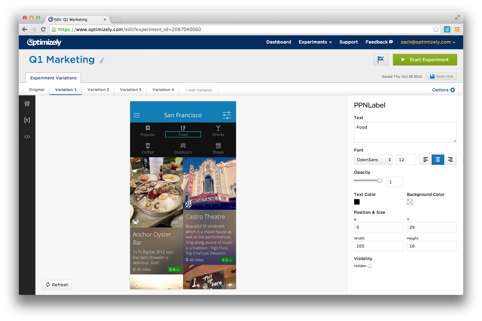
In this post, I will walk you through the design process, show you the sketches and prototypes that led up to the final design of Optimizely's Mobile editor.
-
Building an MVPP - A Minimum Viable Product we're Proud of
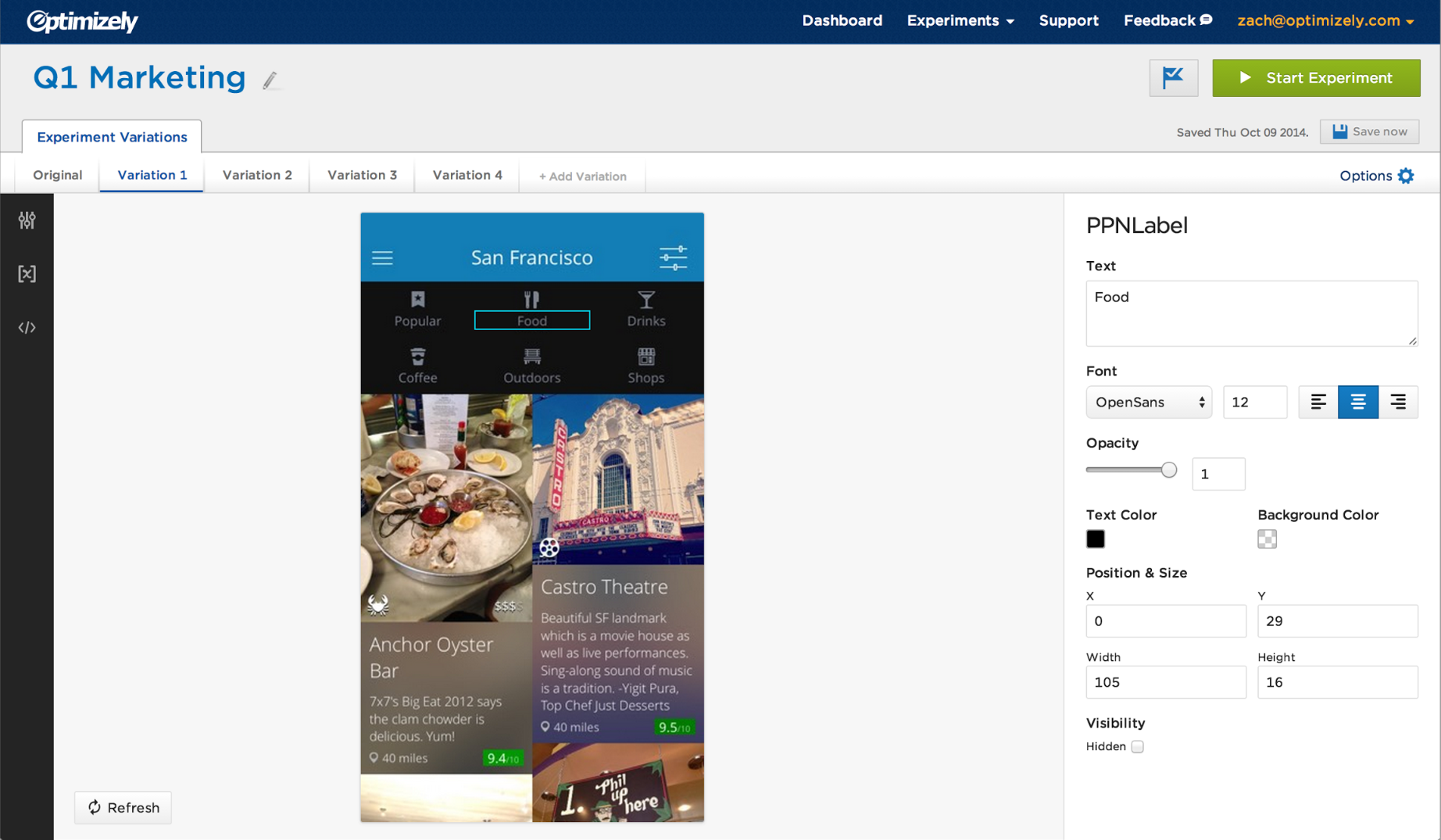
On November 18th, 2014, we publicly released Optimizely's iOS editor. This was a big release for us because it marked the end of a months-long public beta in which we received a ton of customer feedback and built a lot of missing features.
-
How Tina Fey’s “Lessons From Late Night” Apply to Product Design
In 'Lessons From Late Night,' Tina Fey discusses the lessons she learned from Lorne Michaels while working at SNL. Turns out most of them are lessons I’ve learned in product design while working at Optimizely.
-
Design Process of Optimizely's Sample Size Calculator
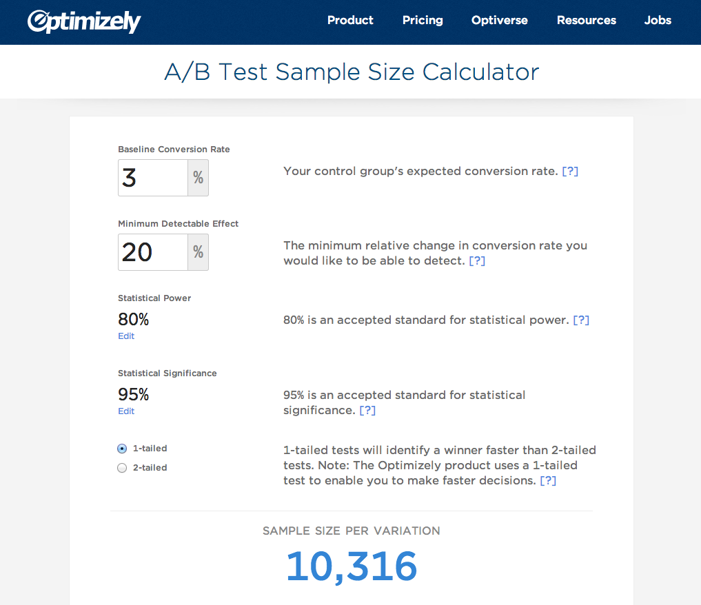
Optimizely just released a sample size calculator, which tells people how many visitors they need for an A/B test to get results. This page began as a hack week project, which produced a functioning page, but needed some design love before being ready for primetime. In this post, I'm going to explain the design decisions we made along the way.
-
I, Too, Only Work On Unshiny Products
Jeff Domke's article about working on 'unshiny' products sums up my view of my own work at Optimizely. The crux of his argument is that many designers are drawn to working on 'shiny' products — products that are pretty and lauded in the design community — but 'unshiny' products are a lot more interesting to work on.
-
On Being a Generalist
The tech community has walls between various disciplines that we see as opposites, such as print vs. digital, text vs. image, and so on. However, the most interesting design happens in the borderlands, where these different media connect.
-
Why We Hire UI Engineers on the Design Team
This Happy Cog article by Stephen Caver perfectly encapsulates why we hire UI Engineers on the design team at Optimizely (as opposed to the engineering team). We want the folks coding a UI to be involved in the design process from the beginning.
-
Matthew Carter’s “My Life in Typefaces”
I just got around to watching Matthew Carter's excellent TED talk, 'My Life in Typefaces.' In it, he talks about his experience designing type for the past 5 decades, and how technical constraints influenced his designs. The central question he tries to answer is, 'Does a constraint force a compromise?'
-
Designing with instinct vs. data
Braden Kowitz wrote a great article exploring the ever increasing tension between making design decisions based on instinct versus data.
-
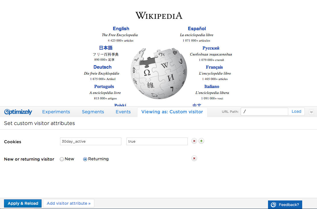
Re-Designing Optimizely's Preview Tool
We just released a major addition to Optimizely's preview tool: the ability to impersonate visitors. In this post, I am going to describe our design process and the design decisions we made along the way.