Behind the Design: Optimizely's Mobile Editor
On 11/18/14, Optimizely officially launched A/B testing for iOS apps. This was a big launch because our product had been in beta for months, but none of us felt proud to publicly launch it. To get us over the finish line, we focused our efforts on building out an MVPP — a Minimum Viable Product we’re Proud of (which I wrote about previously). A core part of the MVPP was redesigning our editing experience from scratch. In this post, I will walk you through the design process, show you the sketches and prototypes that led up to the final design, and the lessons learned along the way, told from my perspective as the Lead Designer.
A video of the final product
Starting Point
To provide context, our product enables mobile app developers to run A/B tests in their app, without needing to write any code or resubmit to the App Store for approval. By connecting your app to our editor, you can select elements, like buttons and headlines, and change their properties, like colors and text. Our beta product was functional in this regard, but not particularly easy or delightful to use. The biggest problem was that we didn’t show you your app, so you had to select elements by searching through a list of your app’s views (a process akin to navigating your computer’s folder hierarchy to find a file). This made the product cumbersome to use, and not visually engaging (see screenshot below).
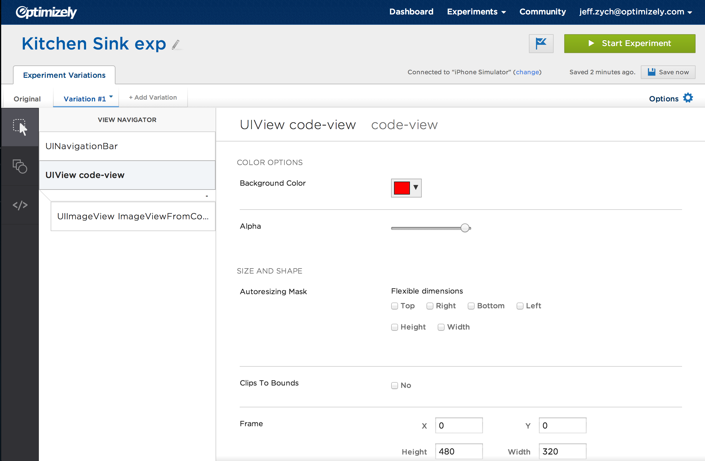
Optimizely’s original iOS editor.
Designing the WYSIWYG Editor
To make this a product we’re proud to launch, it was obvious we’d need to build a What-You-See-Is-What-You-Get (WYSIWYG) editor. This means we’d show the app in the browser, and let users directly select and edit their app’s content. This method is more visually engaging, faster, and easier to use (especially for non-developers). We’ve had great success with web A/B testing because of our WYSIWYG editor, and we wanted to replicate that success on mobile.
This is an easy design decision to make, but hard to actually build. For this to work, it had to be performant and reliable. A slow or buggy implementation would have been frustrating and a step backwards. So we locked a product designer and two engineers in a room to brainstorm ideas and build functional prototypes together. By the end of the week, they had a prototype that cleared the technical hurdles and proved we could build a delightful editing experience. This was a great accomplishment, and a reminder that any challenge can be solved by giving a group of smart, talented individuals space to work on a seemingly intractable problem.
Creating the Conceptual Model
With the app front and center, I needed an interface for how users change the properties of elements (text, color, position, etc.). Additionally, there are two other major features the editor needs to expose: Live Variables and Code Blocks. Live Variables are native Objective-C variables that can be changed on the fly through Optimizely (such as the price of items). Code Blocks let users choose code paths to execute (for example, a checkout flow that has 2 steps instead of 3).
Before jumping into sketches or anything visual, I had to get organized. What are all the features I need to expose in the UI? What types of elements can users edit? What properties can they change? Which of those are useful for A/B tests? I wrote down all the functionality I could think of. Additionally, I needed to make sure the UI would accommodate new features to prevent having to redesign the editor 3 months down the line, so I wrote out potential future functionality alongside current functionality.
I took all this functionality and clustered them into separate groups. This helped me form a sound conceptual model on which to build the UI. A good model makes it easier for users to form an accurate mental model of the product, thus making it easier to use (and more extensible for future features). This exercise made it clear to me that there are variation-level features, like Code Blocks and Live Variables, that should be separate from element-level features that act on specific elements (like changing a button’s text). This seems like an obvious organizing principle in retrospect, but at the time it was a big shift in thinking.
After forming the conceptual model, I curated the element properties we let users edit. The beta product exposed every property we could find, with no thought as to whether or not we should let users edit it. More properties sounds better and makes our product more powerful, but it comes at the cost of ease of use. Plus, a lot of the properties we let people change don’t make sense for our use case of creating A/B tests, and don’t make sense to non-developers (e.g. “Autoresizing mask” isn’t understandable to non-technical folks, or something that needs to be changed for an A/B test).
I was ruthless about cutting properties. I went through every single one and asked two questions: first, is this understandable to non-developers (my definition of “understandable” being would a person recognize it from common programs they use everyday, like MS Office or Gmail); and second, why is this necessary for creating an A/B test? If I was unsure about an attribute, I defaulted to cutting it. My reasoning was it’s easy to add features to a product, but hard to take them away. And if we’re missing any essential properties, we’ll hear about it from our customers and can add it back.
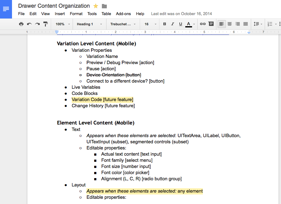
My lo-fi Google Doc to organize features
Let the Sketching Begin!
With my thoughts organized, I finally started sketching a bunch of editor concepts (pictured below). I had two big questions to answer: after selecting an element, how does a user change its properties? And, how are variation-level features (such as Code Blocks) exposed? My top options were:
- Use a context menu of options after selecting an element (like our web editor)
- When an element is selected, pop up an inline property pane (ala Medium’s and Wordpress’s editors)
- Have a toolbar of properties below the variation bar
- Show the properties in a drawer next to the app
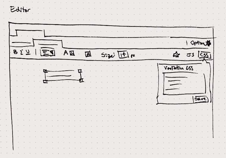
A sketch of the toolbar concept
A messy sketch of inline formatting options (specifically text)
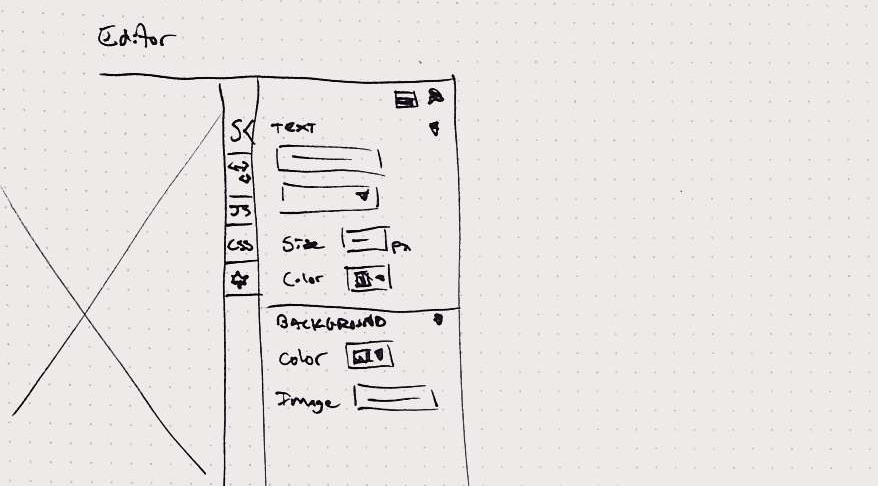
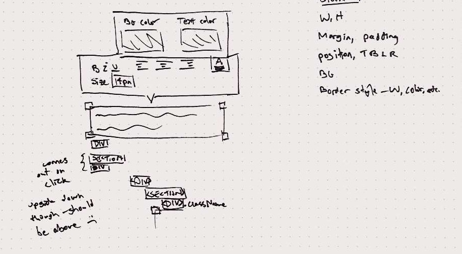
One of the many drawer sketches
Interactive Prototypes
Each approach had pros and cons, but organizing element properties in a drawer showed the most promise because it’s a common interaction paradigm, it fit easily into the editor, and was the most extensible for future features we might add. The other options were generally constraining and better suited to limited functionality (like simple text formatting).
Because I wanted to maximize space for showing the app, my original plan was to show variation-level features (e.g. Code Blocks; Live Variables) in the drawer when no element was selected, and then replace those with element-level features when an element was selected. Features at each level could be separated into their own panes (e.g. Code Blocks would have its own pane). Thus the drawer would be contextual, and all features would be in the same spot (though not at the same time). This left plenty of space for showing an app, and kept the editor uncluttered.
A sketch told me that layout-wise this plan was viable, but would it make sense to select an element one place, and edit its properties in another? Would it be jarring to see features come and go depending on whether an element was selected or not? How will you navigate between different panes in the drawer? To answer these questions, an interactive prototype was my best course of action (HTML/CSS/JS being my weapon of choice).
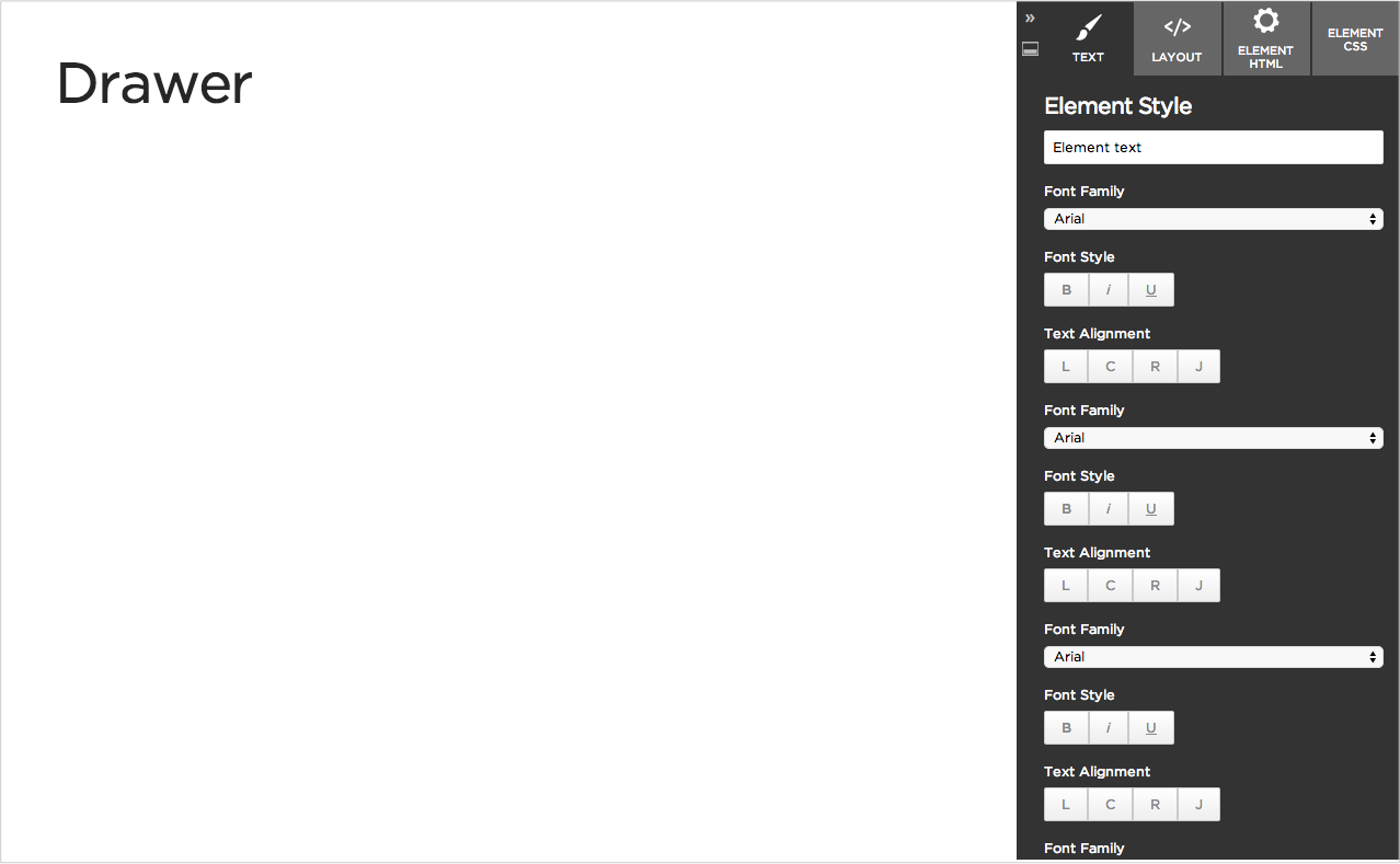
An early drawer prototype. Pretend there’s an app in that big empty white space.
I prototyped dozens of versions of the drawer, and shopped them around to the team and fellow designers. Responses overall were very positive, but the main concern was that the tab buttons (“Text”, “Layout”, etc., in the image above) in the drawer won’t scale. Once there are more than about 4, the text gets really squeezed (especially in other languages), stunting our ability to add new features. One idea to alleviate this, suggested by another designer, was to use an accordion instead of tab buttons to reveal content. A long debate ensued about which approach was better. I felt the tab buttons were a more common approach (accordions were for static content, not interactive forms that users will be frequently interacting with), whereas he felt the accordion was more scalable by allowing room for adding more panes, and accommodates full text labels (see picture below).
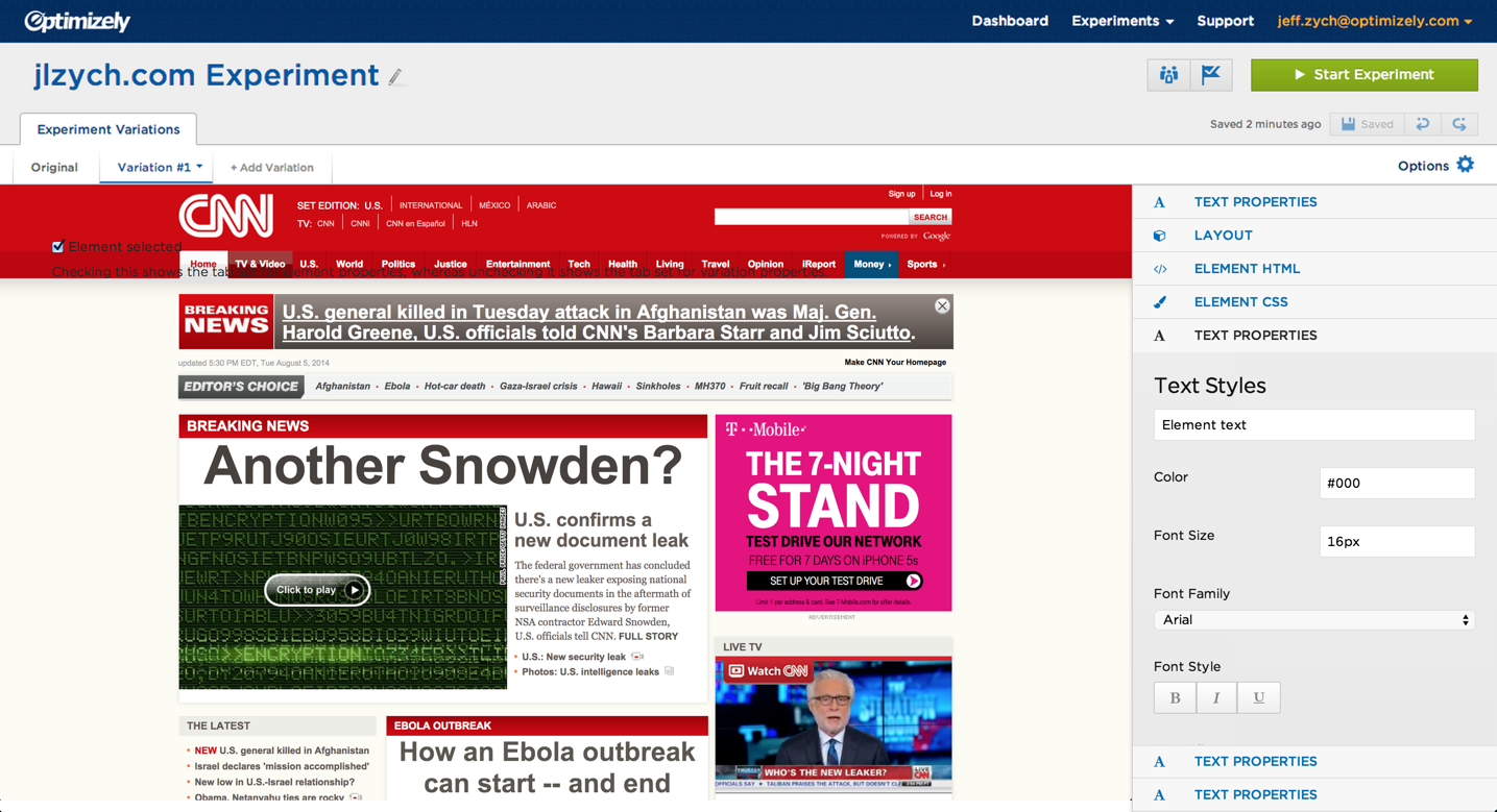
Drawer with accordion prototype. Pretend that website is an iOS app.
To help break this tie, I built another prototype. After playing around with both for awhile, and gathering feedback from various members of the team, I realized we were both wrong.
Hitting reset
After weeks of prototyping and zeroing in on a solution, I realized it was the wrong solution. And the attempt to fix it (accordions), was in fact an iteration of the original concept that didn’t actually address the real problem. I needed a new idea that would be superior to all previous ideas. So I hit reset and went back to the drawing board (literally). I reviewed my initial organizing work and all required functionality. Clearly delineating variation-level properties from element-level properties was a sound organizing principle, but the drawer was getting overloaded by having everything in it. So I explored ways of more cleanly separating variation-level properties from element-level properties.
After reviewing my feature groupings, I realized there aren’t a lot of element properties. They can all be placed in one panel without needing to navigate between them with tabs or accordions at all (one problem solved!).
The variation properties were the real issue, and had the majority of potential new features to account for. Two new thoughts became apparent as I reviewed these properties: first, variation-level changes are typically quick and infrequent; and second, variation-level changes don’t typically visually affect the app content. Realizing this, I hit upon an idea to have a second drawer that would slide out over the app, and go away after you made your change.
To see how this would feel to use, I made yet another interactive prototype. This new UI was clean, obviated the need for tab buttons or accordions, was quick and easy to interact with, and put all features just a click or two away. In short, this new design direction was a lot better, and everyone quickly agreed it made more sense than my previous approach.
Reflecting back on this, I realize I had made design decisions based on edge cases, rather than focusing on the 80% use case. Starting the design process over from first principles helped me see this much more clearly. I only wish I would have caught it sooner!
Admitting this design was not the right solution, after a couple months of work, and after engineers already began building it, was difficult. The thought of going in front of everyone (engineers, managers, PMs, designers, etc.) and saying we needed to change direction was not something I was looking forward to. I was also worried about the amount of time it would take me to flesh out a completely new design. Not to mention that I needed to thoroughly vet it to make sure that it didn’t have any major drawbacks (I wouldn’t have another opportunity to start over).
Luckily, once I started fleshing out this new design, those fears mostly melted away. I could tell this new direction was stronger, which made me feel good about restarting, which made it easier to sell this idea to the whole team. I also learned that even though I was starting over from the beginning, I wasn’t starting with nothing. I had learned a lot from my previous iterations, which informed my decision making this second time through.
Build and Ship!
With a solid design direction finally in place, we were able to pour on the engineering resources to build out this new editor. Having put a lot of thought into both the UI and technical challenges before writing production code, we were able to rapidly build out the actual product, and ended up shipping a week ahead of our self-imposed deadline!
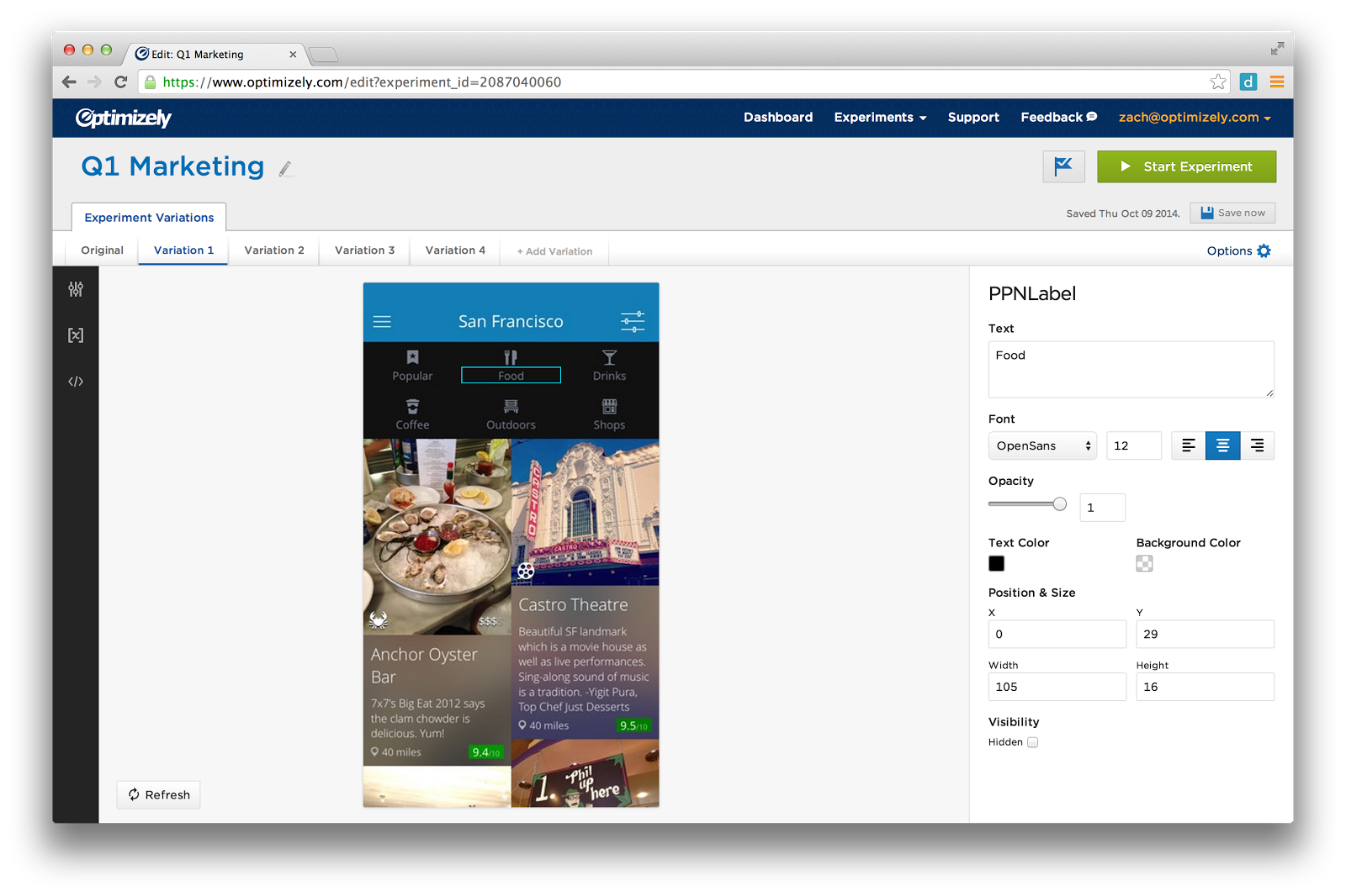
The finished mobile editor
Lessons Learned
- Create a clear conceptual model on which to build the UI. A UI that accurately represents the system’s conceptual model will make it easy for users to form a correct mental model of your product, thus making it easier to use. To create the system model, write down all the features, content, and use cases you need to design for before jumping into sketches or prototypes. Group them together and map out how they relate to each other. From this process, the conceptual model should become clear. Read more about mental models on UX Magazine.
- Don’t be afraid to start over. It’s scary, and hard, and feels like you wasted a bunch of time, but the final design will come out better. And the time you spent on the earlier designs wasn’t wasted effort — it broadened your knowledge of both the problem and solution spaces, which will help you make better design decisions in your new designs.
- Design for the core use case, not edge cases. Designing for edge cases can clutter a UI and get in the way of the core use case that people do 80% of the time. In the case of the drawer, it led to overloading it with functionality.
- Any challenge can be solved by giving a group of smart, talented individuals space to work on seemingly intractable problems. We weren’t sure a WYSIWYG editor would be technically feasible, but we made a concerted effort to overcome the technical hurdles, and it payed off. I’ve experienced this time and time again, and this was yet another reminder of this lesson.
On 11/18/14, the team was proud to announce Optimizely’s mobile A/B testing product to the world. Week-over-week usage has been steadily rising, and customer feedback has been positive, with people saying the new editor is much easier and faster to use. This was a difficult product to design, for both technical and user experience reasons, but I had a great time doing it and learned a ton along the way. And this is only the beginning — we have a lot more work to do before we’re truly the best mobile A/B testing product on the planet.