Design Process of Optimizely's Sample Size Calculator
Optimizely just released a sample size calculator, which tells people how many visitors they need for an A/B test to get results. This page began as a hack week project, which produced a functioning page, but needed some design love before being ready for primetime. So my coworker Jon (a communication designer at Optimizely) and I teamed up to push this page over the finish line. In this post, I’m going to explain the design decisions we made along the way.
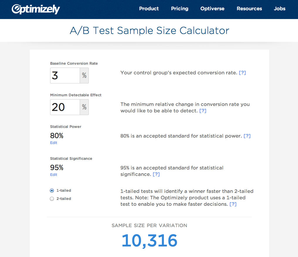
The finished sample size calculator
We Started with a Functioning Prototype
The page started as an Optimizely hack week project that functioned correctly, but suffered from a confusing layout that didn’t guide people through the calculation. After brainstorming some ideas, we decided the calculator’s layout should follow the form of basic math taught in primary school. You start at the top, write down each of the inputs in a column, and calculate the answer at the bottom.
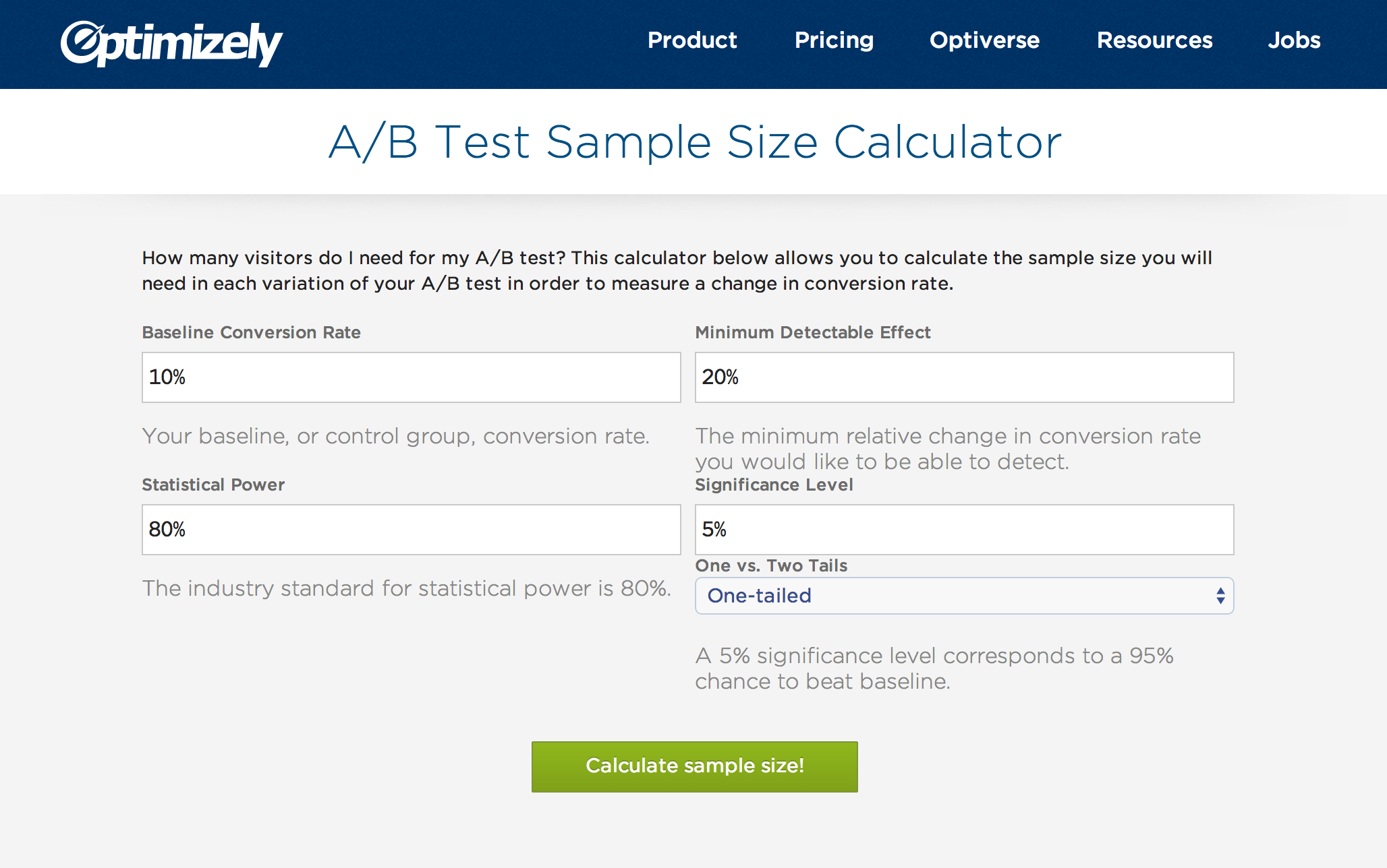
The original sample size calculator prototype
This made sense conceptually, but put the most important piece of data (the number of visitors needed) at the bottom of the page. Conventional wisdom and design theory would say our information hierarchy is backwards, and users may not even see this content. It also meant the answer is below the fold, which could increase the bounce rate.
All of these fears make sense when viewing the page through the lens of static content. But this page is interactive, and requires input from the user to produce a meaningful answer to how many visitors are needed for an A/B test. Lining up the inputs in a vertical column, and placing the answer at the bottom, encourages people to look at each piece of data going into the calculation, and enter appropriate values before getting an answer. The risk of visitors bouncing, or not seeing the answer, is minimal. Although this is counter to best practices, we felt our reasons for breaking the rules were sound.
Even so, we did our due diligence and sketched a few variations that shuffled around the inputs (e.g. horizontal; multi-column) and the sample size per variation (e.g. top; sides). None of these alternates felt right, and having the final answer at the bottom made the most sense for the reasons described above. But sketching out other ideas made us confident in our original design decision.
Power User Inputs
After deciding on the basic layout of the page, we tackled the statistical power and significance inputs. We knew from discussions with our statisticians that mathematically speaking these were important variables in the calculation, but they don’t need to be changed by most people. The primary user of this page just wants to know how many visitors they’ll need to run through an A/B test, for whom the mathematical details of these variables are unimportant. However, the values should still be clear to all users, and editable for power users who understand their effect.
To solve this challenge, we decided to display the value in plain text, but hide the controls behind an “Edit” button. Clicking the button reveals a slider to change the input. We agreed that this solution gave enough friction to deter most users from playing around with these values, but it’s not so burdensome as to frustrate an expert user who wants to change it.
Removing the “Calculate” Button
The original version of the page didn’t spit out the number of visitors until the “Calculate” button was clicked. But once I started using the page and personally experienced the annoyance of having to click this button every time I changed the values, it was clear the whole process would be a lot smoother if the answer updated automatically anytime an input changed. This makes the page much more fluid to use, and encourages people to play with each variable to see how it affects the number of visitors their test needs.
This is a design decision that only became clear to me from using a working implementation. In a static mock, a button will look fine and come across as an adequate user experience. But it’s hard to assess the user experience unless you can actually experience a working implementation. Once I re-implemented the page, it was clear auto-updating the answer was a superior experience. But without actually trying each version, I wouldn’t have been confident in that decision.
Conclusion
This project was a fun cross-collaboration between product and communication design at Optimizely. I focused on the interactions and implementation, while Jon focused on the visual design, but we sat side-by-side and talked through each decision together, sketching and pushing each other along the way. Ultimately, the finished product landed in a better place from this collaboration. It was a fun little side project that we hope adds value to the customer experience.