Square in a Circle Branding
My friend Titus reached out a while back to do some brand work for his new venture, Square in a Circle. He’s branching out into life coaching and voiceovers, and needed an identity that could hold all of that together.
![]()
Right away he had a strong reference point: the lyric “Square in a Circle” from the Seal song Whirlpool. The line resonated with him because it captures this feeling of trying to fit into a shape that was never meant for you — a square peg in a round hole.
To give me more context, Titus sent over photos of stuff around his house — burnt oranges, teals, metallic finishes, some real depth and richness to the palette. He also sent Pinterest boards of buildings, icons, imagery he was drawn to.
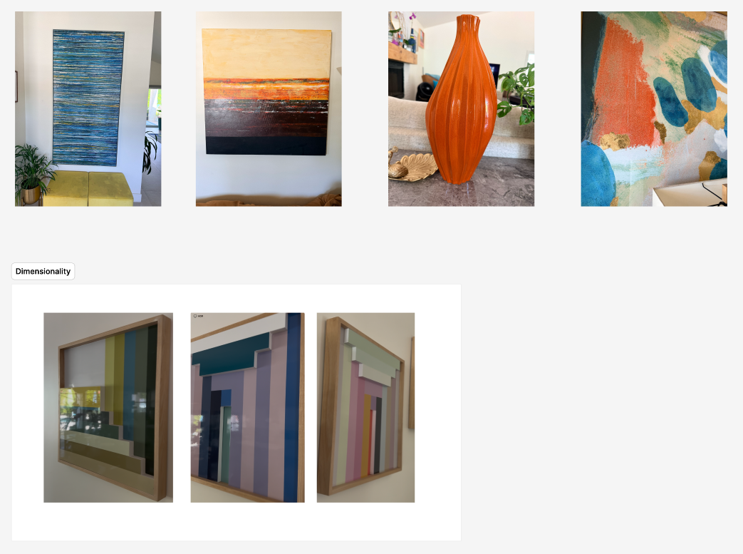
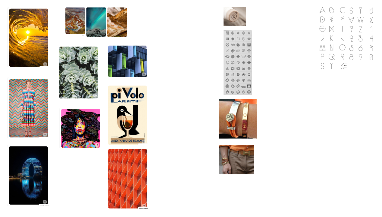
Samples of our mood board
Finding the concept
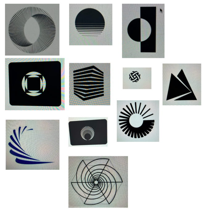
Early explorations were pretty literal: various combinations of squares and circles, shapes breaking out of other shapes. There were some cool icons in there, in a purely geometric sense. But there was no why to them. Visually clever, but no meaning behind any of it. It lacked soul.
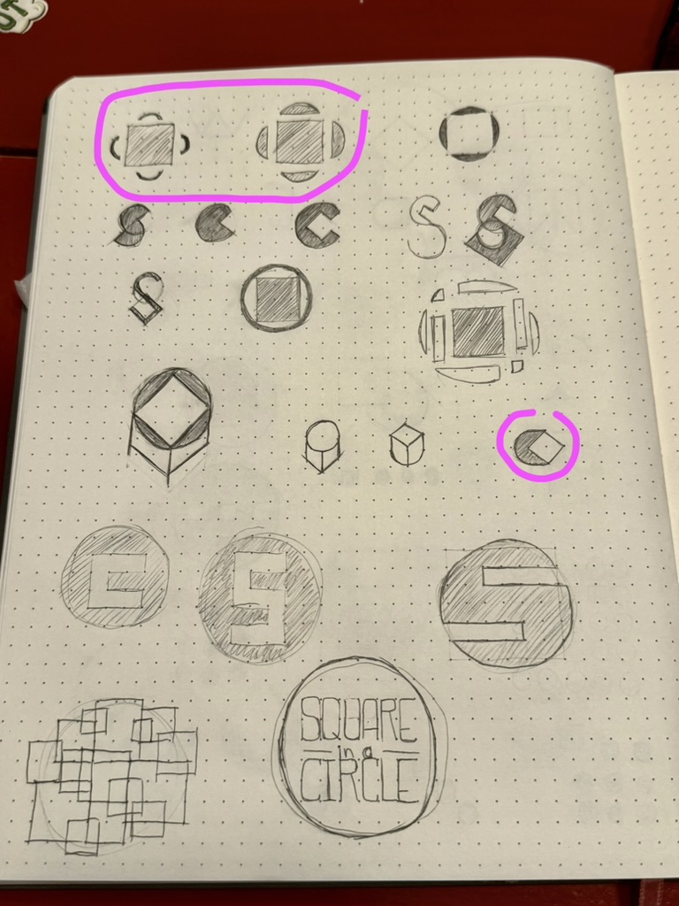
Some sketches of various concepts

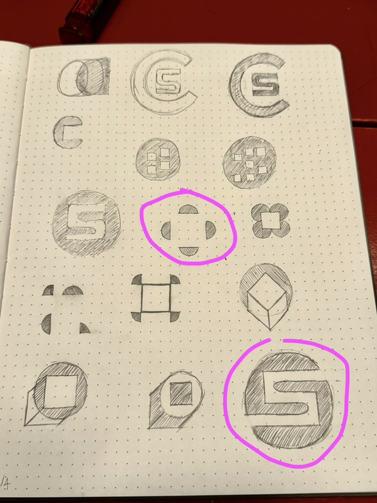
Playing around with vectors
But then something interesting started emerging: the idea of transformation and growth. Not just a square inside a circle, but a square that has moved beyond fitting in, transcended that constraint. That’s found itself. That felt true to what Titus is doing with his coaching work — helping people grow into who they’re supposed to be — and true to Titus personally.


Where we landed
We played with a lot of color treatments and mark directions and typefaces before it clicked. We landed on a final mark of concentric layers of a circle transforming into a square. Each layer has a bit of imperfection to keep it human. And because growth isn’t linear.
The square is the core, the bright center that holds everything together. Everything radiates outward from it. It’s not about fitting in or breaking free, it’s about the square finding itself, being exactly where it’s supposed to be, and everything else building out from that. That feels right for a coaching brand about becoming who you’re meant to be.
![]()
Titus loved it immediately. He felt like it represented him and what he was going for. And everyone he’s shown it to has agreed that it feels like him. Which is the exact reaction I was hoping to hear.
p.s. Titus is an amazing life coach (and human!) so check out his website at https://www.squareinacircle.net/. Not only that, but he has a voice of gold, too, and does voiceovers.