The Importance of Good Defaults
One of the simplest and most robust findings from behavioral economics is that when people are faced with a choice they tend to stick with the default option. This sounds like something that shouldn’t have any effect on people. Common sense leads us to believe we’ll always choose whichever option benefits us the most, regardless of the default. Although this intuitively makes sense, numerous studies show that’s not the case. For example, most countries have an option for people to donate their organs upon their death. In America, the default choice is to not donate organs, meaning they must specifically check a box on a form (an “opt-in” system). As a result, the consent rate is only about 28%. In contrast, Belgium’s default option is to donate organs (an “opt-out” system), in which about 98% of the population consent to donation (read the fully study here [pdf]).
There are many explanations for this behavior. One reason is that making a choice takes effort (even if it’s only checking a box), whereas sticking with the default is effortless. Another reason is when decisions have unclear costs and benefits that are difficult to evaluate (such as organ donation), defaults can imply the “recommended” option, thus saving people the time of thinking through the choice themselves. It also sends the signal that this is the option most people choose and is a safe bet (which reinforces the idea of social proof).
Applications to Web Design
Applying this insight to web pages is fairly straightforward: when presenting people with a choice, provide a default option. The simplest method is to pre-populate form fields with the most common choice. For example, the checkout form of an ecommerce store whose customers are mainly American should have “United States” already chosen as the default country. Obviously, there may be customers from other countries, but they would have to select an option were it left blank anyway. This decreases friction when completing a form, decreases errors, and increases usability.
The previous scenario is useful, but unlikely to increase conversions significantly. Defaults really shine when people are faced with a less clear-cut choice. For example, if you have multiple service plans, highlighting one will guide people to that option. Deciding which option to make the default is something you should A/B test, but a good approach is to use existing customer data to preselect the most popular option. For example, if you have multiple pricing tiers, you could highlight the most common one.
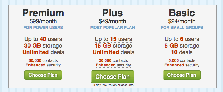
No recommended plan
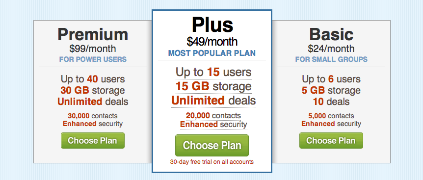
The most popular “Plus” plan is highlighted
Another strategy is to select the option you want your potential customers to select (such as the one that earns you the most profit). This will subtly nudge potential customers towards this option. For example, Optimizely ran an experiment recommending their Gold plan and saw a 20% increase in signups to that option.
Recommending pricing plans is just one way that default options can be applied to web design. Consider experimenting with your forms, account settings, preferences, or anywhere else people face a choice. By providing a default option to fall back on, you’re doing a favor for your customers and yourself.
Further Reading
Read Eric Johnson and Daniel Goldstein’s full study on defaults, titled “Do defaults save lives?” (2003).