Good North Star, Bad North Star
“We need a North Star.” Most product designers have been asked for one at some point, and it usually causes us to internally groan and roll our eyes (if not externally, too). We’ve all worked on North Stars that are a frustrating waste of time and served no purpose, and where the sole burden was on us to “come up with the vision.”
But many of us have also created ones that painted an inspiring vision, getting a team excited about the road ahead and keeping them on track to deliver that vision.
I led a discussion in a product design meeting at LaunchDarkly to learn about the team’s experiences with North Stars. What made for good ones, and what made for bad ones? What follows are some takeaways from that discussion.
What is a “North Star”?
Julie Zhou, former VP of Design at Facebook, defines a “North Star” as:
A design “North Star” is a visual output (commonly a video, although it can also be a storyboard, a series of hi-fidelity designs, etc.) that explains the high-level narrative of why an idea or concept will improve people’s lives.
They should be inspiring, get people on the same page and excited about a vision, but still be realistic.
It’s not a roadmap, a spec, a detailed design mock, nor does it answer every question about how an upcoming product or feature should work. What eventually gets built won’t be exactly like the North Star.
They can be used for projects as big as a whole new product or service, or as small as individual features.
Julie talks about North Stars as very future forward, and primarily videos, but myself and the team have created ones for individual features, and the output was just static screenshots. I’ve also called them “hero shots” and “concept mocks.” You could argue these aren’t “North Stars,” but spiritually they’re the same: get people excited about the future they’re building.
Do’s and Don’ts for North Stars
Simply put, good North Stars distill complex concepts to their essence, and get people excited about the future they’re building towards. These “Dos” and “Don’ts” will guide you to successful North Stars.
Don’t
- Design for an unspecified time in the future
- Redesign every screen or specify every interaction and design detail
- Put all the work on the designer
- Have too many cooks in the kitchen
- Spend multiple quarters making one
- Do it “for fun”, or because someone said you’re not “innovating enough”, or because you’re bored with the current experience
Do
- Set a target timeframe for when this could be achieved. In my experience at high-growth startups, a timescale of 6–24 months is best for most features or products, but it will depend on your project and needs.
- Scope it aggressively to 1-2 screens, a handful of use cases, a persona — something to set the focus on the most important aspect of a future product or feature. You’re trying to sell a vision, not answer every question. Good North Stars should tell a story in just a couple of screens.
- North Stars should be a cross-functional effort, like any product work. Expecting the designer to “come up with the vision” without input from engineering, PM, and other stakeholders is doomed to fail.
- Conversely to the above, too many people involved slows down the process, leads to too many opinions, and takes too long to get to consensus. The triad (design/eng/PM) is usually the right group size.
- A north star should take somewhere between days and weeks to create (maybe months if it’s a multi-year vision with filming and editing to do), depending on the time frame and scope of the future vision you’re trying to communicate.
- North Stars need to be tied to concrete initiatives that are actually going to be built. Doing them speculatively will be a frustrating waste of time for everyone involved.
North Stars That Worked
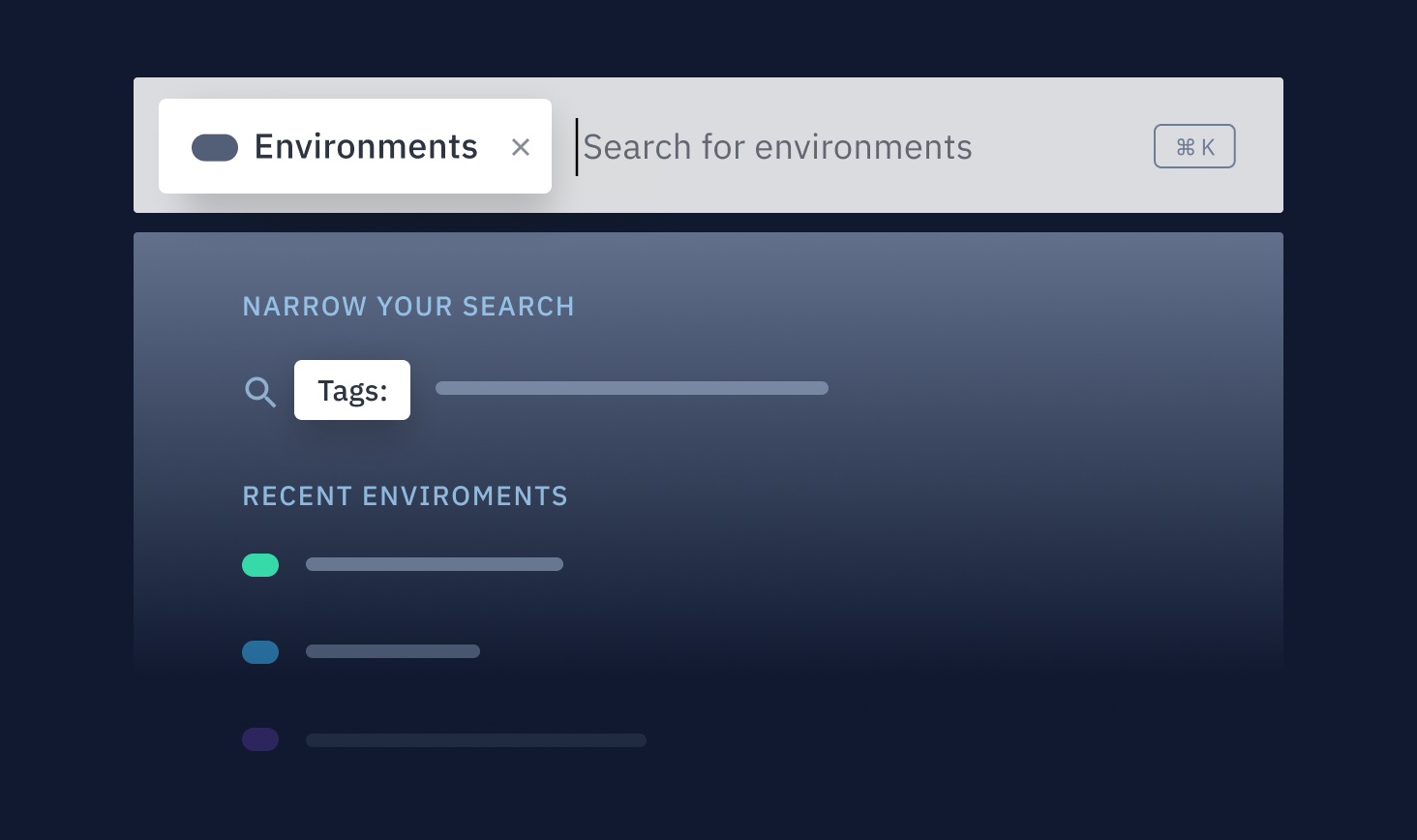
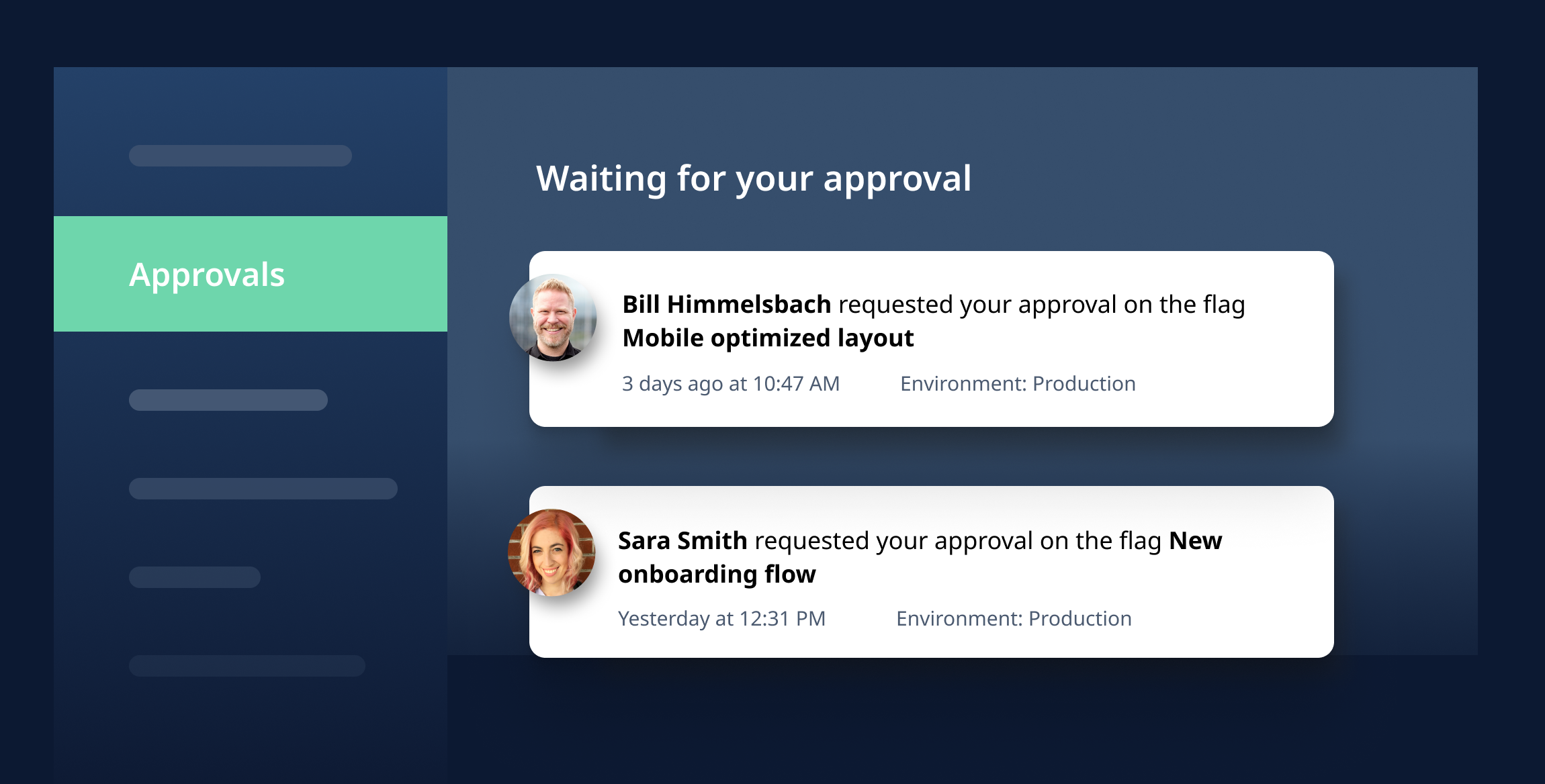
At both LaunchDarkly and my former company, Gladly, we’d make “hero shots” of features we’re planning to build for roadmap presentations and sales decks. They’re a single screen that communicated the feature to prospects. We’d usually spend a few hours designing this 1 screen to represent a whole concept. It forced us to distill complex features down to their essence. When design and development actually kicked off, they kept our focus on the purist version of the idea. There were a few times when features were getting too complex, or we were over-optimizing for edge cases, and the “hero shots” reoriented the team back to the essence of the concept.
 Hero shot for LaunchDarkly’s “global search”
 Hero shot for approvals in LaunchDarkly
North Stars That Didn’t Work
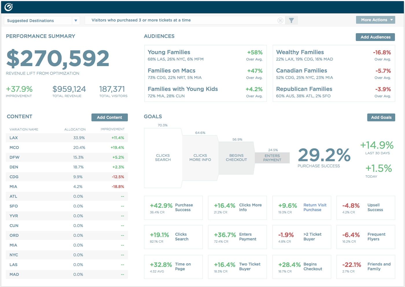
While at Optimizely, myself and a couple of other designers worked on a “North Star” (which we called a “concept car”) to envision what the product would do in some far off future (we didn’t have a specific time frame in mind). We were tapped by the co-founder to do this as a way of getting the company excited about the future of the product, get investors bought into our vision, and to sell candidates on joining the company. It was not tied to any product initiatives, nor did it feed into product strategy.
We spent months speculating on a bunch of cool new features, redesigning the UI, and rethinking the core flows. The end result looked awesome and was packed full of new stuff that solved existing pain points. The company was excited about this potential future we could build.
 Optimizely’s “concept car”
But it went nowhere. It was shared with the company, shown to some investors and candidates, but ultimately none of it was built. It was way too broad in scope, had a non-specific time horizon that was too long, wasn’t tied to any product initiatives, wasn’t an input to product strategy, didn’t tell a story, and wasn’t cross-functional. Basically, we did everything wrong.
Here’s an article about the project. It sounds amazing, but in reality the concept car had no wheels.
In Closing
When used properly, North Stars can be a fantastic tool to accelerate projects and sell a vision. But when used incorrectly, they’re a frustrating waste of time. Hopefully now you have some guidance on when and how to do North Stars.