Testing Theory: Mo' Choices, Mo' Problems
When asked, most of us would say we’d prefer more options to choose from, rather than fewer. We want to make the best possible choice, so more options should increase the likelihood we’ll choose correctly. But in actuality, research shows that more choice usually leads to worse decisions, or the abandonment of choice altogether. In this post, I will describe how we can use this knowledge to generate A/B test ideas.
Cognitive Overload
More choices are more mentally taxing to compare and evaluate, leading to cognitive overload and a decrease in decision making skills. Anecdotally, it’s the experience of walking into a supermarket to buy toothpaste, only to be confronted by an endless wall of brands and specialized types that all seem roughly the same. You’re quickly overwhelmed, and with no distinguishing characteristics to help you choose, you just grab whatever you bought last time and get the hell out of there.
This common experience was formally studied by Iyengar and Lepper (pdf) (2000), who compared buying rates when shoppers were presented 24 jams to sample, versus just 6. They found when 24 jams were available, only 3% of people bought a jar. But when only 6 jams were available, 30% bought a jar. By providing fewer jams to sample, it was easier for shoppers to compare them to each other and make a decision.
Generating Test Ideas
From these findings you can apply a simple rule to your site or mobile app to generate test ideas: any time a user has to make a choice (e.g. deciding which product to buy; clicking a navigation link; etc.), reduce the number of available options. Here are some examples:
- Have just one call-to-action. If you have “Sign Up” and “Learn More” buttons, for example, try removing the “Learn More” button. (See below for an example).
- Remove navigation items. For example, Amazon has been continually simplifying its homepage by hiding its store categories in favor of search. Shoppers don’t need to think about which category might have their desired item; rather, they just search for it. (For help simplifying your navigation, check out this series of articles on Smashing Magazine).
- Try offering fewer products. See if hiding unpopular or similar products increases purchases of the few that remain.
- If removing products isn’t feasible, try asking people to make a series of simple choices to narrow down their options. Returning to the toothpaste example, you could ask people to choose a flavor, then a type (whitening, no-fluoride, baking soda, etc.), and present toothpastes that only match those choices. The key is to make sure your customers understand each facet, and the answers are distinct and not too numerous (i.e. less than 6).
- Break up checkout forms into discrete steps.
- Remove navigation from checkout funnels. Many eCommerce sites (like Crate&Barrel and Amazon) do this because it leaves one option to the user — completing the purchase (see below).
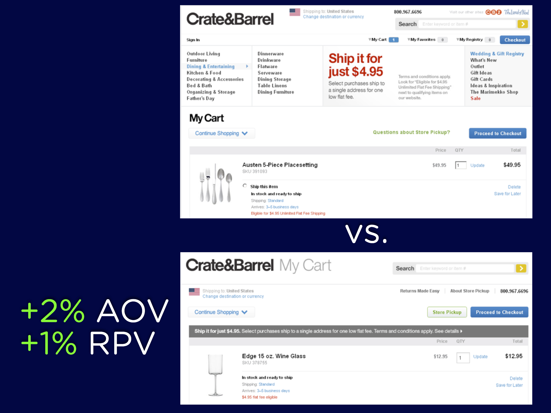
By removing the main navigation from their checkout flow, Crate&Barrel increased average order value by 2% and revenue per visitor by 1%.
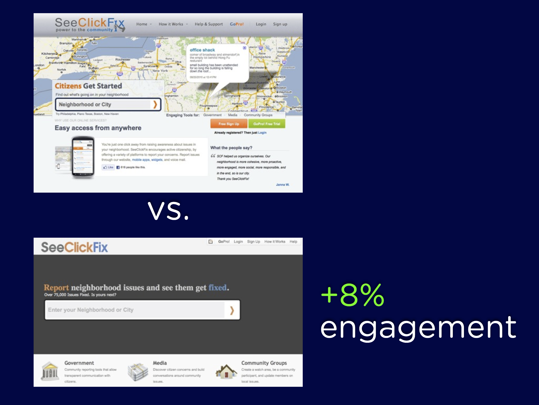
By removing extraneous calls-to-action (“Free Sign Up” and “Go Pro! Free Trial”), SeeClickFix (a service for reporting neighborhood issues) focused users’ attention on the search bar and increased engagement by 8%.
Know your audience
Of course, there are times when more choice is better. Broadly speaking, experts typically know what they’re looking for, and are able to evaluate many options because they understand all the distinguishing minutia. For example, professional tennis players can rapidly narrow down the choice of thousands of racquets to just a few because they understand the difference between different materials, weights, head sizes, lengths, and so on. If you don’t offer what they’re looking for, or make it easy to get to what they want, they’ll look elsewhere. For this reason, it’s important that you understand your audience and cater to their buying habits.
We’re trained from an early age to believe that more choice is always better. But in actuality, more choices are mentally taxing, and lead to poor decision making or the abandonment of choice altogether. By testing the removal or simplification of options, you can increase sales, conversions, and overall customer satisfaction.
Further Reading
- Botti and Iynegar – The Dark Side of Choice (pdf)