Site Redesign IV: Color, Layout, & Logo
While I was exploring the world of typography to match my guiding concept, I was also exploring ideas for the color, layout, and logo (some of which you saw in the previous post). I explored all 3 of these together because they were all interrelated. The placement of the logo and navigation dictated their color and style, so I was changing each variable simultaneously.
My starting point was summer and beach — blue skies and water, warm sun, yellow sand, and so on. These ended up being both too cool-toned, and like I was getting fried on the beach under the bright mid-day sun. They were too literal. But hey, you have to start somewhere.
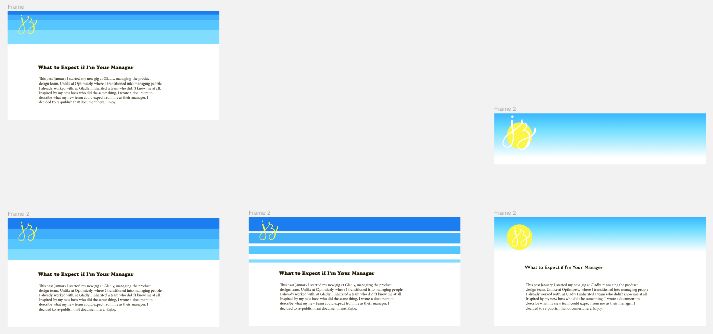 Exploring blue skies and water, warm sun, and yellow sand.
I switched to a warmer palette, and using fat bands of solid color that I pulled from my mood board.
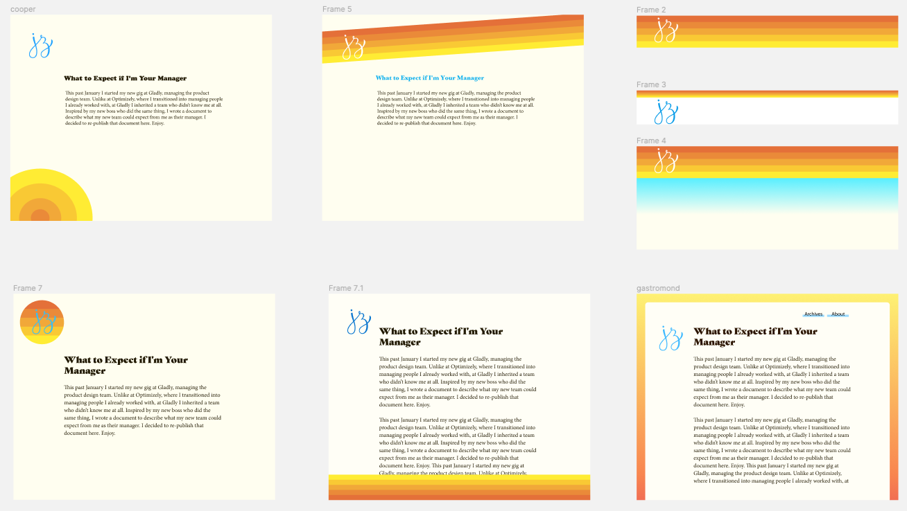 Warmer palettes with fat bands of color.
I also tried out a “watercolored” (it was done in Procreate) header, and while the colors were nice, the aesthetic felt too artistic.
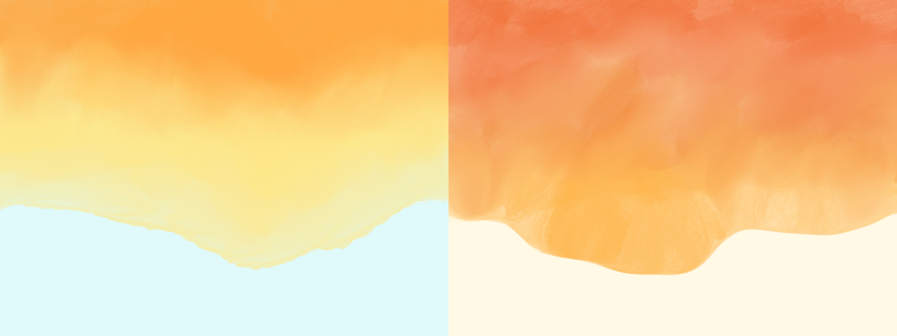 Watercolor header.
While none of these were working as is, the colors were moving in the right direction. These explorations also helped me refine the aesthetic towards a 60s/70s California summer vibe (as described in the inspiration post). That pushed me to notice sunsets more. Specifically the time right when the sun is setting and the sky is a warm blue and the horizon is orange. That palette had just the right tones. The blues of my previous exploration were too bright and cool-toned, but this blue felt warm and comforting. And the orange paired with it perfectly (you can’t go wrong taking inspiration from nature, y'all).
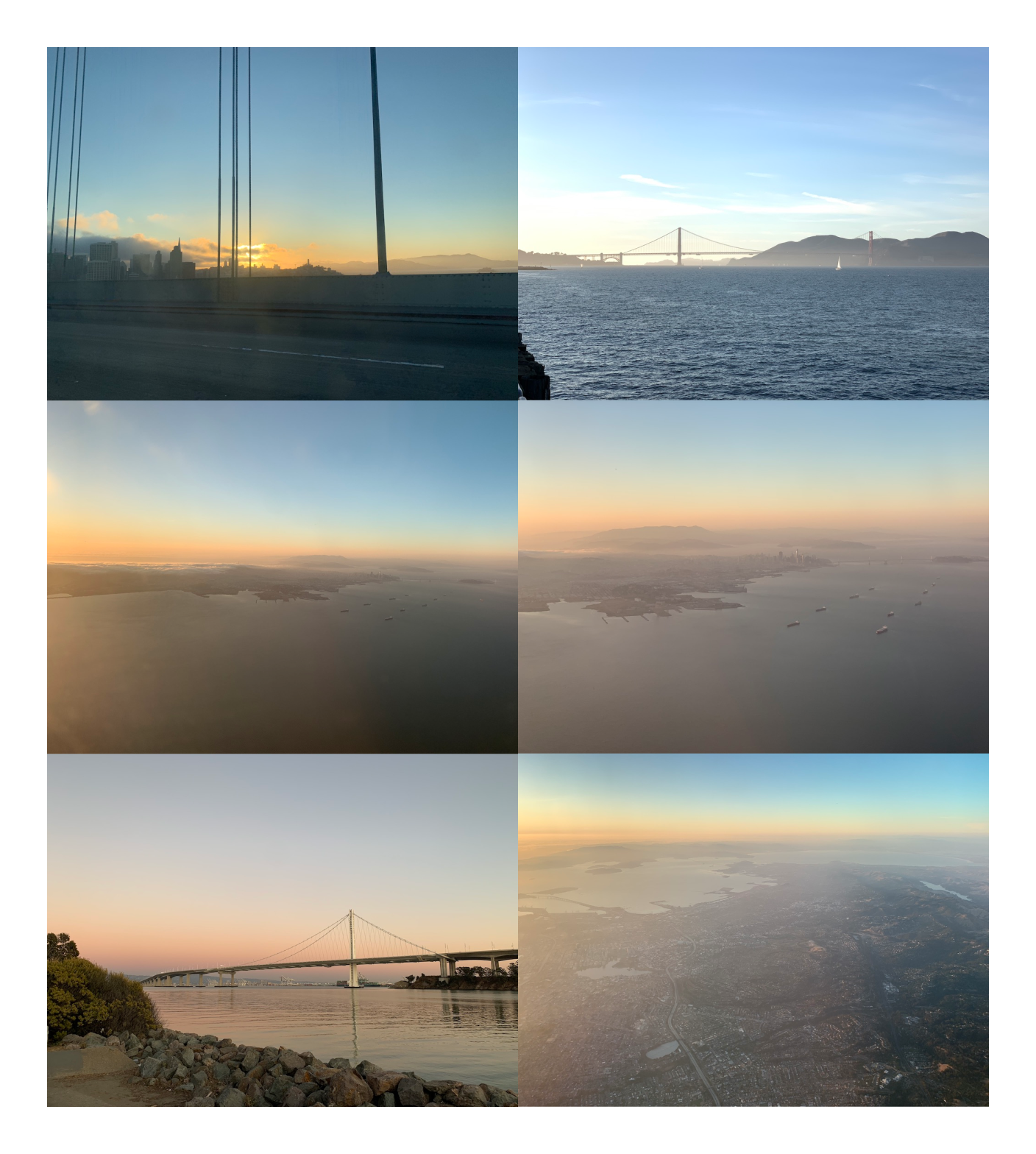 Pictures of sunsets that inspired me.
Not too long after this (or maybe before, the timeline is impossible to keep track of) I saw the site design of Iheanyi Ekechukwu via Jules Forrest’s tweet. I combined his site layout with my sunset-inspired gradient, and violà! I had the basic frame for my site. I gave the content a warm, off-white background, and made the text a warm brown-ish orange, and the main content’s style snapped into place.
Navigation & Logo
Even though I was heavily influenced by Iheanyi Ekechukwu’s site, my navigation and logo were different from his, so I still needed to figure out where to place them, and how to style them.
I tried them both inside and outside the main content area, in various blues, oranges, whites, and blacks. I didn’t fall in love with any option, and eventually settled on a temporary location of the navigation being dark blue and sitting above the main content while I tried out various type options.
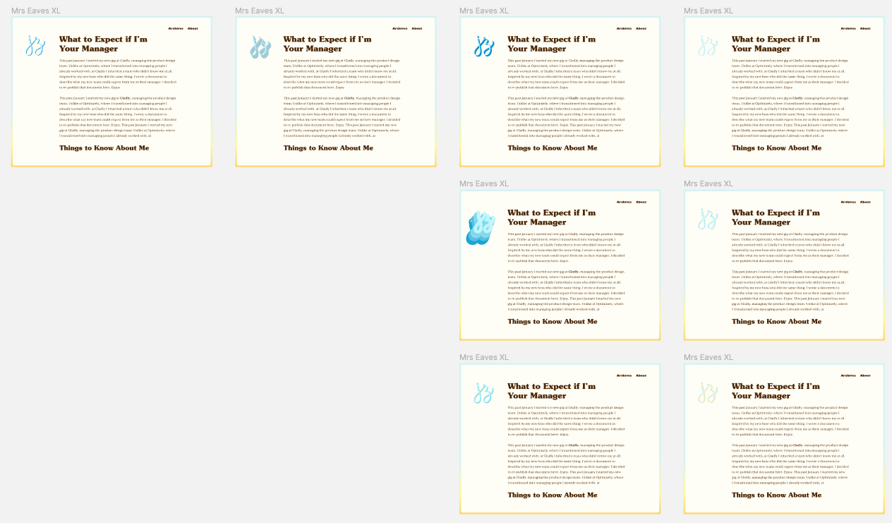
![]() Logo and navigation above content.
Logo and navigation above content.
I was also struggling with the JZ monogram. The hand drawn warmth of it still fit with the site’s new guiding light, but where do I put it? How do I style it? This took awhile to nail down. Like the navigation, I settled on the logo sitting above the content area in a light orange while I played with type (see image above), but that option never felt right.
After I set the type, I revisited these temporary decisions. I hit reset and started over with the design of Iheanyi Ekechuku’s site. The thinner outside gradient, combined with everything inside the white content area, felt cleaner, lighter, and put the emphasis on the content while having just enough color to make the site visually interesting and pull your eyes down the page.
I made the navigation dark blue so it would be of secondary importance to the content, and placed it in the top left corner, and that felt about right. At the last minute I switched it to a lighter brown color because I decided the blue was actually calling too much attention to itself. I must have done this in code because I couldn’t find it in Figma.
Now I was left with the logo, and let me tell you — this was a struggle. I converged on its placement pretty quickly (left side of the content, top-aligned with it), but couldn’t find any color or style that fit with the guiding concept.
I churned out dozens of variations, of which a good 20 or so survived in Figma. I tried strokes, shadows, different colors and backgrounds, and more. I tried a bunch of tricks I learned from doing hand lettering, and was confident I had a style somewhere in my tool belt that would work. Alas, nothing stuck.
 A subset of monogram variations.
I eventually hit a wall, so I sought out more inspiration. I scoured Fonts in Use posts, Google image searched for retro posters, and browsed 60s/70s lettering. I eventually found a hand-lettered style of big, chunky type that was duplicated and offset many times in different colors (inspiration that I apparently never saved anywhere).
I tried that out and could tell I was in the right ballpark (see image below). I played around with the offest colors, sizes, and directions until landing on what you see today (see them all in my Figma Community file).
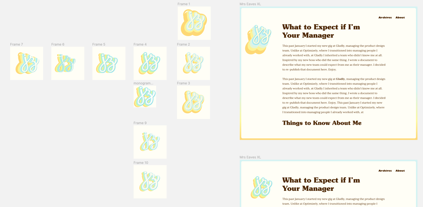 Monogram explorations in the right ballpark.
I’m pretty happy with the final result, although I find the colors a little too bright (especially in contexts off the site, like the favicon and Twitter), so I need to desaturate it and tweak the colors a bit more.
The last thing I did, mostly in code, was the link style. I knew I wanted a link style that didn’t call too much attention to itself, but at the same time they were an opportunity to give the text some visual flair. I can’t remember exactly what I tried, but when I saw the bright blue underline style, I knew that was it. I decided to make the underline “grow” on hover as a nice way to do something different and surprise readers.
And that, my friends, sums up my journey of how I redesigned this site. It took multiple years of off-and-on bursts of activity going back all the way to when I started adding hand lettering to the site, but the end result is a massive leap forward. I will continue tweaking it, but I’m confident the core aesthetic will serve me for years to come.
The rest of the site redesign posts