Redesigning Pragma's Web Portal
From Hidden Features to a Scalable IA with Modern UI
Pragma provides backend infrastructure services for game developers, enabling them to add online features to their game (like cross-platform gameplay, friends lists, messaging, and more). Our web portal serves as the web interface for managing these systems.
In this project I redesigned Pragma’s web portal from the ground up—turning a confusing interface with hidden navigation into a modern, scalable platform that customers started describing as “clean and modern” and “lightyears ahead of the competition.”
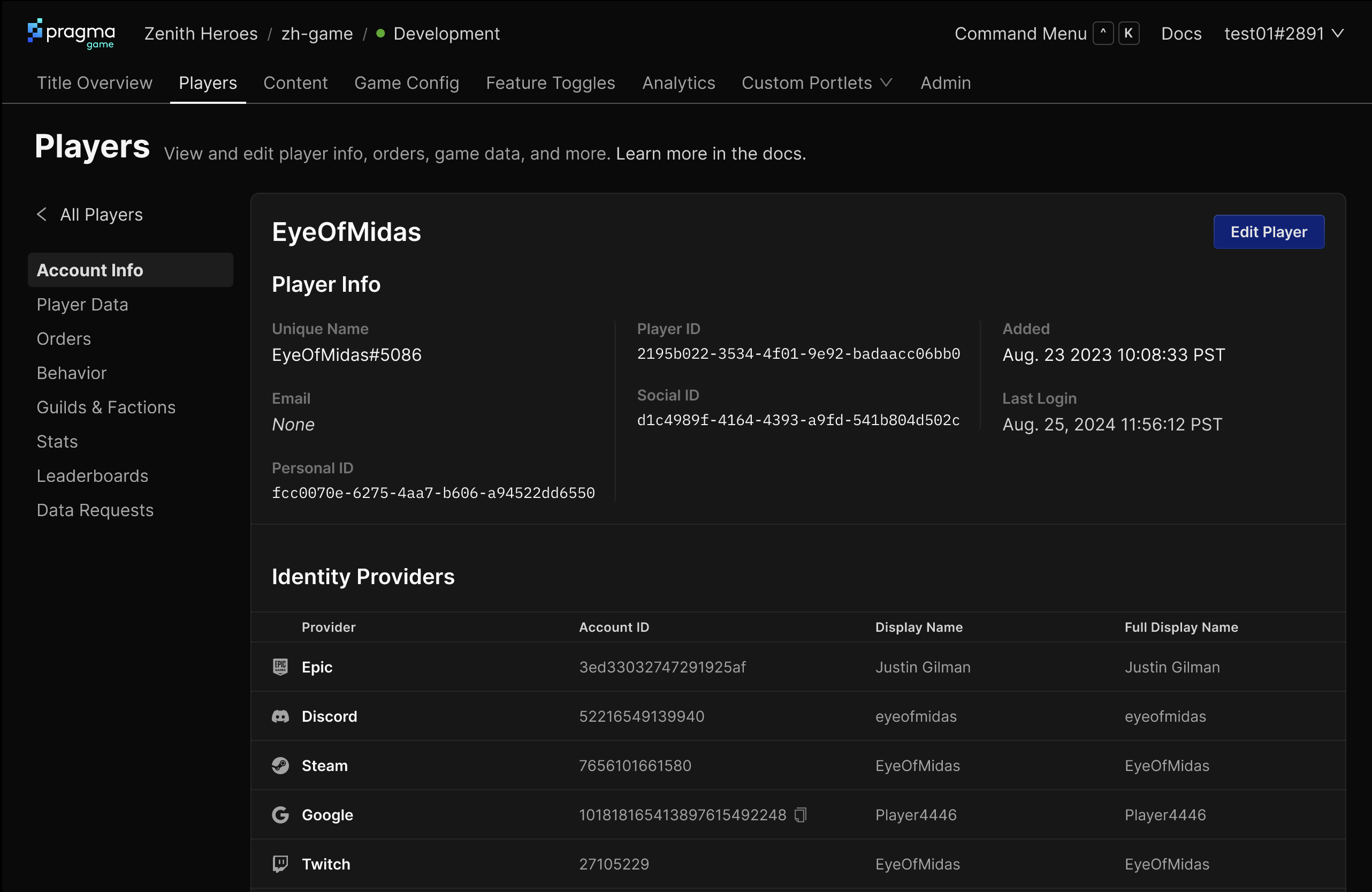
 Before: A portal where key features were buried behind an easily-missed “Services” menu, with inconsistent visual design that made Pragma appear less capable than competitors.
The Challenge
As part of Pragma’s backend game engine, we provide customers a web portal for managing these systems. Developers and designers use it to view live game data (like player inventories, currency balances, and item statistics), edit game content and configurations, and managing API keys. Player support teams rely on it daily to investigate and resolve player issues—for example, if a player purchased an item that didn’t appear in their account, support staff can view the player’s data and make corrections.
When I joined Pragma as their sole product designer, it had been built by a patchwork of engineers and contractors, with no one guiding its overall UX or navigation patterns. As such there were numerous problems holding us and our customers back:
- Hidden functionality: The navigation was buried behind a “Services” menu that most users missed entirely (it didn’t even look clickable)
- Lack of scalability: We had no clear framework for adding the dozens of new services on our roadmap—every new feature was a navigation puzzle
- Looking outdated: Our dated design made us appear less sophisticated than competitors in demos and trials
- Development morass: No standardized patterns meant engineers constantly built one-off solutions, slowing everything down
These problems weren’t so bad for our existing customers, but they were on the cusp of becoming huge problems: we wanted to build a cloud version of our product that anyone could sign up for, and these problems would significantly hinder the success of that offering. Without the white glove support we provided our enterprise customers, self-serve customers would never figure out how to use the product.
 Before screenshot showing items in the game
 Another before screenshot showing item details
Therefore, we needed to evolve to achieve these goals:
- Create a scalable information architecture for 20+ planned services
- Modernize the visual design to match user expectations
- Make sure existing users (especially daily users like player support) could still navigate efficiently
- Establish reusable patterns to accelerate future development
Working directly with our co-founder/CTO and head of product, I drove this project from strategy through implementation—including writing the PRDs, conducting user research, and even jumping into the code to help build it.
How I Approached It
This project was actually 2 related projects I pushed forward in tandem — one was a new IA and navigation, and the second was an updated visual design.
Information Architecture
For the information architecture piece of the puzzle, the biggest challenge was creating navigation that could scale from our current limited feature set to dozens of planned services. I audited current and planned functionality with leadership, mapping out the full ecosystem of services Pragma would eventually offer (which represented years of work, some of which would never be built, but we needed to be prepared).
We aligned on a few principles to stick to for the new IA:
- Navigate anywhere in 1-2 clicks
- Make features discoverable
- Scale to dozens of potential services
I explored numerous organizing schemes, with the 2 primary poles being:
- Put all primary services in the top level nav: more discoverable, but more nav items overall which can be overwhelming
- Group lesser-used services whose primary use was configuration in a “Game Config” section, and surface the rest at the top level: this is a cleaner, simpler nav, but more services hidden under one section
I built prototypes of each for us to try out internally, and to test with customers (using an AI service to run the tests, which easily cut the time to results in half), and ultimately the first option (primary services in the top-level nav) won out: it didn’t feel too overwhelming, and customers didn’t have any issues finding the functionality they were looking for.
After going through this exercise, though, I realized the choice wasn’t really either-or: because we were designing to accommodate future functionality, as opposed to existing functionality, the main need was to develop a flexible organizing scheme and set of UI patterns to accommodate these services as we built them, and we’ll decide which to use and how to group them as we add them to the portal. So essentially we could start with a very flat navigation (option 1) and group services together as it gets too big (option 2).
Visual refresh
As I pushed forward the information architecture, I was also developing a new visual style for us to use. Before diving into moodboards & mockups, I knew I needed leadership buy-in on the visual style we wanted. To do this, I facilitated a workshop with our co-founders and leadership to align on our new look.
The workshop used a simple prompt: “Ideally, customers should describe Pragma portal’s UI as…”, and I had 5 scales for everyone to vote on (e.g. traditional → modern, serious → friendly, etc.).
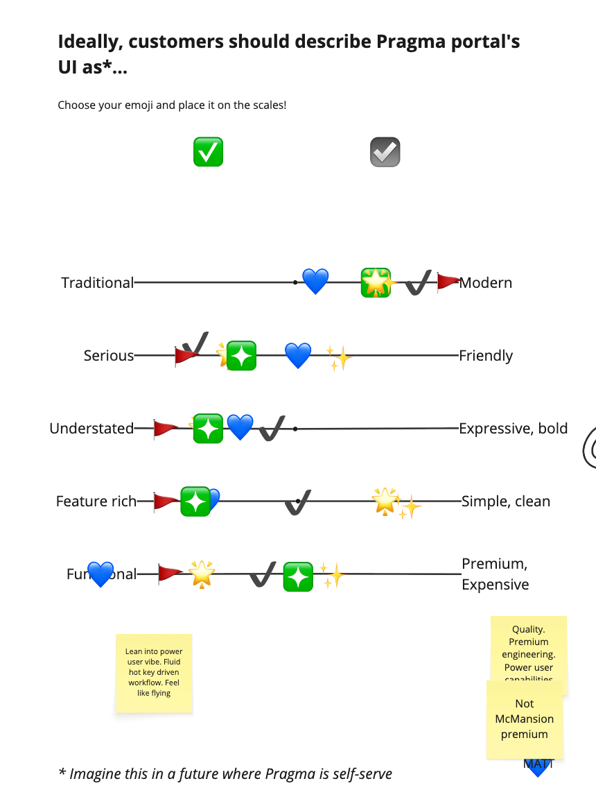 The visual spectrums everyone voted on
Some scales were really straightforward (e.g. everyone agreed we should feel “modern”), and others stirred up rigorous debate (such as “feature-rich vs simple, clean”). By the end, we had a shared vision:
- Modern over traditional (avoiding “bad enterprise software” associations)
- Serious but approachable (professional tool for professional context)
- Understated over bold (shouldn’t distract from core tasks)
- Premium and well-crafted (conveying power and quality)
Additionally, I included screenshots of adjacent products (e.g. Github, Linear, Vercel, etc.) for everyone to vote on what they liked and disliked, which tied specific visual styles and design decisions back to abstract words like “modern” and “bold”. This prompted more rich discussion and helped us align on what we wanted.
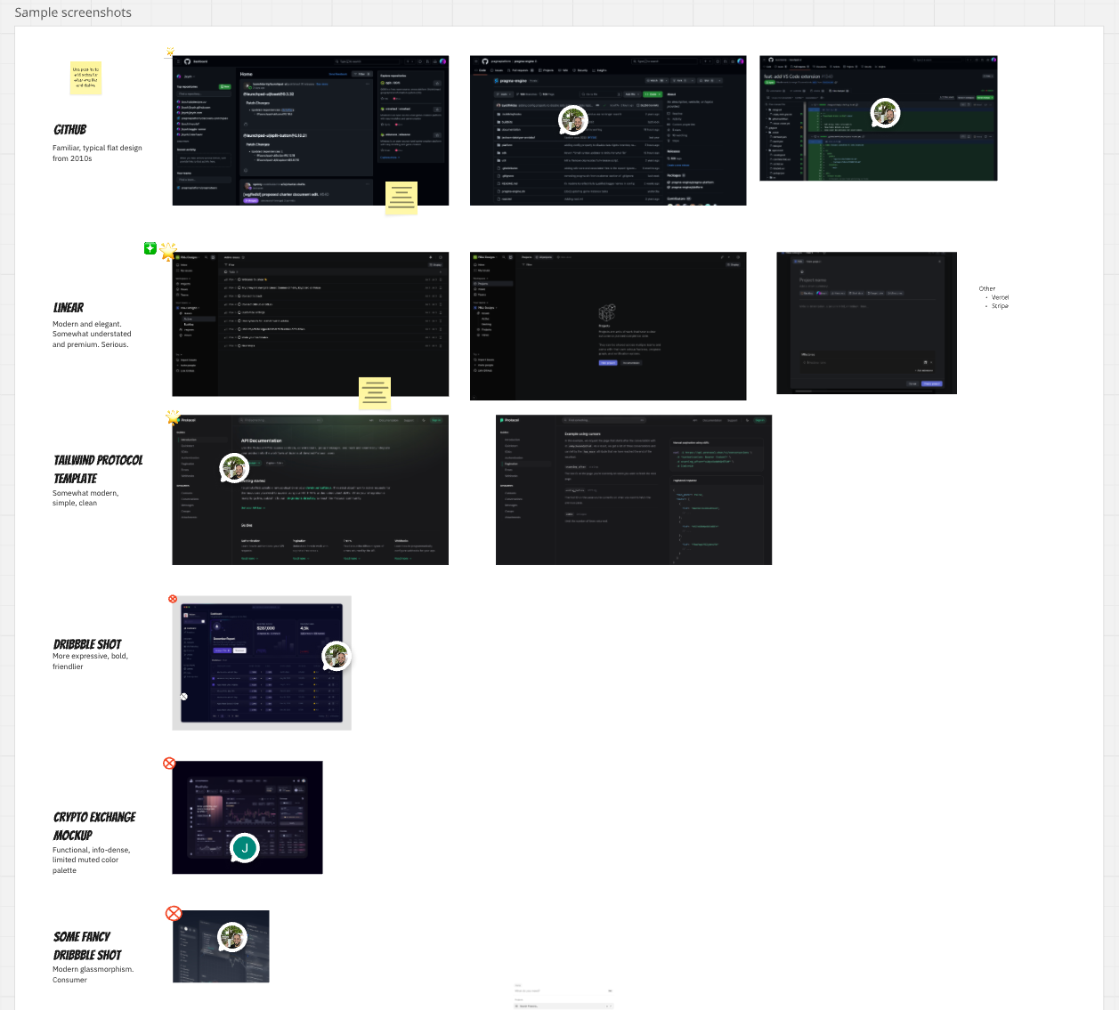 Screenshots of adjacent products everyone voted on
Having this alignment upfront made later design decisions much less controversial. When someone questioned a choice, I had a strong reason for why I made that choice.
(Sidenote: the output of this actually became something myself and the CEO referred back to many times in other projects, such as refreshing our marketing site and sales assets).
Visual Design Explorations
Now that we had a shared vision I could dive into visual explorations. I took a couple of the core screens that had different patterns on them (e.g. a table-based page, a text-heavy page, etc.) and applied different visual styles to each (some with different fonts, different types & amounts of color, different information densities, and so on). I explored dozens of ideas, winnowing those down to a few to share with stakeholders for feedback. After three rounds of iteration we landed on a direction we liked. Key decisions that came out of this process:
- Typography: Selected Inter font for its neutrality, availability on Google Fonts, and consistency across design and development tools
- Color strategy: Minimal color palette to avoid distraction—let the content and data take center stage
- Dark mode only: A dark theme fits with our overall brand, developers (generally) like dark themes, and rather than try to maintain two themes with our small team, I focused on making one really good experience
Quick user feedback
As part of the IA testing above, I also asked participants to select words that they would use to describe the look and feel of the UI (e.g. “modern”, “simple”, “powerful”, and so on) to make sure it matched our vision. The results were strong: most people selected “modern” and “simple”, but one person also thought it was “boring”, leading me to do one more revision to add a touch more color.
Making it Real
I partnered with an engineer to make the bulk of the changes together. He was already upgrading our Ant design version and theming system, which was fortuitous since it dovetailed with the new IA and visual design nicely. The bulk of the work was done in 2-3 weeks, and I contributed a handful of low-priority PRs over the following weeks to get the final changes in.
I actively contributed to implementation with the engineer, doing final polish and design details in code (Vue.js and Ant Design [ugh to both]), which is both faster and leads to higher quality (no handoffs, no back and forth to get it feeling “just right”).
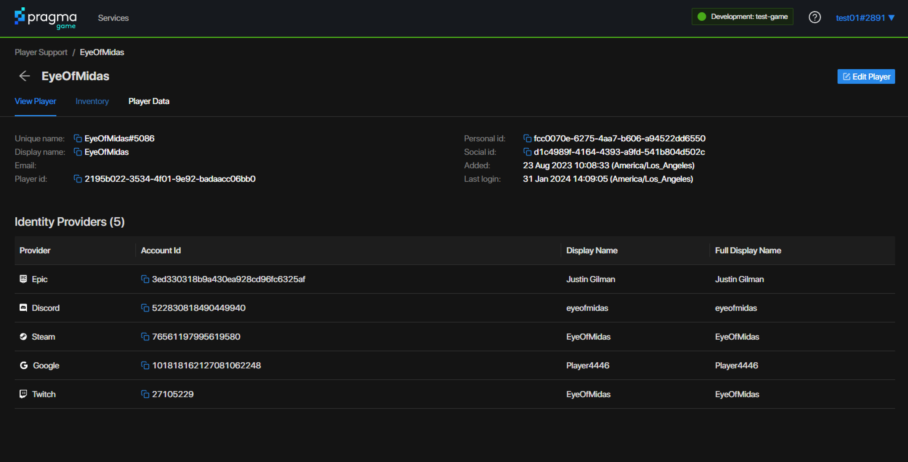
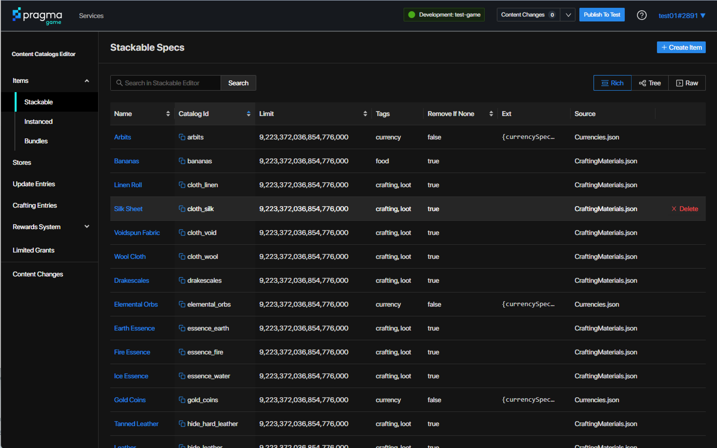
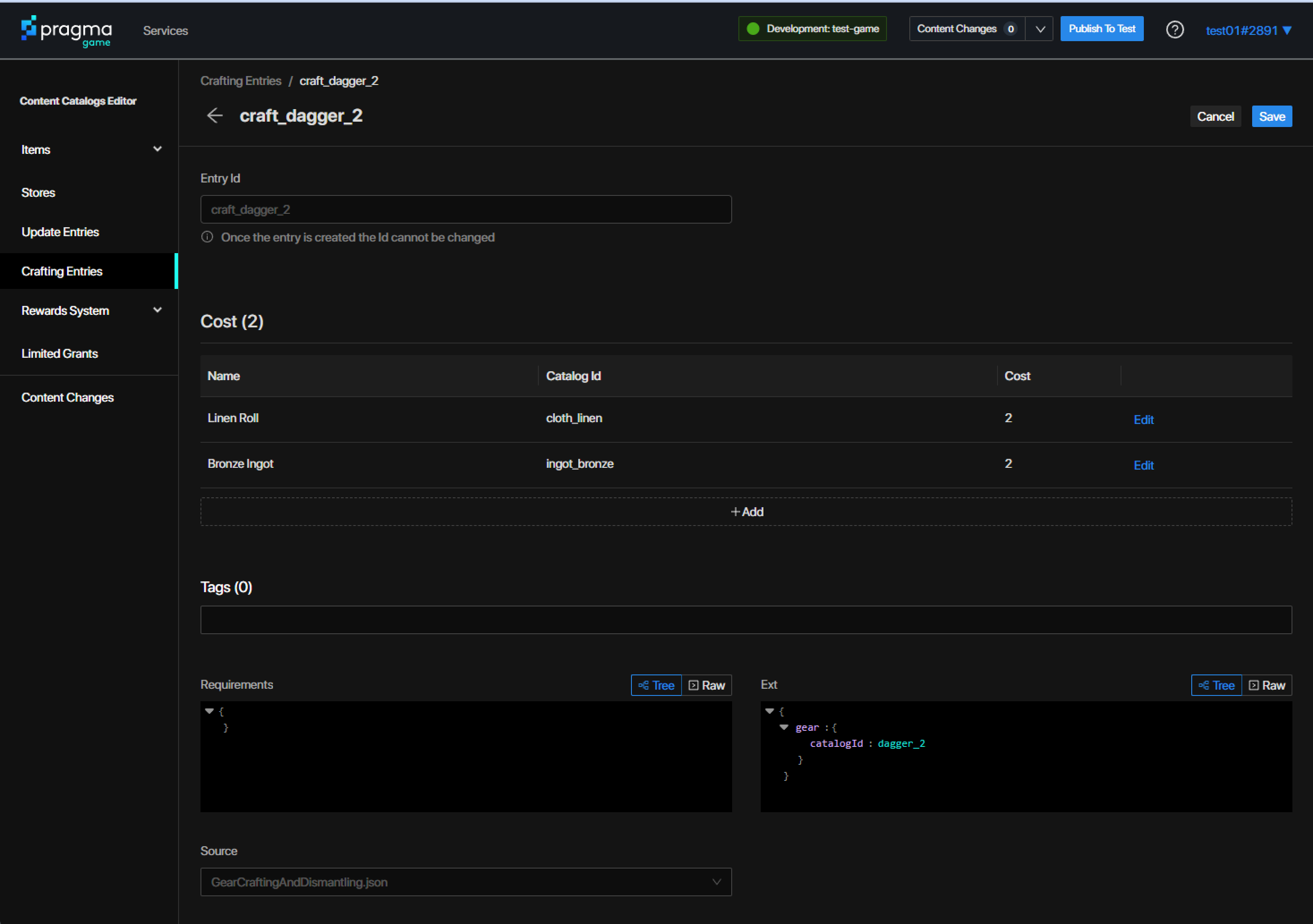
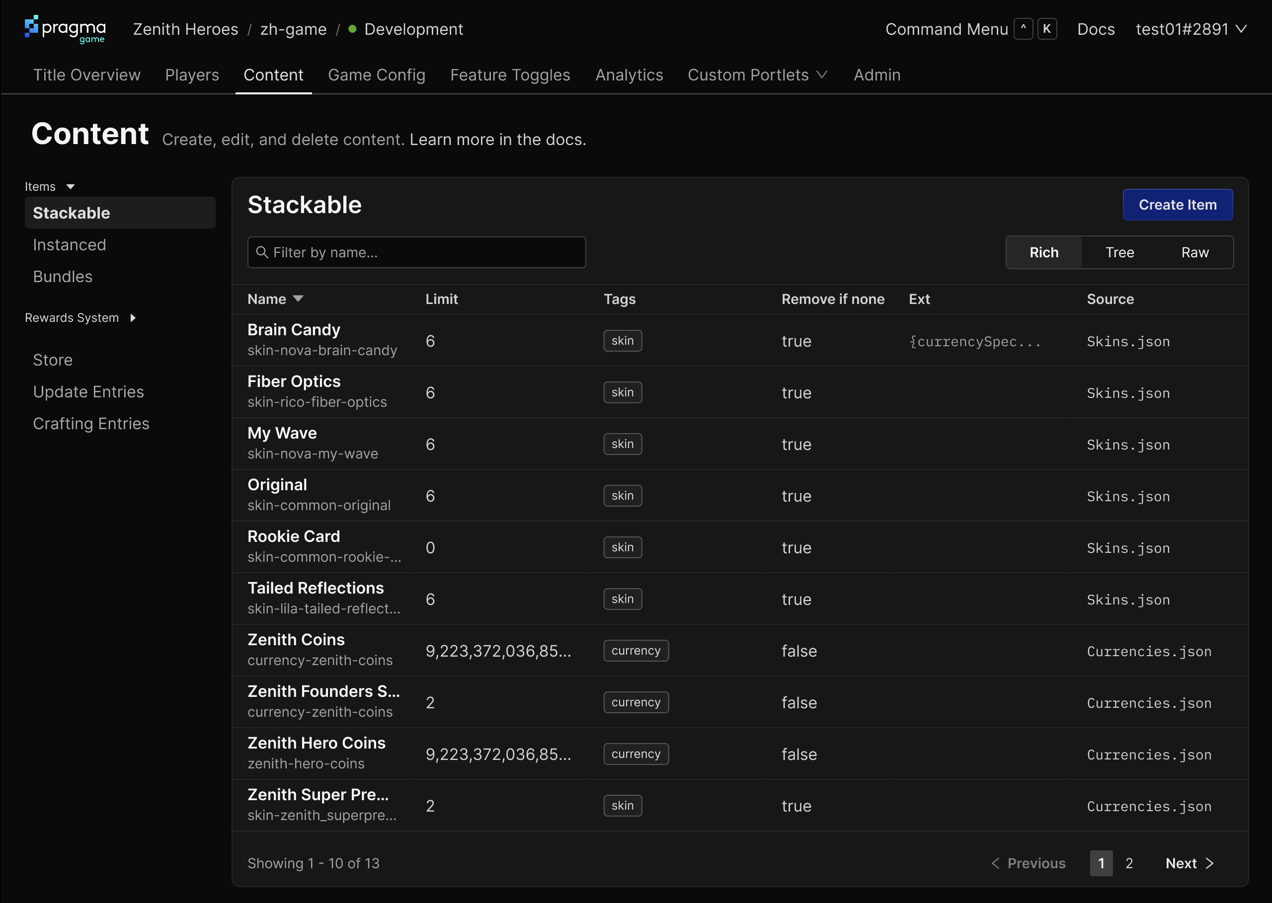 After screenshot of items in the game
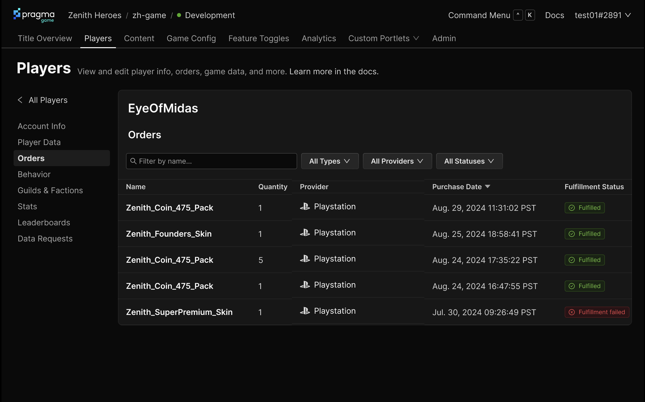 After screenshot of a player’s orders
Post-launch Impact
We didn’t have any hard metrics to measure (our user base is on the small side, making quant metrics hard to measure with statistical certainty; plus the changes were setting us up for the future and improving the aesthetic), but there was immediate impact for users and ourselves:
- Modern aesthetic: Some prospects and customers praised the UI, saying it felt “clean and modern” and was “lightyears ahead of the competition”, without any prompting from us
- Scalable foundation: The IA framework successfully accommodated new services as they launched (which was the whole point)
- Enhanced discoverability: Some existing users discovered functionality that was already there due to a persistent top navigation replacing the opaque “Services” menu
- Development velocity: A strong organizing system, navigation patterns to support different types of services, and a consistent component library accelerated feature development—we knew exactly what to build and how for new functionality we built
Wrapping Up
In the end, we transformed our web portal from a future liability into an asset. We had a scalable foundation to support years of product development, wrapped up in a new, modern aesthetic. And when the time came to build our cloud product (see the Pragma Connect case study), we didn’t waste any time debating navigation or page patterns: they already worked perfectly for what we needed. Our existing users barely noticed the transition, while new users and prospects immediately saw us as more professional and capable. We may not have had hard metrics to measure, but nevertheless the impact was obvious and immediate.