Adding clarity by removing information
“Where’s the clipboard?”
A customer wrote this in to our support team after using our Copy with cite feature. This feature allows customers to copy snippets of text from a court case, and paste them into the document they’re writing with the case’s citation appended to the end. It’s a huge time saver for lawyers when writing legal documents, and is Casetext’s most heavily used feature.
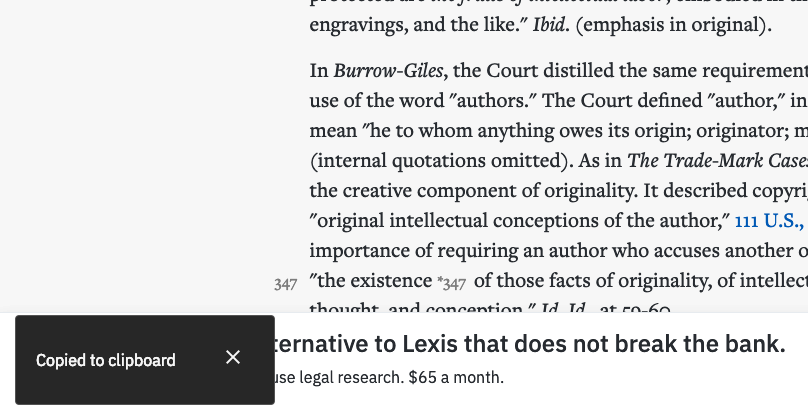
When I first saw this feedback, I assumed it was an anomaly. The success message says “Copied to clipboard,” but who doesn’t know what the clipboard is? How much clearer could we make the success message?
But then it came in again, and again, and again, until eventually the pattern was undeniable. It was only a small percentage of users overall who were writing in, but it was happening regularly enough that we knew we had to fix it.
 The original, confusing toast message that pops up after the user clicks, “Copy with cite.”
To debug this issue, I opened Fullstory (a service that lets you watch back user sessions, among other things) so I could observe the people who wrote in actually use the product. After watching a few sessions, a pattern emerged. People would click “Copy with cite,” zig-zag their mouse around the screen, opening and closing menus, then write in to support to ask, “Where’s the clipboard?” (or some variation thereof).
At first I didn’t understand why they were frantically throwing their cursor around the screen. What were they looking for? After watching many sessions, I finally realized what they were doing: they were looking for the clipboard in Casetext! They thought the “clipboard” was a feature in our product, as opposed to the clipboard on their OS.
Now that I understood the problem, the next challenge was how to fix it. How do we communicate that the clipboard we’re referring to is the system’s clipboard? I started rewriting the text, with options like, “Copied to clipboard. Press ctrl + V to paste.” “Copied to your system’s clipboard.” “Copied to your clipboard” [emphasis added].
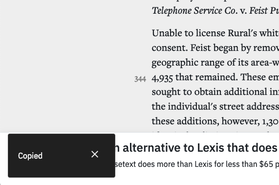
But none of these options felt right. They were either too wordy, too technical, or just more confusing. I took a step back and re-examined the problem. The word “clipboard” is what was tripping people up. What if we just removed that word altogether? Could we get away with just saying “Copied” instead? For the people having trouble with this feature it may prevent them from thinking the clipboard is a feature we offer. For people who aren’t getting confused in the first place, this is should be just as clear as saying “Copied to clipboard.”
 The refined toast message.
The change felt a little risky, but at the same time it felt right. To validate this would work, I decided to just make the change and see what happens. An A/B test and usability testing would both be correct methods to test my hypothesis, but in this case neither tool was the right fit. An A/B test would have taken too long to get statistically valid results, since the conversion event of “failing” to use the feature was very low. It’s also a difficult conversion event to measure. And a usability test would have been more time-consuming and costly than just shipping the change.
Since the solution was easy to implement (the code change was just removing 13 characters), and the impact if I was wrong was low (the change was unlikely to be worse, and it was easy to reverse course if it was), learning by making a change to the working product was the fastest, cheapest way to go.
After shipping the fix I kept an eye on the support messages coming in. In the following 2 months, only one person was confused about what to do after clicking “Copy with cite,” as compared to the 8 people who had written in in the previous 2 months. Not a perfect record, but an improvement nonetheless!
In this case, the best way to improve the clarity of the UI was to provide less information.