#frontend dev
-

Experimenting with layering, filtering, and masking in CSS
I’ve recently been doing some experiments with layering, filtering, and masking in CSS. The language has come a long way in the past few years, with properties like `filter`, `mask-image`, `mix-blend-mode`, additional gradient types like `radial-gradient`, and more, opening the door for Photoshop-like effects that weren’t possible before.
-

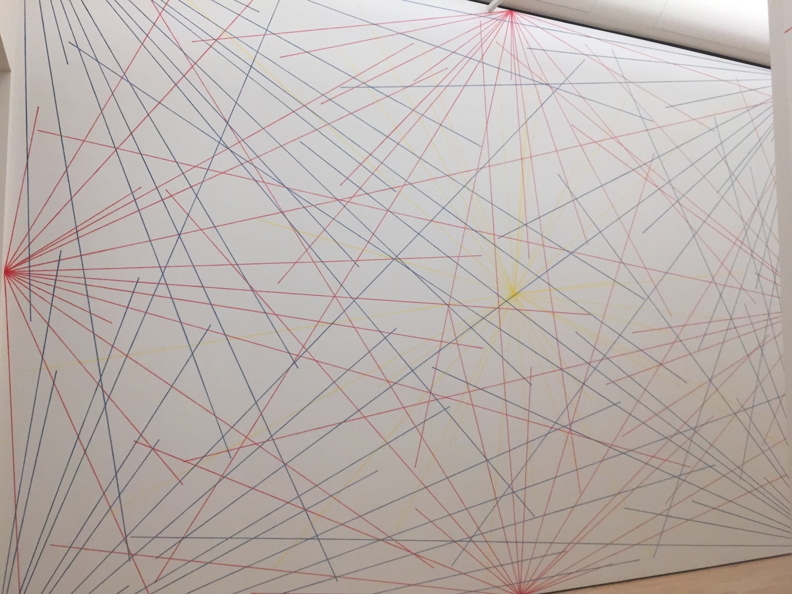
Sol LeWitt - Wall Drawing
I recently saw Sol LeWitt's Wall Drawing #273 at the SF MOMA, which really stayed with me after leaving the museum. In particular, I like that it wasn't drawn by the artist himself, but rather he wrote instructions for draftspeople to draw this piece directly on the walls of the museum, thus embracing some amount of variability.
-
DRY isn't the One True Principle of CSS
Ben Frain wrote a great article of recommendations for writing long-living CSS that's authored by many people (e.g. CSS for a product). The whole thing is worth reading, but I especially agree with his argument against writing DRY (Don't Repeat Yourself) code at the expense of maintainability.
-

Response to CSS Regions Considered Harmful
Håkon Wium Lie, the father of CSS, wrote a great critique of the CSS Regions spec. His article pointed out many of the same flaws that I've noticed.
-
Extend - SASS's Awkward Stepchild
SASS has a lot of really powerful features to help you write DRY code quickly. One such feature is `@extend`, which I find is overlooked by many developers but can be very useful when used properly.
-

Using Gradients In Place of Images
Recently at Optimizely, I needed to create ribbons as part of the design of our Summertime Christmas campaign. The easy way would have been to throw a repeating background image on some `div`s, but then I remembered CSS3 gradients can be used to create some pretty interesting patterns.
-
Automating Semantic Sprites with Compass
In my previous post, I explained how to use image sprites semantically. But as with all image spriting, setting each sprite's size and position is a pain. Compass can automate this, but it's designed with the assumption that all your sprites will be background images of elements.
-
A More Semantic Approach to Spriting Images
Spriting images is a well-known, well-documented way to speed up page load times. The standard technique is to set a sprite sheet image as the `background-image` of an element, and position it so the proper sprite shows through. This works great for icons and other images that aren't part of the actual content, but not so great for images that belong in the page content.
-
Performance comparison of serving fonts through Typekit vs Cloud.typography
On optimizely.com, we just switched our typeface from Proxima Nova (via Typekit), to Gotham (via Hoefler & Frere-Jones Cloud.typography). Gotham has long been what we used in Photoshop mocks, but we made the switch mostly because it just looks better. We've long known that Typekit can be a bottleneck to our page load, so I took this opportunity to compare the performance impact of each service.