Using Gradients In Place of Images
Recently at Optimizely, I needed to create ribbons as part of the design of our Summertime Christmas campaign (see image below). The easy way would have been to throw a repeating background image on some divs, but then I remembered CSS3 gradients can be used to create some pretty interesting patterns (for example, see Lea Verou’s CSS3 patterns gallery). Besides being a novel use of gradients, it also makes my markup more semantic (no empty container divs required), and makes the design more flexible (everything is generated programmatically, and thus easily changeable, unlike images).

The ribbons of Summertime Christmas
The Technique
The basic technique is to make the color stops end and start at the same place, thus creating hard lines between colors. Then, set the background-size so the ribbon occupies a specific width instead of spreading across the entire element.
Here’s the code for the vertical ribbon (vendor-specific properties left out deliberately):
background: linear-gradient(
  to right,
  #4783bf 8%,
  transparent 8%, // transparent starts at the same spot the blue
                  // ends, creating a hard line.
  transparent 12%,
  #4783bf 12%,
  #4783bf 88%,
  transparent 88%,
  transparent 92%,
  #4783bf 92%
);
background-repeat: no-repeat;
background-size: 80px 100%;
See the Pen Vertical ribbon by Jeff (@jlzych) on CodePen
Using percentages for the color stops (instead of hard-coded pixel values) allowed me to adjust the width of the ribbon by changing just one number — the first parameter of the background-size. (One thing to be careful of is that the ribbon can render imprecisely in certain browsers when the width gets small, so you may need to use pixel values in these situations.)
To add the horizontal ribbon, it’s a simple matter of layering multiple background-images on top of each other (by providing a comma-separated list of values, the first of which is on top), and switching the vertical and horizontal values of the background-size.
.ribbons {
  background: linear-gradient(
    to right,
    #4783bf 8%,
    transparent 8%,
    transparent 12%,
    #4783bf 12%,
    #4783bf 88%,
    transparent 88%,
    transparent 92%,
    #4783bf 92%
  ),
  linear-gradient(
    to bottom,
    #4783bf 8%,
    transparent 8%,
    transparent 12%,
    #4783bf 12%,
    #4783bf 88%,
    transparent 88%,
    transparent 92%,
    #4783bf 92%
  ),
  #1964af; // the darker blue behind the ribbons

  background-repeat: no-repeat;
  background-position: center 0, 0 center, 0 0;
  background-size: 80px 100%, 100% 80px, cover;
}
See the Pen Vertical and horizontal ribbon by Jeff (@jlzych) on CodePen
Some SCSS to Save Us
You’ve probably noticed there are a lot of repeated values within each linear-gradient. You also probably noticed that the vertical and horizontal ribbons use the same linear-gradient, except for the direction they’re rendered (the first parameter). As I was developing this, it quickly became cumbersome to fiddle with the ribbon’s sizing and color, so I leveraged SCSS to help me out. I’m not going to explain everything that’s going on here, but am providing this code for anyone who finds it useful (and for my own future reference).
.ribbons {
  // Variable declarations
  $ribbon-blue: #4783bf;
  $ribbon-width: 80px;
  $stops: (8%, 12%, 88%, 92%);
  $ribbon-gradient: $ribbon-blue nth($stops, 1), transparent nth($stops, 1), transparent nth($stops, 2), $ribbon-blue nth($stops, 2), $ribbon-blue nth($stops, 3), transparent nth($stops, 3), transparent nth($stops, 4), $ribbon-blue nth($stops, 4);

  // Ribbon background stuff
  background-color: $new-blue;
  @include background(
    linear-gradient(to right, $ribbon-gradient),
    linear-gradient(to bottom, $ribbon-gradient),
    $new-blue);
  @include background-size($ribbon-width 100%, 100% $ribbon-width, cover);
  background-position: center 0, 0 center, 0 0;
  background-repeat: no-repeat;
}
Ah, so much cleaner and compact! And it puts every value in one place, making it easy to tweak any aspect of the ribbon.
One More Example
I also recently used this technique on the Optimizely styleguide to create the light blue stripe in our navigation, instead of creating a background image or using multiple elements.
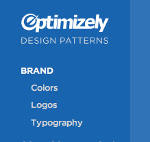
Optimizely’s styleguide navigation
Conclusion
This technique is handy for avoiding image creation, which improves page performance (by avoiding HTTP requests and reducing bandwidth usage), and makes the design easier to modify (no need to fire up Photoshop to make changes!). This example is just scratching the surface of novel ways gradients can be used to draw images in the browser.