Gladly’s Actions API
Designing a way for agents to trigger actions in external systems, without leaving Gladly
Ulta Beauty just signed a contract to have Gladly’s customer support software power all of their contact centers — over 1,000 agents in all. At the time, it was the second biggest deal in the company’s history. We closed them on the promise of giving their support team a “single pane of glass,” meaning agents would never have to leave Gladly to help customers. Cancelling and refunding orders, adding loyalty points, update shipping address, and more, could all be done within Gladly’s UI.
Currently, agents had a dozen different systems to jump between to complete a customer request (we learned this while shadowing agents during the sales process). They used a mix of off-the-shelf software and homegrown solutions, stitched together by their IT team, which slowed down agents and hurt customer satisfaction scores (commonly called CSAT). By providing all this functionality within Gladly – and with a consumer-grade user experience to boot – agent productivity would increase, as would customer satisfaction.
There was just one problem: we hadn’t built it yet. And we didn’t know how.
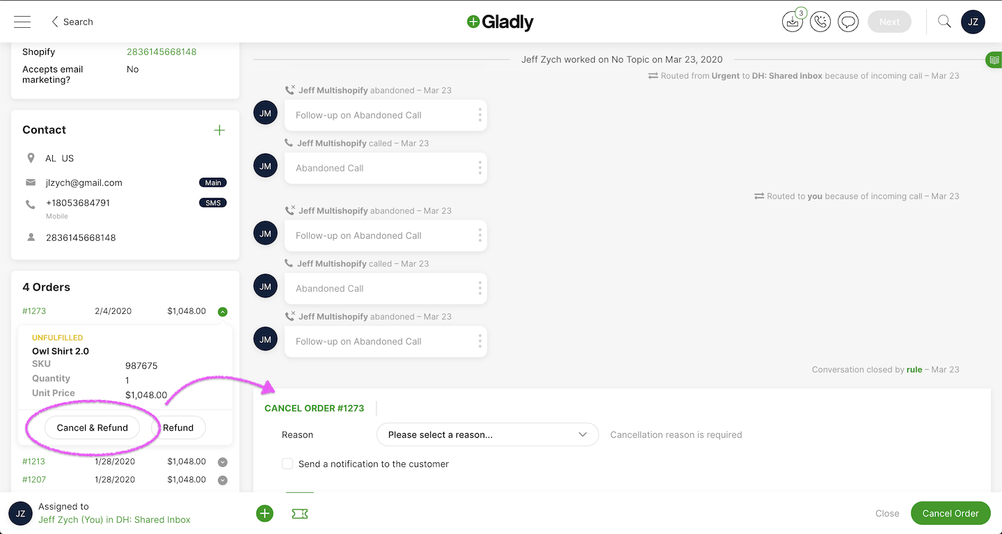 The main screen agents use when helping customers, showing the full timeline of conversations with that customer in the middle, and information about the customer on the left. We added “Cancel & Refund” and “Refund” buttons to the order card, which agents can click to issue a refund and cancel the order, all without leaving Gladly. Behind those buttons lays a lot of technical wizardry we had to figure out.
The Challenge
Making agents more efficient by letting them perform common tasks with Gladly wasn’t a new idea. We had been hearing about it for months from other prospects and customers. Ulta was just the first deal that closed that put it in the contract.
 Early mockups and technical proposal we showed Ulta
We sold Ulta on the strength of a polished mockup of the agent’s experience, and a hand-wave-y technical diagram (pictured above). We knew it was technically possible, but we didn’t know specifically how. The challenge was to build a solution that:
- Worked with any system our prospects and customers could throw at us. Like Ulta, they used a mix of off-the-shelf software and homegrown systems.
- Wouldn’t require months of IT’s time to build the piping into Gladly.
- Was a high-quality agent experience that matched Gladly’s UX, so that we didn’t slow down agents and they didn’t have to know or care which systems it was connected to on the backend. It just worked.
The agent experience was easy. It’s just buttons and forms. The hard part was what happens when those buttons are clicked and the form was submitted? How would we know what data to collect from agents, and where to send it once submitted? It would be easy to build one-off solutions that required little to no work on our customer’s end, but across all of our target customers there were endless combinations of systems to build against, making that option intractable.
Three Potential Paths
To make this agent experience a reality, the PM, engineering lead, and myself got in a room to review the mockup and whiteboard potential ways of building it. We came up with 3 that were viable (and 1 that was technically viable, but didn’t meet our UX goal):
- Form Builder: We could build an admin page for customers to build forms in. When agents clicked “Cancel”, for example, it would show the form they built, and would send data to their systems when agents submit it. No code for them to write, but a large lift on our end to build the admin page.
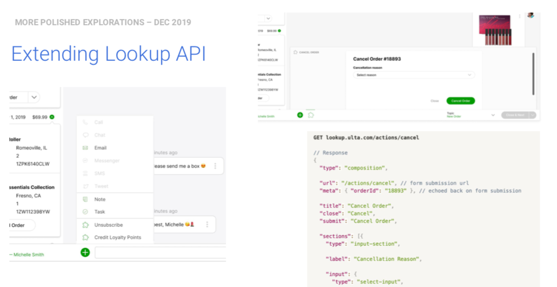
- Extend the Lookup API: We already had an API called the Lookup API that customers used to lookup customer data, like order history and loyalty points, and pipe it into Gladly. We could extend that by adding an
actionsJSON blob to the response, which would let developers declaratively attach “actions” to their customer info, specify what data they needed, and where to send it when agents submitted the form. Simple for developers, but would it be expressive enough to do any action customers could throw at us? - Gladly UI Library: Similar to the above, we could extend the Lookup API with a custom Javascript UI library that would let developers build mini applications for agents to perform actions in. We’d still control the look-and-feel of the UI, but they could build just about any functionality they wanted.
- iFrame: Give developers an iFrame that would load any URL they specify. We knew this was technically viable and would work with any system, but we were strongly opposed to it because the agent experience would be terrible. That being said, at least one customer said, “Just give me an iFrame,” so we needed to consider it.
I did lo-fi mock-ups of each of these options to ensure we were all talking about the same thing, and to review with customers.
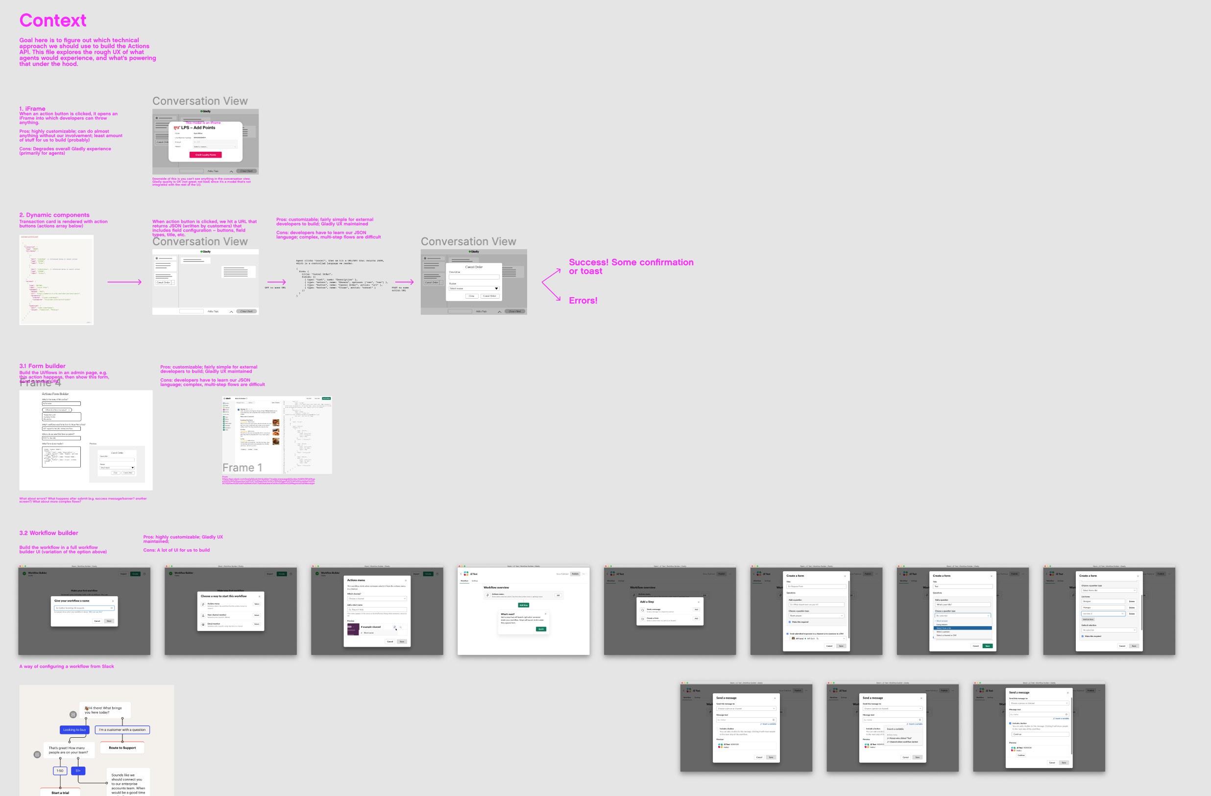 Lo-fi mockups of the 3 paths we were considering
So which was best? Each had tradeoffs, both for us, and for customers. Would developers want to build UIs within Gladly? Would they want to learn how to build custom UIs with our JS library? Would an actions JSON blob be expressive enough to perform any action customers threw at us?
More Customer Discovery
We reviewed these approaches with developers who were already using our Lookup API. After talking to 3 customers (we wanted to talk to more but finding representative developers who were interested in this feature on a short timeframe was difficult), a pattern emerged:
- The form builder was cumbersome to use. Developers write code for a living, and don’t want to build UIs in an admin interface. Plus, they’d still have to build backend systems to receive the response from any UI they built in Gladly, so moving between code and our admin pages was a clunky developer experience.
- The Gladly UI library had similar problems. They’d have to learn a new arbitrary syntax to build a UI, and it forced our customers to be designers, which neither of us wanted and risked degrading the agent experience.
- iFrames sucked for everyone. They all agreed it was painful to build and maintain, and other tools that offered this solution didn’t work well. Cue sigh of relief from us.
The winner, then, was adding an actions JSON blob to the Lookup API to declaratively create a UI out of a limited palette of building blocks. After getting feedback from customers, this felt like the obvious choice. But at the outset, that wasn’t so clear. That’s why it’s crucial to stay close to your customers when designing new features.
Extending the Lookup API was less for us to build (compared to the other options), easy for developers to learn, just expressive enough to do almost anything without giving developers enough rope to hang themselves with.
Pushing the UX Forward
Up to this point, I had stayed lo-fi on purpose. We weren’t sure how we were going to build it, and the architecture would impact the experience for both developers and agents, so going hi-fi too early would have been a waste of effort. I would have been polishing details that were likely to be thrown out. Plus, staying lo-fi lets us stay nimble and quickly throw out options that aren’t working without a second thought. (Read more about my take on staying lo-fi).
My whole strategy for this project was to have the UX take a step, then engineering, then UX, then engineering, and so on, each time moving into higher fidelity. Now that we felt confident in the underlying architecture, I moved into mid-fi and fleshed out each screen, error states, and confirmations (screenshot below).
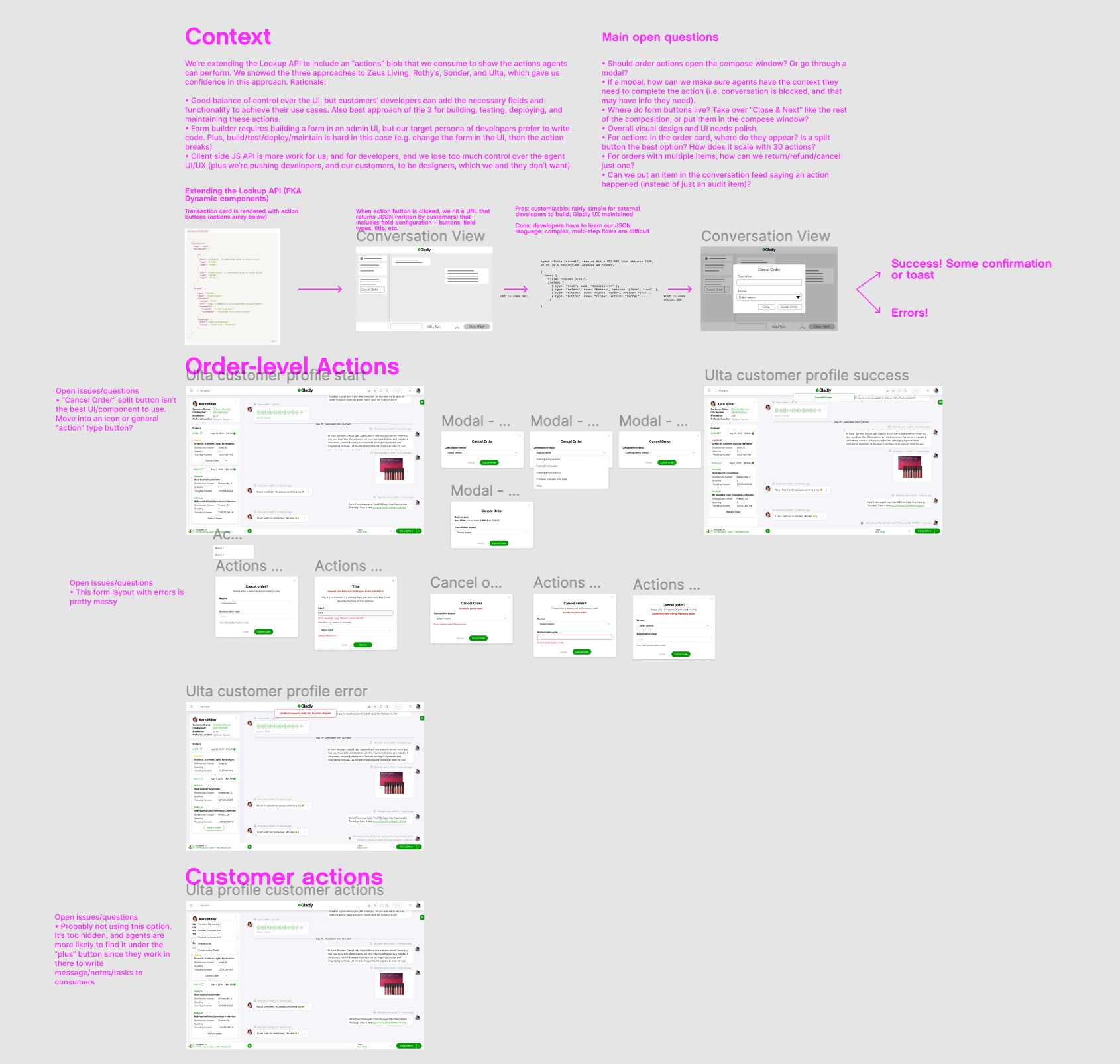 Screenshot of my Figma file of mid-fi mockups
Executive Input
Now that we had line of sight on what we were shipping, we wanted to get final input and sign-off from our executive team. Plus, Ulta wanted specs to build against, so we needed to keep the execs in the loop on what we’d be showing them the following week, when we were flying out there.
The executive team’s feedback was very positive – the project was on track, would make Ulta successful, was general enough to work for other customers, and was a good experience for both agents and developers. Just one piece was lacking: I hadn’t explored enough options for the agent experience.
I showed agents completing actions through a modal flow, but the CEO pointed out that this would stop agents from being able to see information about the customer and the conversation history, which may include details necessary to complete the action (like the reason they’re cancelling an order, for example).
I got so caught up in the technical constraints and staying in lock-step with engineers that I didn’t spend enough time exploring options for the agent UX. This piece felt “simple”, so I focused on the hard bits. But I didn’t come back to re-visit the initial decision we had made in the sales mock. Lesson learned for the future: explore a wide variety of options for every piece of the experience.
Visiting Ulta
We flew out to Chicago the following week, and the meeting was a resounding success. The Ulta team was happy with the fleshed-out API spec. We whiteboarded what they would have to build to get this working, and the only roadblocks were on their side. Their technology stack was a mishmash of various technology vendors and homegrown systems, most of which lacked APIs to integrate with us. Thankfully that wasn’t a knock against our solution – it was a knock against their other technology vendors. They would have to work through that on their side. For us, it meant we had the all clear to start building.
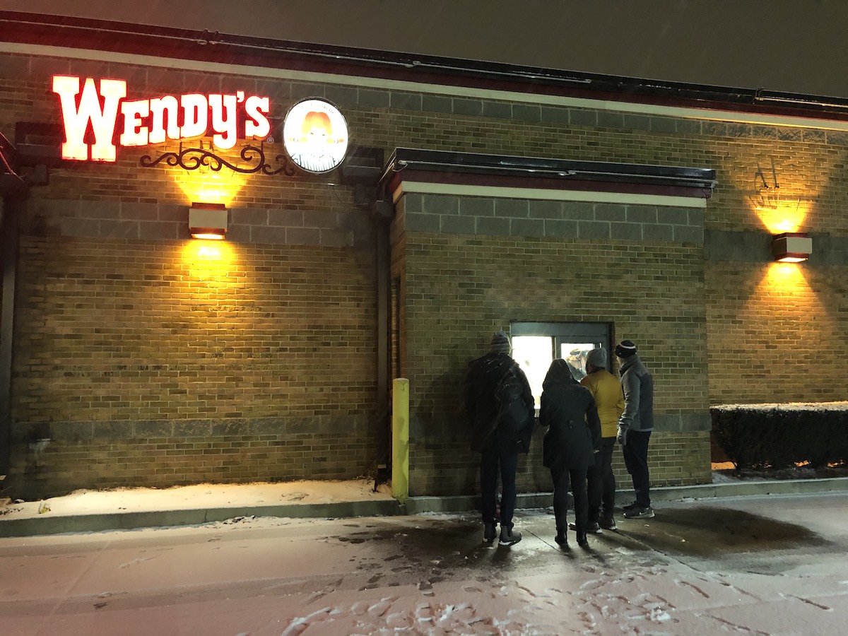 The team huddled outside Wendy’s trying to get food the night before our meeting. Everything was closed, including the inside of Wendy’s, so we had to walk through the drive-thru.
Finalizing the Agent Experience
Upon returning from the Ulta meeting I passed off the work to another designer. There were a few reasons for this:
- He’s the designer on Team Agent, which owns the agent experience. It was always my plan to get him involved.
- My primary responsibility is managing and leading the team. With the trip to Ulta and all the prep that required, it took time away from my managerial duties. I needed the help of another designer to get it over the finish line. It was worthwhile for me to shape the work in the early stages, since a technical project like this needed a technical designer like myself to guide it, but finalizing every UI state and working with engineers on all the final details is best handled by a member of my team.
- We needed to rapidly explore more options for the agent experience, but as stated above, I needed to return my focus to my managerial duties.
I filled him in on all the research and the feedback from the CEO, and asked him to explore a wide variety of options so we could choose the best one for agents. Even crazy, out there ideas that may not seem feasible!
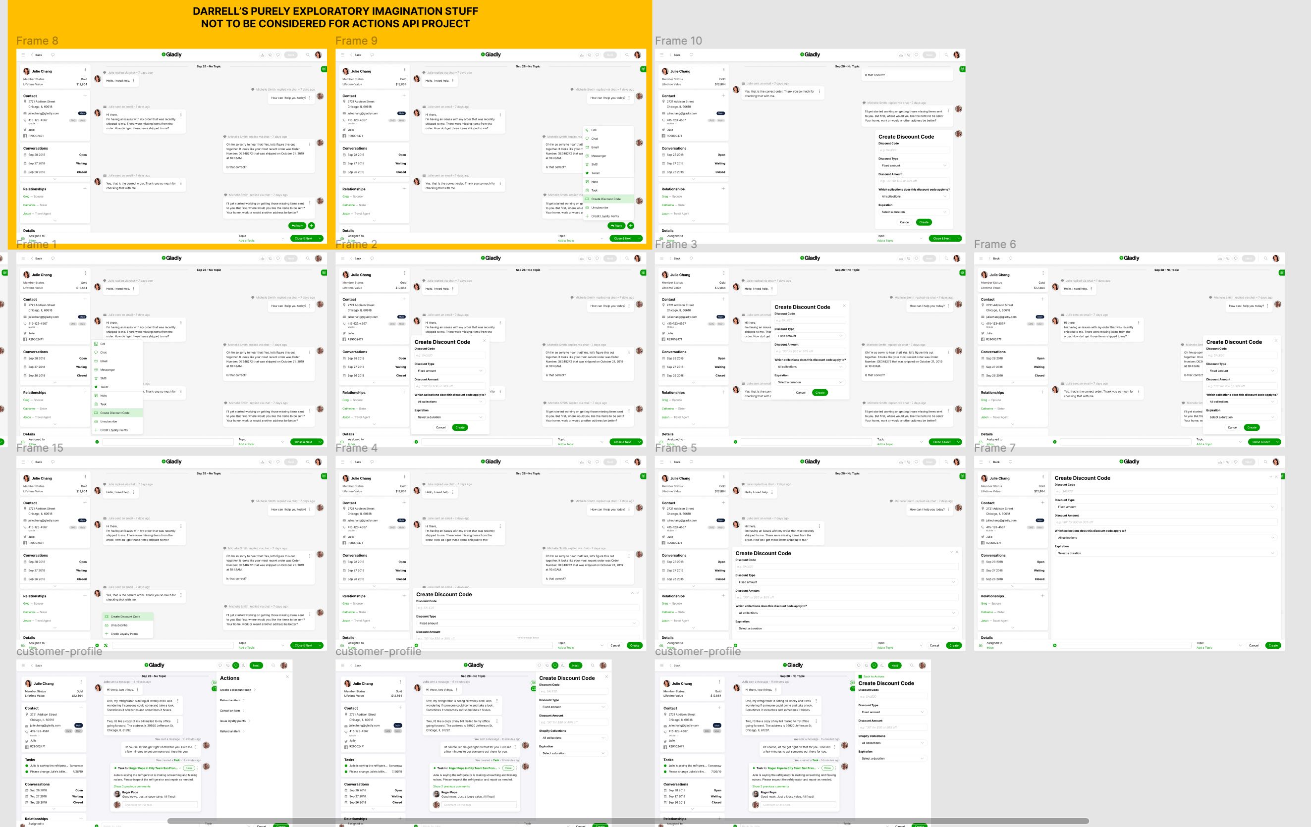 Darrell’s broad explorations of the agent experience
He did an amazing job of doing this, including some pretty experimental stuff that wouldn’t work for the initial launch but would be worth re-visiting later (that’s the yellow box in the screenshot above). I expect this from all of my designers, making it even more egregious that I failed to do so myself.
We narrowed down the options to a handful that were feasible to build in time for the go-live. Each were usable, and had pros and cons, but none were a stand out winner. Normally we’d do some user testing to learn which was best, but that wasn’t an option in this case. The engineers needed to start building immediately to have any hope of hitting the launch date, so we went with the CEO’s preferred option, but made sure the engineers would build it in a way that would let us change it in the future after we got feedback from agents using it in the wild (which would be more accurate feedback anyway).
Launch
The designer quickly polished up the designs, while engineering started coding. They hustled hard and shipped it in time for the go-live date.
The final agent experience we shipped
All systems were go for Ulta and then… they had to push back the date. In my experience this isn’t uncommon when building product for enterprise customers, but it’s still disheartening.
In this case, though, while we were building the Actions API we signed another customer who was eager to use it. In fact, the demo of this feature is what pushed them over the finish line.
First Customer Go Live!
We turned it on for them and I wish I could say it was an immediate hit, but… it wasn’t. It only got a trickle of usage.
Why? We set-up weekly check-in calls with the customer to get to the bottom of it, in which we learned 2 things:
- There were a couple of small bugs that caused the agents to not trust the feature, like orders with 0 dollars that could still be “refunded.”
- The company had an old policy that agents weren’t allowed to issue refunds, so they didn’t think they were allowed to use the feature. This was further backed up when we looked at FullStory and saw people escalating refunds to their manager. Good for them for following the rules! But when our point-of-contact told us that, they realized they needed to re-train their agents to use this feature.
After fixing the bugs and doing re-training, usage steadily grew week over week. Behavior is slow to change, even with training, and especially when the actions are as serious as cancelling orders and issuing refunds — actions that agents want to make sure they’re doing properly.
Even so, the first customer loved the feature, and agents had positive feedback once they got comfortable with it. I wish I had numbers on the time saved or increase in CSAT, but sadly the company had COVID-induced layoffs, so I left before we had enough data to get those numbers.
While the feature was just taking off as my time there wound down, it was a hit in sales demos. Prospects loved making agents more efficient by not having to leave Gladly, and it was the reason several customers signed with us while I was there.
Lessons Learned
Overall the project was a huge success. It closed deals and broke new ground in customer support software, while setting us up for a bunch of new innovative features down the line (like exposing these actions directly to consumers, so agents wouldn’t have to be involved at all).
Even so, there are always lessons to be learned from every project.
- Stay lo-fi as long as possible. It lets you move fast and change direction quickly without throwing out extra work.
- Work in lock-step with engineering. Don’t let the UX get too far ahead of what’s technically possible. Don’t polish details that may change depending on the underlying technical architecture. The UX should be pushing things forward, but regularly reviewing with engineering to ask, “How might we build this? What other options do you see?”
- Always explore a wide variety of options! “Look for the edges of the solution space,” I always say, meaning, push designs outside the bounds of what is possible to find what’s over the line, then reign it back in. Do so quickly and cheaply, and review with engineering and PM, before moving into higher fidelity.
- Behavior change is hard, and enterprise features don’t see immediate adoption. Understanding this, and tempering your expectations, is crucial for measuring success of features. People’s livelihoods are on the line with business software. Mistakes can cost them their jobs. They have certain habits they’ve built, and have been trained to do and not do certain things. A feature not getting adopted doesn’t mean it isn’t valuable or usable, it may mean there’s organizational policies that need to change, or that people need time to get used to a new way of working. Always stay close to your customers to learn if this is the case or not. The data you measure on your side doesn’t tell the whole story.
All said, the project was a ton of fun to work on, challenging, and hugely valuable for our customers.