LaunchDarkly's Accelerate
Designing LaunchDarkly's third product from the ground up
The challenge
LaunchDarkly’s core product is a feature flagging platform for developers. We had good product-market fit and solid revenue and expansion numbers, but we needed a third product offering (the second being our experimentation product) so we would have multiple income streams to shore up the business for an eventual IPO.
In this project, I started as the Head of Product Design and worked with leadership to develop & validate the core idea, then moved into a hands-on role to design the product itself. We put a small team on it to operate as a startup-within-a-startup, moving fast with minimal overhead. I designed the product from the ground up, taking fuzzy, ambiguous problem areas and wrestling them down to concrete designs to build. In my time on the team I…
- Created a flexible and scalable information architecture and navigation scheme
- Developed design patterns and components that helped us rapidly spin up new pages and features
- Wrote product and design principles to guide our decision making
- Interviewed customers to hone our target persona, jobs-to-be-done, and value we’re delivering
- Developed and executed a learning plan to drive us to product-market fit
- Designed a light-mode and dark-mode theme
The solution
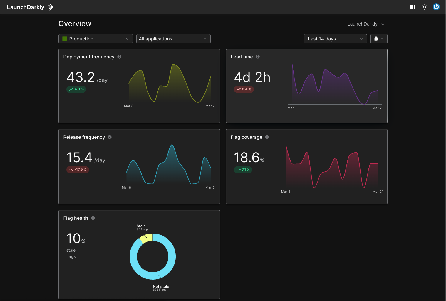
Accelerate’s primary overview page that shows a summary of all your quality and velocity metrics in one place
We ended up building Accelerate: a product for engineering leaders to track and improve quality and velocity by combining key metrics in one place to highlight bottlenecks and track long-term trends.
The idea came from our customers champions. They would ask us, “We’ve rolled out feature flagging across our engineering department, and want to know if that’s improved our velocity and quality. Can you help us measure that?” We had no answer for them.
By using feature flagging, LaunchDarkly should be improving quality and velocity. The DORA (DevOps Research and Assessment) movement was on the rise, which defines 4 metrics for measuring that: deploy frequency, lead time, change failure rate, and mean-time-to-resolution.
A handful of products were popping up to measure these metrics for engineering teams, but there was a gap in the market: none of them were able to take into account feature flagging’s impact to these metrics. By combining the DORA metrics with flagging data, we could create a truly unique product.
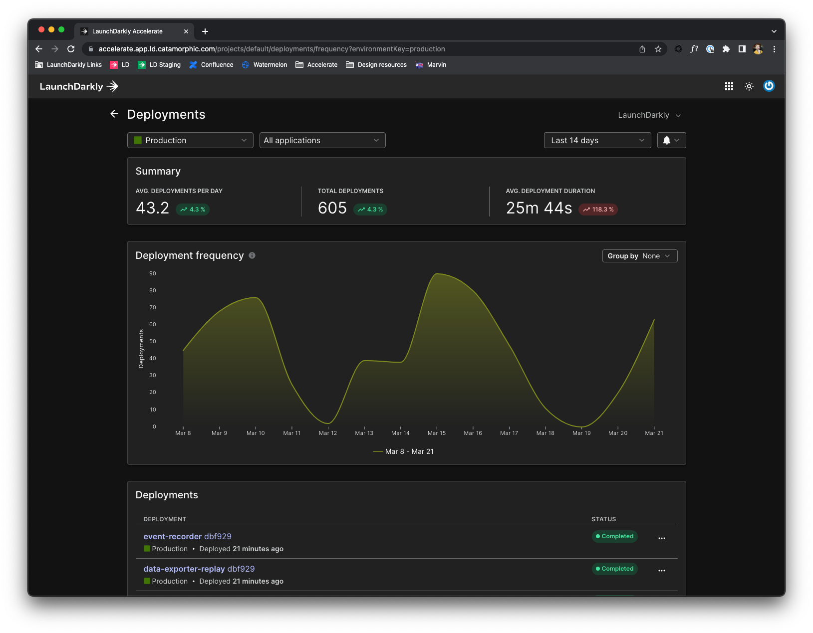 The deployment frequency metric page
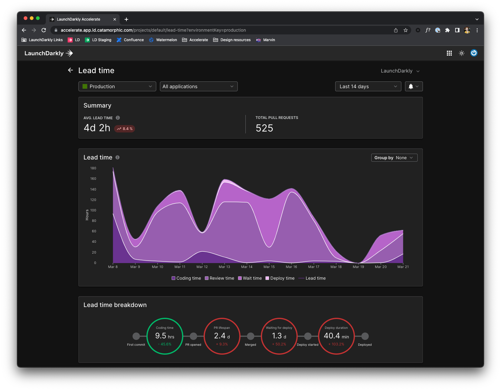 The lead time metric page
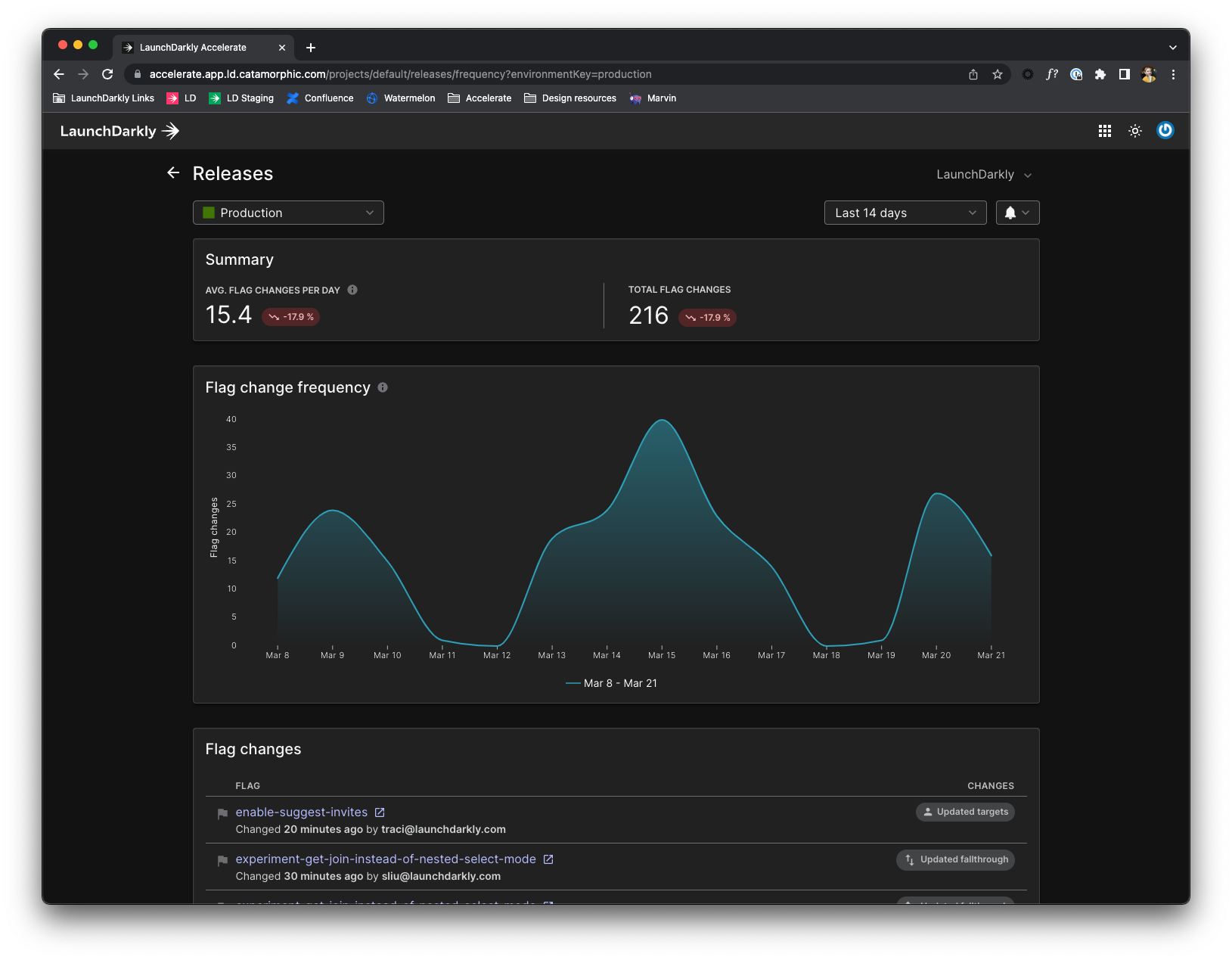 Release frequency metric page
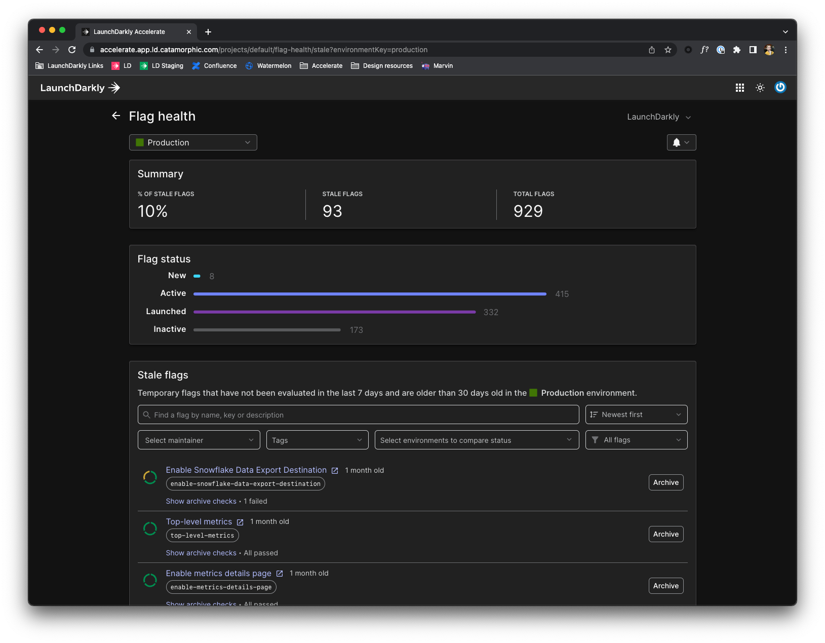 Flag health metric page
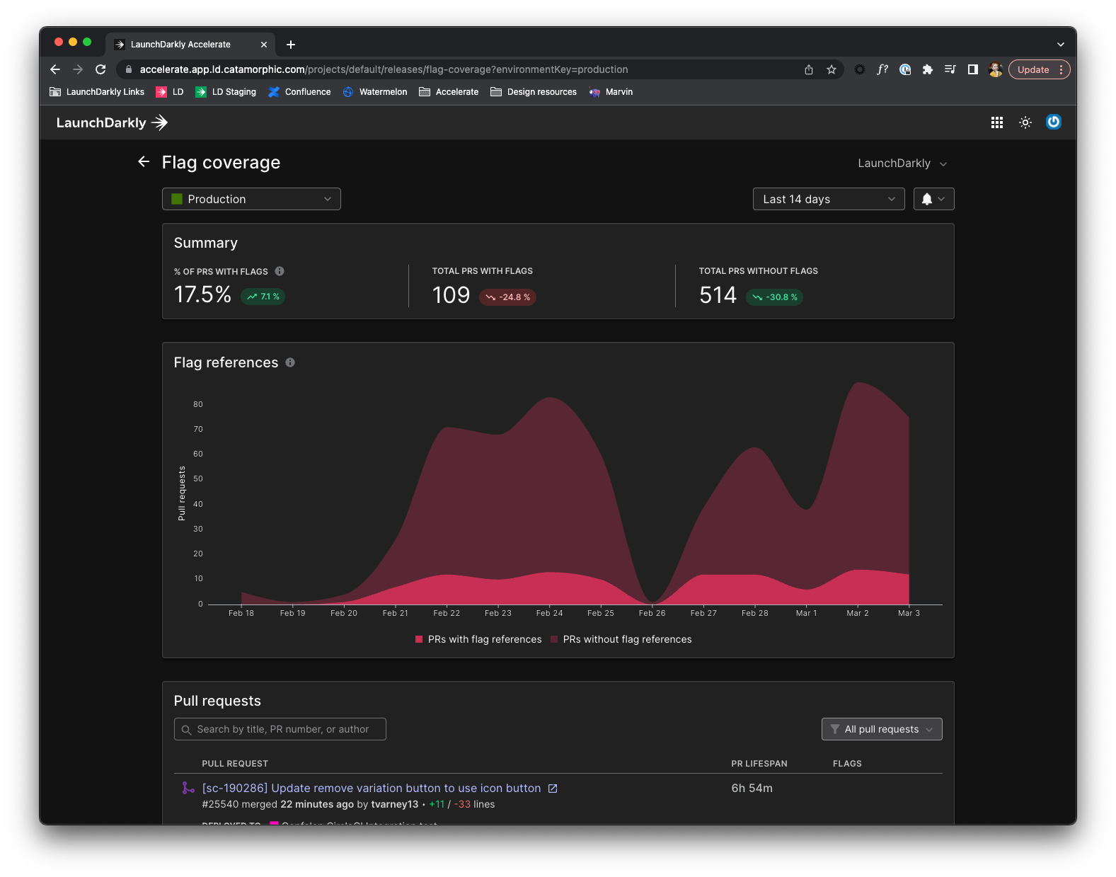 Flag coverage metric page
How we got there
We kicked things off with a team of 6: myself as the product designer, a combination Director of Engineering and product owner, and 4 engineers. We were starting with a blank canvas, so the first thing I did was run a workshop for us to review the competitive landscape, and collect screenshots of general charting and data tools that people like (and dislike). This was put into a “competitive and inspiration board” in FigJam that I referred to throughout my time on the team.
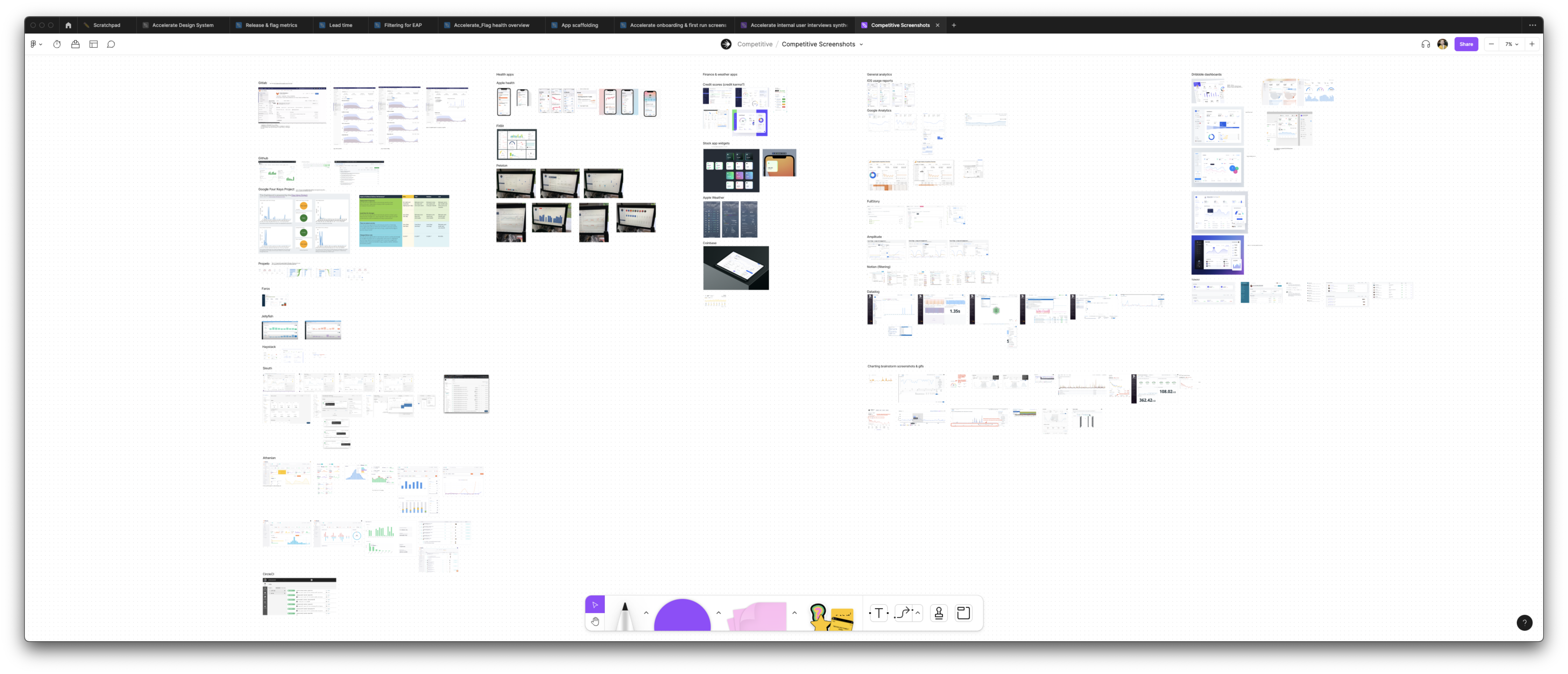 The big FigJam board of competitive screenshots and tools in similar spaces. Also Dribbble shots for pretty inspiration.
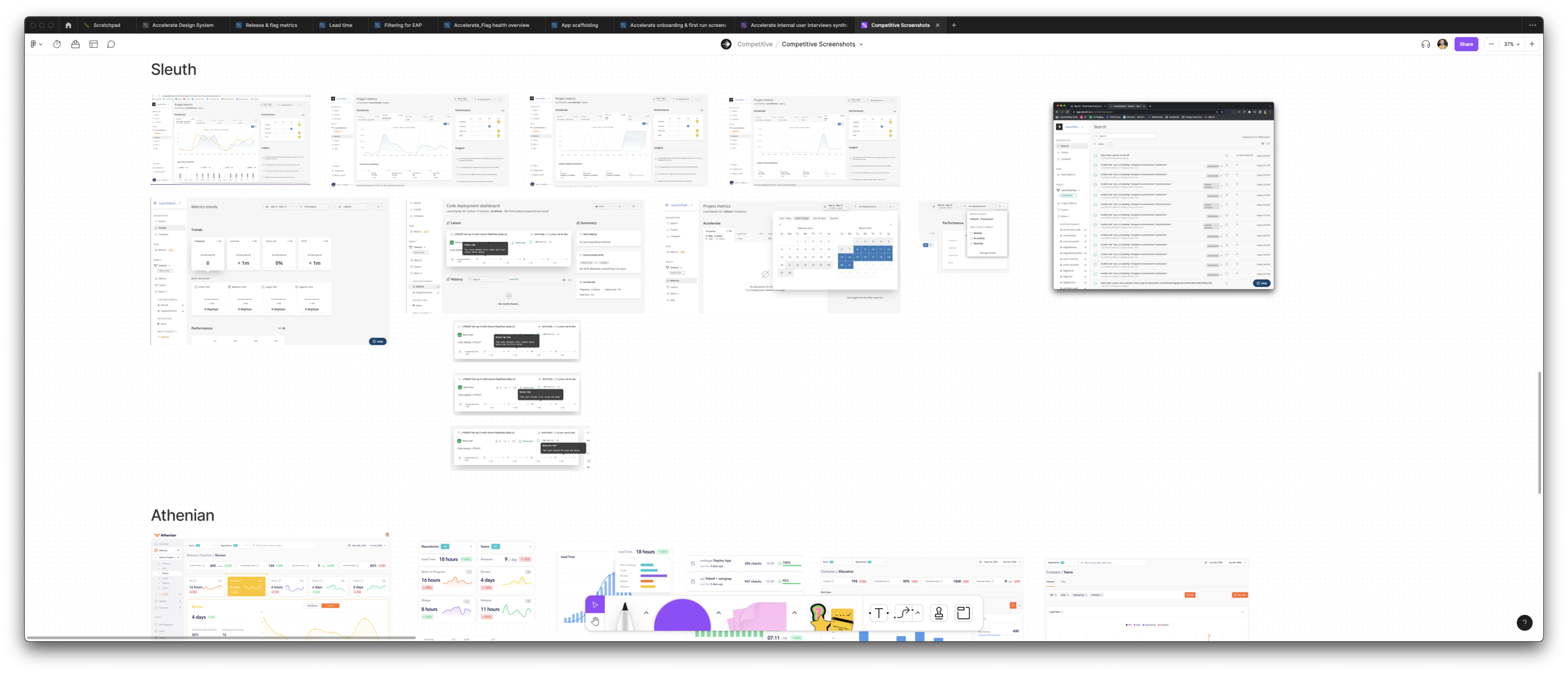 Close-up of competitive screenshots
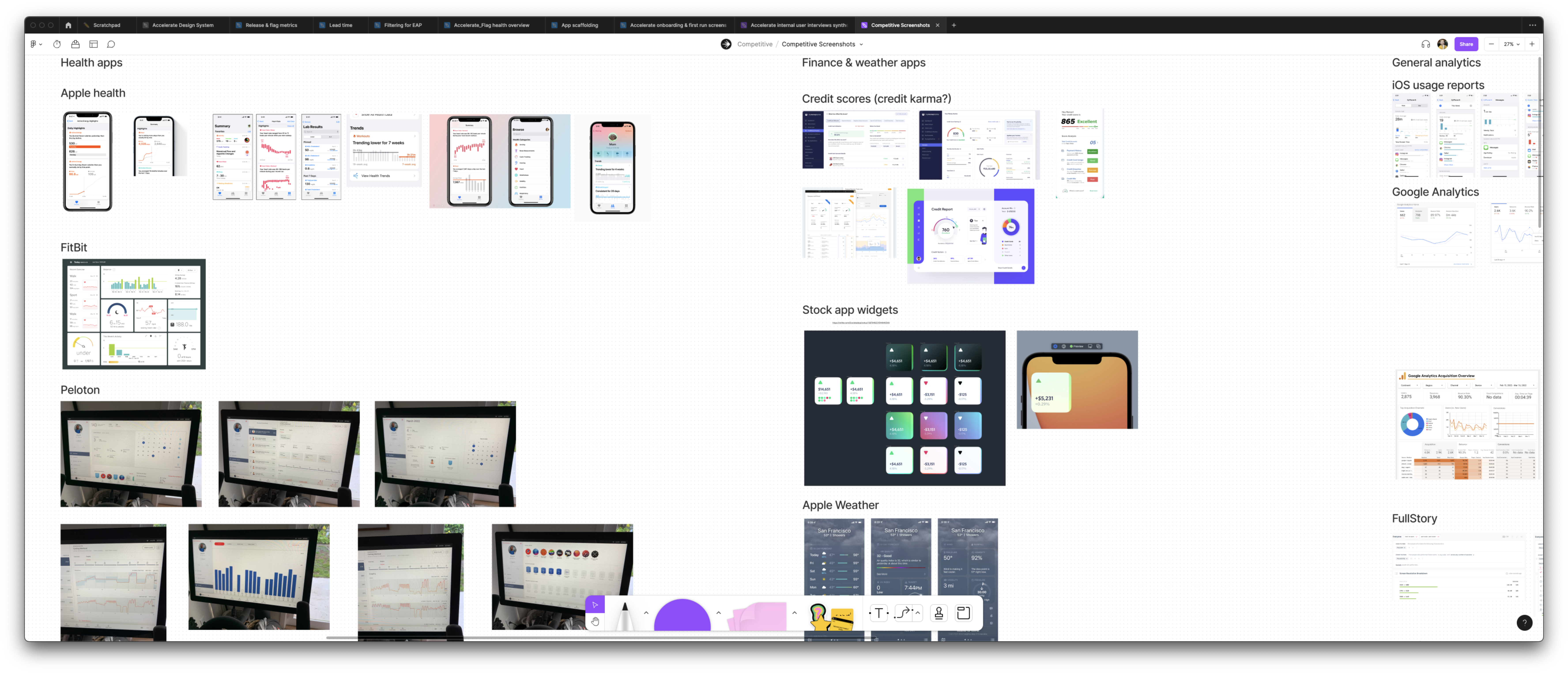 Close-up of general analytics screenshots
First metric screen
When you have a blank canvas, the hardest part is knowing where to start. We discussed this as a team, and ultimately decided the best starting point was the deployment frequency metric: it was easy to calculate, and easy to get the data. For me, this was an opportunity to set the pattern for how most of the screens in the product would look. The product is primarily metrics, so nailing the first one would make the rest of them faster to design and build.
To do that I drew on all the inspiration we had collected previously, and explored a ton of lo-fi options of different layouts, functionality, and data.
The key thing to emphasize here is that I was working in an environment of high ambiguity with no product specs or technical constraints (yet). To create clarity out of ambiguity, I dove right in and made lots and lots of lo-fi mocks, throwing everything at the wall to see what would stick. I wasn’t afraid to try out crazy ideas, and had no problem throwing stuff out to get to the really great stuff. I regularly shared these with the team, got their feedback on what was working and what wasn’t, and iterated more.
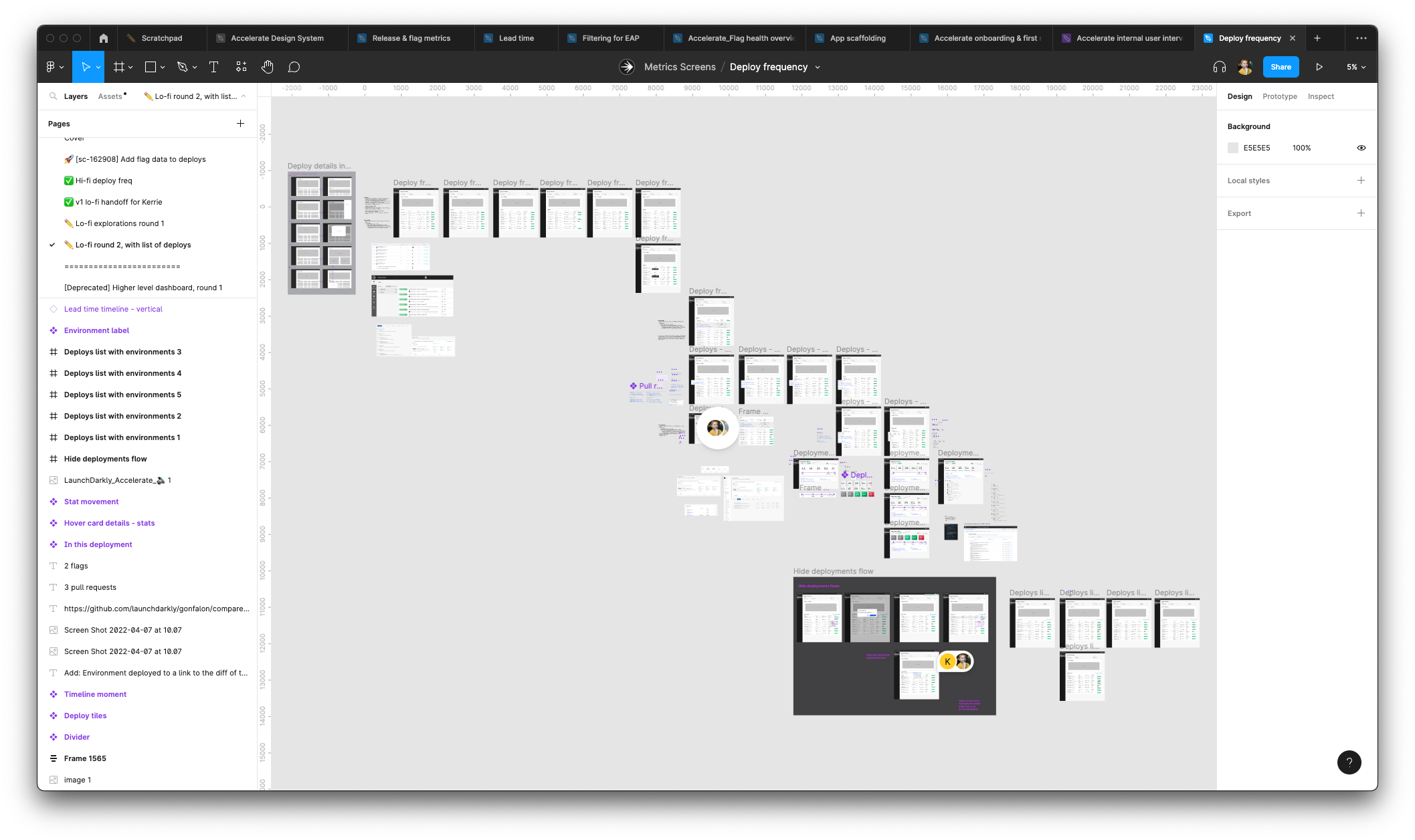 A fraction of the lo-fi options I explored
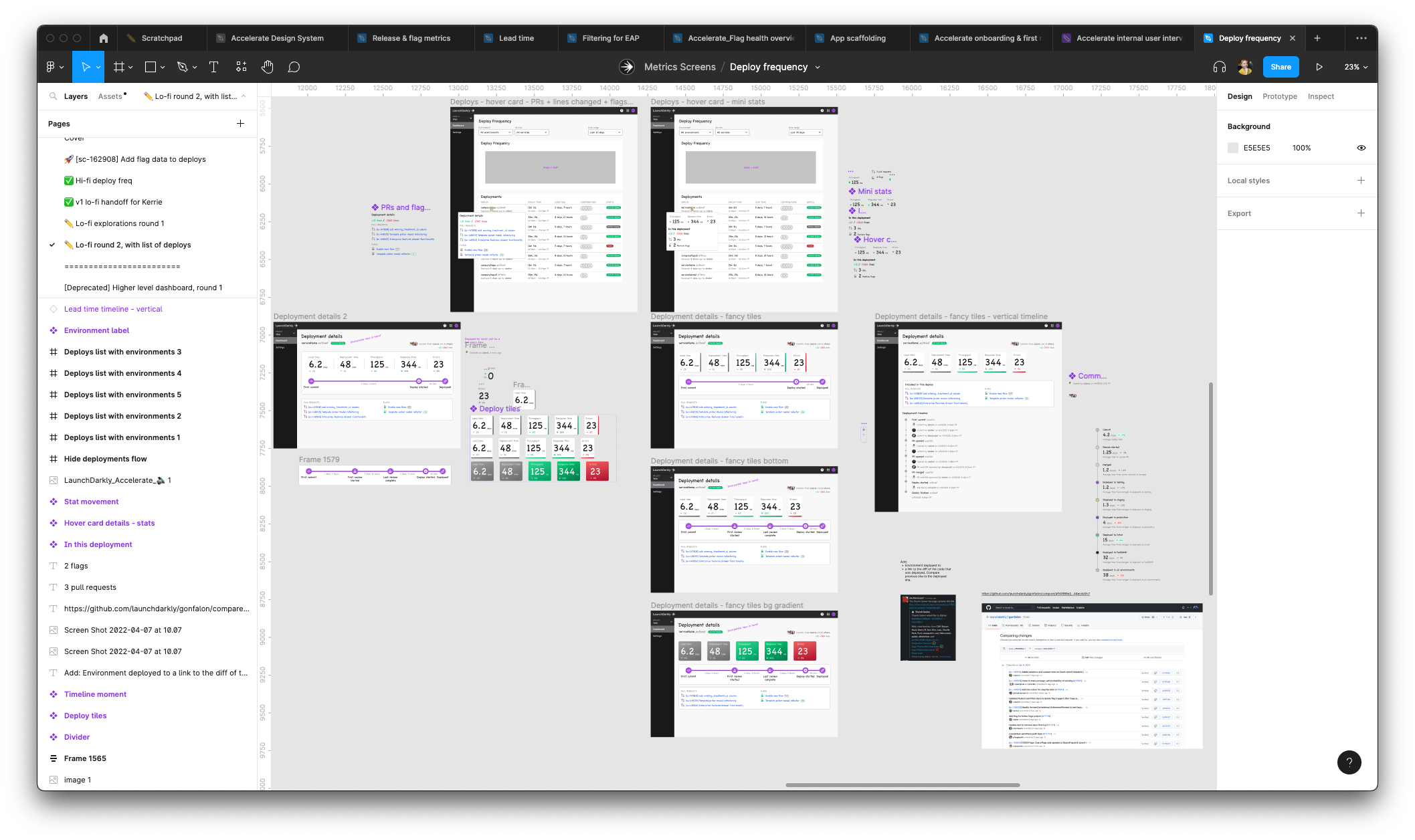 Close-up of some lo-fi options
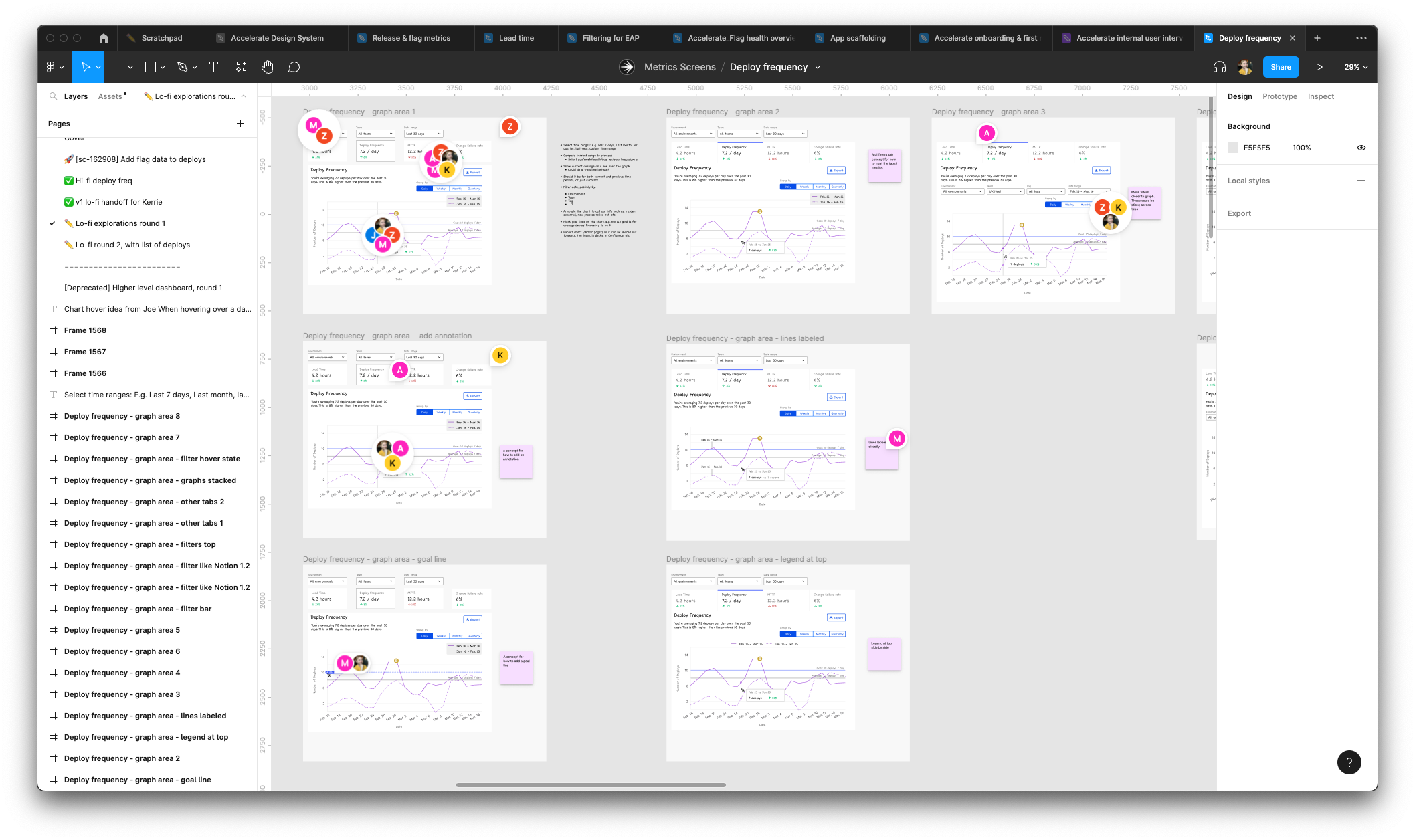 Another close-up of lo-fi mockups
While I was trying out everything, the engineers were building the data models and figuring out how to ingest the data. Our work was informing each other’s – my mocks helped them get a sense of what calculations and functionality we were likely to have, and their data modeling told me what we could build.
After a lot of back and forth we aligned on an initial set of functionality and calculations, which I turned into a polished hi-fi mock. The basic structure was an inverted pyramid: start with high-level summary metrics, then have a graph, then provide more detailed breakdowns and a table of data below that.
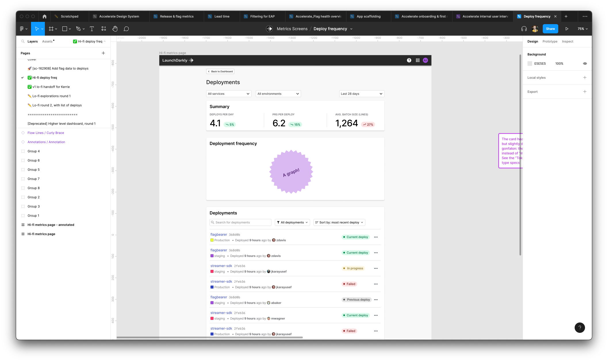 Finished mock of our first metric, deployment frequency
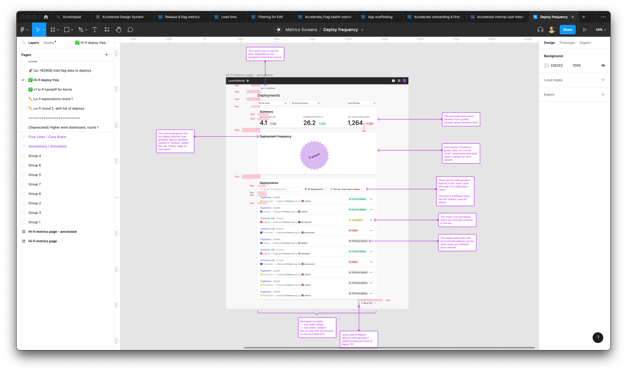 The same finished mock, but redlined to ensure the engineers got all the details right
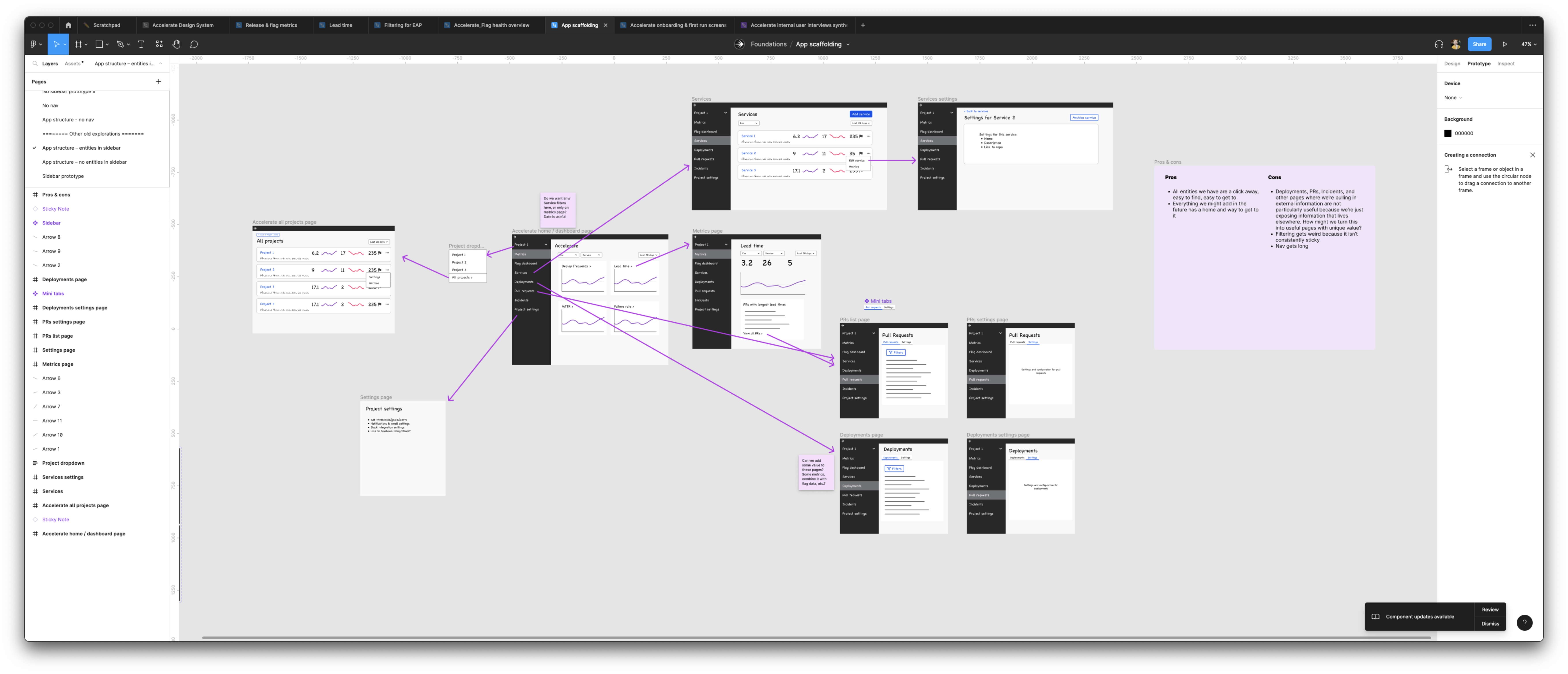
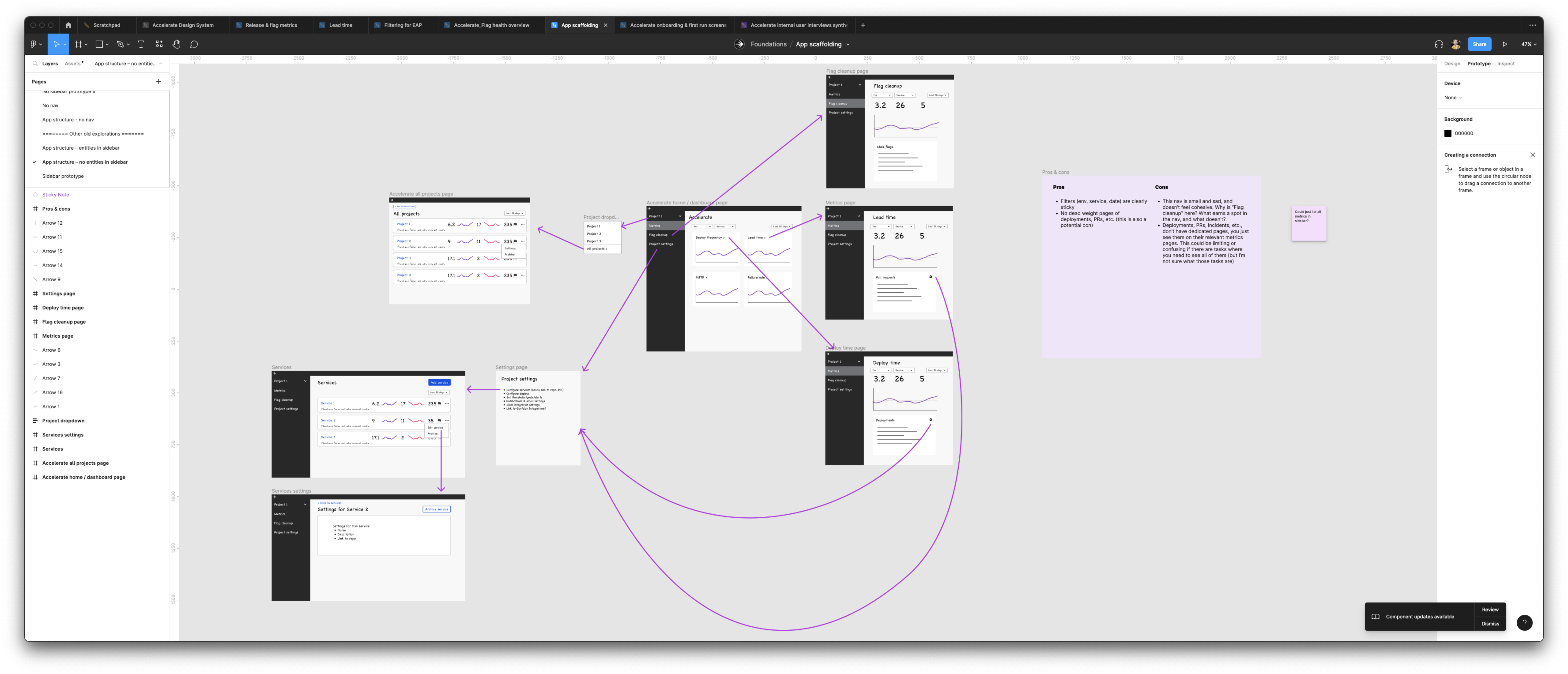
Information architecture and navigation
As we built out the first screen, I worked with the product owner on our information architecture and navigation. We discussed the data models and core concepts of the product, as well as our target users’ mental models, to develop a strong system model to work off of.
The core of it is that we have raw data (deployments, PRs, flags, etc.), which we combine into summary metrics (deploy frequency, change failure rate, etc.), which can be filtered by date, environment, team, and application. We turned this into a conceptual model that we built the IA off of (screenshots below).
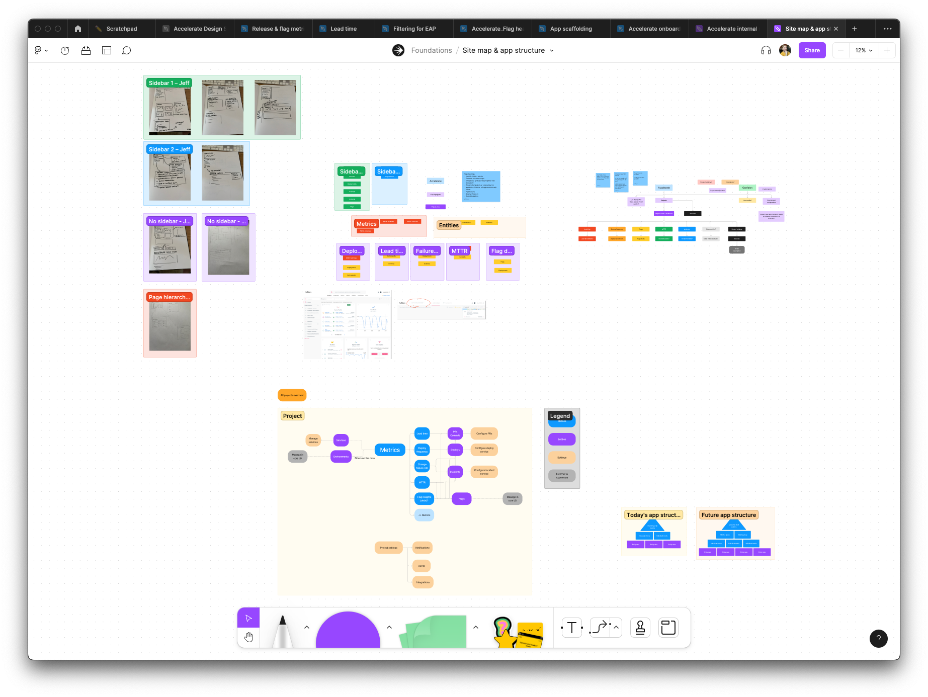 Our working FigJam board of the conceptual model
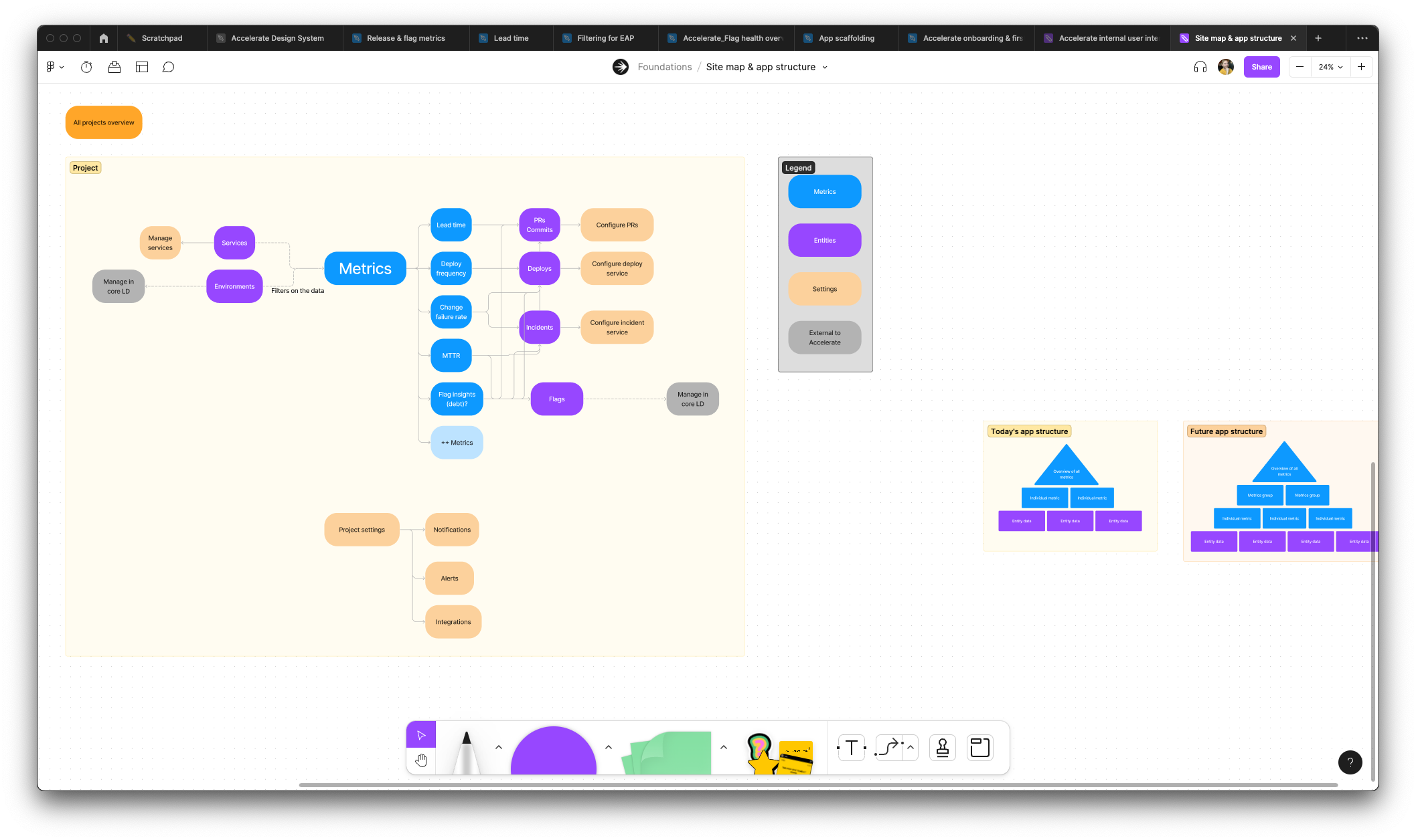 The final conceptual model that we aligned on
Using that system model, I took a similar approach to designing the first screen: I explored a bunch of lo-fi concepts for how to translate the model into a navigation scheme. I built a handful of prototypes to help us assess the “feel” of each model. We tried all the obvious stuff, like a sidebar and top bar and so on, but pushed ourselves to do something more innovative.
We landed on a dashboard experience that eschewed any traditional navigation in favor of showing each metric in cards, and you could click through to the more detailed metrics screens. We did this to put the emphasis on the data itself, and interacting with it, and clicking into and out of it and slicing and dicing it, rather than trying to remember which screen has the number you want.
Accelerate’s finished nav – no nav! Just cards to navigate by
 Screenshot of a lo-fi mock of a discarded navigation scheme
 Screenshot of a lo-fi mock of another discarded navigation scheme
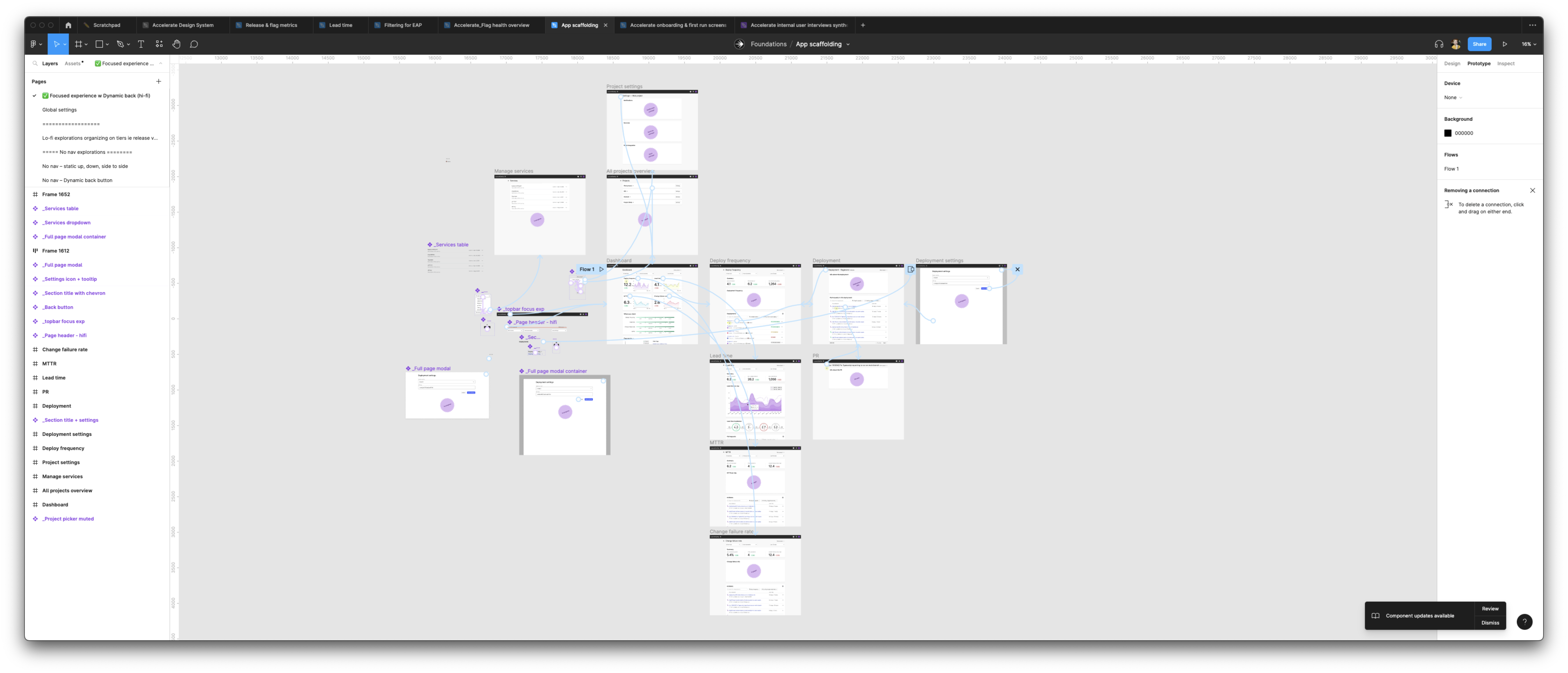 Prototype of the finished “focused experience” no-nav navigation
Design system
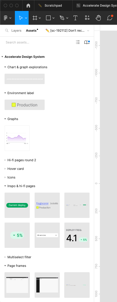 Some of the components I created in Figma
As more of the product got built out, I kept creating components and design patterns for us to use throughout the product. This was important because:
- It adds consistency to the product, which makes the product easier to learn and use for our customers
- Makes the product faster to both design and build since we could reach for established patterns rather than design and build everything from scratch. I would often just hand lo-fi mocks to engineers to build off of, and they would know what existing components to use.
- Increases product quality since we can focus on making a handful of components great, rather than building everything bespoke.
Wrap up
All told, it was a lot of work and a lot of fun. I spent a year on this, and when I left we were nearing the end of EAP and getting ready to officially launch. The learning plan uncovered the gaps to close before launching, which the team is cranking away on.
The early signs I saw while I was there were generally positive: our internal platform team was starting to rely on it, we sunsetted our internal use of our main competitor, and we had engaged accounts in the EAP who were getting value out the metrics we had built. And we got regular feedback that people really liked the clean and simple UI (a big advantage over our competitors). There’s a lot more work to be done, but between the persona and jobs-to-be-done, the navigation and IA, and the design patterns, I set a solid foundation for the team to build on for years to come.