Experimenting with layering, filtering, and masking in CSS
I’ve recently been doing some experiments with layering, filtering, and masking in CSS. The language has come a long way in the past few years, with properties like filter, mask-image, mix-blend-mode, additional gradient types like radial-gradient, and more, opening the door for Photoshop-like effects that weren’t possible before.
I did these in CSS, as opposed to Figma or Photoshop (where they are usually trivial), partly to see if I could, and partly because CSS provides a lot of advantages over graphics programs: they can scale and be responsive to browser/device sizes, dark and light modes can be controlled via CSS variables (which I didn’t do but it’s possible), they can respond to mouse movement (which I also didn’t experiment with but it’s possible), and they can have scroll effects like perspective scrolling (which I did experiment with).
I followed some tutorials and tweets (which I’ll link to), and pushed some of those in new directions.
Adding noise via SVG filters
I was inspired by this Tweet by Fons Mans, where he suggests adding noise to gradients to give them an extra level of polish and pop. This got me wondering how I could do this on the web, and I remembered seeing a tutorial on CSS-Tricks ages ago about how to add noise to backgrounds programmatically via SVG filters. Actually it turned out it was two articles: Grainy gradients by @jimmmy, and Creating patterns with SVG filters by @finnhvman.
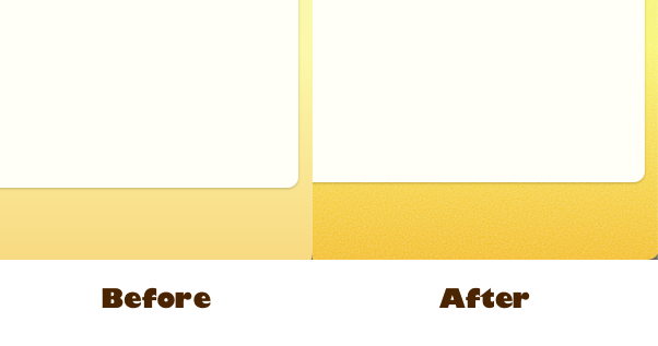
I decided to add some noise to a couple of gradients on my site — the background of the main layout, and the header of the writing page. It’s subtle, but interesting.


It was a fun project to figure out how to do it in code. The tl;dr is I generated a noise filter with SVG, and applied it to an :after element and set mix-blend-mode to overlay.
Blobby background gradients with noise
Fons’ tweet also shows how to layer, blur, and blend elements together to make interesting background gradients in Figma, which I also did in CSS:
See the Pen Background gradient blobs with noise by Jeff (@jlzych) on CodePen.
I also created these stage lights in CSS from a picture I saw in the NY Times:
See the Pen Stage lights by Jeff (@jlzych) on CodePen.
One last one inspired by the design on one of my wife’s purses:
See the Pen Blobby gradient background by Jeff (@jlzych) on CodePen.
Halftone patterns
I saw this cool tutorial on creating halftone patterns in CSS alone, so I followed that tutorial first to create this:
See the Pen CSS Halftone pattern by Jeff (@jlzych) on CodePen.
Then I extended that idea to do scan lines:
See the Pen CSS Scan Lines pattern by Jeff (@jlzych) on CodePen.
Then I extended that idea to do circles radiating out of Frank Zappa’s eye (which was inspired by a photo in the record Absolutely Free:
See the Pen Radiating circles overlay by Jeff (@jlzych) on CodePen.

All of those inspired me to do a motion blur type pattern by blurring SVG noise in one direction, and layering that on top of some stripes. It didn’t quite come out how I had envisioned (I wanted to get it to look more like putting some paint on a canvas and scraping it down), but it’s kinda cool in its own way:
See the Pen Motion blur experiment by Jeff (@jlzych) on CodePen.
Trippy pop art
All of those led me to create some trippy pop art that uses layering and blending to get different colors, and perspective for different scroll speeds so each layer moves across each other at different rates. Scroll within each of these Codepen embeds to see what I mean.
See the Pen Trippy pop art stuff by Jeff (@jlzych) on CodePen.
See the Pen Trippy pop art with fade by Jeff (@jlzych) on CodePen.
See the Pen Trippy pop art waves by Jeff (@jlzych) on CodePen.
This one’s my favorite 😄
Card with fancy border
The last thing I did was create this card with a fancy gradient border, inspired by a design I saw somewhere else (I can’t remember exactly where), which uses some layering and blending techniques from above but isn’t nearly as experimental or “out there” as some of the previous stuff.
See the Pen Card with fancy border by Jeff (@jlzych) on CodePen.
Fin
That’s all I’ve got for now. They’re fun to make, and I feel like I could make a lot more of these since each one inspires new ideas. Plus I’m a lot more attuned to seeing gradients and layers in the world now – lights, shadows, clothing, purses, etc. – which makes me want to figure out how to recreate them in CSS.
Bon appétit!